Let’s take a look at the YouTube logo and the incredible story behind this tech giant. Their logo and brand are recognized by millions across the globe.
The internet is a vast labyrinth of media platforms and has been for many years. You may be able to remember specific video streaming sites that didn’t quite have the longevity and popularity as others, websites such as Vimeo and Dailymotion, among others. But today, when we think of video streaming platforms (be they live or pre-recorded videos), we think of Youtube.
What Is YouTube?
Yes, this question may seem silly to those of us who use this platform every day, but millions of people the world over have not yet seen what wonders await them online. First of all, YouTube is a video hosting platform, a gigantic influence over the internet for well over a decade now.
It is one of the world’s most popular websites, visited by half the internet users every day, and created a massive number of online entrepreneurs (or ‘Youtubers’) who supply the companies’ content.
The original YouTube logo is well known worldwide; the red and white coloring and the unique, memorable font are known and recognized by countless millions. But today, we look at the history of the internet’s number 1 video streaming website and at the logo that has publicized the company so well and made it so famous.
The History of YouTube

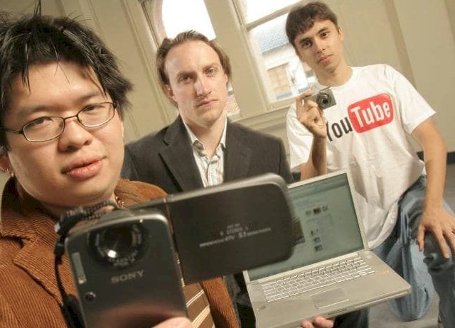
YouTube is the world’s top video hosting service created by three former PayPal employees and friends: Steve Chen, Chad Hurley, and Jawed Karim. The company was founded in 2005. The idea started as a dating site between the three colleagues with the idea that potential daters would have to upload videos of themselves to the website, instead of only photos as per usual.
The idea was revolutionary; there was no other concept quite like it at any time on the internet. However, as the website was established, the code was written, and the videos were uploaded, Youtube realized that the idea that had was much bigger than a mere dating site. They had the potential to host the world’s biggest video streaming site with potentially millions of users and content creators. Youtube set their sights bigger and focused on video sharing, as opposed to dating, and the internet hasn’t been the same since.
When Google Bought YouTube

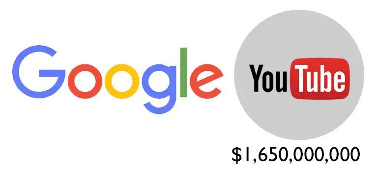
On October 9, 2006, Google announced that it had acquired YouTube for $1.65 billion in Google stock, and the deal was solidified and went through on November 13, 2006. Google’s acquisition of YouTube launched a newfound interest in video-sharing sites.
In March 2010, YouTube released the first online free broadcast, including 60 matches of the Indian Cricket Premier League. On March 31, 2010, the YouTube website launched a brand-new design in its interface and appearance. The aim was to simplify the ease of the user’s experiences when using the website and to increase the amount of time the user would spending clicking and watching.
According to data published by market research company comScore, YouTube is the dominant online video provider in the United States, with a market share of around 43% and more than 14 billion views of videos in May 2010.
Youtube currently enjoys 30 million active users per day, and a staggering 5 billion videos watched worldwide per day! The website has gone from strength to strength, and the logo is a large part of that success.
The YouTube Logo
 The design of the Youtube emblem is an iconic image. The logo has gone through a couple of methods over the years, though. An old YouTube logo comprised the words ‘You’ and ‘Tube’ words, in different parameters. The ‘You’ was written in exact, black type, and the ‘Tube’ was designed in white, shaped into a red, softened triangle.
There aren’t too many Youtube users who would understand why the term ‘Tube’ is used in the company name. The notion is related to Cathode Ray Tube, which was used in old TVs and monitor models. Youtube suddenly realized that and decided to change the emblem a bit. The more recent YouTube logo looks far more up to date, as the ‘Play’ button became stressed. VHSs are out-of-date as well, but the button design has outlived the epoch change and scientific-technical revolution. It symbolizes now the most popular site, with at least half the internet users visiting it every month and turnover a gigantic revenue each year.
The Evolution of the YouTube Logo
 Youtube has said that its change in the logo wasn’t supposed to spark a revolution but show the Evolution of the company’s thought process. Youtube didn’t only develop their primary logo exceptionally well, but also derived services have become a big part of their business models, such as Youtube Kids, YT TV, Red, and Music.
Over time, the unique YouTube type was developed. The development process was long and detailed, though, as the company wanted to create something the resonated in the consumer’s mind, and that would look good and professional on any Youtube channel. They also had to develop it for new technologies like mobile services, and they had to create unique design aesthetics for a smaller, handheld device. Google is also used and applied to all these services. It was this level of detail, development, and consumer consideration that Youtube to becoming the global powerhouse that it is now.
Today, Youtube has expanded far beyond its original intended goal, becoming much more than a video sharing platform. Businesses of all stripes use this platform for marketing and advertising their companies and products, and bloggers and Vbloggers have used it as the staple of their income for years. If you are reading this and considering designing (or redesigning) your own companies’ logo, then taking a closer look at how a mega-giant like Youtube accomplished their design is a great place to start. The simple facts of how proper the creation of the logo is, it’s shape and fonts, aren’t too complicated ones, but they are a great place to learn the success of simplicity.
The famous YouTube design is of minimalistic monochrome colors, with some red elements. The iconography is strong, and the font choice and color scheme combination add a calming, melancholy feel to the image. The logo itself is genuinely mesmerizing, so let’s look at the Youtube logo in greater detail.
The Building of the YouTube Logo
Minimalism was Youtube’s original word of choice when it came to discerning their company’s identity. The logo hasn’t changed too much over the years (being that the company was only established 15 years ago, this is understandable), but this cutting back technique may have been so pivotal in helping the company grow and evolve so rapidly. The Youtube logo is regarded by many as a masterclass in how well simplicity can work in promoting a project.
Even though the logo has remained similar throughout its short history, some modifications have been made:
The Original YouTube Logo
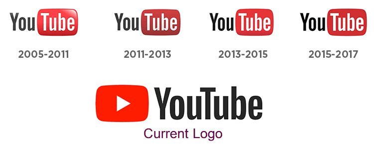
The earliest YouTube logo was created in 2005 and lasted until 2011. The design of the logo itself consisted of two parts; the ‘You’ part, which was written in black letters, and the ‘Tube’ part, which was placed inside what looks like the screen of a vintage style TV, which has rounded corners (a reference to ‘Tube’ meaning a television screen). The ‘screen’ of the TV is bright red, and the ‘Tube’ part is written in white letters to improve the visibility. Sometimes, the slogan ‘Broadcast Yourself’ would accompany the image below it, but this scrapped later.
The 2011-2013 logo design is like the one that came before it, although the rectangle was darker and more trustworthy. The ‘Broadcast Yourself’ slogan was scrapped around 2012. The next variety appeared in 2013, and it was in use until 2015. The rectangle ‘Tube’ part turned a little lighter, and the ‘You’ part was a much darker shade of black.
New YouTube Logo
 We now move onto the current version of the logo. It is very similar to its predecessor, but the ‘TV Tube’ is lighter in color and a more solid image than before. Just like all the other designs, this current one is made up of the black ‘You’ and white ‘Tube’ on the red ‘vintage TV screen.’ The curved shadings were taken away, and now the part of the image that shows the screen is completely flat.
There have been a few small designs of the logo, but the most notable of all was at the end of the summer of 2017. For the first time, the logotype now included the red ‘Play’ button with a white triangle. The logo was colored red, with the word ‘Youtube’ to the right in a slightly modified typeface. This version also only incorporated black letters.
The YouTube Icon
The icon of the famous Youtube logo has undergone a few changes over time. While the earliest versions included the name, and since 2011 the icon has featured a play button. In 2013, the proportions of the rectangle and the triangle were altered. The shade of red used initially has changed several times until the switch was reshaped in pure red in 2017.
Colors
The Youtube logo has three primary colors: white, black, and red – a combination that creates an aesthetically pleasing image. The colors emphasize the traits and attribute that Youtube wishes to show the world: optimism, excellence, purity, passion, elegance, and perseverance. This well-recognized color scheme is a big reason why Youtube and its logo have reached such great heights.
Font
The YouTube logo uses a distinctive and recognizable Helvetica font, which was widely used in TV shows in the 1950s, giving it the feel of ‘Tube’ part of ‘Youtube,’
Youtube is the biggest video streaming platform on Earth and entertains millions and allows thousands to use their creative talent to earn a living. As the company continues to march onto success, we should remember how pivotal the Youtube logo was in getting them there.


