
Let’s get an insight into the GEICO logo and some history behind the insurance company.
The abbreviated name, GEICO, stands for Government Employees Insurance Company. It’s a private company specializing in auto insurance. GEICO is the second-largest auto insurance brand in the United States. It insures over thirty million vehicles and has over eighteen million auto policies and over forty thousand employees.
GEICO has its head office in Chevy Chase, Maryland. Furthermore, it is in Belgium, Germany, Italy, and other western countries. This makes it a global auto insurance company. Since it started, the company has had five incredible visual identities. In 1936, management unveiled the first GEICO insurance logo, and it was a classic white and black logotype.
After serving the company for about 26 years, stakeholders opted for another design.
It was followed by three more redesigns, including the current one. The latest design was unveiled in 1978 and featured a bold wordmark rendered in blue.
It conveys a feeling of security, stability, and peacefulness. On special occasions, you’ll find it being escorted by a funny mascot, a gecko. This logotype derives its charismatic personality from a typeface called Eurostile Bold Extended #2.
An Italian typographer, Aldo Novarese, designed it. And it’s a sans-serif font.
GEICO Logo Evolution
In over 80 years, GEICO has used five different logos. The business unveiled its original logo in 1936. The first update then appeared 26 years later. Let’s quickly review the numerous stages in which the logo has undergone development over time.
The Original Logo:
The insurance company introduced its maiden logo in 1936. It was a black wordmark slanted to the right. At both ends of the shortened word—GEICO were two gray triangles. In addition, the designer placed the words—Government Employees Insurance Company in uppercase letters. This monochrome visual ambassador lasted for almost twenty-six years.
The First Logo Update:
After twenty-six years of using the logotype, GEICO unveiled a new logo. It was a rounded-shaped emblem with an eagle on a pedestal. Beneath this pedestal was a banner with the caption—national service. In addition, the logo had seven stars and the company’s full name: Government Employees Insurance Company, in a circular form. It lasted for seven years.
The Second Logo Update:
In 1969, GEICO had its second redesign. It kept the identity of its previous logo with minor changes. The rounded shape was absent, but the designer added a rectangular shape below the eagle’s pedestal. Inside this shape was the inscription—GEICO in bold caps with the registered mark. Surprisingly, this logo lasted for only a year.
The Third Logo Update:
GEICO introduced its fourth logo in 1970. It featured an elegant shape enclosed with the caption—GEICO and affiliates in all caps. This black and white emblem was clean and minimalist compared to its predecessors. It served the company for almost eight years.
The Fourth Logo Update:
Aiming for a modest logo, the company unveiled another visual identity in 1978. It’s a bold blue wordmark featuring the shortened name—GEICO. Sometimes this logotype comes with the caption—Direct in caps. Also, you’ll find the wordmark with a cheerful lizard. This colorful mascot can appear anywhere around the elegant wordmark.
Why Does GEICO Logo Work?
![]()
The GEICO Logo Is Simple:
It’s a fact that most established brands have straightforward logos. They make their designs effective by avoiding excessive design elements. In the same light, the GEICO logo shares a similar design process. It is recognizable because it has a tidy personality.
The GEICO Logo Is Legible:
Readability is a key factor in logo design. So, a good font lets customers quickly relate to the brand’s personality. The simple, bold typeface in the GEICO logo makes it more readable. On any marketing platform, this bold sans-serif font is impossible to overlook.
The GEICO Logo Is Versatile:
The GEICO logo is quite adaptable. It can fit almost all marketing platforms without issue. Meaning it can seamlessly integrate into both small and large surfaces. Its minimal layout is an important factor in its ability to achieve scalability.
The GEICO Logo Is Timeless:
GEICO has maintained a distinct persona for a long time, and it has consistently maintained its blue color and font choice. Interestingly, this is a trait shared by most iconic logos. The consistency of the design elements has built trust, making the logo enjoy a timeless status.
GEICO Logo Design Elements
Any logo design must include graphic components. They make abstract concepts visible. The GEICO insurance logo carries its message with fewer distinctive graphic elements. Without further ado, let’s examine the qualities that distinguish its logo:
GEICO Logo Shape And Symbols
A Rectangle:
A rectangle was one of the geometrical shapes used in the GEICO insurance logo: It was introduced in 1969’s logo design. You’ll find it below the rounded figure, housing the brand’s name, GEICO. It symbolizes stability, honesty, and peacefulness.
An Eagle:
GEICO’s first logo update has a flying eagle, indicating the company’s protective goals. An eagle, as GEICO’s element, signifies freedom and foresight. It can also represent leadership, bravery, and power. In the logo, the designer captured it in the middle, holding a shield.
A Circle:
A circle was another geometric design element used in the GEICO insurance logo. It’s featured in the company’s second logo. Here, it housed the other graphic elements, giving them protection. The circle here signifies totality, eternity, and unity.
Stars:
Stars, in many fields, radiate positive energies. They can convey a sense of hope, faith, and divinity. In addition, they can symbolize excellence, fame, and good luck. You’ll find seven five stars above the GEICO logo as design elements, particularly in the second and third designs.
GEICO Logo Colors
Blue Color:
The GEICO insurance logo creates a sense of peace, loyalty, and honor. These emotions stem from using blue, the main color in its newest logo. The color blue also inspires a feeling of stability, security, and intelligence.
White Color:
White has played a major role in all the GEICO logos. It has served as the background hue, providing clarity to the other elements. The white color in the GEICO logo symbolizes simplicity, goodness, and cleanliness, and it also inspires a sense of freshness and purity.
Black Color:
The black color ruled in the earliest GEICO logo designs. So, except for the current one, you’ll find it in all the other versions of the company’s emblems. As a color of mystery, it symbolizes elegance, classic, and formality. In addition, it represents power, wealth, and authority.
What Font Is Used In GEICO Logo?
GEICO has kept a very powerful personality. Thanks to its square-like sans-serif font. In 1962, Aldo Novarese, an Italian typographer, designed it from its earliest font, Microgramma. It’s called Eurostile Bold Extended #2. This bold, readable, and attractive geometric typeface inspires confidence and honesty.
What Is the GEICO Logo?
The American insurance company has a minimalist logo. It’s a wordmark crafted from a geometric sans-serif typeface. It’s confident, outspoken, and persuasive. It has a blue personality over a white background, projecting positive emotions. In many ways, the GEICO logo stands for peace, security, stability, and freedom. Also, it’s one of the world’s most recognized logos.
What Is the GEICO Symbol?
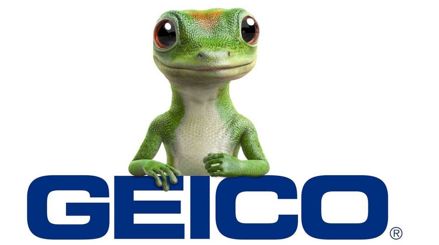
GEICO uses unique comical characters to create a strong emotional connection with customers. These include the GEICO Gecko, Maxwell the Pig, and Cavemen. Among the three mascots, the GEICO Gecko is the most well-known and influential in the company’s commercial dealings.
The Martin Agency created the GEICO Gecko, a funny reptile with an English accent. It originally appeared in an ad on August 29, 1999, and Kelsey Grammer, an actor, did the voice-over. Later, Dave Kelly, Jake Wood, and Andrew Randall were the voices behind the mascot.
What Is the GEICO Catchphrase?
GEICO is one of the world’s most successful brands. One factor leading to its victory in the industry is its creativity and humorous marketing campaigns. To create lasting memories in people’s minds, GEICO uses catchphrases that stand the test of time.
For instance, “Fifteen minutes could save you 15% or more on car insurance” is now engraved in American culture, and it’s one of the most successful slogans in advertising history. Another successful slogan for the company is “GEICO: Real service, real savings.”
Why Is the GEICO Mascot A Gecko?
In fairness, GEICO rhymes with gecko. So, using a different animal as an official mascot would be less relevant. It all began when the Martin Agency noticed how people often mispronounced the company’s name, GEICO, as “Gecko.”
So, during a creative session, they saw the need to capitalize on the prevailing situation. This led to the birth of a friendly animated gecko to lead the company. It appeared on August 29, 1999, becoming an instantly likable character. Since then, it has led to several successful commercials.
What Is the Name of GEICO’s Mascot?
Almost all mascots have unique and personalized names. It’s quite fun addressing these animated characters with human names. Interestingly, these names are inspired by several factors. Regarding the GEICO Gecko, the name aligns with the company that created it.
So, it’s called Martin, referencing the Martin Agency. In addition, the company’s second mascot is known as Maxwell, and it’s a charming pig and the brand’s second most recognizable mascot.
What Does the Acronym “GEICO” Stand For?
GEICO stands for Government Employees Insurance Company. It’s a private company despite having the word “government” as part of its name. The brand started out focusing on government employees, hence its inclusion. Today, it specializes in auto insurance, and Berkshire Hathaway owns it. Also, it’s the second-largest auto insurance company in the United States.
A Short History of GEICO
Leo and Lillian Goodwin started GEICO in 1936. The name—GEICO stands for Government Employees Insurance Company. This indicates the company’s initial focus on government employees and military personnel in the United States.
In 1948, Lorimer Davidson, an investment banker, joined GEICO. Upon joining the company, he helped attract new investors. Among these investors was Benjamin Graham, a Columbia University, New York professor. Then, in 1951, Warren Buffet, a student at the same university, bought his first company stock.
In 1958, Leo Goodwin retired, and Lorimer Davidson succeeded him. Within a year of his ascension, the company opened its head office in Chevy Chase, Maryland. Then, in 1964, GEICO exceeded the one million PIF mark. PIF stands for policies in force.
Fast forward to 1996, and Warren Buffet bought outstanding GEICO stock, making it a subsidiary of Berkshire Hathaway, Inc. Three years later, the GEICO Gecko showed up in the company’s commercial.
It was an effective campaign that moved the brand above the five million PIF mark in 2002. In 2009, the company passed the nine million PIF mark. And in the same year, GEICO opened an office in Massachusetts, covering all fifty states.
Today, GEICO has over forty thousand employees and serves over eighteen million policyholders in the United States.
Wrapping Up On GEICO Logo History
The GEICO logo is among the world’s most recognizable visual assets. It’s a blue wordmark logo designed with a geometric sans-serif font. It’s clean, attractive, and memorable. It was unveiled in 1936, and it has undergone four updates.
Though it often stands alone, the GEICO logo can accompany a gecko. This animated mascot is called Martin, referencing its creator, the Martin Agency, and it’s a friendly brand ambassador for the brand.
The GEICO Gecko showed up in a 1999 commercial, disrupting the insurance industry. Today, the logo and mascot represent the second-largest auto insurer in the United States. The company, GEICO, is headquartered in Chevy Chase, Maryland.
It also has offices in other foreign countries; Germany, Belgium, Italy, Spain, and the United Kingdom. In addition, the company has over 40,000 workers, 18 million policyholders and provides coverage for over 28 million vehicles.
GEICO is a private company owned by Berkshire Hathaway, Inc., and its name stands for Government Employees Insurance Company.


