
A look at the UPS Logo and History Behind the Company. Their logo and symbol can be recognized at glance and seen by millions of people all over the world.
The United Parcel Service, commonly referred to as UPS or Big Brown, is the number one parcel delivery service in the world. Based in Georgia, Atlanta, the company delivered over 3 billion packages in over 200 territories and countries around the world in 1995.
The UPS logo is proudly displayed on 147,000 UPS trucks world-wide.![]()
Apart from its 147, 000-strong vehicle fleet, UPS runs one of the leading airlines in the world thanks to its 500 chartered and company-owned planes. Under the stewardship of Kent C. Nelson, its CEO from 1990-1997, the company tirelessly endeavored to keep its top position in the parcel delivery service market and spread its wings all over the world.
The History of UPS
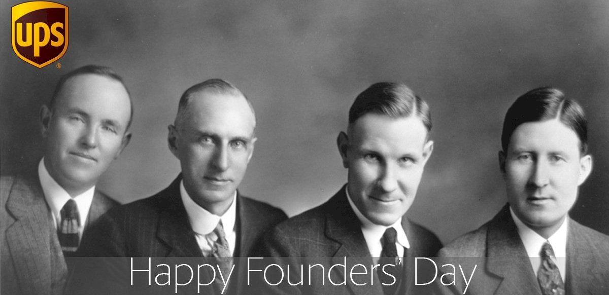 The city of Seattle has always been associated with innovation and industry, which teenagers Claude Ryan and Jim Casey were all too aware of. In 1907, they got a $100 loan from a friend and set up a company known as America Messenger Company. In the beginning, the company was a small courier service in a hotel basement location in the Northwest Pacific, but by the turn of the millennium, it’d grown into the shipping powerhouse we all know today as United Parcel Service (UPS).
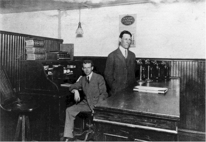
Early on, the company was mostly dispatching messages for businesses and sometimes specialty mail for the United States Post Office, one of its main clients. Deliveries were done largely on foot and sometimes by bicycle.
In the 1910s, America Messenger Company grew further by buying its first delivery van. It’s during this period that commercial delivery of packages caught on.
UPS Beyond Seattle
 In 1919, Merchants Parcel Delivery branched out to Oakland, California, by acquiring Motor Parcel Delivery Company and started going by the current name the United Parcel Service.
Three years later, UPS acquired a Los Angeles common carrier—offering services not often offered at the time by most delivery companies or even the parcel post, like automatically returning undelivered items, accepting checks made to UPS for payment of “collect on delivery” items and daily pick up calls. The takeover of this firm and the decision to grow the carrier service helped UPS expand in the next several decades.
By 1927, UPS was now on all the major Pacific Coast cities. In 1930, it had branched out to the East Coast. Then in the 1950s, it started looking for common carrier licenses to deliver packages to and from all customers, private and commercial, all over America. This decision had UPS directly competing with the United States Postal Service, leading to a number of legal disputes between the two on and off for around 30 years.
UPS eventually moved its head office to California and then finally to Atlanta via New York. In 1962, Jim Casey stepped down from day-to-day management and focused more on his foundation, the Annie Casey Foundation. Along with his siblings, Marguerite, Harry, and George, he’d launched the foundation 14 years earlier in tribute to their mother.
The foundation’s first grants helped support a camp for underprivileged Seattle children. In 1966, Casey expanded the foundation’s focus to include the welfare of kids in ongoing foster care. An independent Seattle-based foundation, Casey Family Programs, now offers a variety of services to help kids in foster care. In 1983, Jim Casey passed on. His estate provided extra resources for Annie Casey Foundation, based in Connecticut. The foundation continues to support disadvantaged kids.
From 1975 to 1990, UPS expanded massively all over the world, providing parcel services in Toronto, and venturing into the Pacific Rim, Middle East, and Africa by 1989. A number of acquisitions helped UPS reach new markets, and shipments by air became a major part of its operations in the 1980s.
Jim Casey, his siblings, other UPS executives, as well as their relatives were the main shareholders of the company for most of its history. In 1999, the company’s shares were offered to the public for the first time.
By 2013, the modest company that Jim Casey and Claude Ryan started was worth close to $80 billion, with yearly revenue of more than $50 billion. In addition, it employs just under 500,000 people in 200 countries around the world and delivers more than 3.8 billion parcels per year. Incredible what $100, a little bit of ingenuity, and hard work can do!
UPS Facts
- Going back to their roots, UPS started hiring bike delivery staff in Washington, Vancouver, and various Oregon cities in 2008.
- UPS created software that plans truck routes such that they reduce left-hand turns during deliveries. By taking that decision, the company lowered its annual consumption of fuel by almost 51,000 gallons in just Washington DC. The fuel reduction stems from drivers not having to wait to execute left-hand turns at red lights.
- When UPS branched out into West Germany they used we changed the solid UPS Brown uniform shirts to a light brown and white pinstripe.
- UPS has its own font, known as UPS Sans. It’s a slightly modified form of FF Dax.
- UPS uses a shade of brown known as UPS Brown.
- The company’s founder, Jim Casey initially wanted the trucks painted RED, then Yellow, rather than black. In the end, he was convinced by Soderstrom argued that yellow trucks would be too flashy and suggested the more subtle and elegant deep brown (now UPS Brown).
The UPS Logo and Its History
![]() The UPS logo is one of the most recognizable in the world. It started its long-running history in 1919 when Merchants Parcel Delivery expanded into Oakland, California and began using the United Parcel Service name.
The UPS logo is one of the most recognizable in the world. It started its long-running history in 1919 when Merchants Parcel Delivery expanded into Oakland, California and began using the United Parcel Service name.
In the sections below, we’ll be taking a look at the history of the UPS logo, as well as its color scheme and design elements to learn about its evolution throughout the century.
The Original UPS Logo – 1919
In 1919, UPS adopted its first logo. It portrayed a dark brown eagle with some package tied in its talons. In the backdrop, there was the shape of a bronze shield with a gold boundary. The package had lettering written “safe, swift, sure”. The shield was chosen as the company’s official emblem by the founder James E. Casey, shortly after UPS merged with one of its local competitors.
1937-1961: 2nd UPS Logo Version
In 1937, the UPS logo was altered to reflect the rapidly expanding company. The eagle was taken out of the shield and replaced with the letters UPS, which stands for United Parcel Services. As the company had started to grow in leaps and bounds, adding retailers to its client base, it changed its slogan to penetrate this customer base even further.
1961-2003: 3rd UPS Logo Version
The third UPS logo was designed in 1961. It featured a package tied with a string above the popular UPS shield. The company created this logo to showcase its specialty, which was, of course, delivering packages. Renowned designer Paul Rand designed this logo with typical aplomb. The story is that Rand got into a meeting with the company and put the design on the desk. When UPS asked Rand if he had other samples, he just replied, “That’s it!”
2003-Present: 4th UPS Logo Version
The current UPS logo was introduced in 2003. The shield was changed, and the string-tied package above it was removed. The designer updated the colors and gave the shield the popular brown color to give the logo a more attractive look both offline and online. With the motto “What can brown do for you?”, UPS also appeared to make the most of the logo’s plainness.
The UPS Logo Design Elements
![]()
The UPS logo design symbolizes power, strength, and simplicity. The logo conveys the firm’s corporate image in the world of international business. The current UPS logo contains a shield with outstanding font and colors.
Shape: The shape of the logo is its most recognizable element. The shield has been a fixture in the UPS logo design since 1919. Despite the various attempts at the redesign, the logo hasn’t changed too much. The earliest shield in the logo was a bit slimmer than later versions. There were two notches above the shield.
There is a flat top in the redesigned version of 1937, and it has stayed there to date. The present UPS logo keeps the shape of the third version of 1961. But gone is the parcel feature, which was in the 1961 version. The current logo shape is larger than earlier versions, looking more like a square, instead of an elongated rectangle.
Logo Color: With the exception of the 1961 variant, the colors of the logo have always been gold and brown. The original shade of brown had a hint of bronze, but with modifications to the logo over the years, the bronze tint is also gone. The 1961 version didn’t feature any colors at all, going instead for a white background and a basic black contour.
The present UPS logo keeps the tradition of past UPS logos alive and the brand name is written in gold over a brown backdrop. The shield shape is bigger, and it’s golden.
Logo Font: Quite stylish in nature, the font of the UPS logo is very basic but expressive. It carries several special qualities, which have all contributed to the success of the UPS we know today. The gold lettering is meant to reflect the company’s long history and proud origins, as well as its reliability.
Another very intriguing aspect of the font in the present UPS logo is that it’s the same font that was manually created by Paul Rand, a famous logo designer. It brilliantly represents the firm, its values, and well as what it stands for.


