This is a look at the Pepsi Logo and the a little history behind the business.
Pepsi and the Pepsi Logo is one of the world’s most popular brands, mostly known for its eternal battle with rival soda manufacturer Coca Cola and its commercials. From modest beginnings in a North Carolina drug store in 1893, Pepsi has evolved into a brand that comes in a variety of formulations. Below, we take a more detailed look at how this popular soft drink became a favorite for pop stars and the role it played during World War 1 and 2.
This History of Pepsi
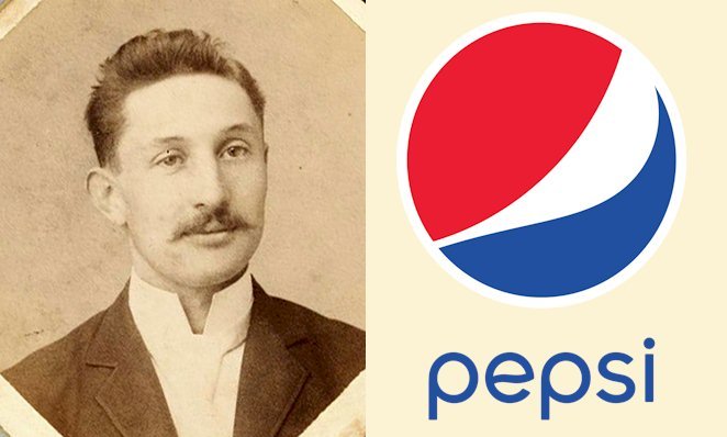
 The original Pepsi Cola formula was invented by Caleb Bradham, a North Carolina pharmacist, in 1893. Like many pharmacists then, Bradham runs a soda fountain inside his pharmacy, where he served customers drinks he made on his own. His most popular beverage was something he christened “Brad’s Drink,” a mixture of water, sugar, lemon oil, caramel, nutmeg, kola nuts, and other additives.
As Brad’s Drink grew more and more popular, the inventor looked for a catchier name for it, eventually choosing Pepsi-Cola. By summer 1903, he’d trademarked the new name, and his soda syrup was in pharmacies and other stores all over North Carolina. By Fall 1910, Pepsi Cola was being sold by franchises in 24 states.
In the beginning, Pepsi was being sold as a digestive enzyme. But as the brand thrived, the company changed tack and instead decided to leverage the pull of celebrities to sell Pepsi Cola. In 1913, the company hired a famous rally driver of the time, Barney Oldfield as its spokesperson. The company continued to market the brand through celebrities in the next several decades.
Pepsi Bankruptcy and Renaissance
After several successful years, Caleb Bradham lost his company Pepsi. He’d speculated on sugar price fluctuations during the first World War, believing that the price of sugar would continue to increase. Instead, it dropped and left Bradham with an inflated sugar inventory. In 1923, Pepsi went bankrupt.
In 1931, after changing hands several times, the Loft Candy Company bought Pepsi Cola. The new owners struggled to revive the company during the Great Depression. In fact, Pepsi’s president even tried to sell the company to their main rival Coca Cola, which refused the offer.
Pepsi was reformulated and then sold in 12 oz. bottles for only 5 cents—twice the size of Coke drinks. Touting Pepsi Cola as “twice the size for one nickel,” the company’s “Nickel Nickel” radio catchphrase was the first to catch on from coast to coast. Ultimately, it’d become one of the best advertisements in the 20th Century.
Pepsi Post-War Period

Pepsi ensured it had a steady sugar supply during the Second World War, and the beverage became popular among U.S. troops fighting around the world. In the post-war years, the drink would remain popular long after U.S. soldiers had gone back home. Back home, Pepsi made the most of the postwar years. Pepsi’s president Al Steele married movie star Joan Crawford, who frequently excited Pepsi during company meetings and trips to local bottlers during the 1950s.
In the early 1960s, Pepsi was one of the brands that targeted the Baby Boomer Generation. The first ads aimed at young people dubbed “the Pepsi Generation” were created. Then they made their first diet soda in 1964, also meant for young people.
Pepsi was changing in a variety of ways. In 1964, it bought the Mountain Dew soft drink brand and merged with snack manufacturer Frito-Lay a year later. The Pepsi Cola brand was quickly growing. By the 1970s, the once ailing brand was close to dethroning Coke as the leading soda brand in America. In 1974, Pepsi became even more popular worldwide as it became the first American brand to be made and sold within the Soviet Union.
The New Pepsi Generation
From the late 1970s to the early 1980s, Pepsi Cola’s “Pepsi Generation” commercials remained popular among the youth while also setting their sights on older drinkers with several “Pepsi Challenge” ads and in-store tastings.
In 1984, the company branched out by hiring Michael Jackson to be its spokesperson. At the time, Jackson was riding high with his successful album “Thriller.” The TV commercials, looking like Jackson’s flashy music videos, became such smash hits that Pepsi would enlist a number of popular celebrities, musicians, and other well-known personalities throughout the ‘80s, including Michael J. Fox, Geraldine Ferraro, Joe Montana, and Tina Turner.
Pepsi’s marketing endeavors were so successful that in 1985, Coca Cola changed its signature “New Coke” formula. The formula was a total flop, making Coke backtrack and bring back its “classic” formula, for which Pepsi often took credit. In 1992, however, Pepsi would suffer its own product failure when the spin-off Crystal Pepsi didn’t impress Generation X consumers. It was swiftly discontinued.
Present Day Pepsi
Like its soft drink rivals, Pepsi Cola has diversified much farther than what Caleb Bradham might ever have dreamed. As well as the traditional Pepsi Cola, customers can also enjoy Diet Pepsi, as well as variants without corn syrup, without caffeine, flavored with vanilla or cherry, or even the 1893 drink that celebrates its origins.
Pepsi has also diversified into the money-spinning sports beverage market with the brand Gatorade, in addition to the Aquafina bottled water, Starbucks coffee drinks, and Amp energy drinks.
The Pepsi Logo and Its History

Many classic brands are ageless as they hold on to the logos that consumers know and believe in. Pepsi is an outstanding exception. The Pepsi logo’s history is one of continuous re-imagination. Over the course of its long history, the Pepsi logo has gone through 12 remodels. And that’s even excluding the minor changes to flavor variants like Pepsi Max and Diet Pepsi.
Regardless of the number of times Pepsi’s logo changes, the company continues to offer the flavors and brand enjoyment that consumers expect. That said, here’s how the Pepsi logo has still stayed recognizable despite the frequent drastic redesigns.
1898-1940: Red Swirly Script Logo

When Pepsi Cola become a brand in 1898, that was the start of the evolution of Coke’s logo. Initially, Pepsi Cola went through swirly text logos that looked like today’s Coca Cola logo.
That wasn’t necessarily because they were attempting to imitate the more successful Coca Cola brand. Instead, almost all companies at the time had their logo written in a logotype.
Pepsi used a long swirly red script, with the font varying over the decades, but the basic design not changing that much. From 1898 to 1940, they used red font, with a long, wavy line connecting the letter “P” with “C” in “Pepsi-Cola.”
The major difference in the types of letters used was that, over time, they got fatter, bolder, and more minimalistic. But the colors remained the same, with red on a white background being a part of the design for around 40 years.
Next, the company altered its logo design in 1940 to something cleaner and more fundamental. The reason why they used the circle was that Pepsi wanted to accommodate the motto of Bradham’s first drink, in the design.
The colors white and red were used because of World War 2. Pepsi wanted to lend their support to the troops by incorporating these colors into the logo design.
The 1950s throughout the 1960s: Bottle Top Design Logo

In 1950, Pepsi got its first logo in a bottle top, with the second arriving in 1962. Here, the color blue is included to accentuate the attention-grabbing red. The company’s logo itself takes up the white space available. But something is not quite right.
In the 1950 Pepsi-Cola logo, the word “cola” still remained, but it was removed in 1960 thanks to reforms in the company. It seems that losing this word got rid of the brand’s “archaic” appearance, marking a new chapter in its evolution. Here is where the development of a seemingly different brand name begins with bold capital letters.
The 1970s: Minimalist Pepsi Style Logo
In the 1970s, many societies around the world were experiencing radical changes. As such, the Pepsi logo design was impacted too. In 1973, aware that consumers were embracing new technologies and modernity, Pepsi thought it wise to adopt a minimalist design to make the logo look clean and neat.
The minimalist design chose to remove the white backdrop. Instead, the designers used white to outline the logo’s spherical and rectangular boundaries. Red and blue dominate the theme of this logo design. The “Pepsi” word was written inside a box, and some changes were made to the typeface.
The 1990s: 100th Pepsi Anniversary Logo

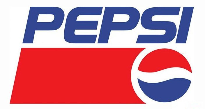
In 1991, the Pepsi logo was redesigned by reducing the globe and putting it in the right lower corner. The “Pepsi” word was written in bold capital letters on top. Blue and red continued to dominate, and white was brought back as the background color.
In 1998, Pepsi celebrated its 100 years of existence. To mark the occasion, the firm made some alterations to its logo design. The logo’s background became blue for the first time. White, which was normally the background, was used to write the “Pepsi” word. The new logo was designed to give the brand a refreshing look.
2003-2006: 3D Pepsi Logo
In 2003, the lettering got a fresh, more dynamic look. As for the globe—it was designed with gradient colors, gaining a vivid, glossy appearance. The logo stayed with Pepsi for three short years, but it can still be spotted on the drinks in some areas around the world.
2008: Current Pepsi Logo
From the 3D-style design, the Pepsi logo switched to the current flat design approach. This is the trend nowadays. Brands such as BMW, Google, and many others remodeled their logos to have an incisive graphic mark.
Opting for a two-dimensional, clean logo allowed Pepsi to get the most readable and legible logo version yet. In addition, the logo also got more screen-friendly.
It’s definitely modern. From the current logo, it’s clear that Pepsi is more than ready to adapt and redesign its look when the occasion calls for it.
Pepsi Logo Design Elements

The Pepsi logo of today, which is often dubbed Pepsi Globe, kind of looks like a smile. In the spherical shape, a white swirl divides it into two areas: red and blue. The redesign reportedly cost $1 million and was done by the Arnell Group in 2008.
Font: The word “Pepsi” is a customized italicized roman type, known as Pepsi Light. For a more common typeface that closely resembles the Pepsi wordmark, you can give the Harry Plain font a try.
Color: The color combination Pepsi uses symbolizes the brand’s core emotional values. The dark royal blue, featured in the first-ever drink, is a symbol of “cool.” In Pepsi Max, the lighter shade of blue is a sign of “cool and fresh,” whereas the golden shade found in the caffeine-free variant embodies energy and balance.


