
A look at the KFC Logo and the History Behind the Company
Long before KFC became the most popular fried chicken chain in the world, the entire company consisted of a single roadside restaurant opened and operated by one Colonel Harland Sanders in the midst of the Great Depression. From these humble and challenging beginnings, KFC has grown to become a worldwide franchise with an estimated value of $8.5 billion and has earned a place at 86th on the World’s Most Valuable Brands 2019 list.
Along the way, a number of factors have contributed to the enormous degree of success that KFC now enjoys, from their innovative approach to frying chicken and offering it as a fast food item to their unique branding as a restaurant built on Southern hospitality and cooking. Among these factors, though, is the company’s recognizable logo and the way that they have creatively used it across their various marketing efforts. In this article, we’ll take a detailed look at the history of KFC, the origins of their logo design, and how that logo has helped KFC secure its spot as the most well-loved fried chicken restaurant on the planet.
The History of KFC
Harland Sanders – the eventual founder of KFC and the man who would go on to become the restaurant’s mascot – was born in 1890 and raised on a farm near Louisville, Kentucky. It wasn’t until 1930, though, when Sanders was already forty years old, that he opened the first Kentucky Fried Chicken restaurant. In fact, the story of Sanders starting such a successful company later in life is very often used as an inspirational example to showcase that it’s never too late to create the next big thing.
Before he opened his first restaurant, though, Sanders had bounced from profession to profession with mixed degrees of success. But even during the height of the Great Depression at a time when starting a new business was even more of a monumental struggle than usual, Sanders never gave up on his entrepreneurial goals.
Finally, in 1930, Sanders purchased a Shell filling station in North Corbin, Kentucky, and repurposed it into a restaurant where he served the southern-style dishes his mother had taught him how to cook – dishes such as steak, country ham, and, of course, fried chicken.
After four years of success with this first restaurant, Sanders expanded into a larger location across the street where he was able to serve more customers. By 1936, only six years after the opening of his first restaurant, Harland Sanders had become such a prominent figure in the Kentucky business community that he was given the honorable title of Colonel by Governor Ruby Laffoon.
At this time, it took Colonel Sanders a total of 35 minutes to prepare an order of fried chicken for one of his customers. Sanders was unsatisfied with this long prep time but refused to use the much faster method of deep frying chicken because he felt it lowered the food’s quality. In 1939, though, the first pressure cookers were released on the commercial market. Originally, these pressure cookers were only designed primarily for steaming vegetables. Sanders, however, found a way to modify them into pressure fryers that he could use to dramatically reduce the prep time of his fried chicken while still preserving its quality. This new technology allowed Sanders to cook fried chicken as quickly as other fast-food restaurants were able to cook items such as burgers and fries, allowing KFC to really compete in the fast-food market.

In 1940, Sanders finalized what is now known as his “Original Recipe” of 11 herbs and spices. While he never revealed this recipe to the public, he did admit on numerous occasions that it was a rather simple one consisting of ingredients that most people are likely to already have in their cupboards. Nevertheless, this new recipe, combined with Sanders’ innovative way of frying chicken in pressure cookers, launched his restaurant into a new stratosphere of success. In 1955, Sanders began to franchise his recipe and the name “Kentucky Fried Chicken” – which he had coined with the help of a sign painter named Don Anderson – out to other restaurant owners, and by 1963, there were over 600 KFC restaurants across the United States, making KFC the largest fast-food chain in the world at the time.
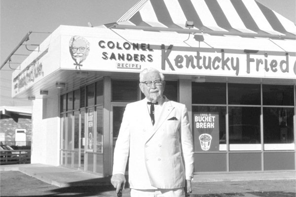
It was also during this period of KFC’s rapid growth that Sanders began to really adopt the persona of “Colonel Sanders” and take on the role of the franchise’s mascot. After being recommissioned as a Kentucky Colonel by Governor Lawrence Wetherby in 1950, Sanders began to dress and act the part. He grew a goatee, began wearing a white suit with a string tie, and began referring to himself as “Colonel”. In his later years of life, Sanders would visit various KFC restaurants across the country, always in character as the beloved Colonel Sanders in order to act as both an ambassador and spokesman for the brand. In December of 1980, Harland Sanders passed away. However, his persona, as Colonel Sanders continues to live on to this day as a key aspect of KFC’s branding.
Of course, another critical aspect of KFC’s branding is the company’s recognizable logo design. While Sanders’ approach to offering fried chicken as a fast-food menu item as well as his magnetic personality were certainly the biggest factors that drove KFC’s initial success, the brand’s logo design has had an important role to play in the growth of KFC over the years as well, and the company has used their logo in a wide variety of ways in order to grow the restaurant’s popularity to the level that it now enjoys.
History of the KFC Logo
![]() The first logo for the KFC brand was designed in 1952 – 22 years after Harland Sanders opened his first fried chicken restaurant. At the time this logo was designed, Sanders and his persona as the Colonel had already become a chief element of the KFC brand, and the first KFC logo featured a portrait of Colonel Sanders with his signature goatee and string tie.
The first logo for the KFC brand was designed in 1952 – 22 years after Harland Sanders opened his first fried chicken restaurant. At the time this logo was designed, Sanders and his persona as the Colonel had already become a chief element of the KFC brand, and the first KFC logo featured a portrait of Colonel Sanders with his signature goatee and string tie.
Since this original KFC logo was designed in 1952, the KFC logo has undergone a total of six different revisions. In each new iteration of the KFC logo, though, the same portrait of Colonel Sanders can be found. Over the course of these six different iterations of the company’s logo, various design elements such as the font, color, or shape of the logo have been redesigned. However, the KFC logo has never been completely redone, and the logo that the company uses today still shares much in common with the very first logo that the company designed almost seventy years ago.
Sid Lee Paris gave Colonel Sanders a nice clean shave for Movember. The new logo does give him a youthful appearance. This is the first time he has been seen without his famous mustache.
![]()
Design Elements of the KFC Logo
![]() The logo design that KFC uses today was created in 2018 and features the smiling face of Colonel Sanders within a red and white trapeze with the name KFC beneath it.
The logo design that KFC uses today was created in 2018 and features the smiling face of Colonel Sanders within a red and white trapeze with the name KFC beneath it.
Up until 1991, the name “Kentucky Fried Chicken” was spelled out in the company’s logo. In KFC’s current logo as well as the four logo designs that preceded it, though, the KFC acronym was used instead of the restaurant’s full name. According to some sources, this change was made in order to move away from the word “fried” and its unhealthy connotations.
Today, the KFC logo is a warm and welcoming design that conveys the idea of old-fashioned Southern hospitality. It is a design that is perfectly in line with KFC’s branding and an excellent example of how a logo design can capture the key themes that a company wants to portray to its customers.
The popularity of the KFC Logo
![]()
The logo of a fast-food restaurant such as KFC plays an incredibly important role in drawing in customers who happen to be driving by the restaurant’s location. Outside every KFC restaurant, you will find a billboard that features their logo. Thanks to the recognizability of the KFC logo, this single billboard is enough to let anyone pass by know what to expect when they pull into the drive.
Of course, the KFC logo has also played an essential role in the company’s digital marketing efforts as well. Any TV commercial or online advertisement that KFC releases are all but guaranteed to have the company’s logo as a central theme in the advertisement’s design.
Like any huge and wildly successful company, KFC has also been able to profit off of licensing their logo as well. While products and apparel that feature the KFC logo are not incredibly common, they are common enough to amount to a nice flow of extra income for the company.
Whether you are wanting to start the next big fast-food franchise or you looking to create a company in any other industry, a high-quality, well-designed logo is sure to prove invaluable. The various ways that KFC has used their unique logo design over the years to grow its brand and bring in new customers is certainly a testament to just how much a value a great logo design can offer to a growing brand.


