
A look at the Prada Logo and some history behind the company. This clothing brand and logo is one of the largest fashion brands in the world.
From high-fashion items worn by celebrities and backpacks to an acclaimed novel and movie adaptation, Prada has grown to become the byword for luxury and modern style.
Behind the Prada Logo and brand is a tale of a family company run by three successive savvy generations of the Pradas who’ve successfully transformed their family’s fashion house from a small Milan-based leather store to a world-famous fashion giant. Here’s a brief history of this iconic fashion label.
The History Of Prada
In 1913, the Prada brothers Mario and Martino created Prada. It started off as a leather goods store named Fratelli Prada, which means Prada brothers in Italian. Fratelli Prada sold products like handbags, steamer trunks, and animal products. Most of the materials for these products were sourced from England.
In the beginning, Mario Prada didn’t want any female member of his family involved in the running of the business, believing that it was men’s role to earn a living for the family.
But fate had other ideas. His son didn’t show any interest in Prada, so his daughter Luisa joined the family business. Luisa worked for 20 years and succeeded her father in the business. Later, she handed over the reins to Miuccia, her daughter.
Fratelli Prada changed its direction when Miuccia Prada met with Patrizio Bertelli, a 24-year-old leather goods businessman. Bertelli convinced Miuccia to change her line of business and focus on manufacturing luxury luggage items.
He also advised Miuccia against importing raw materials from England and instead make all her pieces from locally obtained materials. That was the turning point in the creation of the Prada label that we know today.
Prada’s Evolution from Its Beginnings to Today
When Miuccia took over the helm of the company from her mother in 1978, the sales were about $0.5 million. She appointed Patrizio Bertelli as Prada’s business manager, freeing up herself to focus on Prada’s creative side of the business.
In 1979, the company launched its first batch of backpacks and totes. In the beginning, the general public didn’t know much about these new items. But that changed when Prada advertised these items, and they became a commercial success.

Miuccia and Patrizio were aware of the power of branding and planned to expand into the luxury market. In 1983, the company launched its second fashion store in central Galleria Vittorio Emmanuelle.
The location had formerly been home to the wildly popular and iconic London House, so this was an excellent strategic decision. This new boutique attracted lots of interest from the general public, and the Prada brand stepped up into the luxury market.
Thanks to the second boutique’s success, Prada opened a number of boutiques in Europe, in such locations as Madrid, Florence, Paris, and so on. There was a strong emphasis on each boutique’s location. The locations were always selected in prominent and upmarket areas of the city. The company also expanded its product line.
In 1984, Prada launched a shoe line and followed it up with the launch of the iconic Prada handbag in the next year. This handbag became such a commercial success, and it’s still very popular among customers even today.
The handbag was not only an iconic Prada item, but it became a symbol of luxury fashion. In 1987, Patrizio tied the knot with Muiccia.
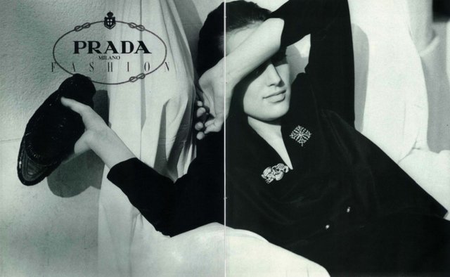
In 1989, Prada released a women’s attire collection. It instantly became a hit with female customers, who loved the narrow belts and low waistlines of the clothing range. Prada made a deliberate choice not to have a conspicuous brand logo like that of rival Luis Vuitton.
Although the Prada brand was a luxurious one and was as pricey at its rivals, it shunned a noticeable logo as it wanted to adopt an “anti-status” or “reverse snobbery” brand image.
Prada In The 1990s
 Throughout the 1990s, Prada scaled the heights of the fashion world and by then was one of the world’s best fashion brands. Prada made a conscious decision to make the brand a bit more exclusive, so they produced limited quantities of some of their products.
In 1992, Prada launched another fashion brand which they named Miu Miu, the pet name of Miuccia. It targeted younger customers.
In 1994, Prada started making men’s clothes and, in 1996, opened its iconic and largest clothing store in Manhattan, NYC. The company expanded overseas and was a massive hit in Japan, where it opened 20 boutiques.
Following a series of acquisitions throughout the 1990s, including stakes in Jill Sander A.G. Fendi, and Church & Company, Prada became the number one luxury goods provider in Europe. Their revenue hit two trillion Italian lira.
Prada 2000-Present
In the 2000s through to 2010s, the acquisitions and mergers slowed down due to a drop in luxury item purchases in Europe. Moreover, there was an increase in the sale of faux luxury goods.
In 2001, Patrizio flipped his 25.5% Prada stake in Fendi for just $295 million to LVMH. This kicked off a series of sellouts by Prada. By 2006, the company had sold various brands, including Church & Company and Jill Sander A.G.
In 2016, Prada’s revenue was $3.91 billion. Miuccia and Patrizio are still at the helm of the company in 2020 and have appointed Raf Simmons, one of their best designers, as the joint creative director. Aside from Prada, Simmons used to work at Calvin Klein, Christian Dior, and Jill Sander A.G.
The Prada brand has definitely evolved throughout the decades, and Miuccia takes credit for its many innovations in design and fabric. She’s added everything to her garments from beaded latex to mirror fragments, and experimented with unique and new fabric blends. But even with all of that experimentation, the quality of the finished item has never gone down.
Prada’s Fashion Rebellion
As mentioned before, Miuccia Prada has played a key role in the rise of Prada. As a designer, however, she’s infamously difficult to keep pace with.
This unpredictability keeps the fashion industry guessing as everyone ponders what she’s got up her sleeve next. For example, 1996 was when she caught the fashion world by surprise.
At the time, pedal pushers, small bags, bucket hats, and backless tops were in vogue, but none of them were in avocado green. There was no hand-drawn prints either. Nor were there clunky, awkward designs that clashed with the minimalist design.
With Miuccia always contemplating a change, she never waits for fashion. Instead, it’s fashion that waits for her!
The Prada Logo and Its History
In 1919, the first Prada logo was designed when the firm was made the official clothing supplier for Italian monarchs. Due to this development, the company was allowed to add House of Savoy’s heraldry elements to their logo. The brand chose two elements: a rope and coat of arms. As well as these, Prada added its own wordmark to the logo.
The royal patronage, reflected in Prada’s official symbol, helped the company hold its own and weather stiff competition from other fashion houses. No other company was bestowed such an honor. The inclusion of royal symbols in the Prada logo was a smart move that allowed the company to gain recognition.
Over time, however, the brand got rid of the monarchical symbols from the logo, remaining only with the popularity it’s achieved over the years. As such, the rope, coat of arms, and even the ellipse vanished from the logo—leaving only the name “Prada”.
Logo Design Elements Of Prada
![]()
Like the brand’s clothing and accessories, the Prada logo is understated but elegant. It’s a basic black logo that reflects Miuccia Prada’s liking for minimalist style. In a nutshell, the Prada logo screams “PRADA” in black, bold capital letters.
Evolution Of The Prada Logo
![]()
Shape: The first version contained elements representing the Italian monarchs. It was an emblem with the company’s name, city of origin, and year. They were placed in the middle of the ellipse. The oval was formed by a rope and royal heraldry and four nautical knots in the upper section.
In the modern Prada logo, the verbal part, i.e., the font, is the focus. It combines two forms of writing: thick and thin characters. Additionally, “R” has a distinctive zest—a unique feature that makes it truly recognizable. The “A” letters have a long leg with a unique serif on top.
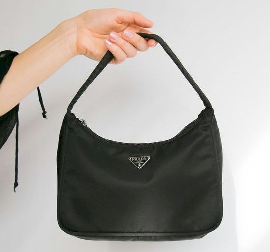
But the official Prada emblem is dynamic. It varies based on the line and range of items that go with it. For instance, the logo appears as a triangle patch plate, which shows a figured ribbon and tiny coat of arms. Some branded items have the words “Prada Milano” on the label, while others have just “Prada”.
Symbol: The emblem’s symbolism is simple. Thanks to laconicism it shows the spirit of this iconic fashion label. In other words, this is a “conspicuous absence” for the Prada logo. The company doesn’t recognize the overelaborate and pompous elements in the official emblem, proclaiming an “anti-status” or “reverse snobbery”. As such, the name only appears on tags, buckles, small fasteners, and labels.
Color: All Prada logo versions throughout its history only had a basic, black color. This keeps the logo versatile in a range of settings. While the logo is black in most cases, sometimes it appears in gold or white.
Font: The distinctive font of the original Prada logo has stayed the same despite the many logo design changes. All versions of the logo have the bespoke Prada typeface.
Closing Thoughts
The Prada logo references the brand’s proud history as a leather supplier for the Italian royal family. Its more streamlined and updated version also maintains the company’s reputation for simplicity, elegance, and quality.
The Prada logo looks really nice displayed on a clothes storefront or discreetly engraved on the clasp of a purse. The understated logo is a well-crafted, versatile symbol for this iconic minimalistic fashion house.


