

This is a look at the Nintendo Logo and how they got started
Nintendo is a Japanese video game and consumer electronics multinational company based in Kyoto. Founded in 1889 by Fusajiro Yamuschi, Nintendo started out as a playing card company and enjoyed great success long before the era of electronic toys and videos.
However, it wasn’t until the release of Nintendo Entertainment System in 1985 that the company became a truly globally recognizable brand. Today, the Nintendo Company Ltd. is one of Japan’s most valuable companies, with a considerable market share of the worldwide video game industry.
The History of Nintendo
The story of Nintendo starts in September 1889, when craftsman Fusajiro Yamauchi from Kyoto, Japan, started to produce and distribute playing cards known as hanafuda. The word “Nintendo” was originally a combination of three hieroglyphs, “nin,” “ten”, and “do.” Although the translation of this phrase is still contested to this date, the generally accepted meaning is “Leave luck/fate to heaven.” An alternative translation given is “’the temple of free hanafuda.”
Within a few years, the cards gained popularity, prompting Yamauchi to hire assistants to help mass produce the cards to satisfy market demand. It was, however, not all rosy in the beginning. The company had to contend with a number of challenges, such as an expensive manufacturing process, which partly contributed to a high product price.
The cards were also quite durable, which meant relatively poor sales since customers did not have to replace them that frequently. To address this problem, the company started making lower-quality, cheaper cards while also expanding distribution to such cities as Osaka, where the demand for card games was very high. Additionally, local merchants liked the prospect of customers being able to continuously renew their decks, which helped avert suspicions regarding the re-use of the cards.
From official company records, the first western-style deck by Nintendo was released in 1902. Other documents date this to 1907 when the company partnered up with Japan Tobacco to distribute its card games through the latte’s cigarette stores operating throughout the country.
In the same year, Yamauchi adopted his son-in-law, Sekiryo Kaneda, so that he could later take over the family business, as was dictated by Japanese culture. Sekiryo would later go on to become the president of the company in 1929, by which time Nintendo Koppai had established itself as the biggest card game maker in the country.
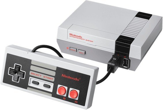
In 1979, Nintendo opened its American subsidiary in New York City. The company created a new arcade games department in the New York subsidiary, with a view to developing new electronic arcade games. In 1980, the company released Game & Watch, the first handheld video game system. The product became a huge success, with sales of more than 43 million units worldwide and a total of 59 games created for the device.
Key Nintendo Timelines
1889: Local craftsman Yamauchi starts making and distributing playing cards known as hanafuda, under the business name Nintendo Karuta.
1929: Yamauchi’s adopted son-in-law Sekiryo takes over the family business, then known as Nintendo Koppai, the largest card company in Japan.
1950: Hiroshi takes over the company from his grandfather Sekiryo and renames it Nintendo Playing Card Co. Ltd. Hiroshi makes a host of other major changes such as centralizing manufacturing operations.
1969: Gunpei Yokoi joins the company to run the research and development department, thanks to his experience in making electronics devices.
1970: The company produces the Nintendo beam gun, Japan’s first electronic toy. The company starts trading in the Osaka stock exchange around the same year.
1973: Nintendo opens its New York subsidiary and starts making arcade games. The wildly successful Game & Watch device is released a year later.
1985: The company releases the popular Nintendo Entertainment System (NES) in North America.
1993: The company starts the development of the Nintendo 64 gaming console while adding improvements to the Game Boy console.
2004: Nintendo releases the Nintendo DS, which went on to sell 154 million units, making it the most successful handheld gaming console.
2010: The 3D gaming console Nintendo 3Ds is released with modern features and improvements.
2017: The Nintendo Switch is released as the Wii U’s successor, with worldwide sales of over 55 million units by March 2020.
2020: In August 2020, Nintendo is officially named the richest company in Japan.
The Nintendo Logo and Its History
![]()
Despite the high-flying history of the Nintendo brand, the company has used the same logo since 1967, typographically at least, with only some minor alterations to the original. Over the years, the company tried out a few enhancements but eventually settled on the familiar racetrack enclosure for the letters.
The company’s plain and simple iconic logo design has such an edge that it’s kept the brand recognizable for decades. Unlike its competitors, the Nintendo brand seems to have made the strategic choice to retain its look and feel, given the millions of followers it’s had since the 1970s.
The Nintendo logo is seen by pundits as “expressive” as well as “intelligent and precise,” like the company’s gaming products. The current version, adopted in 2016, features red and white colors. This is a departure from the previous grey color scheme.
The first version of the current logo came out in 1967 and has remained virtually unchanged since then. The Ultra Machine toy, created in the same year, was the first Nintendo product to spot this familiar symbol.
Nintendo started making its first moves in the American and European markets in the 1950s. This necessitated the design of a westernized logo in the Latin alphabet and a move away from the hieroglyphics used in japan.
The Westernized version, commonly identified as the Ace of Spades logo, was used mainly for the company’s Westernized card decks.
The First Nintendo Logo
![]()
From the beginning and before expanding out of Japan, the first logo in Kanji (the Japanese writing system) was the three characters ‘任天堂’ spelled as 任 (Nin) 天 (ten) 堂 (dō). Though still debatable, this phrase is commonly interpreted as “Leave fate/luck to heaven.”
To this day, this original phrase in Kanji hieroglyphics is used in Japan as the official company name. The name appears on Nintendo’s products for the Japanese markets, although most marketing and communication efforts prominently feature the racetrack logo.
The first official logo for the international markets used a flowing script font for the name “Nintendo.”
The Evolution Of Nintendo Logo
![]() The Nintendo logo has undergone at least a dozen significant changes, although many of these happened in the 1960s before the company finally found an identity it could settle on. This is not including color scheme changes, which can be difficult to track, given the wide range of colors the brand has experimented with.
The Nintendo logo has undergone at least a dozen significant changes, although many of these happened in the 1960s before the company finally found an identity it could settle on. This is not including color scheme changes, which can be difficult to track, given the wide range of colors the brand has experimented with.
As the company tried to find a happy medium for the local and international markets, the designers tried out at least four different fonts, each one different from the previous. It also appears that the company did not favor any particular color scheme, given the random color choices the designers experimented with.
In 1967, the company made a new toy, the Ultra Machine. It is on this toy that the first logo resembling the current symbol appeared. The brand name featured a thick red font, with a square dot above the letter “i.” This new design was regarded as successful and was then pushed to all new product releases.
Although the brand seemed to have finally settled on a typeface for the logo, the experimentation was still far from over. In 1968, the designers enclosed the wordmark in a hexagon shape of the same color. This enclosure was dropped in 1970 in favor of the familiar rounded square.
In 1975, the company decided to drop the rounded square “racetrack” and switched from red to black. This change would last eight years before the company finally went back to the racetrack enclosure, which was made a little bit thicker this time. Interestingly, the racetrack frame is actually the same thickness as the letters, making it an overall well-thought-out look.
Over the years, the company switched between the color schemes red, black, and grey. The most recent iteration features a red rectangular background, with the letters and racetrack all in white.
A small trademark ® symbol was introduced at the end of the wordmark in 1983. Alongside the font, the racetrack enclosing has become the signature element of the company’s brand style.
Nintendo Logo Design Elements
![]()
A large part of the company’s success rests on its use of a simple and intelligent design for the logo. Using a straightforward and consistent symbol helps Nintendo remain recognizable and consequently enhances customer loyalty.
Nintendo Symbol: The modern logo is technically neither an image nor a symbol but a wordmark.
The design is quite simple but still striking. The company retains the racetrack enclosure, this time in white, with a red rectangular background. This iteration communicates the company’s chief focus, gaming, instead of serving as a distraction to users.
Nintendo Font: Before the first westernized version in the Roman Alphabet, the Nintendo name was written in Japanese Kanji characters. The first iteration for the foreign markets used a flowing script, but the company tried many fonts before finally settling on the 1967 version.
The font choice has stayed the same since then. Although not a proprietary font, it has become iconic and links the present age with the company’s golden years.
Nintendo Color: Between 2006 and 2016, the company had used a singular grey color scheme, which was yet another switch from the previous red.
In 2016, the company went back to the red and white combination from 1975, except that the colors were reversed. A number of designers have speculated that the color change had to do with the brand’s presentation of their latest product, the Nintendo Switch.
———
If you’re looking for professional gaming logo ideas or need to make your own gaming logo, LogoMyWay is the place to be. You can make your own gaming logo in less than 10 minutes using our online logo maker.


