
Take a look at the Walgreens logo and the history of the company.
Almost a century old, Walgreens is one of the most well-established pharmaceutical brands in the U.S. and a resounding success story of entrepreneurship and hard work. The company’s success is commonly known, but what is lesser known is the role that the logo played in Walgreens, achieving the heights that it has.
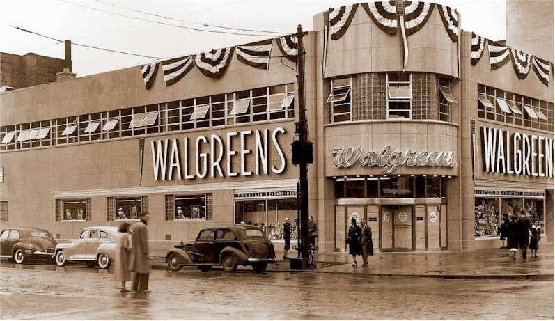
The Walgreens logo is very well recognized across the U.S. Since 1901, the chain of drugstores has had its logo undergo a series of creative and progressive changes. It’s clean, it’s simple, and it’s easily read to state the name of the company, but its cursive style creates a memorable image in the minds of many an onlooker.
Today, we look at the logo and the history of Walgreens and how their history came to be what we all know and recognize.
The History Of Walgreens
 Walgreens drugstores began its life with Charles Walgreen, who opened the first Walgreen drugstore in the year 1901, which was established near Galesburg, Illinois, before his family relocated to Dixon, Illinois – a town 60 miles north of his birthplace – when his father, who turned businessman, saw the tremendous commercial potential of the Rock River Valley. It was here at Walgreen when he was only 16, and he started his working experience at a drugstore, although he regarded this experience as far from positive. He worked at Horton’s Drugstore for a measly $4 a week, was a job he took only due to an accident that left him unable to take part in sports when he was growing up.
Charles Walgreen worked at a local shoe factory; he accidentally cut off his middle finger’s tip, ending his ability to take part in athletic competition. As tragic as it was, the accident was why Walgreen became a pharmacist in the first place, so it turned out to be a blessing in disguise as this led to him becoming a business owner and incredibly successful entrepreneur. As it turned out, his initial experience working at Horton’s was itself a failure, but it turned Walgreen into inspiring success.
In 1997, Walgreen completed the acquisition of Intercom Plus, an advanced computer system that completed a roll out to all their national stores. Intercom Plus drastically speeds up the prescription-filling process, ensuring better patient counseling, and is the leading pharmacy system in the industry – helping Walgreens to remain up in the top spot.

In 1999, Walgreens.com launched a comprehensive online pharmacy, bringing the company well and truly into the information era. They offer customers a convenient and secure way to take care of many pharmaceutical and healthcare needs online. In the year 2000, Charles Walgreen III retired as chairman of the company, and Walgreens reached a respectable and robust landmark by getting to the 3,000-store mark when its location at Halsted and Monroe in Chicago opened.
Walgreen also understood the value and marketing power of having a robust and impactful logo. The first logo the business designers choose to go with was a design of its day and has changed, evolved, and improved over the years. It was made as a handwritten design, giving it that homely look that would appeal to middle America, the companies bread and butter, and it was displayed in a custom grey color. It was simple, straightforward, clean, and to the point. The drugstore enjoyed a modest amount of business, and the original logo remained in place for 50 years after that. The text of the first logo also read ‘Walgreen’ instead of the now familiar, ‘Walgreen’s.’
The evolution of Walgreens logo
![]()
In 1951, the company would find itself in a position where it could expand and grow. Changes in the brand identity of the company also lead to an urgency to update the logo, which would be the first chance in the logo’s design. The grey in the system was altered and changed to red to make it more memorable. Another aspect they added to the design was with a pestle and mortar added in the blue coloring, with the font text’s addition: ‘The Pharmacy American Trusts’ accompanying it.
The logo wording was also changing from ‘Walgreen’ to ‘Walgreens’ at this point as well. The addition of the ‘S’ was a significant change that has remained to this day.
From 1951, the Walgreens logo remained unchanged from this design for another 30 years. After three decades, the next altercation to the system took place in 1981. The creative team decided to add a new element to add to the logo’s scheme, which took the form of depicting the family unit. The two symbols added feature the white silhouettes of a man, a woman, and a child with the child in the center against a black background. The color of Walgreens’s font was changed to white to create a clear juxtaposition between it and the background. The logo was just a basic black and white logo, but it did endure and serve the company well for another 12 years.
The Walgreens Logo
![]() The next chapter of changes in the history of the logo of Walgreens included a restyling of the image with a prominent aesthetic and a red theme to it. The previously established image of the pestle and mortar was improved, placed above the emblem, and colored red. The cursive font choice was still maintained with the ‘S’ remaining as a constant in the logo.
The next chapter of changes in the history of the logo of Walgreens included a restyling of the image with a prominent aesthetic and a red theme to it. The previously established image of the pestle and mortar was improved, placed above the emblem, and colored red. The cursive font choice was still maintained with the ‘S’ remaining as a constant in the logo.
This current form of the logo remained unchanged up until 2005. The mortar from the pestle and mortar image was taken away, as where the log and the font letters were also changed. To make the impact even more robust, the font letters were broadened out and streamlined for fluency, and the cursive script remains as before.
Controversy over the Walgreens logo
![]()
The Walgreens logo is a simple design, a simple color that conveys a simple message, being the name of the company itself. Considering this, it’s hard to believe that the Walgreens logo could be a subject for controversy, but it was. There was an issue in 2008 involving the supermarket chain Wegmans, who took Walgreens to task over the similarity of the Flying ‘W’ font styling in the logo. When placed side by side, there were some noticeable similarities between them. It was Walgreens, however, who ended taking this matter to court in 2010 due to the fact that the Walgreens logo was much older than the Wegmans logo, being how the Walgreens logo was created during the 1930s, plagiarism was suspected.
If you have ever seen the logo that Rochester-based Wegmans began using back in 2008, you would probably notice the similarity to the Flying ‘W’ of the Walgreens emblem. For this reason, Walgreens sued Wegmans in 2010. Wegmans did respond by saying that they were using an old logo created much earlier than the Wegmans around a similar time as Walgreens in the 1930s.
But not all cases resulted in court action. Another controversy surrounding the Walgreen’s logo is its seemingly uncanny similarity to the Washington Nationals logo. The famous and nationally renowned baseball team faced potential logo infringement penalties because both logos are very similar. The team developed their logo many years after Walgreens created their design, bringing the case down in Walgreens favor. After several discussions and after legal action had already commenced, the Walgreens legal team sat down with the legal advisors from the Washington Nationals and struck a bargain that was financially beneficial for both parties.
The Walgreens company agreed that the Washington Nationals would keep their logo, however like Walgreen’s, it may be, without any further legal action, if they found the proposed settlement agreeable. Sensing a lucrative marketing opportunity, Walgreens suggested the out of court settlement provided that as of the beginning of 2013 that the baseball team must change its name to the Washington Walgreens for a total of twelve games a year, and this change would transpire for the following ten seasons beyond that.
They also added the caveat within the agreement that the drugstore chain had the option of choosing up to four members of the Washington Nationals team and to represent the company in T.V. commercials for five years – wherein Walgreens would become the official sponsor of the group. Another (and slightly more unusual) aspect of the clause was to ensure that two members of the Nationals team would need to become fully licensed, practicing pharmacists who would work at counters at local Walgreens stores in the D.C. metro area as part of the promotion. The disclosed amount of time this scheme would last was not made clear during the contract stage and will be run on an ongoing basis.
Elements Of Walgreens Logo
![]() The style of the Walgreens script font is recognizable and iconic the national over. Back in the ’30s, their first logo remained a potent emblem of the companies’ ambitions and their success for 50 years after creation. They created an ever-evolving logo that reflects the elements of advertising that make the company memorable. The logo continuous to maintain a clean and simple styling, but the introduction of different colors has made it stand out more. Broadening the size of the letters has undoubtedly helped to achieve that goal as well.
The style of the Walgreens script font is recognizable and iconic the national over. Back in the ’30s, their first logo remained a potent emblem of the companies’ ambitions and their success for 50 years after creation. They created an ever-evolving logo that reflects the elements of advertising that make the company memorable. The logo continuous to maintain a clean and simple styling, but the introduction of different colors has made it stand out more. Broadening the size of the letters has undoubtedly helped to achieve that goal as well.
The company has experimented and tried out various aesthetic combinations and gone through several image changes, but the Walgreens logo itself has always easily stayed recognizable. The revisions made to the design did not detract from the simple genius of its original concept and did so without totally altering that original image from its early beginnings. The symbol on the store that we see today is an emblem of the success of one of America’s most famous and beloved drugstores.


