
A look at the AT&T logo and how they got started.
AT&T (American Telephone and Telegraph Company) offers telecommunication products and services, such as wireless communications, long-distance services, local exchange services, video services, broadband/data, and internet services, telecommunication equipment, as well as wholesale and managed networking services.
The company conducts business via three reportable segments: wireline, wireless, security, and others. The wireline segment offers both wholesale and retail communication services locally and internationally, which are divided into three product-based classes: data, voice, and others. In the “other” segment, there are equipment, customer information services, government-related services, satellite video services, and outsourcing.
The wireless segment runs an exhaustive range of quality nationwide wireless data and voice communication services in various pricing plans, including prepaid and postpaid service plans. Also, it sells handsets, wireless personal computer data cards, and wirelessly enabled computers made by a variety of manufacturers for use with data and voice services.
The security segment includes disaster recovery and business continuity services, as well as network and premise-based security products. AT&T was established in 1885 and is based in Dallas, Texas.
Origins of AT&T

After the invention of the telephone by Alexander Graham Bell in 1876, Bell and his financiers Thomas Sanders and Gardiner Hubbard founded the Bell Telephone Company a year later. In 1885, a subsidiary of the Bell Telephone Company, AT&T, was incorporated to build and run the first-ever long-distance phone network. AT&T acquired Bell’s assets and became the Bell group’s parent company.
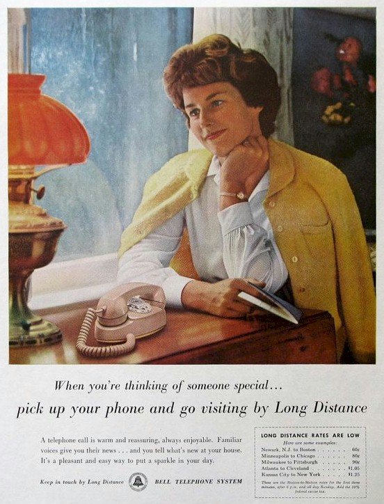
In 1927, AT&T launched long-distance phone service to London via two-way radio for five minutes for $75. But, radiophone service was unreliable, so AT&T offered submarine phone cable services to Europe in 1956. In 1964, the Transpacific cable service was started.
At first, the U.S. government grudgingly accepted the monopoly of AT&T. But in 1984, after the Justice Department helped settle a civil antitrust lawsuit, “MA Bell” was divided into seven local “Baby Bells.” AT&T retained a long-distance telephone service, telephone equipment maker Western Electric, and Bell Labs. The Baby Bells kept the local service and Yellow Pages.
In 1995, AT&T embarked on a restructuring process that would result in the biggest ever voluntary split of a business in America. AT&T stayed a communication services firm, Lucent Technologies took charge of equipment and systems, and NCR turned into a computer firm.
In 2000, AT&T announced that it’d restructured into a group of four separately run entities for its business, consumer, wireless, and broadband services.
SBC bought AT&T in 2005 for $16 billion. Following this acquisition, SBC took up the AT&T brand and name. The original AT&T of 1885 is still around as the long-distance telephone service subsidiary of AT&T.
In 2013, AT&T announced plans to branch out to Latin America via a partnership with America Movil, owned by Mexican billionaire Carlos Slim. In December of the same year, AT&T announced that it’d sell its wirelines operations in Connecticut to Frontier Communications, based in Stamford.
Approximately 2,700 wireline employees running AT&T in Connecticut moved with the operation to Frontier, in addition to 180,000 U-verse video customers, 415,000 broadband connections, and 900,000 voice connections.
In May 2014, AT&T announced a deal to buy DirecTV. In the agreement, which was approved by both companies’ boards, DirecTV shareholders received a $95 cash and stock share, making the value of the deal $48.5 billion. With assumed debt included, the total buying price was around $67.1 billion. The aim of the deal was to increase AT&T’s share of the market in the pay-tv industry.
The deal also enabled AT&T to access the fast-rising Latin American markets, in which 18 million people subscribed to DirecTV. In addition, the purchase enabled AT&T to provide TV through both satellite and fiber-optic lines by retaining DirecTV as a separate subsidiary and allow the company extra flexibility in making TV, internet, and phone bundles.
Key Timelines
1885: AT&T is formed, launching the first nationwide telephone network.
1889: AT&T installs the first-ever coin-run payphone in Hartford, Connecticut.
1908: AT&T starts lowering its prices to regain market control from independent phone companies.
1922: AT&T launches WEAF, a radio station in New York, marking its foray into the commercial radio market.
1947: Microwave radio is adopted as the technological foundation of long-distance phone calls.
1962: AT&T launches its first satellite named Telstar.
1984: AT&T is broken up, resulting in the formation of independent, regional phone companies, allowing AT&T to get into non-telecommunications businesses. AT&T is divided into two segments: AT&T Technologies and AT&T Communications.
1991: AT&T purchases a computer manufacturer, NCR Corporation, for $7.4 billion.
1993: AT&T acquires McCaw Cellular Communications for $12.8 billion, entering the cellular phone business as a result.
1995: AT&T announces plans to split into three separate companies, AT&T Corporation, NCR Corporation, and Lucent Technologies.
1999: AT&T purchases cable television heavyweight, Tele-Communications, for $53.5 billion. AT&T also acquires MediaOne, making the firm America’s largest cable television provider.
2001: Comcast purchases AT&T Broadband in a $72 billion deal.
2004: Cingular Wireless acquires AT&T Wireless for $41 billion.
The AT&T Logo and Its History
AT&T has undergone numerous changes since its foundation in 1885 by Alexander Graham Bell, the telephone inventor. It became a monopoly and was later split up by the government’s anti-monopoly laws. Today, AT&T also provides television and internet services as well as landlines and cell phones.
The company’s many changes have led to several changes in its logo. In AT&T’s long history, there has been more than ten logo version. Below, we’ll go over how the AT&T logo has evolved throughout the decades, as well as the symbolism of its design elements.
First AT&T Logo
![]()
In 1889, AT&T acquired American Bell Telephone Company and immediately became a monopoly it is niche. The monopolistic ambitions of AT&T sparked up a feud between the firm and the American government. Nearly a century later, that conflict would drive the telecom heavyweight to radically alter its corporate style.
Let’s start from the beginning, though. In tribute to Alexander Graham Bell, AT&T picked a bell to be its first visual representation. The first logo was designed in 1889 and showcased a bell inside a triple square framework. Barely a year later, in 1890, the logo was redesigned into an emblem. The design later underwent several modifications until 1969, when Soul Bass created a new minimalist style—a blue bell in a white circle.
Small distracting elements were then let go, and the logo began to look more edgy and solid. The blue color represented the promising future that lay ahead for AT&T.
AT&T Logo Evolution

Following the conflict with the U.S. government over AT&T’s monopolistic ambitions, the company split into several segments in 1984 and was prohibited from utilizing the bell emblem. The challenge of creating a new logo fell upon Soul Bass.
After sifting through scores of ideas, Soul Bass picked the globe image. Lines of varying thickness lent a realistic 3D feel to the sphere. The lines represented a global telecommunications giant that was uniting nations the world over. That was AT&T’s way of announcing their global domination aspirations. To retain a connection with their former design, the new design stuck with the previous color palette. Under the globe, the company name was written in uppercase Omnes font.
There was a slight change in the logo in 2000. In 2005, following the merger between AT&T and SBC, the logo received a voluminous impression to symbolize AT&T’s expanding variety of services. Lowercase letters replaced the uppercase ones.
In 2016, the telecom titan did another redesign as it was venturing into new markets. To create a modern, flexible image, AT&T released a chic flat logo. The piece of graphic looked amazing against both dark and light backgrounds and was a good fit for all forms of media, including printed surfaces and mobile screens. Meanwhile, the company name regained its uppercase typography.
ATT Logo Design Elements
![]() The globe image is the main feature of the AT&T logo. Five bowed white stripes alternate six bowed blue stripes to create the feeling of a 3D globe. The logo uses a bright, cool cyan hue that was deliberately picked to appear on both light and dark backgrounds.
The globe image is the main feature of the AT&T logo. Five bowed white stripes alternate six bowed blue stripes to create the feeling of a 3D globe. The logo uses a bright, cool cyan hue that was deliberately picked to appear on both light and dark backgrounds.
The corporate logotype AT&T, written in black, bold uppercase letters, is to the right of the globe. This custom sanserif font has plenty in common with the traditional Helvetica font, but it’s a bit straighter and thicker.
Symbol: The modern AT&T emblem, portraying the three-dimensional image of the world, symbolizes the company’s global aspirations. In fact, when it comes to the number of subscriptions, this brand leads the way even in spite of many split-ups (including enforced ones).
Also, AT&T continuously improves its technologies, which helps the company expand into new markets (including markets with almost zero competition). The company’s decision to branch out overseas was an enforced move, but even so, it was the start of a new direction with a brand new logo.
Emblem: The modern AT&T logo was adopted in 1984, replacing the previous monochrome version. It’s a formal three-colored voluminous globe with light blue (cyan) and white stripes. The light blue stripes have a darker shade at the intersections, giving the logo depth and volume.
Font: The changes in the AT&T logo led to the modifications in the brand’s corporate font. In 1984, one important change in the signature’s location took place. If the previous text was placed below the globe, now the globe has moved to left, with the text on the right and at a similar level to the globe.
Another fundamental change was the transition to lowercase letters from uppercase ones. This modification was also rather symbolic—the company has become so powerful on a global level that it has the liberty to make use of small letters.
Color: While AT&T logos were black and white (monochrome) at first, the modern version makes good use of color. This transition is a sure sign that the brand aims to be more attractive and visible to customers.


