The Nickelodeon logo is recognized by kids and adults from all over the world.
Nickelodeon entered the media landscape with its intelligent and innovative approach to television. While most television brands broadcast for the adult audience, Nickelodeon produces content wholly for children. With this focus, most people regard it as the first American cable network for kids.
As the kid’s network, Nick is ruled by a modest yet cheerful and futuristic logo. It comprises an orange wordmark uniquely crafted in lowercase sans–serif typeface. It’s ever confident and outstanding with an iconic letter—i, making it look sweet, playful, and kiddie.
The Nickelodeon logo is among the top-rated and influential assets of the world. Its maiden emblem emerged in 1977 with a purple badge. Gradually, it went through the design studios in 1979, 1981, 1984, and 2009 before adorning the latest charismatic powers.
To keep with modern trends, the designers always write the brand’s name in sans–serif font. You’ll find some of its versions written in typefaces such as Frankfurter, Balloon Extra Bold, and Harry Squeezed Fat. Odin Becker and Windsor were other fonts in the earliest designs.
Proudly exceptional, you’ll find the logo parading on all properties of the company. Some of these include t-shirts, banners, billboards, movies, magazines, books, websites, and social mediums. It was the ambassador for its latest kids’ choice awards that reached about 2.4 viewers.
Nickelodeon Logo Evolution
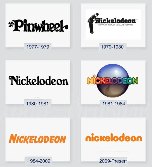
Spanning forty–four years, Nickelodeon has had six major logos with five exclusive updates. The creative directors hired to carry out these redesigns have kept the core values of the brand. They have strived for consistency, readability, versatility, memorability, and modesty. With these hallmarks, the logo has earned trustworthy followers and is still growing stronger. Let’s look at its stages of evolution:
1977—The Genesis Logo:
Before adopting Nickelodeon’s name in 1979, C–3 was the channel’s name. The logo that served the brand featured the alpha–numeric on a rounded square frame. The monogram was white on a purple background. It was classic, readable, and with a youthful charisma.
1979—Nickelodeon’s Official Logo:
On 1st April 1979, Nickelodeon was officially launched. This outdooring came along with an intriguing logo. The designer crafted this rare emblem from two graphic elements—a symbol and a typeface. The wordmark had a stylized letter—N, which looked like a kinetoscope.
The logo featured a man in a black suit and hat peeping through the iconic letter—N. Below the wordmark was the tagline—the young people’s satellite network in uppercase letters. The brand’s name came in bold and geometric san–serif font executed on a neutral background.
1980—The First Logo Update:
The logotype featured a classic wordmark without its previous hat–man. Also, the designer got rid of the projector and the inscription below the brand’s name. The letter—N got a curved line that mimics an animal’s tail. With sharp lines, the letterings look pretty balanced, unique, and readable. However, it kept its black hue. It served the brand shortly, giving way to another one.
1981—The Second Logo Update:
To represent a new era of television, the network’s management asked for a redesign. This time, they got a colorful emblem. It served their interest for about three years. The new logo came with a purple and gray three–dimensional globe. Also, across the face of the circular symbol, you’ll find a readable wordmark executed in the beautiful colors of the rainbow.
1984—The Third Logo Update:
In 1984, Nickelodeon adopted a solid orange emblem on a neutral white background. The design featured an elegant and legible standalone wordmark. Its letterings were of uneven heights with stylized letters—O. Crafted from the sans–serif font family, this trademark is distinct, attractive, and memorable. It served the television network for almost twenty–five years.
2009—Nickelodeon’s Current Logo:
In 2009, Nickelodeon ushered its brand into the world of lowercase letters. The trademark comprises an orange wordmark, but with different letterings. These letters are smooth, rounded, and readable, making the emblem friendly and memorable. The letter—i, which mimics the emotion of a keyhole, makes the logo appear unique, iconic, adventurous, and outstanding.
What Font Is Nickelodeon Using?

Nickelodeon is a loyal fan of sans–serif fonts. This is clear from its maiden logo to the current one. For instance, its rainbow logo was crafted using a typeface known as Frankfurter. Again, the 1984 design, which set out the tone for Nickelodeon’s signature logotype and color preference, was written in the Balloon Extra Font. Finally, though it resembles Bauhaus 93, the current famed logo is a customized version of Harry Squeezed Fat Font.
Who Designed the Nickelodeon’s Logo?
Like many iconic logos across the world, Nick has had logos from various graphic artists. Joseph Iozzi created the bowler emblem unveiled in 1979. More so, Lou Dorfsman holds the credit for designing the colorful trademark which featured the three–dimensional globe in 1981.
In 1984, the company hired Fred–Alan, Inc. to redesign its logo. The graphic directors who worked on this project were Tom Corey and Scott Nash. They designed the playful orange emblem, which became the brand’s signature. Eric Zim’s name is attached to the 2009 design.
Why the Nickelodeon Logo Works?

1. The Logo Is Modest:
Nickelodeon favored clean logo designs. From the first design to the latest emblem, the designers aimed for simple visual identity. Other than the brand’s name, the current logo employs no other design elements. It’s classic, elegant, and readable across several platforms.
2. The Logo Is Memorable:
All simple logos are memorable. They can achieve this essential branding requirement because they don’t have detailed design features that blur their personalities. With only a clean wordmark, the Nickelodeon trademark can be recalled with ease.
3. The Logo Is Transferable:
Scaling is another design requirement for logo creation. It helps the emblem to reach several people on different mediums. Nickelodeon’s logo has a clean outlook and a modest layout. So, it can communicate with its audience on any marketing channel.
4. The Logo Is Unique:
To stay above your business rivals is to be outstanding. You can’t compromise on this trait. Nickelodeon, like all iconic trademarks, is exceptional. It shares no close likeness to other brands in the industry. The logo, with its modified letter—i, is a king above kings.
5. The Logo Is Consistent:
Brand consistency gives birth to confidence and trust among customers. It’s never achieved overnight. Since the orange logo made its debut in 1984, it has kept its values with only a few updates. For the last thirty–seven years, the logo has remained relatively the same.
Nickelodeon Logo Design Elements

All the logos that served the cable network show the touch of experts. They have crafted the logos bearing in mind the rules of logo designs. With the rules as a guide, they chose the relevant graphic elements that resonate with Nickelodeon. Let’s look at the elements below:
Nickelodeon Logo Shape And Symbols
1. The Hat–man:
The hat–man was the center of attraction in Nickelodeon’s original logo design. The man in a black hat and professional attire stood for the experts behind the brand. This image represented the workforce from top management to the lower employees.
2. A Projector:
Again, the same original emblem had the hat–man looking through a device. This device was crafted using the letter—N. It stood for a kinetoscope, an earlier form of projector that showed Nickelodeon was in the business of motion–pictures.
3. A Globe:
The globe accompanied Nickelodeon’s colorful wordmark in 1981. It stood for the brand’s mission and vision of reaching out to the four ends of the earth with its educative and entertaining programs targeted at children.
Nickelodeon Logo Color Scheme
Technically, Nickelodeon has used almost every prominent color there is in the design world. You’ll find these colors in its rainbow trademark. However, instead of focusing on all the colors, I’ll write on its most prominent hues and their emotions. Let’s explore these three colors below:
1. Orange Color:
This is the signature color for the brand. And it’s a perfect choice for conveying messages to children. It’s a youthful color that resonates with the power of fire and sunshine. It exudes warmth, joy, and eagerness. Also, it encourages creativity and social communication.
2. Black Color:
Black was the dominant color in two of Nickelodeon’s previous logo designs. The color is both intimidating and exciting. It’s a color you can infer from darkness or the absence of light. Graphic artists and brand experts used it to convey power, authority, and leadership. Sometimes, people used it to evoke mystery and wealth.
3. White Color:
Almost all Nickelodeon’s logo designs have white as their background colors. It has served as a suitable balancing color for the other color choices. This color of goodness sends a signal of cleanliness, simplicity, and perfection. White aligns with light and the heavens.
How Did Nickelodeon Get Its Name?
Names hold an emotional part of our lives. You know this! It’s not a hidden gem. However, it’s often difficult to come up with names. Dr. Vivian Horner, the brain behind Nickelodeon, found herself in the same dilemma. To solve this puzzle, she asked her working colleagues for ideas.
Rainbow network and Savoy channel were two names that popped up from several others. Finally, they settled on Nickelodeon, a word that traces its root to notable coin-operated movie houses in the 1900s. Sandy Kavanaugh, the producer of Pinwheel, suggested this name.
What Does Nickelodeon Stand For?
Nickelodeon comes from the word—Nickel, a strong silver–white metal. In North America, it represents a five-cent coin. Nickelodeon took inspiration from well–known movie houses that charged one nickel (five–cent) to admit people into their theatres.
Who Started the Nickelodeon Network?

Self–help coaches always encourage aspiring entrepreneurs to start a business in line with their passions, interests, skills, and experiences. The formation of Nickelodeon is close to this advice. Dr. Vivian Horner founded Nickelodeon by harnessing her love for children, passion for education, and experience with many organizations. She was the architect behind the series, Pinwheel, first aired on 1st December 1977.
Brief History of the Cable Network
Based in New York, Nickelodeon is an American cable network that serves children’s viewing pleasure. The ages of its targeted audience range from two years to seventeen years. It also has few programs to entertain the family audience. It started operating locally in Columbus, Ohio.
Its maiden program, Pinwheel, was premiered in December 1977. Dr. Vivian Horner produced this educational content. On 1st April 1979, the network changed its name from C–3 to Nickelodeon. This name traces its roots to the end of the 19th century where movie theatres across the country charged one nickel (five-cent) as gate fees.
At this earlier stage, Warner–Amex Satellite Communication owned the network. Its flagship program, Pinwheel, was aired every day from 7 am to 9 pm. It was the only program aired by the channel at the time. In 1984, the channel started showing advertisements from other brands.
In 1986, Viacom bought the children’s cable network. The package deal includes Nickelodeon and its sister stations—MTV and VH1. Nick J, a weekday morning show targeted at preschoolers, was unveiled on 4th January 1988. Bubble Guppies and PAW Patrol were some of its shows.
Three years later, the company launched another innovative show. It was called the Nicktoons. These were original animated movies produced solely for the channel. It started on 1st August 1991. Some cartoon movies shown on the channel include the Loud House and It’s Pony.
The network had an agreement with DreamWorks Animation in 2006. DreamWorks Animation was tasked to produce cartoon films for Nickelodeon’s audience. This partnership brought the Penguins of Madagascar and other classic animations to the screens.
Besides animated movies, books, and magazines, the brand has other outstanding programs. These include Nickelodeon’s Kids’ Choice Awards, Nickelodeon’s HALO Awards, Worldwide Day of Play, and Nickelodeon’s Kids’ Choice Sports. In 2018, precisely September, the animated network reached nearly 87.17 million households in the United States alone.
My Final Thoughts On Nickelodeon
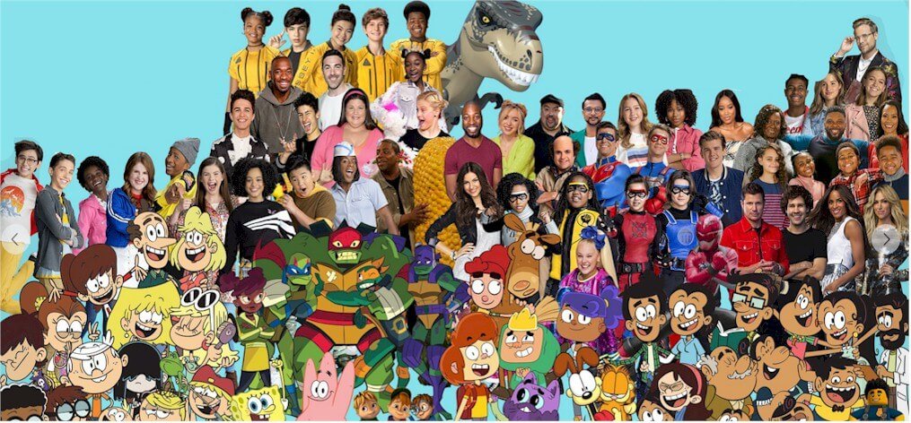
Nick’s celebrated logo is outshining its rivals. This is because it has been crafted with its ideal audience in mind. The orange outfit and the lowercase stylized wordmark resonate well with children. So it will continue to make them giggle from the comfort of their seats while they stay glued to enjoy their favorite cartoon series from home.
As one of the influential brands in the world, Nickelodeon would continue producing and airing educative and award-winning cartoon series that children will like. Its logo, the versatile orange emblem, will also be in charge. It will drive these animated movies to more audiences and sales.
With Nickelodeon in the entertainment business, children would never have a dull moment. Nickelodeon’s success and impact across the world are not by accident. It’s the result of conscious effort in producing quality content and keeping a purposeful trademark. It’s not just a day of wonder, but a consistent attempt to stay above the competition. Let’s keep an eye on it!

