
Let’s delve into the Chipotle logo and some history behind the food chain.
Chipotle is an American brand with a palatable Mexican flavor. It joined the food craving business in 1993 with a yummy dish. Yet, its logo design looked bland and flabby for a food brand. In 2009, it altered its logo designs to reflect its lush and delicious food service.
Today, Chipotle has one of the hottest, compelling, and peppery logos in the world. It evokes the personality of the brand—healthy, earthy, and organic food. Two designs are representing the company—a roundel style and a rectangular type. They convey the same ethical message.
Both styles featured the famous chili pepper, the brand’s name, and colors aligning with food. You’ll find white representing hygiene, red signifying passion, and brown conveying healthy living. The emblem resonates well with a food chain that’s serving all–natural foods.
The peppery Chipotle logo is sizzling on almost all marketing channels. Because of its classic layout and charisma easily cooks its mouth–watery dishes on billboards, television shows, banners, websites, merchandises, and other essential promotional mediums.
Undeniably, Chipotle is one of the high-ranking and wealthiest brands in the world. From a single location in Colorado, it’s now a recognizable fast-food empire across the globe.
Chipotle Logo Evolution
![]()
For close to thirty years, Chipotle has evolved little. The company has had one major overhaul of its visual identity. The rest have been minor updates to fine–tune its trademark. This has been a helpful exercise to reflect its latest mission. You can learn more about this below:
1993—2009—The Papyrus Logo:
A black logotype on a white background formed the maiden trademark of Chipotle. The logo design comprises two legible inscriptions—the brand’s name and a tagline. The brand’s name, Chipotle, is written in uneven sentence letters. And below it is the tagline—Mexican Grill in uppercase letters. The handwritten typeface evokes a papyrus charisma. Sometimes, you’ll find the wordmark in white on a black background.
2009—The Red Striped Logo:
To allow customers to identify with its service offerings, the company adopted a circular logo. It comprised two circles of black and red. The designer placed the red circle inside the black one. The smaller circle, which was red, housed a white pepper with red stripes around it. Again, the bigger black circle had the brand’s name and its slogan in white. You’ll find between the black and red circle a thin white outline.
2009—The Brown Striped Logo:
Not quite long, the brand opted for another update. This time, it kept its visual identity but adjusted its graphic elements. The designer interchanged the positions of the colors. The bigger circle became red, whereas brown paints the smaller roundel. The white pepper on the black frame had black strokes instead of red. Also, the letterings took on different fonts.
2009—The Current Chipotle Logo:
Within the same year, the company experimented with another design. The trademark moved away from being rounded to rectangular. This novel emblem featured a square on the left and a rectangle on the right. The red rectangle houses the brand’s name—Chipotle in white and caps. The short square became the frame for the ever–loved white pepper. The tagline, in all caps, stood below the bright red frame. This logo looks more minimalist.
What Font Is Chipotle Using?
All the versions of Chipotle logo designs came with readable fonts. The original emblem came with a handwritten style similar to papyrus typeface. However, it looked customized. More so, the latest logo aligns itself with a custom typeface. The geometrical letters are the closest choice to Gotham Bold, designed by Tobias Frere–Jones. While the maiden font looked old–fashion, the current one looks classy and modern.
Who Designed Chipotle’s Logo?
![]()
Most of Chipotle’s promotional properties are designed in–house. This includes its earliest visual identities. However, Sequence, a design firm in San Francisco, created the latest appetizing logo. Using the roundel logo as a guide, the firm crafted the rectangular one.
Why does Chipotle’s Logo work?
1. The Logo Is Simple:
Most famous logos are simple. In the same way, Chipotle’s iconic emblem is modest. It features few graphic elements that evoke its personality. With the current logo, you’ll find no detailed elements that distort its message. This act of simplicity makes the logo twinkles with joy.
2. The Logo Is Eye-catching:
Chipotle’s logo design is attractive. This is also another attribute of renowned emblems. There are two factors responsible for this achievement. First, it has eye–catching design elements. These include a pepper, rectangle, inscriptions, and colors. The precise arrangement of these graphic features is also the reason the logo is much loved.
3. The Logo Is Scalable:
Not all official logos are versatile, but Chipotle’s logo is different. For having no detailed graphic element, the logo has a clean layout. This allows it to be adaptable. With a minimalist design, the company’s logo can suit any promotional medium.
4. The Logo Is Consistent:
Compared to other food brands, the fast-food chain hasn’t stayed for long. Yet, it has worked harder to keep a consistent personality. This is clear from its graphic design elements. From the second to the current design, you’ll find the same colors, icons, and letterings. These reliable emotions have made customers believe in its mission and purpose.
5. The Logo Is Legible:
Chipotle’s designers chose a suitable font for its outstanding logo design. It’s also clean from any stain. The impact of these two traits enhances its readability and deepens its connection with customers. In reality, you’ll find that all iconic trademarks share this attribute.
Chipotle Logo Design Elements
Chipotle has employed all the vital ingredients needed to prepare its ambassador. In the basket, you’ll find a chili pepper, a circle, a rectangle, and some suitable colors. The chef hired to cook the meal did a fantastic job. Let’s get into the details below:
Chipotle Logo Shape And Symbols
1. A Pepper:
Pepper is a symbol of spice and excitement. It’s the most outstanding icon in Chipotle’s trademark. Apart from the first logo, it has featured in all the latest logo designs. Pepper, as a vegetable, relates well with Chipotle as a fast-food chain.
2. A Circle:
Chipotle’s second emblem and its variations came along with two circles. A circle is a universal symbol that evokes eternity, totality, and perfection. Also, as a geometric shape, it aligns with vitality and movements. This is a powerful shape that speaks of the company’s intent of serving its cherished customers endlessly.
3. A Rectangle:
The brand’s newest logo featured both square and rectangle frames. These geometric shapes convey similar emotions: they signal stability, honesty, and solidity. A rectangle and a square are the most widely used shapes in the branding industry. As a frame in Chipotle’s logo, they boost the objects in them.
Chipotle Logo Color Palette
1. Red Color:
Chipotle has adopted red as its traditional color. It’s a befitting color choice for the food chain. And it speaks volumes of the brand’s iconic symbol, the pepper. In branding, experts used red to represent passion, love, and energy. It’s also a powerful color that stimulates the taste bud to desire food. In short, red increases appetite for food.
2. Black Color:
After red, Chipotle’s next favored color is black. It paints its circular frames and letterings. The color of darkness stands for mystery, power, and elegance. Its presence in the logo evokes authority and leadership. It’s a suitable color for one of the leading fast-food brands in the world.
3. White Color:
The creative directors who worked on Chipotle’s logo used white color to dress the roundel’s outline and its wordmark. White represents purity, cleanliness, and safety. As a fast-food chain, the color aligns with simplicity, wholeness, and hygiene.
4. Brown Color:
The brand also favored brown. It represents the earth. It adorns the frames and houses the pepper. It’s a perfect food choice that stimulates appetite, signals health, nature, and wholeness. It also resonates well with its mission of serving customers with all–natural and organic food.
How Did Chipotle Get Its Name?
Chipotle is one of the exciting names in the food industry. Its famed icon, the pepper, gives us a tip-off as to the source of its name. Chipotle means chipotle. Don’t get confused. The term stemmed from the Nahuatl language (in Mexico), which means dried and smoked chili pepper.
What’s Chipotle Motto?
Chipotle prioritizes trust above many things. This reflects in their catchy phrase—Being Real. For being real to both people and the planet, they coined the motto—Food with Integrity. With this motivation, Chipotle prepares and serves foods that are natural and ethically made.
Who Started Chipotle?
Steve Ells, the son of a pharmacist, was born in Indianapolis, United States. The date was 12th September 1965. As a teenager, he completed Boulder High School. Afterward, he attended the University of Colorado. He majored and graduated with a Bachelor in Art History.
One of his childhood dreams was to become a chef. He loved cooking and hoped someday to share his cooking skills with the world. This flaming desire led him to the Culinary Institute of American. In 1990, he graduated from this reputable institute in Hyde Park, New York.
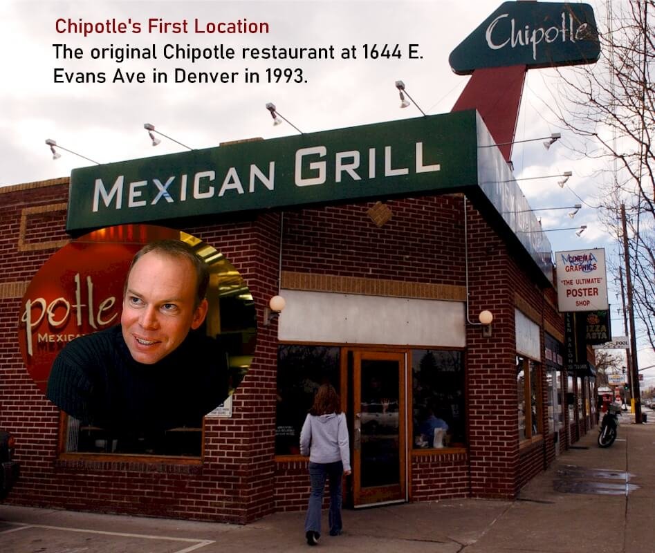
He worked at the Star Restaurant, San Francisco. Interestingly, he dreamed of owning a food chain similar to it. Under Jeremiah Tower, he served for about two years. In 1993, Steve started Chipotle by combining his experience and passion.
Until 2020, Steve was an active and a top personality in the company. He served as a chief executive officer and a chairman for the fast-food chain, Chipotle Mexican Grill. According to reliable sources, he is worth about $200 million.
How Chipotle Got Started?
Steve’s vision of turning passion into ethical profit gave birth to Chipotle. As a young boy, he often spent much time around his mother in the kitchen. Here, he learned the basics of cooking. Steve shared his love for cooking by preparing delicious foods for relatives and friends.
With no particular direction after university, he took some cooking lessons from the Culinary Institute of America. To gain on–the–job experience, he spent two years with the Star Restaurant in San Francisco. He envisioned starting a fine–dining restaurant.
After leaving Star Restaurant, Steve put his idea into action. In 1993, he launched his startup close to the campus of the University of Denver. With no initial capital, his father became the financier of the business. He received $85,000 from his dad to fund the first location.
Most businesses hardly make a profit in their early days. So, together with his dad, they estimated the quantities of burritos to sell daily for a profit. They projected 107 burritos per day. However, the brand raked in over 1000 sales per day after one month in business.
From the brand’s cash flow, he opened the second location in 1995. Just after a year, the third food chain followed. This location was founded with a loan from SBA. These positive signals gave Steve’s dad hope to invest $1.5 million into the business.
He further raised $1.8million, put a board in place, and created a business plan. Afterward, more branches were unveiled. In 1998, the brand had a new store in Kansas City, Missouri. This was the fourth chain but the first outside Colorado. The Minnesota store followed it in 1999.
Looking at the liquid nature of Chipotle, McDonald’s invested $350 million in 1998 to further expand the brand. Within three years, it has become the largest investor in Chipotle. This capital injection quickly increased the food chain from sixteen locations to about five hundred by 2005.
To raise more funds, Chipotle went public on 26th January 2006. The stock was sold at $22 a share, and it attracted several investors. Nine months later, McDonald’s detached from Chipotle. In 2008, Chipotle opened a new store in Toronto, Canada. It was its first location outside the US.
In March 2020, Steve Ells distanced himself from Chipotle. He resigned as its chairman and also as a board member. Today, Brian Niccol is the reigning CEO and chairman of Chipotle.
How Big Is Chipotle?

Chipotle is an American fast-food chain that’s a master in tacos and burritos making. From a single store, the brand has grown into an envious empire. From the United States, the brand also serves clients in Germany, France, United Kingdom, and Canada with its Mexican flavor.
Some dishes served at Chipotle are bowls, tacos, burritos, salads, and veggies. Today, Chipotle operates about 2,622 locations worldwide. As its branches increase, so does its working staff. According to Macro Trends, Chipotle has precisely 88,000 employees as of 2020.
In 2019, the company made $5.586 billion in sales revenue. After deductions, Chipotle earned a net income of $350.158 million. While most fast-food chains run on the franchising model, all Chipotle’s restaurants are company–owned.
The brand went public in 2006 with a stock value of $22. Since then, the company’s stock has been surging with confidence. Today, Chipotle’s stock is selling at $1,427 per share. You can see the astronomical effect of the brand’s strength over the last fifteen years.
My Final Thoughts On Chipotle
Chipotle is a high-status brand worth emulating. Its journey from a lone store to a mega fast-food giant offers practical lessons. This is a case study for all aspiring entrepreneurs to embrace. Steve Ells, Chipotle’s founder, started with no cash and business experience.
He built an empire from his love for cooking. Again, he started with no board of directors, a business plan, and a clear purpose. He just went to work without thinking of the threats. A loan of $85,000 from his father is enough to serve some lip-smacking dishes to its customers.
Chipotle had a miraculous beginning. It sold over 1000 burritos a day within thirty days in business. This is quite rare in an industry dominated by giants. Though Steve did many things wrong from the start, he leveraged people’s skills, experiences, and funding.
Though Steve is no longer with Chipotle, I’ve faith in the company staying for many years. Also, the Chipotle logo will continue to represent the brand to win more laurels. When you have a burning desire to start a business, start and wait for the miracles to rain on you.
That’s one lesson from Chipotle’s founder, Steve Ells. Wait no more, start!


