Coming up with logo color combinations can be challenging. Whether it’s a new color combination for your logo, colors to use inside an infographic, or a differing color palette for an upcoming presentation.
Regardless of the reason for your venture into the beautiful world of logo colorization, if you’re starting a new company and need a logo, looking to rebrand an existing design, or only looking for some inspiration, we’ve got what you’re looking for.
Here is our Top 40 pick of color combinations that are used in established logo’s that will hopefully give some logo ideas for your own logo.
40. Slack Logo Colors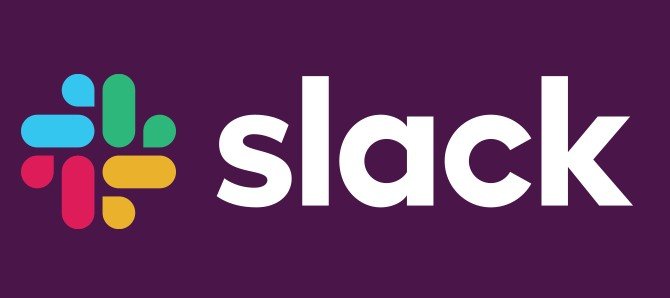
Slack is an online communication tool that many a company work team uses to stay in touch. This brightly colored logo, standing against a deep purple background, makes the app look unique and easy to find on one’s phone.
The multi-colored logo color combination that sits to the left of the font text allows this brand to play with color in its way instead of only using only one or two shades.
39. Asana Logo Colors
This one is a magnificent ombré within a logo. Asana has knocked it out of the park with minimalist faded red circles, creating a bright ambiance for this project management software provider.
38. The Miami Dolphins Logo Colors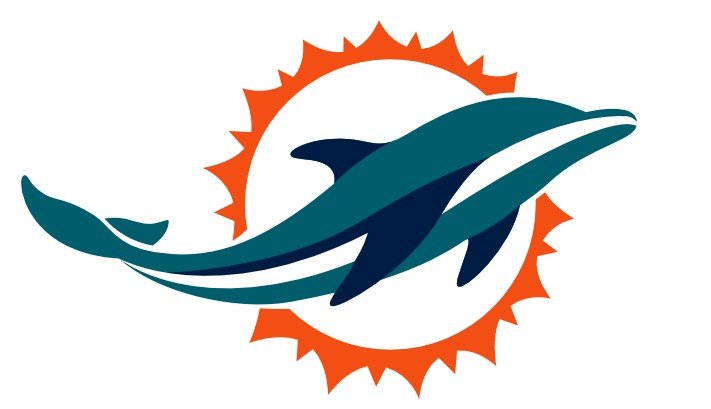
The Miami Dolphins have one of the most eye-catching logos in all American sport, with their teal flat-design dolphin in the middle and a bright orange sun surrounding it. If you’re looking for a slightly more muted tone alongside a bright color, this can create a stunning image,
37. Mastercard Logo Colors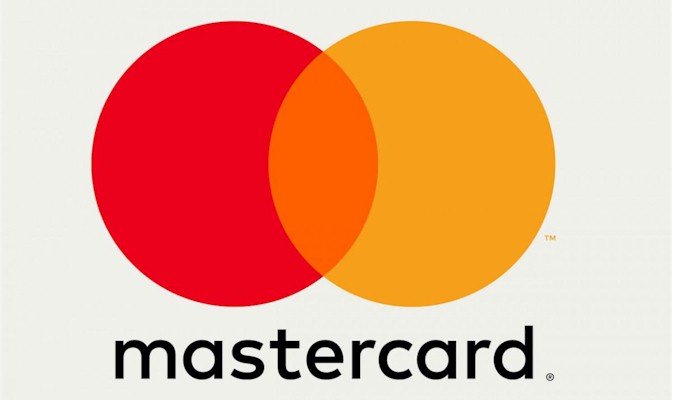
Multinational conglomerate, Mastercard, rebranded themselves to produce a more modern version of their logo while keeping the logo color combination the same as it has been for years. The famous bright color palette has aided MasterCard in becoming as recognizable as they have; the red and orange circles have shown simple shapes don’t have to equal simple logos.
36. Sprout Social Logo Colors
This one has a tremendous monochromatic logo scheme, a perfect fit for the social media management software, Sprout Social. The coloring fits nicely into the theme of a company that invokes greenery imagery in its name – the green logo on a white background symbolizing nature, eco-friendliness, and calmness.
35. NBC Logo Colors
Here is the enjoyable, fun, and iconic NBC logo color scheme from a news network, of all places. The peacock logo was meant to introduce their viewers to color TV, hence all the colors on the spectrum being present.
If you’re designing a company logo, consider how its logo color combination could represent a service, product, or business mission – like what NBC did.
34. Best Buy Logo Colors
Best Buy has been around for decades, and over time they have rebranded their logo to a flatter and more modern design.
Despite the changes, they have kept their bright blue and yellow logo combination. They faded out the black outline around the text and made the yellow more of an accent color whilst making the white in the image more prominent.
33. Airbnb Logo Colors
This one is simple and to the point. If a brand can be represented purely by one color, then why not go for that? The black and grey shading, along with the white background of the Airbnb logo really does allow the simplistic prominence of the scheme to shine through.
32. Pampers Logo Colors
The multimillion-dollar diaper manufacturers are another excellent example of a logo combination mixing the cool colors with the fiery yellow-orange pairing is a very eye-catching image.
31. Expedia Logo Colors
It doesn’t happen often, but sometimes the most appealing logo scheme is all one color, with only a simple accent differential of a second color to offset it—a decent contender but not colorfully creative enough to get higher on our list.
30. Hyatt Place Logo Colors
Here’s another excellent example of color used well, the Hyatt Place logo uses different colored circles to create an H, then add black circles which represent the spaces in the letter itself. Creative use of color for the hotel brand, making a simple geometric logo seems like more is going on with it.
29. Airtables Logo Colors
This one uses different tints and shades of the three main primary colors – blue, yellow, and red – to show off its design. This is a tried and tested technique as the three primary colors are always great choices.
28. Brilliant Earth Logo Colors
Brilliant Earth is a jewelry organization that is renowned for its work with conflict-free diamonds. The green shade they have incorporated into the logo is used to showcase their eco-friendliness while still making it appear feminine in design.
27. Drip Logo Colors
Drip’s purple logo is an example of how using just one primary color can help your logo stand out.
Whether it’s a neon color that you’re looking for or a muted tone line that can also be seen in the Airbnb logo, using one single pigment to represent your brand can have a same effect on your logo if you do it right.
26. Billie Logo Colors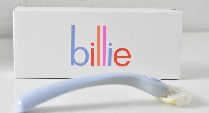
Billie is a women’s razor company, and their feminine, pastel logo helps them to resonate with their target market. Keeping a color combination that is enthralling to your target audience is a fantastic way to keep them engaged in your brand.
25. Brandwatch Logo Colors
Here’s another multi-color rainbow combination. Logos like this are always eye-catching, and there are so many ways to take advantage of rainbow colors. Choosing a brighter variation of the NBC logo (or one of similar colorfulness) or a more subdued palette like you can see here in this logo scheme.
24. Monday.com Logo Colors
Monday.com is a project management software, and its traffic light inspired logo color scheme is a great use of color.
23. Career Karma Logo Colors
This logo is mostly black with just a couple of orange accents in there too. This can help the brand to feel essential and serious in the eyes of the consumer while still giving the logo a playful edge in color.
22. Tableau Logo Colors
Tableau’s logo color combination is also multi-colored but allows more use of blue in its shades. As mentioned before, multi-colored palettes can be fun to play with because there are so many ways to have them presented. You will see several throughout this roundup.
21. Ahrefs Logo Colors
The SEO software uses a search engine data algorithm to guide its customers with strategic decisions. Therefore, it’s essential to pay attention to the way they’ve used color in their logo; the format and color difference is meant to convey the retro feel of old programming software.
20. Clarity Money Logo Colors
Financial organizations tend to lean towards green and blue color palettes in their branding, and the money management app Clarity Money is no different. The primary thing to notice here is the brightness of the main colors, showing trustworthiness in its scheme.
19. Poppin Logo Colors
Here’s yet another one to be put in the ‘a single color can work for wonders’ pile. The period also adds a sense of professionalism. Their website also uses a bright hue on the logo, making online shopping with Poppin an all-around pleasure for the consumer.
18. Hello Fresh Logo Colors
This fresh food subscription boxes logo should surprise no one with its use of green. It should be noted that bright greens usually symbolize a natural, eco-friendly brand, and greens and whites are perfect for showing that value.
17. CHSToday Logo Colors
CHStoday is a daily newsletter that covers the Charleston, SC area. But despite its relatively small popularity, it puts together a varying monochromatic logo color scheme that draws the eye. It’s a great example of how several shades of the same color can create some lovely branding.
16. Sprinklr Logo Colors
Here’s another multi-colored one with bright, eye-catching aesthetics that stick in mind. Sprinklr is an online experience platform, and like much other technology and SaaS companies take advantage of using a lot of color in their brands.
15. Cognism Logo Colors
Another single color one here, but well worth a look as the dark shading does a lot to utilize the branding image. This helps you put out a serious and informative and can be a great use of color if that is the look you wish to put forth in your consumers’ minds.
14. OptinMonster Logo Colors
OptinMonster is a marketing software company that has utilized many a bright shade in its color scheme as well as a cute little monster chewing a mail envelope within the logo itself.
Here we see another excellent example of the calming instinct that the green and blue color scheme has on a viewer’s mind.
13. Respona Logo Colors
Respona is an outreach tool for customers to help them find their business contacts, their contact information for PR and outreach campaigns. There are numerous other companies in a similar vertical who will go with a duller color palette. Still, Respona’s bright purple and teal color combination aid it to stand out from all its competitors.
12. Dress Up Logo Colors
DressUp is a woman’s boutique, and the pink shade in the logo goes a long way to reinforce the idea of the feminine brand. This color resonates with your target audience and does what DressUp did and dress it up in your color scheme.
11. Amy Poehler’s Smart Girls Logo Colors
This one is just easy on the eye, a pink and yellow color scheme; Amy Poehler’s Smart Girls has really hit the nail on the head here.
If creating yourself a substantial online presence that really grabs the attention of others, a bright logo color is a way to go for you.
10. HealthIQ Logo Colors
There are many a financial institution who stick to intense colors like blue and green and HealthIQ show that healthcare companies share this loo vision also. Blue resonates with people as a calming and more natural color, and to pair that shade of blue with green and grey in their logo is a safe bet.
9. Human Rights Campaign Logo Colors
The Human Rights Campaign gives us the navy blue and bright yellow option in its color combination to ensure the focus in their logo – the equals sign being a universal sign.
This one uses a color combination strategically in its logo; the colors combined with the image helps to emphasis what values the company stands for.
8. Pantheon Logo Colors
Accents can be used (as we have seen in this list) very well with the addition of a greyscale logo color scheme, like the one for Pantheon.
Looking for a way to create your own accent within your color palette can also give you an edge when creating other branded items.
7. Upstart Logo Colors
This personal loan company has a more subtle, muted color palette. Like other highbrow, monitory institutions, a blue and green hue is the color aesthetic of choice – and the two-tone teal in this design is perfect.
6. CoverageBook Logo Colors
CoverageBook has a very low-profile logo color scheme in a pastel pink and dark teal color combination. This interesting mixing of colors really creates an eye-catching image that will no doubt resonate in your consumers’ minds.
5. Cision Logo Colors
They are keeping up with the theme of using (dark) teal in the logo design in a way that grabs attention. This teal and bright orange combination are stunning to behold, and Cision uses geometric shapes in their logo, which gives it a light-hearted and playful edge.
4. FEDEX Logo Colors
This one is an iconic logo – everything from the hidden arrow and its orange, purple, and white color combination. Purple and orange are two unusual colors to see next to each other in design, but the combination works perfectly for this world-renowned brand.
3. Preview Logo Colors
For the Instagram generation, we have Preview, a feed planner that embraces the use of a square pattern of its pictorial logo. The combination of colors and squares represents a bright and very well-curated Instagram feed, and it earns a well-deserved place in our top 3.
2. TrueData Logo Colors
Penultimately, we have a monochromatic blue logo color scheme. Blue, as we have stated previously, is an excellent indicator of trustworthiness. For a data company, trustiness will equate to accuracy in the minds of consumers.
1.Reese’s Logo Colors
And finally, our number 1 pick is the iconic logo color combinations of Reese’s. From the cereal boxes to candy bars, the color scheme of this logo is reminiscent of what their confection itself looks like. The yellow, orange, and brown in the logo grabs the attention, and there is no doubt that this chocolate and peanut butter brand has created a color scheme that is recognized the world over.


