The is a look at the Gmail Logo and how the email service was started.
Google, the number one search engine globally, recently updated its logos, including the Gmail logo. Such remodeling of a brand’s visual identity becomes necessary because people’s likes and dislikes change over time.
Technology and other areas of life aren’t as they were ten or so years ago. The redesign of company visuals is a vital aspect of the branding policy for small, medium, and big enterprises.
Thus, Google has good reasons for giving its logos a refresh. Here’s how the Gmail logo has evolved over the years and an overview of the design elements that make up the logo.
The Gmail Logo Evolution
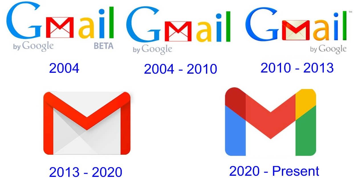 In October 2020, Google introduced a new multi-colored, simplified Gmail logo in place of the red-lined envelope logo version, which had been in existence since the email service launch in 2004. It was part of Google’s broader rebrand of its G suite offering in the Google Workspace.
According to Google Workplace general manager and vice president, Javier Soltero, the reason for redesigning a new bunch of logos under one color palette was that, over time, Google’s products became so much more integrated and the lines between the various Google apps were no longer there.
This rebranding sparked a flurry of debate worldwide by comparing the new designs with previous ones. Below is a brief look at how the Gmail logo has evolved over the years since its unveiling in 2004.
2004: Gmail Beta Version
In 2004, Gmail was first established as a beta variant, and the first logo was named Google Mail, with the word “mail” beneath the more conspicuous Google logo slightly off-center. The text “beta” was also included in the logo.
2004
Google formally established the Gmail email service in 2004. It included the brand name Gmail and a new logo. The Gmail logo was designed by Dennis Hwang the night before the unveiling. Incidentally, Hwang was the one who made virtually all of Google doodles then.
The most noticeable part of the logo was Gmail, with the catchphrase “by Google” aligned to the left underneath. At first, the Gmail logo was designed in a similar font to that of Google, a font known as Catull that was created in 1983. But the Catull font had a “very weird-looking” letter “a,” making it unsuitable for Gmail. Hwang decided to retain the “G” in the font and used a sans serif typeface in “ail,” but wound up using the font Myriad Pro instead.
2010
The Gmail front page was relaunched in 2010. Simultaneously, a refreshed Gmail logo was introduced and looked more like the recently launched Google logo. The only notable change is that the phrase “by Google” was shifted to the right beneath the Gmail logo.
2013
Google opted for a different logo version which was more minimalistic and sleeker than its predecessor. The background is white, and it only consists of red and gray. There are various shades of gray and red necessary for producing 3D effects. The logo is simply made up of the red iconic “M” envelope, minus the term “Gmail.”
2020
The Google logo was rebranded in October 2020. The Gmail logo became more eye-catching, stronger, and integrated with other logos in the Google family. In place of the iconic red-lined white envelope was a stylized M, representing “Mail” in Google’s official colors—blue, green, red, and yellow. The letter comprises four sections, with two of them (red and blue) overlapping.
Throughout Gmail logo’s evolution, one thing that should be noted is that Google never altered it in its entirety. Instead, they’ve taken a most prominent part to the next version and changed it slightly. With every version, they’ve retained the same color palette throughout the journey.
The Gmail Logo Design Elements

The new Gmail logo is a basic design. It’s an M-shaped symbol that users can easily identify with. There aren’t many other elements. The original logo had plenty of text. At the time, it featured the full name of the company. But it’s now a basic M, and Google only redesigned it to ensure the envelope looked different.
Gmail Shape: The Gmail Icon is a critical design element, which determines the visual effect on the target audience. A unique aspect of the updated Gmail logo is its M-shaped envelope.
The design team headed by Mr. Cyphers carried out some testing and received feedback on it. It dawned on them that the “envelope” feature of the Gmail Icon wasn’t that crucial to the logo design, which was a surprise.
The previous Gmail logo design in red was sleek and boasted some shades on top of and inside it. This gives it a 3D effect. Now, the new Gmail logo design is much thicker. The shoulders and legs of the letter “M” now look a lot thicker. The shoulders appear wider than before and are well rounded.
While the older Gmail logo design had some shades, the newer design appears clean but lacks shades. But the absence of shades is made up for by overlapping colors. Since the Gmail logo is a colorful version now, it no longer depends on shades to leave an impression on viewers.
Gmail Logo Colors: This is perhaps the most crucial design element in most companies’ visual identities. Companies communicate to potential customers using brand colors. Therefore, colors play a great role in determining the right visual language of a brand.
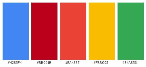
In most cases, when a company picks its brand color scheme, it uses the colors in all products, including business cards, brochures, websites, etc. This maintains consistency and shows that the product/service is from the firm, and customers can rest assured.
Taking that into account, the Google Icon has also retained the old color scheme in the redesigned Gmail version. It has redesigned its iconic envelope M logo. The M shape stays the same but comes with significant color changes.
Now, the new Gmail logo has blue, green, red, and yellow—which are Google’s brand colors. Also, these are the colors of all products from Google, including Google Chrome, Google Photos, Google Docs, Google Maps, and many others.
So, the designers retained the M component but added all of the company’s traditional brand colors. Now, the color scheme dominates the Gmail logo. But red is the most prominent color in the logo. Blue, green, and yellow merely appear at the arc of the logo.
Gmail Color Consistency: After redesigning the Gmail logo, Google also maintained the color consistency. All logos of Google products appear in the same color scheme and shape as the new Google logo. Google Calendar, Google Docs, Google Sheets, and Google Meet logos have been redesigned in line with the new Google logo design.
After updating its own logo and that of other products, Google now boasts the same visual identity for all its products. But some experts have criticized how the colors appear in the new design.
For example, some experts say that the colors have been used without any order or direction. You can spot that randomness in the order of colors, and this causes some confusion. But it appears that the designers didn’t think that was important while redesigning the different Google product logos.
Overlapping Gmail Colors: Another aspect of the new Google logo designs is that they use overlapping colors. To some people, these logos may seem a bit confusing and complex to the eye.
In older Google logos, the three main colors were green, blue, and yellow alongside their secondary colors, and they were isolated from each other. But the new Google logos have three primary colors and only one secondary color.
The History of Gmail

Gmail is a free email service offered by the number one search engine on the planet, Google Inc. In 2004, Google started offering online email accounts to a good number of beta testers.
Origins of Gmail
Although Gmail was officially launched in 2004, its history started a few years previously. In 2001, an engineer named Paul Buchheit began to create an email service that Google employees could use internally. Buchheit had had experience developing webmail services in the 1990s.
He took a look at the leading webmail providers at the time, Hotmail and Yahoo! Mail, and worked out their major shortcomings. It was a slow and confusing interface, lack of storage space, and use of out-of-date programming languages, forcing people to delete old messages when they hit the storage limit provided by the webmail services.
Google engineers also strived to incorporate Google’s main offering into the webmail service. With the Google search engine integrated with email, it became easy for users to locate old emails, which became much more crucial considering Gmail’s storage space.
Therefore, on April Fools’ Day of 2004, Google formally established Gmail. At first, just a few lucky customers got an invitation to use the service. Those able to use the service were happy. Gmail was feather-light with a clean and simple interface and opened messages fast no matter the power of one’s computer. Moreover, when top email services offered just 2-4MB of storage space, Gmail offered 1 GB of storage space.
Success was instant, and it didn’t take long for Gmail to become the world’s most widely used email service. Over time, Gmail has become even more important. For example, nowadays, your Gmail account ushers you into the Android world.
Past and Present Gmail Privacy Concerns
One feature of Gmail that was highly controversial and remained so is how the Google search engine examines the content of every email that enters and leaves Gmail accounts and uses that to customize ads to end-users.
While some users have argued that this violates their privacy, no person goes over the messages that are examined by the system. This allows Google to sell adverts at higher prices than they’d ordinarily be able to since they can reasonably assure marketers that the targeted customers will have at least a fleeting interest in their goods or services.
Gmail Today
Developed by Paul Buchheit in 2004, Google’s email provider Gmail has almost 1.5 billion active users every month. Gmail initially offered every user 1GB of storage space. While Gmail still offers users a free service, it has now started offering a suite of paid enterprise products, including word processing and presentation software.
Nowadays, Gmail offers users 15GB of storage space for free. Users can get emails of up to 50MB disk space, including attachments, and they can send emails of up to 25MB disk space. To send larger file sizes, you can insert Google Drive files into your message.
By contrast, Yahoo! Mail has only 228 million active users per month. Gradually, Gmail has dethroned established email services like Yahoo! Mail, Hotmail, and AOL Mail.
In 2005, a year after the launch of Gmail, Google introduced Google Maps, the leading online map service in the world. Google also bought YouTube and Android—the world’s number one video-sharing website and mobile operating system, respectively. The company also developed the Google Chrome browser, replacing Internet Explorer as the number one choice of web users.
It’s reported that each of the Google apps mentioned above has over 1 billion active users per month. Android alone powers nearly 90% of all smartphones sold globally.
Wrapping the History of Gmail
Gmail has changed the face of email services and that of online applications for the most part. When the email service was first introduced to a considerable number of beta testers in 2004, it differed from what users had come to expect from an online application.
It was the first time that a web-based email service didn’t need a full page to reload each time you switched to a new page. The service allowed you to search and sort your mail easily. For most users, storage space was almost unlimited—and all of that for free! It’s no surprise then that Gmail and the Gmail logo have developed into one of the world’s most popular email applications.

