
Let’s look at the Fruit of the Loom’s logo and some history behind the clothing maker.
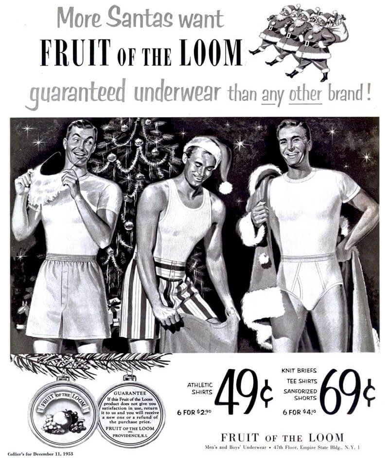
Fruit of the Loom, a historic brand, took part of its name from the phrase—fruit of the womb. In contrast, the biblical term refers to children, and the American brand points to clothing. Among fashion giants, the brand has earned a reputation as one of the leading casual wear producers.
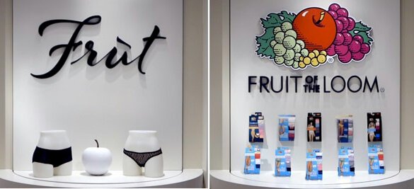
Going by its name, the company has used fruits to design its logo. The colorful Fruit of the Loom logo design comprises a red apple, green grapes, leaves, berries, and purple grapes. Under these tempting fruits, you’ll find the brand’s name in bold, style, and caps.
The cleanness of the design and its choice of graphic elements make the trademark widely acceptable. With its modest layout, the Fruit of the Loom’s logo sprouts readily on all marketing mediums—merchandise, websites, billboards, televisions, and many others.
Evolution of the Fruit of the Loom’s logo
![]()
For about a century-plus, the trademark has undergone six redesigns. Though the key elements in the Fruit of the Loom logo are always kept, they get retouched from time to time. The designers have altered the colors, redrawn the fruits, changed the fonts’ position, and added frames. These pluses and minuses have not changed the brand’s personality. Let’s check the updates up!
1893—The Original Logo
The Fruit of the Loom logo shows four fruits—red apple, purple grapes, light berries, and green grapes on a square frame. And inside a golden brown banner was the brand’s name—Fruit of the Loom in uppercase letters. The emblem featured the cloud and a vegetative background. This design looks like a realistic painting, and it was the original logo design.
1927—The First Logo Update
The company used the first logo for about 34 years before making changes. A sphere replaced the square frame, and the fruits were redrawn. The vegetative background became less visible, but the blue and white cloud remained prominent. The banner also disappeared, leaving the wordmark alone. Though the name remained in caps, the “Fruit and Loom” got enlarged.
1936—The Second Logo Update
What do you think of the Fruit of the Loom’s second logo design? To me, it looks like a coin with rough edges. After nearly nine years, the company adopted a light shade of brown seal as its official identity. The fruits and the wordmark that were resting in the circles had 3D emotions.
1951—The Third Logo Update
The 1951 logo updates didn’t change the previous visual asset’s look—the same Fruit of the Loom’s logo, but with colorful additions. The fruits took on their bright colors, but the background color grew lighter, making the graphic elements look classic.
1962—The Fourth Logo Update
For the fourth time, the Fruit of the Loom’s logo changed. The emblem had colorful fruits on the edge of a white and black eclipse frame. And inside the frame but below the fruits was the wordmark. Apart from the Letters—F and L, the designer underlined the rest with red lines.
1978—The Fifth Logo Update
The fifth redesign had the fruits above an eclipse frame with a shadow. Also, one of its grapes became green, and the letters of the wordmark grew in the same size, weight, and height. Below the wordmark was the inscription—unconditionally guaranteed in uppercase letters.
2003—The Current Fruit of the Loom Logo
The Fruit of the Loom’s logo design has taken on a modern approach. With no frame, it has become modest and mouth–watering. The logo features the fruits above the wordmark in bold letters. The designer has redesigned the fundamental graphic elements, making them look cleaner, sharper, visible, and more attractive.
Why the Fruit of the Loom’s Logo Works?
1. The Logo Is Clean:
The designer put every thought into making the Fruit of the Loom logo clean. The Fruit of the Loom’s emblem has graphic elements that are few—fruits, colors, and typeface. This resulted in an attractive and modest logo design with a tasty bite.
2. The Logo Is Memorable:
An apple, grapes, and berries are familiar fruits. So customers would hardly forget a brand that features them on its logo design. Anyone who comes into contact with the Fruit of the Loom’s logo can recall and connect it to the company.
3. The Logo Is Consistent:
The brand has had six redesigns, yet it has used the same design elements in creative ways for about 128 years. The consistency has earned it the trust it needs to survive in a keen business environment. All famous logos use constant elements to win the loyalty of their customers.
4. The Logo Is Scalable:
The Fruit of the Loom’s logo can dress on many marketing channels with comfort. This is because its layout is clean and modest, giving it the ability to fit better on any medium while keeping its quality and persona.
5. The Logo Is Readable
The official logo has kept a clean personality. This implies it has a bold and legible font that helps customers read it regardless of the medium being used. Customers can interpret it whether it shows on clothing, website, or business cards.
The Fruit of the Loom Logo Colors:
1. Black Color:
Though design experts regard the color black as a mystery, it signifies power, elegance, and strength. It’s the color that holds the Fruit of the Loom’s wordmark. It also has a close relation to fear, danger, and evil. Yet, the company’s logo projects positive emotions.
2. Green Color:
Green is one of the brightest colors in the emblem. This primary color, which paints the leaves in the logo, stands for freshness, healing, and nature. Aside from these positive emotions, it also evokes some negative feelings: boredom, envy, and inexperience.
3. Red Color:
The most outstanding fruit in the logo is an apple. The fruit comes in red, and it signifies love, passion, and desire. As a color of fire, it can also exude intense aggression, anger, and violence. Red is a daring and attention-getting color that makes the logo glow with power and courage.
4. Purple Color:
Do you care to be treated like a royal? The company considers its customers as nobles; that is why it used purple in its logo design. Purple represents royalty, wealth, and luxury. The color is a blend of blue and red, and it’s one favorite among young girls.
5. Yellow Color:
Light yellow shows in the company’s emblem. It cares for one of the grapes. Positively, yellow stands for hope, happiness, and honor. This bright primary color can also exude negative vibes such as jealousy, betrayal, and cowardice.
What Font is the Fruit of the Loom Logo?
The American clothing maker, Fruit of the Loom, uses a geometric sans–serif typeface called Futura Book. Paul Renner, the German typographer, owns the credit for designing this beautiful and readable font.
Who Started Fruit of the Loom?

The Knight Brothers—Benjamin Knight and Robert Knight started Fruit of the Loom in 1851 in Warwick, Rhode Island, United States of America. If you wouldn’t mind, come with me while we bite into their personal and professional lives, starting with the elder.
Benjamin Knight:
On 3rd October 1813, Stephen Knight and Weltham Brayton gave birth to Benjamin Knight. They lived in Cranston, Rhode Island, in the United States. Benjamin, until he turned 18, helped his parents on the farm.
When he was 18, Benjamin left the family farm to try something new. In the same town, he found a job at Sprague Print Works. He worked for a short period. Four years on, Benjamin opened a grocery store near the Sprague Print Works.
He found another company, Penniman, Knight & Company, by partnering with D.T Penniman. This business focused on buying and selling grains and flour. By 1852, he had sold part of his grain and flour business to his brother, Robert Knight.
Benjamin also bought some stake in Robert’s business, the Pontiac Mills. He engaged in politics, banking, and insurance before passing on 4th June 1898. Many considered him an entrepreneur with a charitable character.
Robert Knight:
Robert Knight was born in Warwick, Rhode Island, to Stephen Knight and Weltham Brayton on 8th January 1826. Like his senior brother, Benjamin, he worked at the Sprague Print Works for a while when he was eight years.
Before his 17th Birthday, Robert worked for Elisha Harris in Coventry, Rhode Island, and earned $1.25 per week. Robert worked with his brother, Benjamin, in 1843 as a store clerk. And in 1845, he took an eighteen-month course at Pawcatuck Academy in Westerly, Rhode Island.
After teaching in Exeter for four months, John Clarke hired him as a store clerk at Pontiac Mills in 1846. With a partner’s help, Robert bought Pontiac Mills when John Clarke was elected as a senator to the upper chamber of congress.
In Providence, Rhode Island, Robert stayed with his wife and children. He also engaged in many businesses and charity works before retiring to the unknown world on 26th November 1912.
How Did Fruit of the Loom Begin?
The Knight Brothers, after years of exploring various businesses, held stakes in the Pontiac Mills. In 1851, they changed the business name to B.B and R. Knight Corporation. To focus their energy and resources, they turned to textile manufacturing in Warwick, Rhode Island.
The company made high–quality cotton dresses for all—children, women, and men. In 1956, the Knight Brothers adopted Fruit of the Loom as the company’s new name. An event that happened at Rufus’s place, a friend and customer to Robert Knight, inspired this name.
Rufus had a daughter who was fond of painting apples on the bolt of some clothes from the Knight Brothers. Her fruit labels proved to sell well, and Robert was happy with the girl’s ingenuity. So, in 1871, Fruit of the Loom became the official registered trademark for the brand.
The company became part of Northwest Industries, Inc. in the 20th century, and by 1985, William Farley had bought and renamed it Farley Industries, Inc. For 15years, he held majority stakes and served as both the president and Chief Executive Officer.
Under his watch, the brand’s sales rose to $2.5 billion. But in later years, it faced operation and financial challenges, so it filed for chapter 11 bankruptcy protection in 1999. While looking for an excellent brand to invest in, Warren Buffett bought the brand for about $835 million.
What does Fruit of the loom mean? Rober Knight thought fruit would be a perfect fit for his brand. Fruit of the loom is a reference to “Fruit of the womb” which means “Children”. It’s an old bible verse Psalm 127.
How Big Is Fruit of the Loom?
Fruit of the Loom is an American fashion brand with expertise in designing, making, and selling quality clothing—casual wear, underwear, and sporting gadgets. The company’s prime head office is at Bowling Green, Kentucky, United States.
The company serves the needs of men, women, and children by providing them with high–quality products such as panties, t-shirts, socks, and sweatshirts. Others include hoodies, jackets, lingerie, softballs, and basketballs.
Fruit of the Loom is one of the most prominent designers and distributors of clothing items with a paid workforce of about 32,400 workers globally. The parent company, Berkshire Hathaway, reported in 2018 that its apparel and footwear sales had increased to $4.3 billion.
Globally, the company operates within forty–four countries. These include Germany, United Kingdom, France, Ghana, Morocco, and South Africa.
Who Owns Fruit of the Loom?
Berkshire Hathaway Inc. owns Fruit of the Loom and many other brands across various industries. It’s an American global conglomerate founded by Oliver Chace and having Warren Buffett as its Chairman and CEO.
A final thought on the Fruit of the Loom
Is it a wise move to buy a sinking business? Veteran entrepreneurs amaze me a lot. They always seem to know a secret about a company that the rest of us are clouded from seeing. The buying of Fruit of the Loom, Inc. is a typical case in focus.
From an ailing business to a near–death company, and finally, to a blooming and fruiting brand, the Fruit of the Loom company is worth studying. Its revival shows the business insight, experience, and financial powers of Warren Buffett and his army of seasoned entrepreneurs at the Berkshire Hathaway office.
Also, the Fruit of the Loom’s logo has been a trusted ambassador—representing the brand from times of sadness to gladness without withering a single fruit. It’s not by fate that the emblem is one of the celebrated and leading visual symbols globally.
For more than a hundred years, the logo and brand signify quality, value, style, originality, and timelessness. As entrepreneurs, let’s learn from its humility, rise, challenges, and rebirth.


