This is a look at the Target logo and some history behind the business.
Three circles of two reds and a white formed the simplified but famous emblem of Target Corporation. The logo design is a clear resemblance to the target game, and it’s officially registered as bull’s eye. Beneath this colored Target logo is the company’s name in lowercase letters.
As it’s affectionately called, the bull’s eye leads one of the largest retail chain stores in the world. With about 1,900 stores in the United States and 20 office locations in the world, Target ranks as the second-largest discount store in the United States of America.
As a corporate social responsibility, Target donates 5% of its pretax profit toward improving people’s lives in the communities in which it operates. This philanthropic practice has been with the company since 1946.
The mascot logo carries the company’s huge promotional obligations by appearing on merchandizes, television, billboard, social media, packaging boxes, in-store layout, shopping carts, etc. It’s so effective that it has attracted 27 million users for its cartwheel mobile app and 1.2 million daily visitors for its website.
The Evolution of the Target Logo
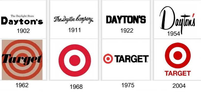
The Target celebrated logo has evolved over the years. Its current clean and highly recognized trademark differs slightly from the original logo that emerged and represented the brand in 1962 for almost six years. The iconic bull’s eye has had four minor updates over fifty–eight years. You can explore below the various stages that the trademark has undergone:

1962—Original Target Logo
The original Target logo appears in the market scene in 1962. It mirrors the actual target on a dartboard. The famous bull’s eye is a circular logo of three red and three white rings. Across the face of the bull’s eye is the brand’s name in solid black. With this emblem, the color white starts from the center.
1968—The First Logo Modification
The first modification came after six years of using the original logo. Its font, which was relatively hard to read on the first emblem, was erased, and the ring was also reduced. The changed logo featured two red circles and a white ring, with the white color starting from the center. Here, the font which appeared on the right side was italicized, colored white, and outlined.
1974—The Second Logo Modification
After another six years, the recognized emblem underwent its second refreshment. With this modified logo, the two red circles and a single white circle were maintained, but the white italicized font was replaced with a solid black. This change improved the readability of the font. The bull’s eye became smaller, and the uppercase font maintained its position on the right.
2004—The Third Logo Modification
The Target logo underwent a slight update in 2004. The only thing that changed was the typeface, which moved from black to red and became a bit smaller than the bull’s eye. Instead of the right side, the brand’s name went below the iconic bull’s eye.
2018—The Fourth Logo Modification
After 14 years of leading the brand, the target logo underwent refreshment. This time, the uppercase letters beneath the circular symbol gave way to lowercase letters. And though the bull’s eye remained the same, it had a vibrant red color.
Why the Target Logo Works?

For any logo to be effective, you must create it with a precise aim in mind while aligning with branding practices. With its minimalist design style, the Target logo conveys its mission and vision with no ambiguity.
Also, its corresponding and contrasting colors make it stand out from the crowd. As a simplified logo, it looks awe-inspiring and recognizable across all promotional channels. In effect, this creates an instant emotional relationship with its customers.
For the over five decades that the logo came into existence, it has remained relatively the same with minor changes. The consistency of its brand’s persona has resonated with customers and created a sense of trust.
In 2003, the company conducted a survey that revealed that about 96% of shoppers recognized the bull’s eye. These loyal customers perceive the logo to represent a brand that sells quality products and adheres to best business practices.
The Target Logo Design Elements
 Design elements are crucial for any logo design. However, using many of them in a single logo can be problematic. The famous Target logo, from all indications, is the work of a thoughtful masterpiece. It has fewer design elements, which gives it a distinctive appearance, precision, scalability, relevance, memorability, and timelessness.
Right from the beginning, the designer aimed for a minimalist design style. He opted for a symbol that is synonymous with the company’s name. Let’s explore further the three design elements used in the Target logo design.
The Target Symbol and Shape
- The Target Circles
Though some people refer to the center symbol as a dot, most people also identify it as a circle. In effect, the current Target logo has three circles which convey an idea of completeness, movement, and timelessness. They also represent the unity between the company and its stakeholders—directors, suppliers, employees, customers, etc.
- The Numerical Three
Numbers have their symbolism and emotions that they communicate. The three circles represent three numerical numbers. In numerology, it resonates with creativity, effective communication, and distinctiveness. It also exudes good taste, sociability, and expansion.
The Target Logo Colors
- The Red Color:
Red is one of the adoring colors for Target. It’s there to capture the attention of both loyal and potential customers instantly. For incorporating red into the Target logo, Target wants customers to perceive it as desirable, lovely, vibrant, and powerful.
- The White Color:
Complimentary colors give clarity to Target’s logo. And the white color does it perfectly well by providing a massive contrast to the red color. The color white represents cleanliness, humility, simplicity, and peacefulness. These are the values that Target wants customers to associate with its brand.
- The Black Color
Black is the next color that conveys the right ethos of the company. Mostly, the company uses it on its wordmark. It represents formality, elegance, authority, and strength. It harmonizes with the other colors to give a magnificent personality to the iconic trademark.
The Target Logo Typography
Target adopted the Helvetica Neue Bold Font. Though it’s a readable font, it created few legibility challenges on how the company used it in the past. Now, the Target logo is highly identifiable that the company uses it without the wordmark.
Who Started the Target Company?

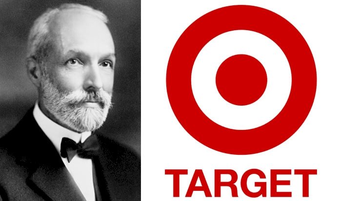
The Target retail store was originally called Goodfellow Dry Goods Company and traced its founding lineage to George Draper Dayton. He was born on 6th March 1857 to David Day Dayton and Caroline Draper Wesley at Clifton Springs, New York.
As a devoted religious teenager, he dreamed of becoming a church minister. However, he ended up a successful entrepreneur. He developed a strong interest in real estate and started buying farm mortgages in Southwest Minnesota.
In 1878, he married Emma Chadwick, and five years later, they moved to Worthington, Minnesota. He spotted massive business potential in his new environment and invested wisely. He established the Minnesota Loan and Investment Company and became the head of the Bank of Worthington.
As a Sunday School Teacher and a devoted Christian, he became a church clerk and a trustee of Westminster Presbyterian church while also been part of the Worthington Board of Education.
In 1918, he formed the Dayton Foundation with $1 million to improve people’s lives in his community while supporting his church with a colossal amount of cash. Today, the foundation’s name is Target Foundation.
At the age of 80, George Dayton died of cancer, and he was buried in Minnesota. It was on 18th February 1938, and after that, his sons and grandsons took over to continue with his legacy.
How Target Got Started
“Expect More. Pay Less” is the tagline of Target. It prides itself as one of the largest discount retail stores in the United States of American.
It all started in 1881, when the American Banker and Real Estate Investor, George Dayton, set out to explore the Midwest economy’s business potential. He landed in Minnesota, where he bought land at Nicollet Avenue.
In 1902, he invested in Goodfellow Dry Goods Company, the fourth largest department store in Minneapolis, Minnesota. A year later, the owner retired, and George Dayton took full ownership of the store. He changed the store’s name to Dayton Dry Goods Company, and he became the first President.

The company modified its name again in 1911. This time, it settled on Dayton Company to simplify the name and depict its growth and expansion after a decade. In 1916, the Retail Research Association was formed, and the company was part of its founding members.
Two years on, and the association changed its name to the Associated Merchandising Corporation. It became the umbrella cooperative association for the leading retail brands.
In 1920, freight forwarders embarked on a strike action that affected the movement of goods from New York to Minnesota. With this potential threat, George Dayton airlifted his merchandise. Later, this inventive way of transporting goods became part of the American culture among entrepreneurs.
The company launched a radio station in 1922. It became part of the six radio stations in Minneapolis, but the first by a retail store. It became the most powerful and popular radio station in the community.
The life of the mercurial entrepreneur ended in 1938 when he succumbed to cancer. His son George N. Dayton took over as President. And in 1950, his grandchildren—Donald, George II, Kenneth, Wallace, Bruce, and Douglas took vital positions in the company.
 In 1962, the board, to launch a new retail store, asks Stewart Widdes, a former Dayton’s Director of Publicity, to find a suitable name for the new store.
Together with his team, they came up with 200 potential names. However, Target became the official name, leading to the birth of the Target logo. In 1966, Target launched its Denver store, the first outside Minnesota.
How Big Is Target?
Today, Target is the second-largest discount retailing store in the United States with close to 1,900 locations. Its wide range of products includes but is not limited to food and beverages, baby products, furniture, apparel, toys, electronics, personal care, pets, games, and school supplies.
Its innovative app, cartwheel, has helped customers save over $160 million for buying from its website. In partnership with Facebook, they developed the digital coupon app, which attracts 1.2 million visitors daily.
Target has made it convenient for customers to use third-party chip cards to buy from their website. With over 40,000 items, customers can purchase and pick up the items at a nearby Target store within a few hours.
By the end of 2019, Target has a total workforce of about 359,900 employees. In the same year, its sales volume stood at $75.3 billion, total assets at $41.29 billion, and net income at 2.93 billion. Also, it operates four subsidiaries, namely Target Brands, Inc., Target Capital Corporation, Target Enterprise, Inc., and Target General Merchandise, Inc.
Bringing the Curtains Down
Target, like many successful brands, has evolved from a small local store to a worldwide retail giant. Though some blood relatives have been liabilities to some family businesses, George Dayton has proven that it can be a valuable human capital when planned and nurtured well. His sons’ and grandsons’ involvement in continuing and expanding the business to its present state is an obvious testament.
Target has grown to be the preferred retail store because it offers quality merchandise at an affordable price. Furthermore, fair business practices and charitable works are powerful strategies that have contributed to its successes.
More so, it would be unfair to examine Target’s achievements without showering praises on its familiar trademark. The bull’s eye emblem has kept its core message intact over the years, contributing massively to its popularity, increased customer base, and impact on sales revenue.


