The Samsung logo and the history of the company.
Samsung is one of the biggest technology companies on Earth, earning billions of dollars in turnover and producing hundreds of product lines. They voted the 6th most valuable global brand in 2019, and this is in no small part to the iconic Samsung logo – the unique white font onto a blue oval background.
Samsung’s logo is recognized the world over and is a symbol of prosperity and innovation. Today, we take a closer look at the Samsung logo, how it came to be, how it came to be the logo we all know.
The History of Samsung
Today, Samsung is a major global electronics producer who has taken a gigantic slice of the market pie in recent years. Their success has been virtually unparalleled by any competitor in their vertical, and the end to that success seems nowhere in sight.
However, did you know that Samsung was initially founded on the basis it would become a food distributor, not an electronics powerhouse? They supplied rice, dried fish, and noodles into neighboring China and Manchuria, and from the ’30s onwards, they provided a wide range of rice vodka and wine brands. As the business grew, it gradually changed direction and appearance – as did the now-famous Samsung logo.
What did the logo look like back then?

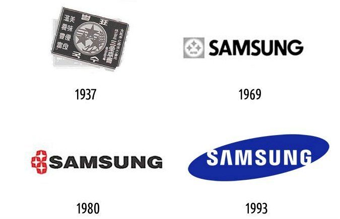
The logo almost resembles a postage stamp, with its fonts, colors, and format looking like something the government would have involved themselves in. Framed by white hieroglyphs, there was a circle on a black shield, and you can see the three stars in the center of the frame along with a branch and a strand of wheat, which represents the company’s agricultural roots.
 The word Samsung translates to ‘three stars’ in Korean, hence the inclusion of them here in the original logo. The company’s founder, Lee Byung-Chul, has never explicitly stated the exact meaning behind the three stars of the loo means, but perhaps it was about his three sons who were always going to inherit the company and help it become the global phenomenon it is today. Maybe the stars symbolized the success that was destined to follow his three boys. Whatever the reason was, the three stars logo became a staple site in Korean life and viewed as a lucky and prophetic symbol.
How did the logo change over time?
By the middle of the twentieth century, Samsung was looking to move beyond dried fish and noodle packs and into more significant and more lucrative markets. Their first move was to get involved in the insurance and real estate business, and they most likely would have succeeded in those areas were it not for one huge, earth-shattering event. World War II broke out.
 The Second World War was very tough in southern Korea, and its government made a political decision after Imperial Japan overran the country. The Korean government reviewed the 30 most profitable companies and endowed them with lower taxes and improved industry development funding. Samsung has moved away from insurance and property and taken down the road of electronics by the Korean government, a decision that the world is still benefiting from today!
As for the old-fashioned noodle and agriculture inspired design? That changed over time as well. The company wanted to redesign the logo to encapsulate their most recent successes in the technology and electronics fields. Neighboring countries and nations from across the world would recognize Samsung as a high-tech right supplier. For this reason of international appeal, they wrote the logo in English, and the three stars moved to the left of the fonts.
The Attributes of the Samsung Logo
The Shape of the Logo
The first Samsung store was so small that it did not even bother displaying the logo on packaging nor products until 1958, just before Samsung’s business boomed in the 1960s. With the new insurgence of success, they were going through came a new logo, and they celebrated their status with a brand-new design.
This new logo was a rectangular shape that contained a circle with three four-pointed stars in it, and the name in English, ‘Samsung,’ was to the right of the emblem.
In 1980, the logo changed once as Samsung altered the emblem to the left of its brand name. This new emblem was three four-pointed stars within three slightly squarish shapes stacked on top of each other. The modern version of the Samsung logo was revealed in 1993, and it is the first logo in the history of the company not to include the famous three stars emblem within the logo.
The Color of Samsung Logo
The color scheme of Samsung’s first three logos were lackluster at best. They were all shades of grey, black, and white that could easily be printed and reduced in size for any packaging medium. Starting in the 1980s, however, Samsung added a lot more color to its already famous logo by making the shapes around their four-pointed stars red while keeping the remainder of the logo a plain black.
Eventually, they decided to create a softer looking image by switching the font of the logo from black to white and including the calming blue shade that we all know today.
The Samsung Font
As mentioned before, Samsung’s first logo was not in English but written in the Korean script. When they branched out to an English-speaking market, Samsung opted for a simple, all capital san-serif Helvetica-inspired font. This font was made thicker and broader during the 1980 logo, before returning to a thinner font for the modern-day.
The Influences
Every design element of the Samsung was carefully planned by a team of experienced designers, despite its simplistic appearance. Removing the horizontal bar on the ‘A’ was an intentional decision intended to make the font look more dynamic and show the ambitions of innovation that the company held.
Samsung also decided to leave a small part of the ‘S ‘and the ‘G’ open to convey open-mindedness and communication. They chose blue as the background as it is a corporate color, and it is most often associated with reliability, stability, and responsibility.
How the Samsung logo evolved
In the 1980s, the entire world switched to color television, which meant the whole world had to adapt along with it, and as black and white TVs became a thing of the past, so did black and white logos. Samsung is ready to provide the world what it wants, and therefore the logo couldn’t remain colorless, and so it was altered into full Technicolor. This new logo was also designed by American investors, who Samsung thought would give the image more of a modern, western edge.
1993 was the next year that three stars would change its logo appearance once more. The modern, western design worked well and made Samsung a famous international company, but their next step was to move up to becoming a global empire. The world was changing, the ’90s saw technology companies’ boom, and the internet turned the world into a big neighborhood. Korean workers and western workers dispatched to each other’s nations, creating new, exciting cultural exchanges. The world was changing again, and the logo had to change along with it.
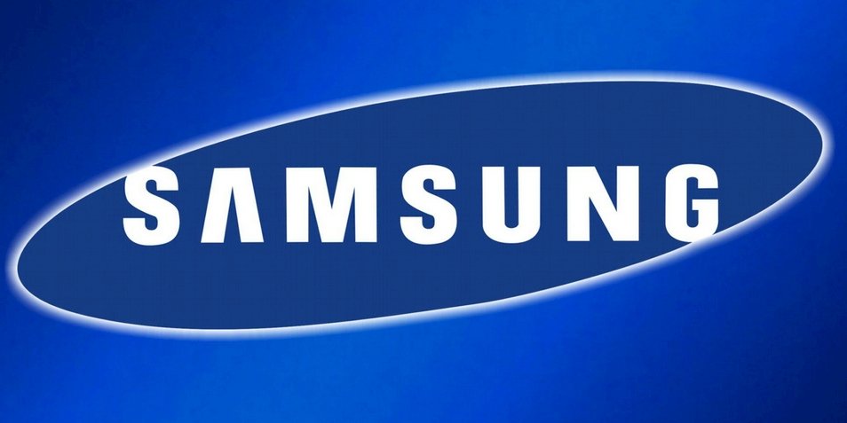
Here it is. The variation of the Samsung logo we all know and love the oval, the futuristic font, the calming background.
The meaning of the new Samsung logo
 The blue oval and the white letters make an appearance for the first time. For the first time, the three stars are missing from the logo, but the connection with space and the stars remains with the shape of the oval surrounding the fonts, symbolizing the form of our universe.
If you look closely, you will see that the letter ‘S’ was designed to look like spilling outside of the blue oval and into outer space beyond. The same is also true of the lower part of the letter ‘G.’ Designers made these decisions deliberately as this symbolizes Samsung’s willingness to be open to the whole world, to everything new and developmental perfection. Blue, being the color of the ocean and sky, represents serenity, confidence, and reliability.
Initially, the logo was going to include the word, ‘Electronics’ beneath the main font, but the company decided for a more straightforward, less wordy design, and left the company name. Samsung is always open to altering their logo as sometimes the blue oval can disappear entirely from the logo, as evidenced by the Chelsea football club shirts, which Samsung are the official sponsors.
In Conclusion
Samsung has gone from noodle supplier to 98″ inch TV screen suppliers, and their profitability and market share in that time has been extraordinary. Every mountain that has been put in the way of this company they have scaled and conquered, whilst always remaining humble and open to learning.
On the subject of mountains, British Alpinist, Kenton Cool, climbed Mount Everest in 2011. After the long, arduous climb to the summit, he noticed that his Samsung Galaxy S II phone was working fine, and he had a full bar of signal. He sent the following tweet from the summit of the highest mountain on Earth:
“@KentonCool: Everest summit no 9! 1st tweet from the top of the world thanks to a weak 3G signal & the awesome Samsung Galaxy S2 handset!”
It was a very proud day for Samsung s the world saw that their smartphone could generally function at 29, 000′ feet above sea level. This is just one of the ways that Samsung continues to push forward the world of technology, and that famous blue and white logo has become a symbol of innovation and prosperity as well as hard work and good value.


