
A look at the Kia Logo and the history behind the auto giant.
The Kia logo, from its inception, has represented the company well. Also, it has blended the elements of designs expertly throughout its branding history. The official color of Kia is red and white. The red stands for the company’s passion and energy, and the white stand for loyalty and purity. Another element of design worth-noting is the ellipse shape encircling the letters, Kia. This shape symbolizes the earth, and it denotes Kia’s global presence.
Further, Kia uses a simple custom logo typeface. These three-dimensional letters denote youthfulness, and it ensures easy readability- a hallmark of any robust logo design.
Companies come and go, but few can stand the test of time. In today’s competitive environment, for a company to stay competitive for over two decades, it means that the company is doing something innovative and beneficial for consumers. The likes of Coca-Cola, McDonald’s, Disney, Mercedes-Benz, Samsung, Alibaba, Nike, Toyota, Nestle, and Kia are prominent examples.
What do these global brands have in common?
The foundation of a great company depends strongly on its having a visionary leadership, quality product, powerful brand, ready market, and the ability to attract funding. This is what I called the five pillars of business. These pillars, when aligned strategically with the vision and mission of the company, guarantee success. This is what elite companies have in common, though they might operate in different industries.
![]() Kia Motors, the South Korean Tigress, has used the five pillars to start, grow, and expand its business into a global icon. It has defied all odds for 75 years to remain competitive in the business environment. It has a unique story and an excellent record worthy of exploring. In this article, I will explore the Kia logo and the incredible history behind the company. I will limit my focus to the following questions:
Kia Motors, the South Korean Tigress, has used the five pillars to start, grow, and expand its business into a global icon. It has defied all odds for 75 years to remain competitive in the business environment. It has a unique story and an excellent record worthy of exploring. In this article, I will explore the Kia logo and the incredible history behind the company. I will limit my focus to the following questions:
- Who was behind it?
- What are its product ranges?
- And how has Kia evolved?
The History of Kia
From a humble start to a global brand, Kia is arguably one of the largest brands and automobile makers in the world. With sales of 2.8 million vehicles in 2019 and a prestigious ranking as the second-largest automobile producing company in South Korea, only to Hyundai Motor Company, Kia is a company worth spending time to study. Kia association with automobiles wasn’t the case from the beginning. It has evolved from making smaller items for bicycle users to the manufacturing of luxurious cars for the world. Let’s meet the man who started it all.

In 1905, Kim Chul Ho was born in Korea. As an ambitious teenager in search of better opportunities, Little Kim moved to Japan, where he found work in a steel mill. With the technical know-how gain from this job, he started a business making bolts and nuts for bicycle users in Osaka, Japan.
In 1944, Kim moved back to his native country, Korea, and found Kyungsung Precision Industry. A company that makes bicycle parts and steel tubing. Nine years later, the company changed its name to Kia Motors.
The name Kia is not a shortened version of its former name (i.e., Kyungsung Precision Industry) or any other acronyms. Instead, it’s a name that portrays the founder’s passion and vision of bringing something innovative out of his continent to impact the world: a feeling of patriotism.
According to South Korea’s oldest car maker, the name comes from the Sino-Korean words ‘Ki’ (meaning to come out) and ‘A’ (standing for Asia). In effect, the name Kia means ‘to come out of Asia,’ or ‘to rise out of Asia.’
As an ambitious company, Kia has made a tremendous impact in the transportation industry- from producing steel tubing and bicycle parts in 1944, first Korea bicycle in 1952, Honda-licensed small motorcycles in 1957, Mazda-licensed trucks in 1960, and their cars in 1974 among other innovations. Unfortunately, Mr. Kim died in 1973 before the Kia Brisa range of compact cars was released into the market.
As any veteran businessman will expect in business, Kia encountered some challenges on its way to the top. Before some of these challenges, Kia built its first automotive assembly plant, the Sohari Plant, in 1973 to produce the Brisa fleet of compact cars.
The production continued until 1981, when Chun Doo-hwan, the new military dictator, enforced industry consolidation. To comply with this directive, Kia gave up on the manufacturing of passenger cars and directed its resources to the production of light trucks.
In 1992, Kia sold its first fleet of cars in the United States. Five years later, the Asian Financial crisis impacted the company terribly. This negative impact forced them to agree with Hyundai Motor Company in 1998 to create a mutual partnership between them.
With this agreement, Hyundai Motor Company holds about 34% stakes in Kia Motors, outbidding Ford Motor Company, which had a strategic interest in Kia Motors since 1986. Kia Motors also keeps some stakes in about 22 subsidiaries belonging to Hyundai Motor Company.
With the core focus on design and the need to remain competitive in the European market, the company brought in Mr. Tom Kerns from Cadillac and Mr. Peter Schreyer from Volkswagen, both Chief Design Officers. These two designers were very instrumental in the redesigning of Kia’s production line. For instance, Mr. Peter Schreyer designed the ‘Tiger Nose.’
Other few models of the company are Kia Cadenza, Kia K900, Kia Optima, and Kia Soul.
The History Of Kia’s Logo
A powerful brand is one pillar of a great company. It’s as essential as the other assets that a company uses to conduct its business. In marketing, it’s called the silent salesman. From 1953 to date, Kia’s international logo design has undergone six transitions. Interestingly, Kia is one of the few if not the only company that has two logos representing it at the same time: a text-based logo and a stylised-K logo for both the international and local markets, respectively.
![]()
In 1964, the company redesigned its logo to reflect its new line of business–the manufacturing of license cars. This time the logo featured a new circle with a diagonal line coming out of it and looking upwards towards the right. This logo design looks like an upside-down letter Q, and it’s all green.
Kia, in 1986, revisited its logo design. This time the logo design comprised a stylized word-mark, drawn in thick bold lettering of custom typeface, with a waving line attached to the upper part of the letter ‘K.’ The new logo had two colors-black and sky blue.
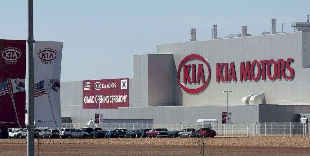
Kia designed the most familiar logo that we knew today in 1994. It is a text-based logo that spells out the company’s name elegantly. This logo has three uppercase letters resting in an ellipse with the ‘A’ missing its horizontal line. The company proudly uses this custom logo design on its international fleet of cars.
In 2004, the same custom text-based logo design that we all know underwent a slight modification–this minor modification makes the red color look brighter.
There’s another logo that people hardly see around because it’s mostly used in their local market- the K logo. This logo featured a stylized letter K designed with white lines resting in a black ellipse.
Kia is working hard to introduce another logo to the market. In July 2019, the company sent an application to the Korea Intellectual Property Right Information Service (KIPRIS) to register its new logo. The trademark application is still under consideration as of this writing. Compare to all the previous logos, most people think this angular logo design is the most stylized logo Kia has ever made.
The Popularity of Kia’s Logo.
KIA just launched a new logo in early 2021. ![]()
Amid other automobile brands on the market, customers can easily recognize the Kia fleet of cars. Thanks to its simple but legible custom logo design. Without this identifiable symbol, Kia cars will look generic, and customers could quickly credit it to any other automaker in the industry.
Inspect Hyundai ix 35 and Kia Sportage or Audi R8 and Lamborghini Gallardo. Without their logo designs, can you tell their manufacturers? I guess not! Identification is one function of logo design, and Kia has gotten it right.
A 2019 report, compiled by Interbrand, put Kia among the top 100 brands in the world. Another report from the Car Logo put Kia among the top 50 car brands in the United States. Kia, in its seven decades, has built a strong global brand through education, donations, partnerships, sponsorships, controversies, and many other means.
The bad press gets more attention–the media will instead give more airtime to negative news than positive ones because people pay more attention to them. In 2012, after the investigation and audit report by the Environmental Protection Agency, Kia admitted inflating the fuel economy numbers in the United States. This negative event gave the company the chance to stage its position and to announce reimbursement to the affected car owners.
The Asian automaker is not new to sponsorship. In 2014, it was among the official sponsors of the FIFA World Cup held in Brazil. This tournament attracted approximately 3.4 million attendance from the 64 matches played. Add this to the millions who watched from home, and you will see the staggering number of people the Kia logo design reached.
In the same year, the Kia logo garnered another vital attention. This time, Pope Francis, one of the global iconic figures, was spotted riding in a Kia Soul. This is mammoth free advertising. The Catholic iconic leader commands about 1.3 billion faithful members who always find the time to either meet or watch him wherever he makes himself available.
Conclusion
At the various stages of transition, the Kia logo has communicated the company’s vision and its offerings to its audience. This shows how long the company has stayed in the topflight business.
The ellipse shape of the logo reminds stakeholders of the company’s vision of selling globally. It also magnifies the company’s position to produce eco-friendly cars to protect the environment.
Its simplicity, style, and uniqueness show in their cars. Kia cars provide comfort, style, luxury, and innovation while giving value for money.
Finally, the red-bold typeface that spells Kia sends a passionate signal of the company’s courage to face the future.


