Let’s get an insight into the Cadillac logo and some history behind the automobile maker.
Cadillac is one of the most idolized and recognizable brands in the world. Also, it’s the second oldest American carmaker. And for over 100 years, the American automobile brand has led and pioneered several innovations in the car industry. That’s why it focuses on luxury cars.
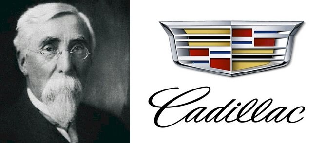
It began in 1902 in Detroit, Michigan, taking on the name of the city’s founder. On records, historians identified this French explorer as Antoine de la Mothe Cadillac. In addition, Henry Leland, Cadillac’s founder, adopted Cadillac’s coat of arms as the company’s emblem.
This trademark, unveiled in 1902, differs from the modern logo. Yet, customers can still feel its core values. Today, the Cadillac logo released in 2014 looks elegant, keeping only the refined crest. You’ll find colors such as silver, white, red, yellow, blue, and black projecting its charm.
Cadillac Logo Evolution
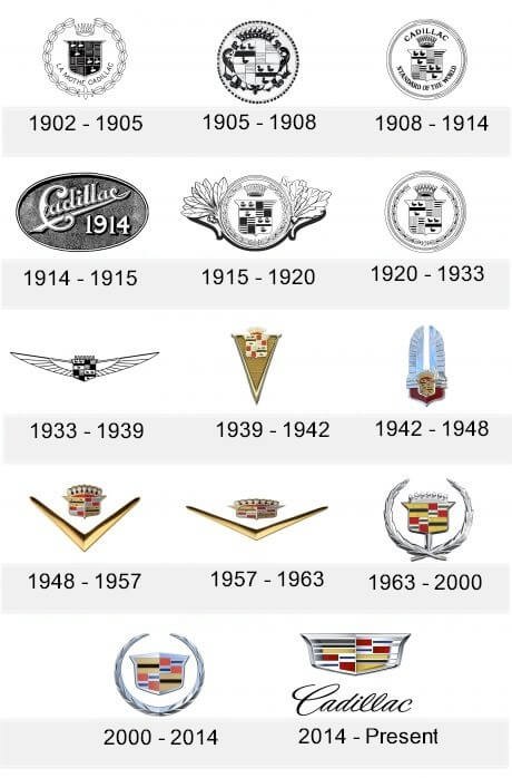
What can you expect from a Cadillac symbol that’s about to mark its 120th birthday? In most cases, more changes. And that’s precisely the situation with the Cadillac visual asset. Though Cadillac has had several logo designs over the century, I will focus on the 14 prominent ones.
So without waiting, let’s enter the garage to learn more.
1902—The Original Cadillac Logo
Cadillac unveiled its first logo in 1902. Some people recognized this emblem as the coat of arms of the La Mothe family in France. The iconic emblem comprised a crown, crest, ducks, parallel lines, and a wordmark. Finally, the designer kept these elements in an ornate circle. This frame resembles a chain of petals, and it ruled for about three years.
1905—The Second Cadillac Logo
Cadillac’s second logo came in 1905. Again, it drew inspiration from the previous version. This logo comprised a smaller circle inside a larger one with some black elements around it. More so, the smaller ring housed six ducks and some checkers. Also, there was a floral element and a crown attached to the smaller frame. It also ruled for three years.
1908—The Third Cadillac Logo
Aiming for simplicity, Cadillac updated its visual ambassador in 1908. This logo featured a crown, crest, and a tagline—Standard of the world in caps. Also, you’ll spot the six ducks and the checkers on the crest. Finally, the nameplate—Cadillac, also in caps, soared above the crown. It reigned for about six years, paving the way for a spherical emblem.
1914—The Fourth Cadillac Logo
In 1914, Cadillac altered its logo again. It marked its third update in twelve years. This logo comprised the nameplate—Cadillac executed in a decorated typography. The designer underlined the wordmark and placed it inside a black spherical frame. Sadly, it stayed for a year.
1915—The Fifth Cadillac Logo
Cadillac’s fifth logo borrowed some design elements from the 1908 edition. Besides the crest and ducks, the designer added a floral wreath and a crown. Then, he attached two leaves at the ends of the frame. Graphically, these elongated leaves evoked the sight of wings. Happily, this emblem represented the company for about five years.
1920—The Sixth Cadillac Logo
In 1920, Cadillac released yet another circular logo. With clarity, this emblem reigned for almost thirteen years. Also, it kept its 1908 design but with a minor change. Besides the crest, ducks, and floral ornate, the stylized crown came with seven pommels. Unlike the previous one, it had no inscription. It looked bold, clean, and modern.
1933—The Seventh Cadillac Logo
For the next six years, Cadillac used a winged emblem. Again, it took inspiration from airlines in the United States. The logo comprised the iconic Cadillac crest with its ducks and checkers. The crest had broad wings and seven pommels, representing the crown.
1939—The Eight Cadillac Logo
In 1939, Cadillac ushered in its eighth visual diplomat. It featured the crest and its elements on the upper part of a triangular frame. Besides the crown, the frame had several rows and columns of rectangles. Flexibly, it came in both colored and monochrome color schemes. It also stayed with the automobile maker for about three years.
1942—The Ninth Cadillac Logo
Keeping faith in metallic style, Cadillac went for a redesign. Here, the iconic crest with its crown sat at the center of a winged shield. The designer executed the novel symbol upwards. And for about six years, it reigned religiously.
1948—The Tenth Cadillac Logo
For about nine years, the automobile maker introduced a new logo design. Though it contains several elements, we can limit them to two— a V-shape and the official crest. Again, you’ll spot the crest above the wide-opened symbol—V.
1957—The Eleventh Cadillac Logo
After nine years, Cadillac updated its V-logo. Compared to its forerunner, this edition is more expansive in persona. Besides this change, the other elements remained intact. Luckily, the company used it for almost six years before saying adieu to it.
1963—The Twelfth Cadillac Logo
To create the 1963 logo, Cadillac blended two graphic symbols from its past. They comprised the floral wreath around the official coat of arms. Again, this design dazzled in five colors—black, blue, red, white, and yellow. Regarded as the most famous Cadillac logo, it lasted for thirty-seven years.
2000—The Thirteenth Cadillac Logo
To evoke its touch of innovation, Cadillac refined its visual ambassador once again in 2000. This marked its twelfth redesign. The coat of arms and the wreath took on metallic personalities. However, the ducks and the official crowns were absent. Overall, the emblem looked modern, sleek, and progressive. It lasted for about fourteen years.
2014—The Current Cadillac Logo
Today, the Cadillac logo comprises an emblem and a wordmark. You’ll find a cursive inscription—Cadillac below a modern crest. A closer look shows the coat of arms has undergone a subtle refinement. It looks sleek, elegant, and eye-catching.
Cadillac Logo Design Elements
In the earlier emblems, you’ll find several graphic elements telling the Cadillac’s story. For instance, besides the colors, you will see a crown, wreath, wings, ducks, etc. But today, the coat of arms without the original design elements stands alone.
Now let’s explore these features further.
Cadillac Logo Shape And Symbols

1. A Crown:
Most Cadillac logos used a crown. It was one of the idolized graphic elements. A crown is a symbol of royal appetite. So it symbolizes glory, power, and nobility. Throughout civilization, kings, queens, and emperors used it to convey their authority and identity.
2. A Wing:
On some occasions, we saw the company using a wing to tell its brand story. The company unveiled the first winged logo in 1915. Often, people associate wings with angels, fairies, and demons. And, symbolically, wings carry the emotion of power, speed, and freedom.
3. A Wreath:
The laurel wreath is another famous design element that has served the logo well. From an abstract to a metallic feel, the wreath was ignored in 2014. This shows how powerful its presence was to the company. In most cases, a wreath signifies the cycle of eternal life. Also, it symbolizes honor and victory.
Cadillac Logo Colors
1. Black Color:
The color of mystery, black, is one of Cadillac’s custom hues. Besides the nameplate, you can find it on the coat of arms. Black symbolizes elegance, strength, and authority. But, again, it can also promote the feeling of fear, aggression, and sadness.
2. Silver Color:
The Cadillac logo has a metallic persona. Notably, the silver color highlights this specific emotion, and it represents riches and wealth. Again, it symbolizes sleekness, modern, high-tech, and industrial. Its presence in the logo makes it lively and playful.
3. White Color:
White features highly in the logo design. Without it, the Cadillac logo would find it hard to attract enviable eyebrows. White, a neutral color, symbolizes simplicity, humility, and cleanness. Also, other brands used it to convey purity, loyalty, and peacefulness.
4. Blue Color:
The Cadillac’s iconic crest has blue painting 4 of its checkers. Seriously, blue is a favored color for technology and innovation. Also, it’s the color representing the ocean. And it signifies calmness, loyalty, and peace. On the flip side, blue symbolizes despair, depression, and solitude.
5. Gold Color:
Gold is the universal mark of a fiftieth anniversary. Essentially, three of the checkers on the Cadillac’s crest ride in gold. The color of precious metal signifies wealth, riches, and extravagance. But, also, it can represent prosperity and grandeur.
6. Red Color:
The red color paints four of the squares on the emblem. The positive symbolism of red includes courage, vigor, joy, and strength. But, contrary, it stands for danger, anger, rage, and hate.
What Font Is the Cadillac Logo?

Cadillac’s logo font is readable. But, again, a closer look at the calligraphy-style inscription shows a typeface similar to the English 157 font. More so, Vladimir Yefimovi designed this handwriting font.
Why Is It Called Cadillac?
In 1902, William Murphy, Lemuel Bowen, and Henry Leland came together to form Cadillac Automobile Company. They found the new company in Detroit, Michigan, United States of America. Therefore, to pay homage to the city’s founder, Antoine de la Mothe Cadillac, the owners opted for Cadillac’s last name.
What Does Cadillac Logo Mean?
To understand the Cadillac logo, you must know whom they named it after. The brand owners named it after Antoine de la Mothe Cadillac, a French military officer. Most people regard him as courageous and enterprising. Today, the brand still conveys these qualities. Also, you can tag it as the pioneer in the automobile industry.
Why Does the Cadillac Logo Have Ducks?
Happily, the six swimming ducks earned the name—Merlettes. In the logo, they divide themselves into two groups. You’ll find the first three on the upper left and the second three on the lower right of the crest. The company adopted them at the time of the crusade, and they conveyed the trinity belief. Also, the birds represent the lineage of nobility.
When Did Cadillac Lose the Ducks?
The ducks have featured in almost all the designs. And like an idol, Cadillac has revered them for over a century. However, the brand removed them from the year 2000’s design. And after this update, the logo looked more geometric, elegant, and energetic.
When Did Cadillac Change their Emblem?
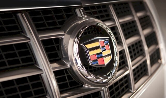
Since it began in 1902, Cadillac has changed its logo thirteen times. The first updates came in 1905. Then, after a series of changes, the last update occurred in 2014. During this period, the iconic laurel wreath disappeared, leaving the coat of arms alone.
Did Henry Ford Make Cadillac?
Cadillac Automobile Company traces its roots to the Henry Ford Company. In March 1902, Henry Ford left the company after a dispute between him and his partners. So, to liquidate the company, William Murphy and Lemuel Bowen brought in Henry Leland, an engineer.
However, instead of appraising the company, he advised the bankrollers to make cars. So, finally, Cadillac came into existence using Leland’s proven single-cylinder and the remains from the Ford Company.
Why Did Cadillac Remove the Wreath?
The wreath was one of the most used design elements in the Cadillac’s logo. However, the year 2000 was the last time it showed up. With the company focusing on innovation and modernity, it was critical to ignore it. The reason was apparent—The owners felt it was old-fashioned and not resonating with the brand’s current image.
Who Makes Cadillac?

Cadillac got started in 1902, and it took its name from Antoine de la Mothe Cadillac, the founder of Detroit, Michigan. Cadillac Automobile is an American carmaker that focuses on luxury cars. However, since 1909, it’s been owned by General Motors as part of its various brands.
Where Did the Cadillac Name Come From?
The nameplate—Cadillac came from the last name of the founder of Detroit. Legend has it that Antoine de la Mothe Cadillac founded the city in 1701. He was a French military officer and trader who enjoyed exploration and adventure.
Concise History Of Cadillac
Cadillac is an American automobile maker and a division of General Motors. The brand designs and builds luxury cars. Notably, its primary markets include the United States, Canada, and China. Also, the company has a presence across the world.
In 1701, Antoine de la Mothe Cadillac led a group of French explorers to the United States. Settling in the northern area of the country, they named the place Ville d’Etroit. Later, however, it became Detroit, an industrial hub for car plants.
Fast forward to 1902; two investors joined hands with Henry Leland to start Cadillac. Initially, the two financiers—William Murphy and Lemuel Bowen had worked with Henry Ford. Shortly after Ford left, the investors had wanted to liquidate the company.
However, Leland convinced them to stay in business. So with the remnant of Ford’s innovation and his (Leland) excellent engine, the three men got into the business. And to honor the name of the city’s founder, they opted for Cadillac.
In its first production year, Cadillac made available about 2500 cars. Then, in 1908, it won the British Dewar Trophy for excellence in technical innovation. This was the first award to an American carmaker. With its bright future, General Motors paid $4.5 million to merge with it.
In 1912, Cadillac unveiled the world’s first successful electric system. It powers the starter, ignition, and lighting. Then three years later, Cadillac released the first car with a V-8 engine. This allows the cars to run at 65 miles per hour. Then in 1954, it became the world’s pioneer in power steering. The company featured this innovation in its models.
Summary On Cadillac Logo History
Cadillac has a memorable history worth learning. In 1902, Henry Martyn Leland formed it in Detroit, Michigan. He named the company after Detroit’s founder, Antoine de la Mothe Cadillac. Then, after only seven years in existence, General Motors gained it for $4.5 million.
Also, he adopted Antoine Cadillac’s coat of arms as the logo for the new company. Since then, the Cadillac’s trademark has undergone several updates. Now, the emblem is more elegant, high-tech, modern, and visually pleasing. You’ll love to be in its driving seat.
Again, since its inception, Cadillac has championed many innovations in the auto industry. That’s why it has won the Dewar Trophy twice. Notably, the first American auto company to receive these prestigious awards from the Royal Automobile Club of England.

