
Let’s get an insight into the Dallas Mavericks logo and some history behind the basketball team.
The Dallas Mavericks are one of the competing clubs in the NBA—National Basketball Association. Also, they play in the Western Conference Southwest Division. Again, based in Dallas, Texas, the Mavericks play their home matches at the American Airlines Center.
Since the team began about forty-one years ago, it has won seven titles. These include four division titles, two conference championships, and one NBA Championship. Seriously, it took the Mavericks thirty-one years to lift their first NBA Championship.
In 1981, the Mavericks unveiled their maiden logo. However, this visual diplomat has changed over the years. Now the club has had four different logo designs over four decades. But, in 2017, the club unveiled its current logo. This emblem has a basketball and a horse inside a frame.
Also, the designer rendered the wordmark in a banner. Superbly, this design plays in four official colors—white, blue, silver, and black. And with a tiny star in it, it looks exceptional.
Dallas Mavericks Logo Evolution
Since it started in 1980, the Dallas Mavericks team has had four visual identities. However, it took almost over a decade before the franchise updated its emblem. Then, the second redesign came, changing it altogether. However, the last update kept the personality of its predecessor.
Without wasting time, let’s explore these changes.
1981—The Original Logo:
The first Dallas Mavericks logo comprised a letter, an icon, and a wordmark. Overall, they used three colors—blue, green, and white. This logo featured a blue letter—M with a white cowboy hat over a green basketball. You’ll spot the wordmark—Dallas Mavericks on the right. It represented the club for about twelve years.
1994—The First Logo Update:
The Dallas Mavericks had their first logo updates in 1994. Though they kept the unique personality of the original, the changes were visible. With this logo, the designer opted for a simple typeface. Also, he removed the outline colors from it. Compared to the original logo, this one had a lighter color shade. For about seven years, it represented the Dallas Mavericks club.
2002—The Second Logo Update:
The Dallas Mavericks redesigned their emblem in 2002. This logo had a stylized basketball with a horse’s head. In addition, this element had a crescent with the caption—Dallas above it. The designer further placed it on a silver triangular frame. Also, you’ll find a banner housing the inscription—Mavericks in all caps. At the tail end of the frame was a five-pointed star. The white and black star represents the lone star state, Texas. It ruled for about fifteen years.
2018—Now:
In 2018, Mavericks refreshed their logo once more. The new emblem kept all the graphic elements of its forerunner. However, it altered its hues. The silver shade on the stallion’s background and mane became darker. However, the designer rendered the blue on the basketball and the arched frame lighter. Overall, the logo looks attractive and modern.
Why Does Dallas Mavericks Logo Work?
1. The Logo Is Readable:
The Dallas Mavericks logo is effective because it’s legible. Thus the font choice makes it easy for fans to identify the team’s name. Never fall for a decorative typeface that makes your visual diplomat unreadable. Always be on the safest side by using clean typography.
2. The Logo Is Consistent:
Consistency is another quality that makes the Dallas Mavericks logo work. Interestingly, the club has kept its graphic elements intact for a very long time. And the net effect is trust. So, to imprint your brand in the minds of fans, stick with this.
3. The Logo Is Relevant:
Relevance is another essential quality in logo design. To make your logo applicable, it should relate to your industry. Luckily, the Dallas Mavericks trademark is effective because it has relevant design elements. Yes, it uses graphic elements suitable for its sporting field – basketball.
4. The Logo Is Scalable:
Marketing channels have grown, making entrepreneurs position their brands in specific places where their fans hang out. Happily, the Dallas Mavericks identity has passed this test. It can dunk on several promotional mediums without compromising its quality.
5. The Logo Is Unique:
Finally, the Dallas Mavericks logo works because it’s unique. You wouldn’t find any visual ambassador that resembles it. Therefore, its fans can interact with it without getting confused. To elevate your brand above competitors, you must design a distinctive logo.
Dallas Mavericks Logo Design Elements
Graphic experts advocate for more minor design elements—about two or three. However, the Dallas Mavericks emblem contains about six symbols and colors. You’ll find a hat, basketball, triangle, star, square, and horse. Though it goes against the rule, the arrangements of the elements make the logo appear clean and readable.
Let’s now study each of them carefully.
Dallas Mavericks Logo Shape And Symbols
1. A Hat:
The maiden Dallas Mavericks logo featured a letter—M with a hat. You’ll quickly notice the white icon as a cowboy hat. Ultimately, a cowboy hat is part of American pop culture. It represents heroism, protection, and elitism. Also, it’s a symbol of pride and power.
2. A Basketball:
A basketball remains the most consistent element in the logo. Quickly, it helps fans identify the team’s discipline. A circle is the most suitable geometric shape representing this sporting object. And as a universal symbol, it embodies unity, infinity, and wholeness.
3. A Triangle:
The Current Mavericks logo uses a triangular frame. It’s a symbol of enlightenment and revelation. In most fields, a triangle signifies creativity, harmony, and strength. Also, in Christianity, the shape symbolizes the trinity—God the Father, the Son, and the Holy Spirit.
4. A Star:
At the lower end of the Mavericks, emblem is a five-pointed white star. Most people regard stars as sacred symbols. In western cultures, it stands for stardom or champion. However, in religion, it signifies divinity, faith, and magic.
5. A Horse:
A horse is one of the most remarkable symbols of the Mavericks trademark. This majestic animal represents freedom and courage. Also, it carries the emotion of power, fearlessness, and endurance. But, again, you’ll be safe to use it to convey a sense of royalty, nobility, and wealth.
Dallas Mavericks Logo Colors
1. Black Color:
Black has a mysterious personality. In graphic design, it’s arguably the most used color, especially for the wordmark. On the Dallas Mavericks logo, the designer used it for the shadow, outline, and wordmark. The symbolism of this color includes elegance, power, and seriousness. But, don’t forget; it can also convey negative feelings—sadness, fear, and death.
2. White Color:
White is the next official color. It conveys part of the Mavericks logo story. The color of faith, white, represents simplicity, purity, and coolness. Also, it symbolizes humility, freshness, and perfection. And despite its good charisma, it has some negatives. This includes emptiness and isolation. Interestingly, white offers clarity to all logo designs.
3. Green Color:
In the original logo, Mavericks had green in its trademark. Powerfully, the blend of yellow and blue results in green. Therefore, it exercises some emotions from both colors. Green, the hue of nature, signifies healing, harmony, safety, productivity, and freshness. Yet, on the flip end, it conveys greed, envy, and materialism.
4. Blue Color:
Blue takes a sizable presence in the Dallas Mavericks logo. It serves as the background color for the horse and the wordmark. Experts associate blue with the sky and the sea. Impressively, blue stands for calmness, stability, and loyalty. On the opposite end, it can convey timidity, stubbornness, and sorrow.
5. Silver Color:
In the Mavericks emblem, silver paints the triangular frame. Just like gold, people consider silver a precious metal. So, it symbolizes riches and wealth. But, again, as a color having some traces of white, it can speak of calmness, maturity, and intelligence. In contrast, you can also use it to portray arrogance and a sense of supremacy.
When Did the Dallas Mavericks Change their Logo?
The first update came in 1994. However, the complete overhaul happened in 2002. Though some people might be against this move, there are good reasons for changing a logo completely. For instance, a change in ownership is one such reason. Interestingly, this was the Dallas Mavericks situation in 2002. And with Mark Cuban investing a whooping sum of $280 million in the franchise, he saw a new logo as an essential move to convey his brand identity.
What Is the Dallas Mavericks Mascot?
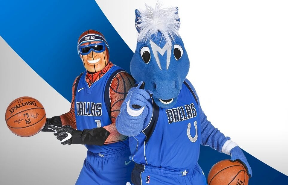
Champ and MavsMan are the two official mascots representing the basketball franchise. Together, they wear the team’s uniform and cheer it to victory on game days. Champ is a horse with blue fur and a white mane and tail.
Why Is the Dallas Mavericks Logo A Horse?
Maverick refers to a calf or unbranded cattle. So, why a horse and not a calf, bull, etc.? Well, the original logo had a cowboy hat. And it aligns with the Maverick personality. Similarly, the current logo has a horse, a close walking alley for cowboys. Though the connection might be subtle, both the hat and horse resonate well with the Maverick identity.
Why Are the Mavericks Called Mavericks?
At the start, the team had three names to choose from—Express, Wrangler, and Mavericks. So, the club allowed fans to vote for their favorite. At the end of voting, 4,600 fans opted for Mavericks over Express and Wrangler.
But the chosen brand name originated from a television series with the same name. Yes, Maverick is an American drama television series with a comedy focus. Roy Huggins created this exciting series in 1957, starring James Garner as a skillful poker player.
Concise History On the Dallas Mavericks Club
Formed on May 1, 1980, the Dallas Mavericks are an American franchise that plays professional basketball. The Mavericks play in the National Basketball Association as a member of the Western Conference Southwest Division. The team is based in Dallas, Texas, United States.
Initially, the leagues weren’t willing to extend a franchise to Dallas. The reason was simple—Houston Rockets and San Antonio were already in Texas. But, at the 1980 All-Star game, the league owners voted to let an expansion to Dallas. The expansion fee was $12.5 million.
So, after paying half of that amount, Donald Carter became the club’s first owner. In addition, the club became the twenty-third team to join the National Basketball Association. His wife, Linda’s passion for the indoor game, influenced Carter’s desire to buy a basketball team.
Five months after their formation, the Mavericks played their regular season. Here, they played at the Reunion Arena, beating the San Antonio Spurs 102–92. This game took place on October 11, 1980. In December, the club signed Brad Davis from Anchorage Northern Knights.
Brad played the final twenty-six games for the Dallas Mavericks. For the twelve years that he played for the team, Brad became instrumental in the team’s victories. Today, the club and its fans regard him as one of the greatest Mavericks’ players.
In 1981, the club signed three more players. They were Mark Aguirre, Rolando Black, and Jay Vincent. Jay was so good he led the team, scoring 21.4 points per game. With this incredible show, he earned the NBA All-Rookie Team honors. Also, the team improved its score to 28–54.
The Mavericks continued with their impressive form in the 1982-83 season. Though the team finished behind the Denver Nuggets, they recorded 38–44. That was an improvement compared to the previous one. And Mark Aguirre led the team’s scoring with 24.4 points per game.
In the 1983-84 season, the Mavericks finished 43–39, the first in the club’s history. Also, they placed second in the Midwest Division. So, for the first time, they qualified to play in the playoffs. Though they did their best in the playoffs, the Los Angeles Lakers humbled them.
In 1996, Donald Carter sold the franchise to Ross Perot Junior. With new owners, the club underwent a strategic overhauling. Shockingly, Mavericks featured about twenty-seven different players. Yet, they struggled to win the ultimate prize.

Then, on January 4, 2000, Mark Cuban bought the franchise. He also brought in a new direction for the team. However, it wasn’t until 2011 that the team and fans harnessed the enviable prize. In 2011, the Mavericks finished the season with fifty-seven wins.
As the third-seeded team, they put up an incredible showing against their opponents. At last, in the finals, the team beat the Miami Heat to win their first NBA Championship.
My Final Words On Dallas Mavericks Logo History
Affectionately, fans sometimes called their team the Mavericks or the Mavs. With $12.5 million, Donald Carter became the first owner of the team. However, the decision to extend a franchise to Dallas wasn’t clear-cut. It took until 1980 for the league’s owners to award the franchise.
Interestingly, fans chose the team’s name, Maverick. Overall, the club’s stakeholders received 4,600 postcards, favoring Mavericks over Express and Wrangler. Like other clubs in the league, the Mavericks have tasted both defeats and victories.
For instance, after thirty years without the NBA Championship title, they got it in 2011. This trophy came under the new owner, Mark Cuban. He bought the franchise from Ross Perot Junior in January 2000. But before this achievement, the Mavericks have won other titles.
Today, the Mavericks can brag of four division titles, two conference titles, and one NBA Championship. In addition, the franchise is worth over $2.4 million, according to Forbes.


