
A Look at the Vans Logo and the history behind this popular brand. Their iconic logo is seen on thousands of products all over the world.
Based in California, Vans is a renowned company that manufactures sports apparel and shoes. It was founded in 1966 when brothers Paul Van Doren and James Van Doren, together with Gordon C. Lee opened a little shoe factory and retail store. They also ran the factory and oversaw the entire production process. In 2004, Vans was acquired by the renowned VF Corporation.
The History of Vans
It’s quite difficult to imagine skateboarding without the Vans skate shoes. Variously considered the number one manufacturer of sports apparel and shoes, Vans has grown into a global brand and today even sponsors other events like snowboarding, surfing, and BMX.
In March 2016, Vans celebrated its 50 years of existence. Five epic decades of remarkable service and growth have made Vans one of the United States’ trendiest and coolest brands.
The Humble Beginnings
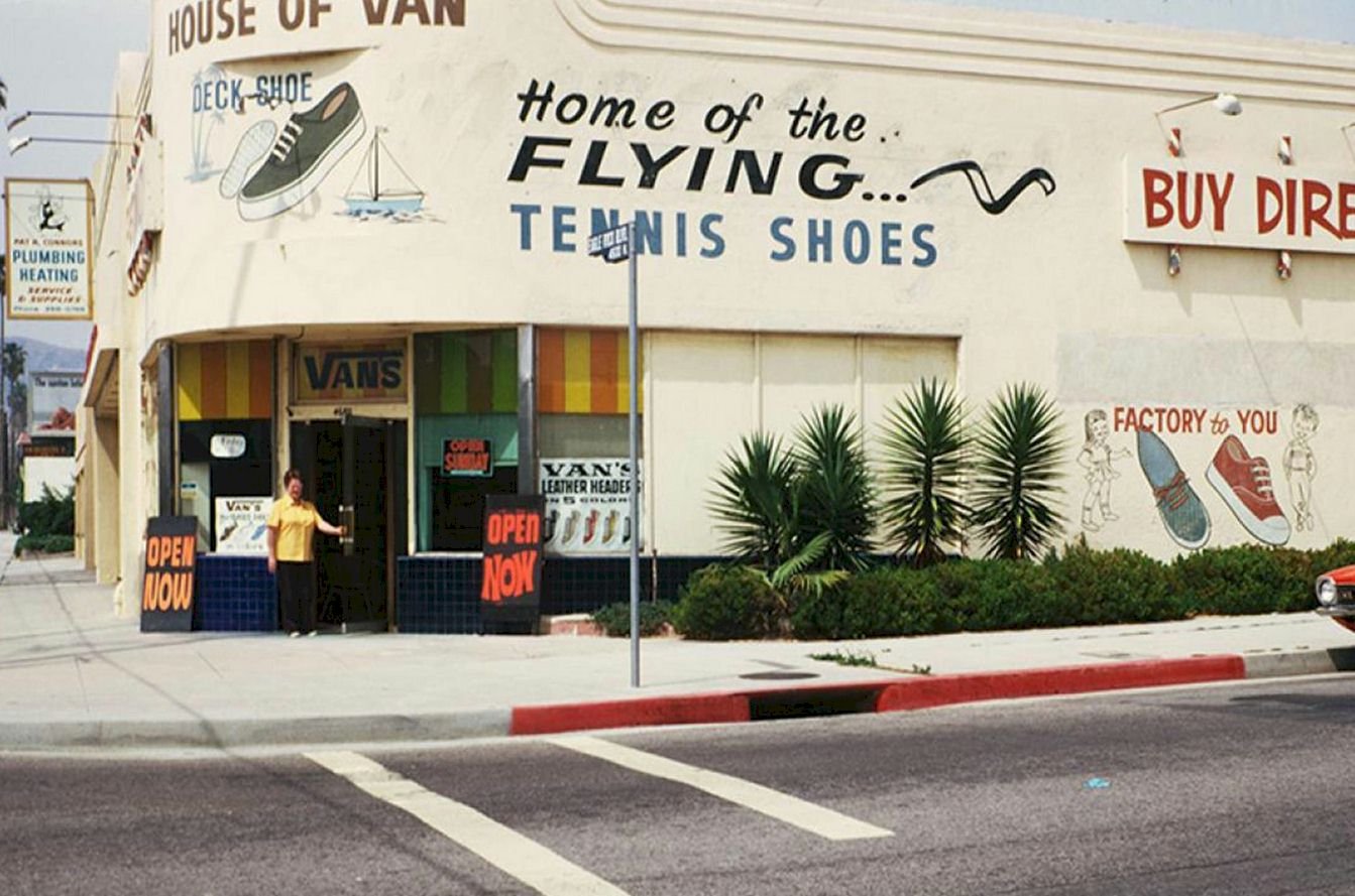
A small shoemaking store in Anaheim, California, is where it all began. The Van Doren brothers, along with Gordon C. Lee, started the company in March 1966, naming it The Van Doren Rubber Company.
Paul Van Doren was raised in Boston. Before he was even in the eighth grade, he’d dropped out of school to follow his other passions, including horse racing and other things 14-year-old boys liked in the 1940s.
Quitting school upset Paul’s mother so much that she took him to Randy’s, a shoe factory that was her workplace. There, Paul got a job sweeping the floor and making shoes. No one knew that this would shape and guide the young man’s future. Paul worked at the factory for 20 years, rising through the ranks to become the company’s executive vice president.
In the early 1960s, while Randy’s had risen to become the 3rd biggest shoe manufacturer in the United States, the company’s other plant in California was losing $1 million per month. Randy’s assigned Paul, his brother James, and longtime pal Gordon C. Lee the task of restoring the plant’s service and reputation. Within eight short months, the west coast factory was able to post even bigger profits than the Boston one.
After three successful months, Paul Van Doren told his family that he was leaving his job and launching his own shoe company. After being in the shoemaking business for almost his entire life, Paul learned that shoemakers were making just a few pennies per pair, while retailers were raking in all the dough.
Paul’s biggest dream was to become a shoe maker who also runs his own shoe store. The Van Doren brothers, along with Gordon C. Lee, took 12 months to create their own shoe company at 704 East Broadway, CA, known as the Van Doren Rubber Company. Since 1900, only three other firms had been manufacturing vulcanized shoes in America, namely Randy’s, Converse, and Keds.
When the trio’s company started in March 1966, their shoes even didn’t have names—just numbers. In fact, they only had a slip-on, a two-eyelet, and a lace-up. The styles were named No. 16, No. 19, and No. 20. The first price for men’s No. 44 was $4.49, while the women’s was $2.29.
After day one or two, a woman returned moaning about her yellow pair of shoes being too light and her pink pair of shoes not being shiny enough. Paul promised to make the woman a pair of shoes in any pink shade she wanted, therefore, Vans personalized shoes were made. The Van Doren Rubber Company made bespoke shoes for Catholic schools, drill teams, and cheerleaders in the entire southern California.
The main goal of the firm was to create the strongest possible footwear so that folks would show them off to their friends. The molds for waffle soles were made twice thicker than PF flyers. A better canvas as well as nylon, was used rather than cotton. The aim was to outlast all other shoes.
The company grew fast. They had ten stores in 10 weeks. Within 18 months, they had 50 shops. In the late 1970s, Vans made their first skating shoes as skaters’ shoes were wearing out so fast. The skating world propelled Vans to another level. Santa Monica skaters like Stacy Peralta and Tony Alva wanted custom skating shoes. Vans added the popular “Off the Wall” slogan and padded backs. The Skate Hi footwear also featured padded sides to protect skaters’ ankles in case their board flew off the wall of the empty swimming pool.
Vans’ success stems from lending their customers an ear. If customers wanted checkers on the feet, the company added checkers on the footwear. If they wanted crazy, two-tone colors, low-top, high-top slip-ons, the company delivered.
After over half a century in business, Vans sells shoes worth $400 million per year. The company sponsors professional athletes in many different sports, including snowboarding, BMX, skating, and surfing. Vans has managed to stay authentic throughout the decades while also being a fashion staple. Unlike Adidas or Nike, who make sports shoes with conspicuous breathable pockets or shock absorption features, Vans make original, tough, chic shoes that people always keep buying.
The Vans Logo
Vans is widely popular among athletes and young people. It’s all because the brand was originally designed for those who live an active lifestyle—more so skateboarders. The first logo even popped up on a skateboard, after which it was depicted on shoes.
First Logo
![]()
The first-ever Vans logo was created by the son of one of Vans’ founders. He created a stencil he intended to paint on skateboards. His father, James Van Doren, instantly noticed this graphic and put it on Style 95 sneaker’s heel. Then he decided to start the large scale manufacture of skateboarding footwear.
The Vans logo has the lettering “Vans,” which looks weird thanks to the stretched out, horizontal line over the letters A, N, and S. This line begins from the top right of V, which makes the letter look like the mathematical root sign. This design aspect is crucial, and it’s become the key feature of Vans’ visual brand identity.
Golden Jubilee Logo
![]()
In 2016, Vans logo creators made the logo red. The color symbolizes passion, energy, and joy. The white background exudes aesthetic sophistication and purity. The white and red palette is watered down with the black motto “Off the Wall” below.
The motto “Off the Wall” first appeared in the mid-1970s. Santa Monica skateboarders Stacy Peralta and Tony Alva narrated how they skated in an empty swimming pool. Tony bragged that he’d managed to fly off the wall and into the air. Then the fascinated Skip Engblom invented the term “Off the Wall”.
Vans decided to keep a catchy expression in their logo. Initially, the phrase was portrayed against a tortoise shell-like skateboard nicknamed “turtle”. Sometime later, the term “Vans” was added over the “Off the Wall” phrase. The new trademark was only used on skateboarding shoes. The rest of the items were decorated with the logo and the company’s name.
In 2016, the designers removed the skateboard from the old design and left the words only. But if the wordings were uneven at first, the font is now very unified. All the letters are symmetrical and uppercase. The dashes have the same length and width. Most lines finish at right angles and there aren’t serifs at the margins.
Vans Logo Design Elements
The present Vans logo is part slogan and part brand name. Atop this logo is an orangish, red wide rectangle. In white uppercase letters, the word “Vans” is depicted inside the rectangle. The letter V is a bit bigger than other letters, and there’s a horizontal line that starts at the top right of V and extends above all the letters.
Under the rectangle, there’s a pair of quotation marks around the Off the Wall phrase. The company’s motto is rendered in black, but with a similar font to the rest of the Vans logo. The uppercase, san-serif font has thick lines of the same width and some curves.
Changes and Evolution
![]()
While the popular vehicle emblem still appears on some Vans items, the company opted to switch to the more basic rectangular modern design as it looked more contemporary than the skewed design of the 1970s.
Font: All Vans logo versions use a bold, thick, all-caps sans serif font that stretches the letter V in a horizontal line above all the other letters. The font is a bespoke variation of Helvetica font, which became very popular for 1970s advertising.
Color: Earlier Vans shoes had a white band with blue writing. When the company changed its logo to the shape of a van, a bright red, orangish color was picked as it stood out more. The company briefly switched to a drearier black and white variant but then reverted to the original red. The current logo is red in a white background, while the motto is written in black.
Inspiration: Like many shoe designs, the skaters who wore Vans shoes directly inspired the company’s logo. Then, skaters loved to pull off crazy stunts in the numerous empty swimming pools of California. This was called flying “off the wall”. It was also a fancy trick that even inexperienced skaters could pull off.
Moreover, this turn of phrase is used to depict an eccentric or quirky person, so it perfectly fits in with the image of Vans. While the founding Van Doren brothers gave Vans its brand name, the name was also the inspiration behind the company’s van-shaped logo.


