
This is a look at the Burger King Logo and its Incredible history in the food industry.
Since first being founded in 1953, the Burger King logo and brand has grown to become one of the most recognizable and popular fast-food restaurants across the world, rivaling even the likes of McDonald’s for the king of fast food throne. Today, there are more than 13,000 Burger King restaurants located across 91 different countries, making it more than fair to call the chain an international success.
While much of the success that Burger King is of course owed to their tasty food and swift service, the famous Burger King logo has certainly played a role in the chain’s popularity as well. In this article, we’ll explore the history of Burger King, the origins of the restaurant’s logo, and how that logo has helped propel Burger King to the lofty status of one of the world’s most recognizable fast-food restaurants.
The History of Burger King
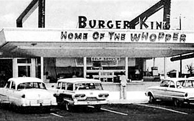
Inspired by the success of the McDonalds brothers, Keith J. Kramer and his wife’s uncle Matthew Burns decided to open their own, similar restaurant in July of 1953. This first restaurant was named Insta-Burger King and was located in Jacksonville, FL.
This first restaurant was built around a new piece of equipment called the Insta-Broiler, which proved very successful at quickly cooking tasty burgers – so successful, in fact, that use of the Insta-Broiler was a requirement for new franchise owners as the chain first began to expand.
By 1955 – just two years after the first Insta-Burger King was opened – the chain had expanded to forty different locations throughout the state of Florida. Despite this initial success, though, Mr. Kramer and Mr. Burns soon ran into financial troubles and were forced to sell the brand to a pair of Cornell alums named James McLamore and David R. Edgerton. In 1959, Mr. McLamore and Mr. Edgerton purchased the international rights to the chain and renamed the company Burger King of Miami. The name of the company was soon changed again to Burger King Corporation when the new owners started selling territorial licenses to private franchises located all over the United States.
While the company’s innovative flame broiler is what first put them on the map, Burger King added two more developments early in its growth that helped propel it to the worldwide success that it is today. The first of these was the Burger King mascot that they unveiled in 1955 – a character that would go on to become commonplace in all of the company’s advertising for the next 60 years. The next of Burger King’s developments was their signature burger, the Whopper. After deciding that offering an especially large burger was the key to bringing in more customers, McLamore created the Whopper and gave its now-famous name in order to convey “imagery of something big”.
In 1967, the Burger King franchise was sold once again, this time to the Pillsbury Company. At the time that Burger King was bought by the Pillsbury company, the chain had grown to a total of 274 restaurants located across the country and was valued at an estimated $14 million. Nevertheless, the corporation soon ran into issues regarding the management of its franchisees, which led to wild inconsistencies in its products. In order to right the ship, Burger King hired McDonald’s executive Donald N. Smith to oversee the restructuring of all future franchising agreements. Under Smith’s guidance, the franchise benefited from much better management, and franchisees were required to adhere to a strict set of rules that guaranteed consistent products and service across Burger King’s locations.
In 1989, the Burger King brand was sold for a third time, this time to British liquor company Grand Metropolitan for a whopping total of $5.7 billion. Thirteen years later, though, in 2002, Grand Metropolitan took a loss on their investment by selling the company for $1.6 billion to the capital investment firm Texas Pacific Group. They retained ownership of the brand for eight years before selling it once more to the brand’s current majority owner, 3G Capital for a total of $2.2 billion. Finally, in 2012, Burger King was taken public on the New York Stock Exchange and given the symbol BKW.
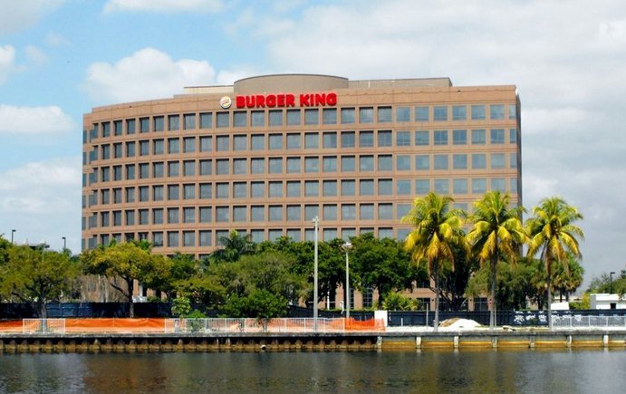 Today, the Burger King chain is valued at $7.6 billion. While this number can’t compete with the valuation of Burger King’s rival, McDonald’s – which today sits at just a little over $158 billion – there’s still no denying the success that Burger King has enjoyed. Throughout Burger King’s journey, which started with a single restaurant in Jacksonville and went on to become an international chain worth billions of dollars, the famous Burger King logo has played many essential roles, helping propel the brand to a worldwide national name and brand.
The History of the Burger King Logo
One year after the first restaurant was opened, original owners Keith J. Kramer and Matthew Burns created the brand’s first logo design – a design that featured the restaurant’s name in a bold, all-caps font set beneath a half-circle sun. When the chain was purchased just one year later by James McLamore and David R. Edgerton, the logo was redesigned to a minimalist design that featured only the restaurant’s name in a custom sans-serif typeface.
![]()
![]()
Burger King announced early in 2021 it has a new logo. The logo looks more simplistic and has gone back in time with some slight changes to the color and shape. They will start to roll out the new logo on adverting, packaging and signage. It will take several years to completely roll out the New Burger King Logo to over 19,000 locations from all over the world.
This design lasted for three years before the Burger King logo was revamped once again. The new Burger King logo featured the company’s mascot sitting on top of a burger along with the name of the restaurant and a tag-line that read “Home of the Whopper”.
This designed was put to use for the next twelve years before the Burger King logo was redesigned once more. In 1969, the restaurant adopted a logo very similar to Burger King’s current logo design – one that features the name of the restaurant sandwiched between two buns. This design was slightly revised in 1994 when the brand decided to alter its color scheme and was redesigned for the final time in 1999.
The current Burger King logo still features the name of the company placed between two buns but with a more rounded shape, brighter colors, and a blue line that encircles a majority of the logo. In the 21 years that have passed since this latest logo was first unveiled, the Burger King logo has not undergone any further changes.
Design Elements of the Burger King Logo
The newly designed logo looks like the logo from 1969 with some revisions.
When Sterling Brands was hired to design what is now the current version of the Burger King logo in 1999, they didn’t reinvent the wheel. Burger King’s current logo design still displays a burger as its key design element, just like all of the logo designs that preceded it since 1957.
However, what Sterling Brands did accomplish when they revamped the Burger King logo was the creation of more professional and eye-catching design. The current Burger King logo features sleek lines, bright colors, and three-dimensional depth to its design that was lacking in previous concepts.
With this newest design, professionalism was the main goal that Burger King was striving toward. As a company that had grown to become one of the largest restaurant chains in the world, Burger King needed an exciting and professional-looking logo that would communicate their status and separate them from the idea that Burger King was a second-rate restaurant. Given that this logo design has been in use for over two decades now, it is safe to say that it has accomplished these goals.
The Popularity of the Burger King Logo
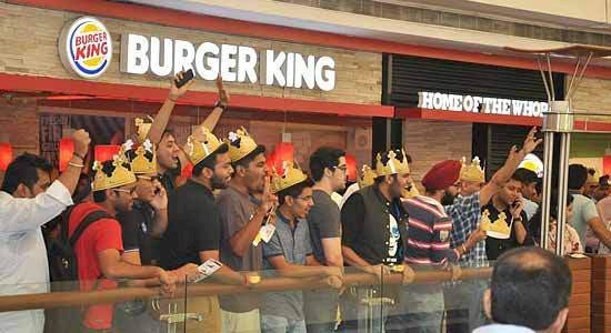
Over the years, Burger King has pursued an aggressive marketing strategy that has largely been made possible thanks both to their iconic mascot and logo design. These branding elements can be found across Burger King’s current marketing efforts, from the commercials that they produce to their social media advertising and beyond.
Of course, a restaurant’s logo also has the important job of attracting customers that are driving by. By creating a recognizable logo and placing it on tall billboards near their locations, Burger King is able to market themselves to anyone who happens to drive past using their logo alone.
In addition to using their logo as a central element in all of their marketing pursuits and a means of attracting customers on the road, Burger King has also taken advantage of their logo’s licensing by offering a wide range of Burger King apparel.
Whether you one a one-location restaurant or you are looking to create the next big chain, an attractive and professional-looking logo is key to your success. At LogoMyWay, we are dedicated to helping restaurant owners and business owners in all industries create one of a kind logo designs in a way that is affordable and hassle-free.
When you start a logo design contest on LogoMyWay, you will be able to receive up to hundreds of unique design entries from talented designers all over the world, making it easy to find the perfect logo for your brand. To get started creating a logo that will help set your brand apart from the competition, we invite you to start your own logo design contest on LogoMyWay today or contact us for more information.


