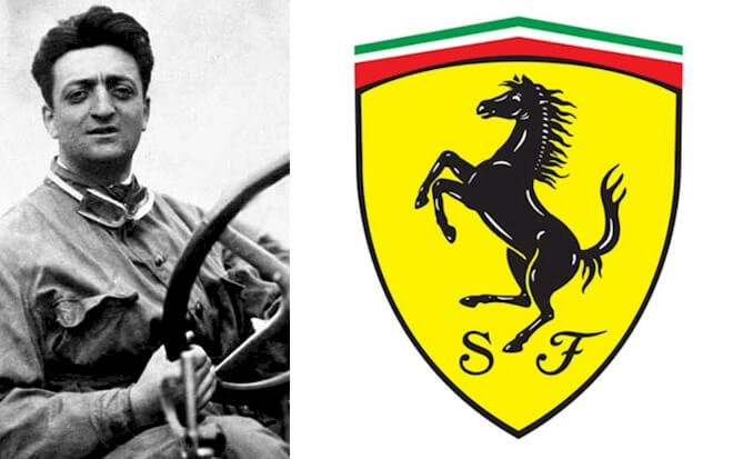
Let’s look at the Ferrari logo and some history behind the luxury sports car.
Do you believe in luck? Can luck bring success to a person’s career or business? Can you relate to any instance when fate plays a pivotal role in your success?
Upon the suggestion of Countess Baracca, Enzo Ferrari believed a horse could bring him good luck in his racing career. The horse in focus was the one the Countess’s son, Francesco Baracca, had on the side of his fighter plane during World War One.
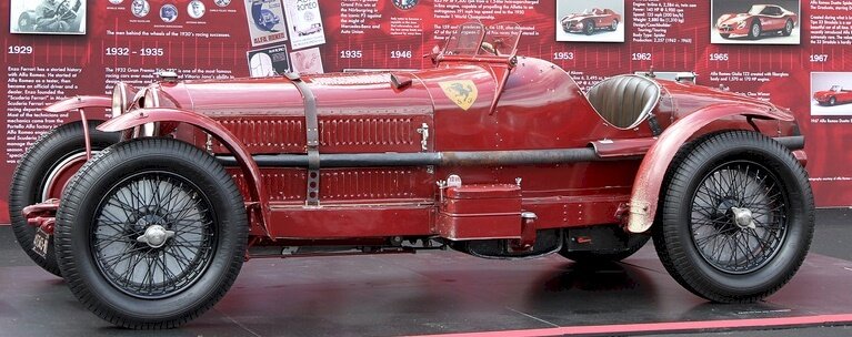
To show respect to the Countess, Enzo Ferrari adopted a black horse and a yellow background as his official trademark. According to him, the yellow represents the color of his hometown, Modena. In 1932, this logo first showed on the Scuderia Ferrari’s car, Alfa Romeo 8C Monza.
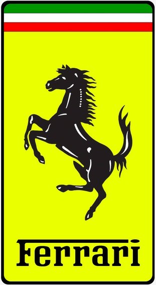
Today, a yellow framed emblem with a black prancing horse leads the brand. The design also features the Italian national colors at the top of a rectangular frame. And at its base is the brand’s name in black.
Fans can find the Ferrari logo on many channels. Besides showing on cars, the logo populates on websites, social mediums, TV shows, merchandise, and several other places. The most potent symbol in the world represents power, style, and wealth.
The Evolution of the Ferrari Logo
To a large extent, you’ll agree with me that everything under the sun evolves. The Ferrari logo has had several updates. Yet, its core graphic elements since 1929 remain intact. These subtle redesigns have made most people not notice changes in the design. Let’s now delve briefly into a few of its updates below:
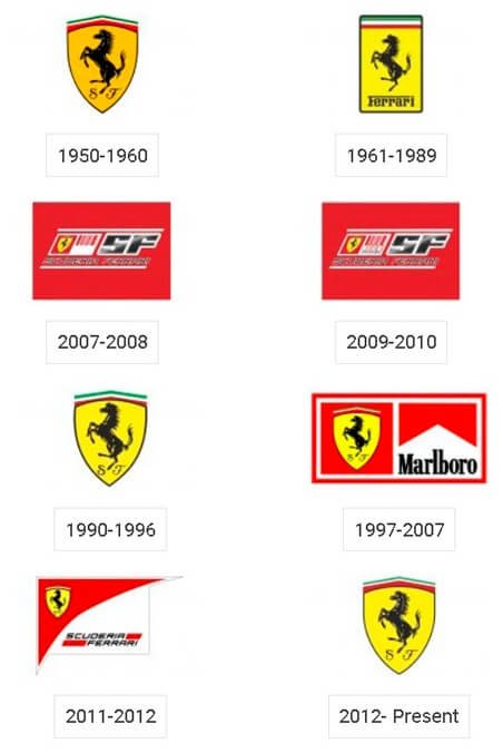
1929 to 1931—The Original Ferrari Logo
The maiden emblem that appeared on the Ferrari cars was a yellow shield with a black outline. Inside this protective shield was the famous black prancing horse. This logo took inspiration from the Italian national colors and an airplane. The top of the shield had the colors—yellow, black, white, and red. And at the base were the letters—SF, which stood for Scuderia Ferrari.
1931 to 1939—The First Redesign
The first update brought a few changes. After two years of using the original Ferrari logo, the company adopted the Italian national flag’s color scheme—green, white, and red. Instead of the curved top, the top became horizontal. The designer also gave away the thick black outline and added a yellow shade to the black horse. The letters—SF became lighter.
1947 to 2002—The Rectangle Symbol
From 1947, a rectangle replaced the shield icon. The iconic prancing black horse became sleek and sharper on a solid yellow background. Below it was Ferrari, where the upper part of the letter—F extended to meet the flattened dot of the letter—i. On top of the horse were the Italian colors—green, white, and red. Thin black lines separated these color palettes.
2002 to Present—The Modern Symbol
The current logo looks the same as the final design. This is because the update was just minor. The most apparent change is removing the thin black lines that separate the three colors at the top of the emblem. A critical look at the letter—I shows the designer altered the font. The updates made the Ferrari logo classic, elegant, and powerful.
Why the Ferrari Logo Works?
- The Logo Is Consistent:
Consistency is a mark of an effective logo design. For about ninety years, the Ferrari emblem has kept a visual asset that has changed little. Its graphic elements—the horse, colors, and fonts have stood the test of time. Eventually, this consistency has helped the brand to build trust among its loyal customers.
- The Logo Is Balance:
The effective use of colors impacts how customers perceive a brand. Some logos have awful combinations of colors. When this happens, it distorts the message of the brand. Luckily, this isn’t the case with the Ferrari logo design. The black horse on the yellow background gives clarity and better contrast to the emblem. The effect is a bright and attractive logo design.
- The Logo Is Simple:
Modern promotional outlets favor clean logos. The benefits of reaching more clients on these mediums have forced brands to go for simple visual identities. In the same light, the Ferrari logo has fewer graphic elements, making it look modest.
- The Logo Is Memorable:
Who can’t decode and remember the Ferrari iconic symbol? Simple logos come with easy memorability. With its clean and elegant look, the Ferrari logo makes it easy for people to notice and recall it at first sight.
- The Logo Is Unique:
The Ferrari trademark is one of a kind in the automobile industry. With its yellow frame and majesty black horse, the logo is unique and on top of the competition. Differing from competing brands is the goal of all brands, regardless of the industry they operate.
- The Logo Is Scalable:
The brand’s official symbol is scalable. This is because it has fewer graphic elements that make its layout look clean. With this simplicity, the logo has the flexibility to fit all marketing channels without losing its quality. Scalability is a useful feature of a working emblem.
The Ferrari Logo Design Elements
Ferrari’s design elements show his passion for energetic animals, the aviation sector, and patriotism. So, the designer used a horse, an airplane, and the Italian flag’s color scheme to capture these emotions. Let’s take a brief walk to learn about these graphic elements that have made the Ferrari’s logo design an iconic symbol in branding history.
The Ferrari Symbol and Shape
- Ferrari Shield:
A shield has been part of the Ferrari’s brand history. It’s a protective graphic element with powerful emotions. When used in logo design, it conveys boldness, toughness, and tradition. A shield can also stand for stability, longevity, and solidity. These emotions resonate well with the racing car brand, which has shown strength and stability over the years.
- A Rectangle:
Another protective design element, a rectangle, stands tall in the Ferrari logo history. This frame, like the shield, captures similar feelings. It represents solidity, stability, and honesty. It also gives a sense of balance and assurance. These are positive vibes that align with the auto brand.
- Ferrari Horse:
We can’t ignore the roles of horses in mythology and history. This daring, loyal, and elegant animal is the focus of Ferrari’s logo design. It stands for power, courage, and freedom. It can also depict speed, victory, and endurance. The posture of the horse in the Ferrari logo is impressive and eye-catching.
The Ferrari Logo Colors:
According to experts, colors impact people’s moods in various ways. Whether you aren’t aware, this basic fact is widely accepted. Ferrari’s logo has five colors—two neutral hues and three bright colors. The designer has used these color palettes in the most creative and visually appealing manner. You can read further to know some emotions of these colors below:
- Yellow Ferrari Color:
Yellow is an attention-grabbing color, and it occupies a large part of the Ferrari’s logo design. It forms the background shade of the trademark. Yellow aligns with sunshine, and it stands for hope, happiness, and freshness. This primary hue can also evoke clarity, energy, and honor.
- Black Ferrari Color:
Black, a mysterious color, paints the majestic horse, the brand’s name, an outline of the Ferrari’s logo design. Some emotions that black exudes are power, strength, and authority. In its negative sense, it can stand for evil, death, and fear. It can also represent formal, elegance, and wealth in the most positive ways.
- Green Ferrari Color:
The color of health, green, forms the topmost color in the Ferrari’s emblem. This color of nature promotes harmony, hope, and generosity. You can also use it to convey safety, growth, and prosperity. Its adverse effects include envy, inexperience, and laziness. The color also aligns with youthfulness, rebirth, and healing.
- White Ferrari Color:
In the logo, white is the next color after the green. Most people called it the hue of purity and innocence. As a neutral color, it conveys simplicity, perfection, and openness. However, it can be dull, cold, and empty. Though it’s often linked to good things, these are a few of its downsides.
- Red Ferrari Color:
The color of blood comes as the second most popular color behind blue: It’s the last color stripe on the Ferrari’s logo design. This intense color speaks of passion, action, and energy. In logo design, red also represents love, desire, and willpower. The dark side of red includes rage, anger, and lust. It can also promote stress, wrath, and malice.
The Ferrari Logo Typography
From the standalone—SF to the wordmark—Ferrari, the auto company has relied on different fonts over the years. Its modern font is a custom handwritten typeface from the serif font family. The font is identical to Ferro Rosso, a typeface designed by Michael Hagemann and released via Font Mesa. The letter—F with its line meeting the letter—I resembles a gun with a flying bullet. From a creative point, its letter—r reflects a horse standing on its hind legs.
What does the SF In Ferrari stand for?
The cursive typeface—SF in most of Ferrari’s logo designs stands for “Scuderia Ferrari.” This is an Italian phrase that means a stable, a place where people keep horses. Also, Scuderia refers to Ferrari’s racing team. You can spot these monogram letters in the shielded logo designs.
Who Started Ferrari Company?

Enzo Ferrari was an Italian car designer, maker, and racing driver. His birth took place on the 18th February 1898 in Modena, Italy. His parents were Alfredo Ferrari and Adalgisa Bisbini. A widespread Italian flu outbreak in 1916 killed his father and elder brother.
In 1908, Enzo Ferrari watched Felice Nazzaro wins the Circuito di Bologna. Enzo was ten years when this event took place. The event inspired him to become a racing driver later. After his father’s death and the collapse of their family’s carpentry business, he searched for a job.
Ferrari’s frantic job search finally landed him a job as a test driver at Costruzioni Meccaniche Nazionali, a Milan car maker. Later, he got promoted to a race car driver and had his maiden contest in 1919. He placed fourth in the Parma Poggio di Berceto Hill Climb Race.
In 1920, Ferrari found himself at Alfa Romeo as a driver. With hard work, he won his first Grand Prix in 1923 in Ravenna on the Savio Circuit. He had a blissful season in 1924, winning three contests, namely Ravenna, Polesine, and the Coppa Acerbo in Pescara.
Ferrari married Laura Dominica on 28th April 1923, and they gave birth to a son, Alfredo Dino. Unfortunately, mother and son died, leaving Ferrari to focus on his other child, Piero, born in 1945. Piero’s mother was Lina Lardi, Ferrari’s mistress.
While working with Alfa Romeo, Ferrari built a racing team and naming it Scuderia Ferrari. This team that comprised megastar drivers became the racing arm for Alfa Romeo. The group he formed chalked many successes, and after 11 wins from 41 Grand Prix participation, he retired.
At age 90, Ferrari died on 14th August 1988 in Maranello. Yet, in 2002, a car was named and launched in his name, Enzo Ferrari. After his death, Scuderia Ferrari continued to win races. As of December 2020, John Elkann is leading the brand as its CEO.
How Ferrari Got Started?
As an experienced racing driver and the founder of Scuderia Ferrari—a racing team under Alfa Romeo, Ferrari became the head of Alfa Corse in 1938. Less than a year, he left to form his company, Auto Avio Costruzioni, in Modena, Italy.
He designed and built a sports car—it was a spider-powered by a 1500 cc 8-cylinder engine. Enzo Ferrari named it the 815, and it contested in the 1940 Mille Miglia. In 1943, Ferrari moved his factory from Modena to Maranello.
The change of location resulted from a bomb explosion that hit the Modena auto shop during World War 2. After the war, Ferrari built the 125 S and powered it with a V12 engine. On 11th May 1947, he entered the car in its debut race at Piacenza Circuit.
With Franco Cortese behind the wheel again, the car won its maiden Rome Grand Prix at the Terme di Caracalla precisely 14 days after its first race. With this victory came more victories for the Italian automaker with an iconic brand.
It won the 1948 Mille Miglia Race, the 1949 Le Mans 24 Hour Race, and the 1951 Formula One World Championship. By the end of the 1950s, the Ferrari brand had become influential worldwide. And between 1950 and 1960, it tripled its sales revenue.
To meet the business’s changing needs, Enzo Ferrari changed the business structure to a limited liability company in 1960. And to further raise money, in 1969, he sold 50% of his shares to Fiat Group. In 1968, Ferrari had a deal with Shell to become its main Formula One sponsor.
The F40 was the last car built under Enzo Ferrari. After he died in 1988, the Fiat Group bought an extra 40% of the company. The company went public in 2015, trading on the New York Stock Exchange at a value of about $10 billion.
How Big Is Ferrari?
Ferrari operates in the automobile industry. Based in Maranello, Italy, the company makes luxury cars. Most car lovers see Ferrari cars as a mark of lavishness, speed, and wealth. Besides cars, the company sells license products such as clothing, bicycles, watches, and phones.
Ferrari serves a worldwide client base with about 4,164 employees. With this staffing strength, the company made quality cars to meet the needs of its wealthy customers. Some of its cars’ brand includes 812 Superfast, SF90 Stradale, SF90 Spider, and F8 Tributo.
The Ferrari 250 GTO became the world’s most expensive car in June 2018, and it cost $70 million. This model was made in 1962 and powered by the Colombo V12 engine. The brand owns a racing team, Scuderia, the oldest team with several championship titles.
In 2019, the company’s production output was 10,131 units. This raked in about €3.8 billion in revenue and €699 million in net income. Brand Finance in 2014, rated Ferrari as the world’s most powerful brand.
With a Brand Strength Index of 94.1, Ferrari has kept its brand ranking at the top of 2020. Again, according to Brand Finance, the Ferrari brand is valued at $9.1 billion. Today, the public, Exor, and Piero own 67.09%, 22.91%, and 10% stakes, respectively, in Ferrari.
Wrapping Up Ferrari’s Logo
As a student of color, you may wonder why most Ferrari cars are red. The choice stemmed from a law that required all racing cars from Italy to come in red. As a law-abiding citizen, Enzo Ferrari complied with the directive, and the color has become part of its branding tradition.
Today, about 40% of Ferrari cars are red, and the shade they use is called Rosso Corsa, which translates to racing red. The attention-grabbing color is not just a color, but its lifeblood and lineage to the Italian racing car tradition.
If the famed prancing horse brings luck, then the brand’s success on revenue and contest are testimonies to the Countess’s suggestion. The celebrated logo, without mincing words, leads the best and fastest sports car in history. Let’s keep loving the brand’s line of products.

