
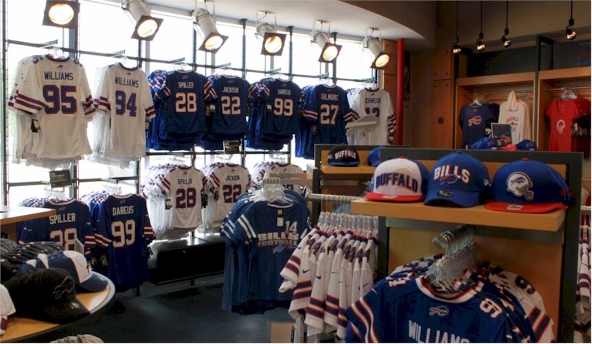
This is the Buffalo Bills logo and some history behind the club.
Before you dash into the stands to watch the game between the Miami Dolphins and Buffalo Bills, allow me to quiz your brain. Can you tell the difference between a buffalo and bison?
One of the celebrated America Football Clubs, Buffalo Bills, has a sturdy logo representing it. People refer to this mascot as buffalo or bison. Most people think these two animals are the same, yet they aren’t. Both are large animals from the Bovidae family, though. You can quickly tell the difference by focusing on the 3Hs—home, horns, and hump.
Home—Buffalos are in Asia and Africa. In America and Europe, you’ll find the bison.
Horn—Buffalos have large arc horns while bisons have shorter and sharper ones.
Hump—Buffalos do not have humps. But you’ll find one on the shoulders of a bison.
Whether buffalo or bison, Buffalo Bills has one of the recognizable mascots in the sporting arena. This brave emblem comes as a leaping bison that’s ready to take on its opponent. The logo dresses in the official colors of the club. These are blue, red, and white.
The blue leaping mascot races across the forest with no words. It’s the fourth official logo for the club. The design is the brainwork of Stevens Wright. It caught the public’s eyes in 1974 and has since remained the pillar ambassador of the club. The design is classic, versatile, and timeless.
Evolution of Buffalo Bills’ Logo
What is the white part in the Buffalo Bill Logo?
The white part in the logo has been a discussion online and some say it’s a horn and an eye.
Buffalo Bills has had five logos in 61 years. In 1960, the first logo raced the fields. Four updates followed it in 1962, 1970, 1974, and 2002. However, fans disliked the last redesign. So, the 1974 emblem kept its enviable position till today. To save time, let’s inspect the various stages the logo has evolved over the years.
1960—The Blue Emblem:
Buffalo Bills’ original logo lasted only for a year. It had a blue football as its frame. Within this frame were the other graphic elements. These included a herd of buffalos and two football players. The players were in the team’s uniform. You’ll find the caption—Buffalo Bills curved above the animals and players. It was boldly written in uppercase letters.
1962—The Brown Emblem:
The first update came in 1962. Though similar to the original logo, it had some changes. A brown color took center stage. The artist opted for a single buffalo and player. The player wore a blue jersey with 31 and white stripes. Also, a white and red helmet with a buffalo’s symbol protects the player. The brand’s name was missing. The logo reigned for almost seven years.
1970—The Red Emblem:
In 1970, the Buffalo Bills emblem had its second update. The aim was to simplify the logo. The club went for a solid red silhouette. It was the famous Buffalo, standing and facing right. And it was the only graphic element adopted from the last logo design. It served the team for about three years.
1974—The Present Emblem:
The hunt for a modest yet iconic logo for the club continued in 1974. This design took inspiration from its previous logo. Instead of a standing buffalo, the designer opted for a leaping or jumping type. Also, instead of a red kind, he went for a blue bison with a red stripe flaming from its white horn. This elegant trademark wears the traditional colors of the club.
2002—The Unused Emblem:
In 2002, Tom Donahoe, the team’s general manager, wanted a new logo and a jersey for the club. Therefore, he got a stylized letter—B trademark. Attached to the letter was a wild buffalo. This iconic letter was crafted from two bullets—one red and the other blue. This logo couldn’t feature on the field because fans dislike it. So, the 1974 logotype came back to light the fields.
What Font Is Buffalo Bills Using?
Buffalo Bills hardly use fonts to evoke its personality. The only logotype with a typeface was the original emblem. It used a solid bold serif font. The designs after it focused on the graphic components. These trademarks are highly recognizable without labels.
Who Designed Buffalo Bills Logo?
The club has used several graphic designers. The longest in use, the blue leaping bison, was designed by Stevens Wright. As an aerospace designer and a commercial illustrator, Stevens Wright got this project through his wife, Jere Wright.
She used her capacity as the production manager at NFL to sell her husband’s unique talent to David Boss. Stevens presented several logo options to the board. In choosing, they fell in love with the current one favored by Robert Lustig, the team manager.
Why Does Buffalo Bills Logo Works?
1. The Logo Is Consistent:
Powerful logos remain relevant for ages. You must keep this in mind. Even though Bills’ logo has gone through the design studios four times, it has kept a consistent charm. For over five decades, the bison has featured on all designs. This has engraved its image on people’s minds.
2. The Buffalo Bill Logo Is Modest:
For any logo to convey its messages coherently, it must be modest. Across all industries, the most iconic emblems are the simple ones. They are created with fewer graphic elements. Bills logo falls under the same category. It has one identifiable symbol and three striking colors. With this vibe, the Bills logo stands tall.
3. The Buffalo Bill Logo Is Scalable:
The world’s most iconic logos can show on any channel without hindering their qualities. And since the Bills mascot is among the league of classic emblems, it can play on any marketing field without injury. It can perform this essential task because of its modest layout.
4. The Buffalo Bill Logo Is Unique:
Match days are crowded with fans and visual aids. Yet, the Buffalo Bills logo is visible. It’s above the noise because it’s unique and visually enticing. Hardly would you find a trademark close to the racing bison. Practically, it’s way ahead of the herd.
5. The Buffalo Bill Logo Is Memorable:
The human brain receives more information than it can remember. This emphasizes the need to go clean with all logo designs. The Bills’ mascot was crafted from this insight. It’s so simple that fans can recall it. Again, this is the impact of fewer graphic elements used in creating the mascot.
Buffalo Bills Logo Design Elements
The first two logos saw Bills using icons related to its sporting interest. Yet, the successive logos focused on the character of the team. To evoke these emotions of strength, courage, and toughness, they kept a standalone bison. You can learn a few of their graphic elements below:
Buffalo Bills Logo Shape And Symbol
1. A Football:
The first and second logotypes used football as their frames. This spherical symbol is the chief object used in the game that Buffalo Bills features. It helps fans worldwide easily link the team to the exciting but intense sports the brand focuses on. You’ll also find players as icons.
2. A Bison:
Bison remains the core graphic element in all Buffalo Bills emblems. It’s considered a sacred animal in America. The club favored this animal because of its character and association with Native Americans. Bison represents strength, safety, and power. It’s also a symbol of hope, unity, and resilience. Today, it has joined the eagle as an American national symbol.
Buffalo Bills Logo Colors
1. Blue Color:
Blue is one of Buffalo Bills’ traditional colors. It has a presence in all the logo designs except the 1970s version. In the current trademark, it dresses the iconic Buffalo. In color psychology, blue symbolizes security, trust, and stability. Blue is a calming and soothing color.
2. White Color:
Buffalo Bills like white. It’s one of its official colors. This neutral color forms the outline mark of the latest emblem. It played a major impact on all the other trademarks. White symbolizes purity, sincerity, and safety. It’s the most balanced color for all colors.
3. Red Color:
Buffalo Bills used the color red in its logotype to represent strength, energy, and passion. It’s also one of the traditional colors the club favors. Except for the 1960s design, all the club’s official designs had red. In the current logo, red paints the stripe coming from the horn. It’s a perfect color for showing caution and danger.
Who Started Buffalo Bills?
Ralph Wilson was an American entrepreneur and sports enthusiast. He became famed as the founder of the Buffalo Bills. Also, he was a founding member of the AFL—the American Football League. This organization merged with the NFL—National Football League in 1970.
Ralph, the son of Ralph Wilson Snr. and Edith Cole, was born in Columbus, Ohio. The day was 17th October 1918. He grew up in Detroit but attended the University of Virginia. At 18, he graduated from the Detroit University School. It’s now called University Liggett School.
After school, Ralph enlisted in the U.S. Navy. He served during World War II. With the war over, he focused on his father’s insurance business. Ralph further invested in mines, media outlets, construction, and manufacturing. Lest I forget, he owned a piece of the Detroit Lions.
In 1944, Ralph married Janet McGregor. They had three children—Linda, Christy, and Edith. He divorced his wife in 1970. Nineteen years later, he met Mary McLean, who became his new wife. In 1992, he was inducted into the Greater Buffalo Sports Hall of Fame.
In 2011, Ralph fell and broke his hip. He used a wheelchair afterward. At his home in Grosse Pointe Shores, Michigan, he died. This sad event occurred on 25th March 2014.
Buffalo Bills Short History
In 1959, Lamar Hunt and Bud Adams set out to start an ambitious sporting project. Words went round, notifying selected people about this rival league. Ralph Wilson was one of the few sports investors who embraced the idea. He told Hunt, “Count me in with Buffalo.”
Ralph had a stake in Detroit Lions, his hometown club. This team played in the National Football League. On 8th October 1959, Ralph became the seventh person to get the nod to play in the new league. Lamar awarded eight football franchises in all.
Ralph’s first choice was Miami. He settled for Buffalo because the state of Miami wasn’t ready to accept the AFL franchise. The Miami officials were unwilling because of a decade-old failure of the Miami Seahawks. However, in the coming years, the city officials revoked the decision.
The club was named Bills after a previous team in the area. The source of the name came from William ‘Buffalo Bill’ Cody. In 1960, Buffalo Bills became a charter member of the AFL—American Football League. The club’s first two seasons in the league weren’t impressive.
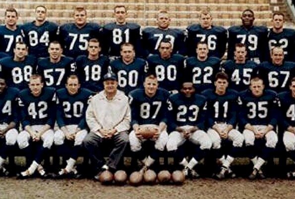
To turn away from their losing ways, the club drafted some talented players into the squad. This included Ken Rice, Bill Shaw, Jack Kemp, Syracuse, and Cookie Gilchrist. With these stars, success was smiling at the corner.
In December 1963, the Bills played the last game against the New York Jets at the Polo Grounds. Jubilations started in the following years. In 1964 and 1965, Bills won the AFL Championships. They top their division and beat the San Diego Chargers in both seasons.
In 1966, the Bills lost to the Kansas City Chiefs, missing the chance to feature in the maiden AFL—NFL Championship. Today, this game is known as the Super Bowl. With the absence of their head coach, Lou Saban, the team experienced losing streaks. He left after the 1965 season.
In 1970, the Bills played in the NFL—AFL merger league. They joined the Patriots, Dolphins, Jets, and Colts in one group. In the first season, they drew one, won three, and lost ten. Before these league matches, the Bills had earlier drafted O. J. Simpson into the team.
Former Coach Lou Saban returned in 1972. Under his leadership, the club became stronger again. He saw the potential in O. J. Simpson and used him well. In 1973, Simpsons recorded a 2000–yard season, winning the NFL Most Valuable Player award.
Lou left again in 1976, and Coach Chuck Knox took over. He had a good season in 1980. For the first time in many years, the team beat the Miami Dolphins. They won their first AFL Eastern title. In the 1980s, the club had a long losing season, six non–winning championships.
In 1986, Marv Levy became the manager. He changed the direction of the team. He led the club to five AFL Eastern titles. In 2001, he was inducted into the Pro Football of Fame. Bills hold the honor as the only team to have ever played in four straight Super Bowls.
Since 2014, Terry and Kim Pegula have been the owners of the Buffalo Bills.
Final Remarks On Buffalo Bills
The Bills’ mascot is one of the winning logos in the world. The blue, red, and white racing bison can face any opponent. Stevens Wright, the artist behind the logo, put his mind and talent to work. He didn’t just design a logo; he crafted an ambassador that conveys the club’s character.
Though the earliest Buffalo bill emblem wasn’t top-notch, you can count on the current one. It has become irresistible since 1974. With only a symbol and three widely used colors, Stevens created a mascot that will reign forever. It’s classic, elegant, versatile, and memorable.
Ralph Wilson started Buffalo Bills with low–quality talents. With time, he drafted and assembled some of the best skills to have glorified the game. From coaches to players, he made his passion for football felt across the United States of America. The world has lost an iconic businessman.


