Let’s get an insight into the UnitedHealth Group logo and some history behind the company.
The UnitedHealth Group has one of the most recognizable logos in the health industry. It comprises a dynamic symbol, sans-serif font, and two cheerful colors. The iconic emblem was formed from its letter—U, resembling a stylized shield.
In addition, the designer turned it halfway to the left while adding three elegant outlines. To the right of this emblem is the brand’s name written in two parts—up and down. Coupled with the colors—white and blue, the logo is modern, simple, unique, attractive, and timeless.
With these commanding qualities, the UnitedHealth Group logo is highly scalable. So, it can fit multiple marketing applications without hurting its personality. These mediums include flyers, envelopes, websites, social media, and merchandise, among other channels.
By revenue, the UnitedHealth Group is the second-largest health care and insurance provider in the US. It was formed by Richard Burke in 1974, and since then, it has become a global brand. Today, it operates in over 120 countries, including all the states in the United States.
Also, it has about 300,000 workers worldwide and earned over $280 billion in revenue in 2021. Since it began, the brand hasn’t changed from its values—integrity, compassion, relationship, innovation, and performance. Today, it runs two subsidiaries—UnitedHealthcare and Optum.
UnitedHealth Group Logo Evolution

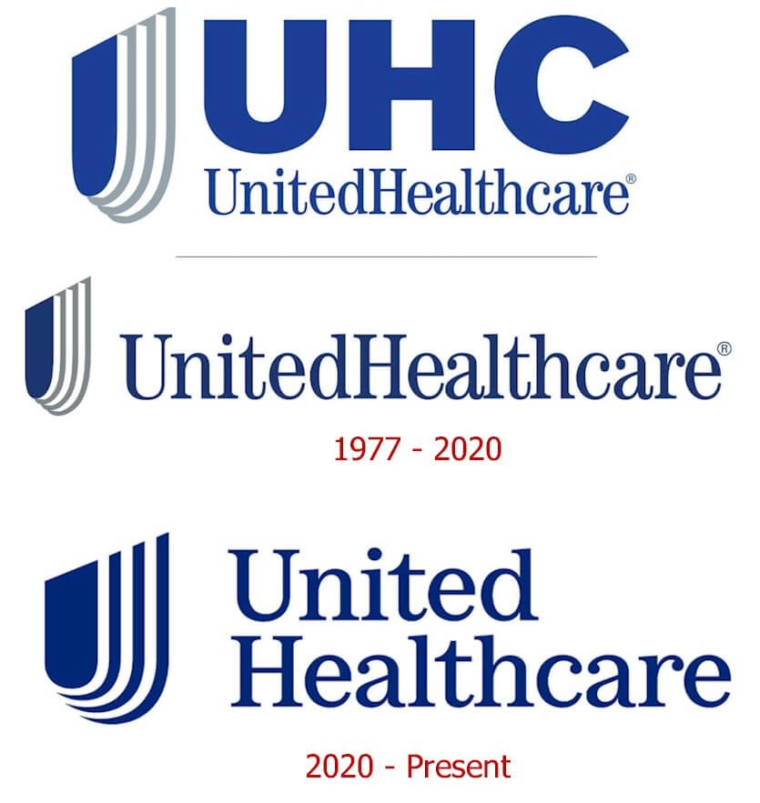
The UnitedHealth Group logo has remained almost the same for over four decades. However, unlike other brands, since 1977, it has kept its traditional emblem, letterings, and colors. Today, the only update is the positioning of the wordmark, the thickness of the outlines, and the absence of the gray color. This refreshment happened in 2020, enhancing the logo’s personality.
Now, to understand these minor changes, let’s explore the logo further.
1977—The Original Logo
UnitedHealth Group unveiled its logo in 1977, and it lasted for about forty-three years. The custom logo comprised a unique symbol and an inscription, and the emblem comprised a rounded, solid shield with three similar outlines.
In addition, the wordmark is a traditional serif font written with no space between its two letters—United Healthcare. Also, the designer placed the wordmark to the right of the emblem while capitalizing the letters—U and H.
Overall, the designer executed the logo in white, blue, and gray colors.
2020—The Current Logo
After nearly four decades, UnitedHealth Group updated its visual asset. It kept faith with its stylized emblem and the wordmark with minor refreshments. Here, the four-layered shield dazzles in two colors—blue and white with thick lines.
Again, the inscription is separated into two parts—with the word United above Healthcare. Overall, the logo looks bold and modern while keeping the icon to the left of the brand’s name.
Why Does The UnitedHealth Group Logo work?
1. The Logo Is Unique:
Among the several healthcare providers, the UnitedHealth Group stands tall. Why? Besides its excellent and quality service delivery, you can count on its logo. It’s exceptional with its custom shield, wordmark, and loyal colors. So, there’s no confusion among users when choosing it among a crowd of others. So, to win the battle in a cluttered marketplace, be distinct from others.
2. The Logo Is Readable:
UnitedHealth Group didn’t gamble with its personality. So, the logo comes with a clean and bold font, making it highly legible. And regardless of distance, people can easily read the brand’s name. In brief, readability creates memorability and a lasting connection.
3. The Logo Is Modest:
The UnitedHealth Group logo is easily noticeable because it’s simple. It has ignored unnecessary features—gradient, border, and shadow, among other styles. In addition, it has stuck with fewer design elements—an emblem, inscription, and contrasting hues. The result is a pleasing visual ambassador that’s recognized worldwide.
4. The Logo Is Versatile:
By choosing to use fewer graphic elements, the United Health logo is versatile. With this important quality, it renders in different sizes. Also, it can fit on several marketing applications without losing its personality. In short, the logo can work on letterheads, call cards, billboards, etc.
5. The Logo Is Timeless:
The UnitedHealth Group logo is over four decades old. Yet, it’s pleasing, relevant, and influential. Aren’t you wondering about its secret? To attain this status of longevity, the brand avoided trendy elements. So it has stood the test of time without changing its visual asset.
UnitedHealth Group Logo Design Elements

The United Group logo comprises three outstanding graphic elements. These are a shield, the brand’s name, and two colors. In addition, while the emblem symbolizes protection, the typeface conveys compassion, and the colors signify loyalty and safety. To further understand these design elements, let’s examine their significance in the logo.
UnitedHealth Group Logo Shape And Symbols

A Shield:
A shield is the only icon featured on the UnitedHealth Group logo. This symbol is exceptional, exuding three layers behind it. In most traditions worldwide, a shield is an accessory for defense. Therefore, within the medical industry, you can assert that it protects people from diseases, sickness, and other dangers. In addition, a shield can symbolize confidence, stability, safety, tradition, and solidity, among others.
UnitedHealth Group Logo Colors
1. A Blue Color:
Blue commands the highest presence in the logo. It marks the personality of both the emblem and the inscription. Representing the sky, the color blue conveys the feeling of freedom, loyalty, and calmness. Again, the color of water bodies signifies confidence, reliability, and peace.
2. A White Color:
The designer opted for a white background to make the blue emblem and wordmark visible. The color of heaven conveys a sense of purity, goodness, and innocence. In addition, it signifies humility, simplicity, and hygiene. Also, the color of snow resonates well with the industry as a mark of cleanliness and safety.
3. A Gray Color:
The gray color played a vital role in the original logo. Here, it marked the personality of the iconic shield. This neutral and cool color represents strength, formality, and mystery. Also, some brands use the color gray to convey timelessness, practicality, and sophistication.
What Font Is The UnitedHealth Group Logo?
UnitedHealth Group uses a clean typeface to remain familiar and connect with many people. It’s custom, bold, and readable across several mediums. Akzidenz Grotesk, Century Std-Book Condensed, and Graphik are the closest to use a similar font.
Interestingly, the personality of this serif font makes it brand-friendly. Again, it promotes a sense of compassion, among other human feelings.
What Is the Tagline of United Health Group?
UnitedHealth Group, Inc. runs two subsidiaries—UnitedHealthcare and Optum. Together they command a staffing strength of about 230,000 workers. In addition, they provide health insurance to nearly 115 million people globally.
UnitedHealth Group adopted the tagline – Helping People Live Healthier Lives as a passionate health provider. In short, this confirms its mission for humanity.
What Is The Mission Statement of UnitedHealth Group?
The UnitedHealth Group has a profound mission statement to serve millions of people worldwide. The healthcare giant is dedicated to helping them live healthier lives while making the health system work better for everyone. This mission revolves around its core values – integrity, compassion, relationships, innovation, and performance.
How Long Has United Healthcare Been Around?
UnitedHealth Group has been around since 1977. So, the largest insurance provider in the United States by market cap has been serving for about forty-five years. It has its head office in Minnetonka, Minnesota, and however, it operates in fifty states in the United States.
Concise History About The UnitedHealth Group
In 1974, Richard Burke founded Charter Med Incorporated, locating its head office in Minnetonka, Minnesota. However, it became part of the United HealthCare Corporation three years later under a restructuring. Then, in 1998, the brand was renamed UnitedHealth Group.
This global organization is an American medical brand that provides health care and insurance services. By revenue, it’s the second-largest healthcare brand in the United States. Also, it has a staffing strength of nearly 300,000 employees in over 120 nations.
In 1984, it achieved a public status, and four years later began its first pharmacy benefit management. This was done via its Diversified Pharmaceutical Services Delivery. The brand delivered these services to its users using retail pharmacy and mail.
After ten years of going public, SmithKline Beecham bought this subsidiary for $2.3 billion. However, United HealthCare bought Ramsey HMO, a Florida insurer, in the same year. In addition, it purchased The MetraHealth Companies Inc. in 1995 for $1.65 billion.
In 1996, it added HealthWise of America to its portfolio. Then, in 1997, it expanded its Evercare program. This service delivery aims to give long-term care to patients in nursing homes. Interestingly, the program focuses on elderly persons and patients with chronic illnesses.
Leapfrog to 2003, and United HealthCare launched a marketing campaign dubbed—It Just Makes Sense. This promotion aimed to build a brand identity while reversing public perception about the brand’s rate and benefits reduction. It was featured in print, radio, and television.
In 2004, the company bought a Wisconsin health plan, Touchpoint Health Plan. Then, three months later, it added Oxford Health Plans in July. After this acquisition, the UnitedHealth Group has bought several brands, increasing its networks.
Today, it enjoys a revenue of over $280 billion, ranking it the world’s eighth-largest company.
Who Founded United Health Group?

Richard Burke is an American entrepreneur who founded the United Health Group. This organization was formally called Charter Med Incorporated, and it provides health care and insurance to millions of people worldwide.
Richard holds a Master of Business Administration from Georgia State University. As the Group’s founder, he served as the CEO until 1988. Afterward, he became the board chairman from 2006 to 2017.
As a serial entrepreneur, he is also involved in other businesses. Rainy Partners LLC, First Cash Financial Services, Inc., and Senior Connect Acquisition Corporation are notable. Also, he’s linked with Meritage Homes Corporation and Phoenix Coyotes National Hockey Team.
As of March 2022, Richard Burke has a net worth of $985 million.
My Final Thoughts On the UnitedHealth Group Logo
The UnitedHealth Group logo is an influential visual identity in the health industry, and it leads the second largest healthcare provider by revenue in the United States. The founder unveiled the first logo in 1977, and it has remained almost unchanged.
However, in 2020, the logo underwent a minor update. The designer kept two colors, increased the outlines, and repositioned the wordmark. The reason for the logo’s longevity is straightforward—it’s simple, attractive, readable, memorable, and scalable.
The brand’s chosen colors align with the health sector. The white signifies humility, cleanliness, and safety, while the blue symbolizes stability, loyalty, and tranquility. Also, the shield-like emblem represents protection, stability, and confidence.
The Group started in 1974 as Charter Med Incorporated. It was founded by Richard Burke, locating its head office at Minnetonka, Minnesota, United States. The company aims to provide health care and insurance to millions worldwide.
It operates two subsidiaries—UnitedHealthcare and Optum across about 125 countries. In addition, it has about 300,000 workers while earning over $280 billion in 2021. Its five core values are integrity, compassion, relationship, innovation, and performance.
And finally, its mission remains—Helping People Live Healthier Lives.


