
This is the look at the Spotify logo and some history behind the business.
You’re a music lover. Yes, I know! But can you recall the first music you listened to, the musician, and how you heard it? You’re a melody genius if you remember all three elements. From time memorial, music has been part of us and influences our moods.
With technology shaping everything, our mode of listening to music has evolved. Technology has made it much easy for us to access millions of music. With streaming technology paving the way, the impact of one brand is astonishing. The Spotify logo is the brand ambassador.
The iconic Spotify logo is everywhere. From PCs, smartphones, and tablets on which users access the app, the green icon is there winking at them. It’s also attracting attention on websites, social media handles, app stores, and several promotional mediums.
Spotify is a giant in the world of audio streaming. Today, the app and its modest logo serve nearly 320 million active users. It’s no doubt it’s the preferred medium for musicians and fans alike. In terms of musicians’ payment, Spotify has altered their method of earning money.
Just as Google is synonymous with search, Spotify will soon stand for streaming. With the influence the green trademark is having, it would take a severe strategy to knock it off the competition.
The Evolution of the Spotify Logo
The reigning Spotify logo differs from the initial one. For almost 12 years, the iconic logo has had two major redesigns. Yet, its core brand charisma remains intact. Now, let’s explore the various phases:
2008 to 2013—The Original Spotify Logo
Spotify introduced its original logo in 2008. It comprises a white typeface on a lemon green square background. The white typeface had a clear outline. The square has rounded edges with the brand’s name along its base. Its name appears like a flowing or dancing style with its letter—O, slightly up. You can spot three stripes above the letter—O with different weights. They represent a Wi-Fi icon or the sound of music.
2013 to 2015—The First Spotify Logo Update
After five years, the Spotify trademark underwent a complete overhaul. The designer removed both the square and wordmark, making the new logotype feature a lemon green circle with three arc-shaped lines.
The lines became white instead of dark green. And on the right side of the emblem was a bold font with sharp lines. The thick stripes and the even font make the logo clean and iconic.
2015 to Present—The Second Spotify Logo Update
The Spotify official signature took on another form in 2015. It was a minor change yet effective. The designer used bright green to paint both the circular emblem and the wordmark. However, the lines depicting waves remain white—the bright green looks more of a neon color.
Why the Spotify Logo Works?
The green Spotify logo deserves a place among the iconic emblems in the world. With its fewer graphic elements: color, shape, and typeface, it qualifies as a modern and minimalist logo. Also, the color scheme gives it balance and clarity.
On the whole, the Spotify logo is memorable and readable. The logotype is versatile and scalable on all advertising platforms. Even though the logo has seen two significant changes, it’s obvious it has kept its fundamental tone.
The consistency of the trademark has resonated well with its audience. It has helped the brand to build trust and win followers. The Spotify logo’s positive attributes, which align with branding rules, make it an effective logo.
The Spotify Logo Design Elements
![]()
To create an eye-catching logo, you ensure that the graphic elements align with each other. The Spotify official logo has adhered strictly to this design concept. It features a circle, green color, and a readable sans–serif typeface. In brief, it has fewer elements, which gives it a modern feel. Let’s take an in-depth look at the different elements of the Spotify logo:
The Spotify Symbol and Shape

- A Square:
Spotify used a rounded square for its original signature logo. Yet, a square represents quite a lot of things. It can stand for direction—north, south, east, and west. As an element of nature, it depicts fire, water, air, and earth. In business, brands use square shapes to convey a feeling of stability and reliability. It can also translate into a sense of honesty and unity. As a rounded shape, it communicates softness and friendliness.
- A Circle:
We can link a circle to the sun, the moon, and the earth. It comes in shape with a female tone. As a geometric shape, a ring carries with it a unique perception. It portrays love, community, and infinity. Good music is timeless. So, Spotify has chosen a suitable solid figure for its current trademark. It serves as the green background for the three arc-shaped lines. A circle can also symbolize commitment, integrity, and perfection.
- Sound Waves:
Spotify has had sound waves in all its logotypes. From the original logo to the current one, you’ll find three lines representing musical energy or waves. This specific shape makes people identify Spotify as a music brand. The free-moving horizontal lines convey a sense of distance, calmness, and never-ending.
The Spotify Logo Colors
- Black Color:
Black is a familiar hue in the company’s visual identity. The current wordmark comes in a solid black color with a neutral background. The absence of light results in black, and it has a close link to mysteries. Emotions conveyed by the colors are several: they can emit either positive or negative vibes. But Spotify picks the color for its positive feelings. Thus, using it to represent power, leadership, and elegance.
- White Color:
In many cultures, people relate white to angels, heaven, and weddings. It also represents cleanliness, purity, and innocence. Brands can also use it to promote a sense of freshness, goodness, and simplicity. The current Spotify logo has the color representing its sound waves. The brand’s name used to be white in the original logo. White is a neutral color and the opposite of black.
- Green Color:
Green dominates the natural world. It’s the hue we associate with vegetation, wealth, and rebirth. More so, it’s stress-relieving, refreshing, and soothing. The color is a symbol of prosperity, freshness, and growth. Green is the reigning color in Spotify’s logo. From the first to the current trademark, Spotify has favored this cheerful and healing color. It has featured its square, circle, and wordmark. By using green, Spotify conveys the spirit of serenity, calmness, and progress.
The Spotify Logo Typography
The Spotify iconic logo featured a sans–serif typeface, preferably a custom version of Gotham. It has thick and straight lines, which makes it legible, identifiable, and clean. The font evokes the right identity that Spotify wants to communicate to its target audience.
Who Started Spotify?
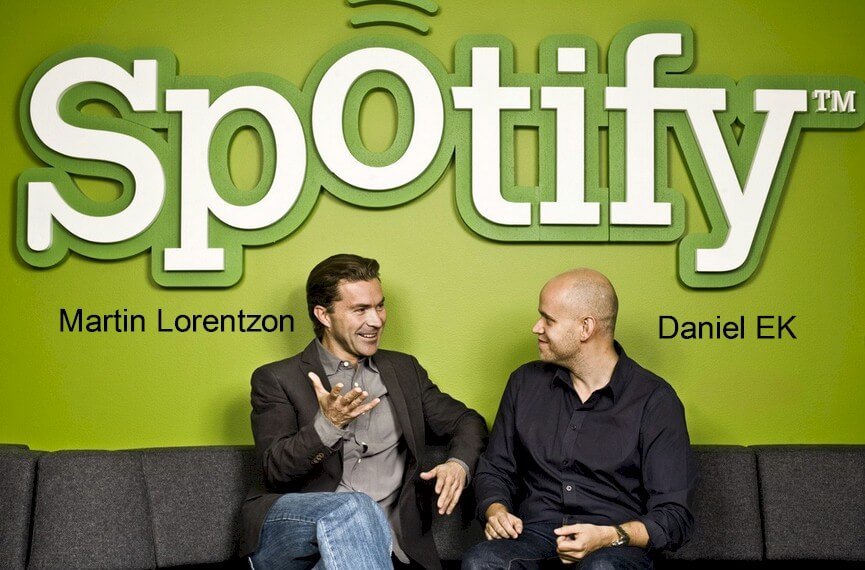
Two smart entrepreneurs masterminded the formation of Spotify. They are Daniel EK and Martin Lorentzon. It’s worth delving briefly into their personal and professional lives.
Daniel EK:
As a Swedish native, Daniel EK was born in Stockholm on 21st February 1983. He spent much of his youthful periods in Ragsved, near Stockholm, Sweden. In 2002, he graduated from high school, IT–Gymnasiet in Sundbyberg.
He got admission to study engineering at the KTH Royal Institute of Technology. But his passion for business made him drop out of college. At 13 years, he had his first taste of business. From his bedroom, he started a website consulting business.
He made $100 from his first clients and $200 from his second project. As his reputation soar, he started earning $5000 per website. He had about 25 people working on his team. These were students he hired from his school who worked from the school’s computer lab.
Often, he used video games to entice his partners. With this strong workforce, he started earning $50,000 per month. Daniel worked with other web-based firms at various capacities. Some include Tradera, Stardoll, and uTorrent.
Later, he channeled the knowledge and experience gain to launch Advertigo. In 2006, he sold Advertigo, an online advertising firm, to Tradedoubler. He is the CEO and co-founder of Spotify, with a net worth of $4.5 billion as of July 2020.
Together with Sofia Levander, they have two children. The wedding took place in 2016, and persons like Mark Zuckerberg, Chris Rock, and Bruno Mars were present.
Martin Lorentzon:
Another Swedish entrepreneur, Martin Lorentzon, was born on 1st April 1969. His father, Sven, was an economist and the mother, Brita, was a teacher. Martin is dating Tara Derakshan, a Swedish entrepreneur with a lineage to Iran.
He also had an interest in the business at a tender age. He completed his primary education at Särlaskolan in Borås. Afterward, his next stage of education was Sven Eriksonsgymnasiet. He joined the technical department.
Martin told his classmates about his desire to become a billionaire by selling a matchbox to every Chinese citizen. His mates might have taken it to be a fantasy, but it’s a reality today in a different industry.
In 1990, he studied industrial economics at the Chalmers University of Technology. He further completed his Masters of Science and Engineering. He graduated from the Gothenburg School of Business. Finally, landing an internship at Volvo Torslanda.
Martin had another internship with Telis, a telephone company. From there, he left to work at Alta Vista in San Francisco. At Silicon Valley, he met with Felix Hagno, the son of a Swedish clothing line. Together in September 1999, they started a company called Net strategy.
It later became Tradedoubler, the leading European marketplace. Since 2001, it has won several awards. The company also became more profitable and socially conscious. In 2005, he sold his share for $70 million and moved back to Sweden after spending ten years overseas.
Today, Martin Lorentzon is the CTO and co-founder of Spotify, and as of July 2020, his net worth stands at $6 billion. He has served on many boards and also a member of various fellowships and associations.
How Spotify Got Started?
The two successful entrepreneurs, Martin and Daniel, met in 2005. Though they have distinct skill sets, experience, and knowledge, their passion for business adventure intensified their friendship. They often meet at Daniel’s apartment in Stockholm to discuss business ideas.
On one such casual meeting, they looked for media on Daniel’s computer. The outcome was shocking, but it gave them a glimmer of a solution to an old problem. There and then, the idea for Spotify was born on 23rd April 2006.
The name “Spotify” is accepted as a combination of two words—spot and identify. Yet, it wasn’t so from the onset. Spotify was a name Daniel thought he heard when Martin shouted it from another room. They verified it from Google, and when no result came out, they registered its domain.
![]() In June 2006, the partners officially registered Spotify. They find it hard to accept the conditions attached to funds they intend to raise, so they resort to their funds. And Martin gave out €1,000,000 to support the business.
In June 2006, the partners officially registered Spotify. They find it hard to accept the conditions attached to funds they intend to raise, so they resort to their funds. And Martin gave out €1,000,000 to support the business.
Martin spent massively on salaries, office expenditure, and music rental services. That earned him 43.3% voting right and 12.7% shares, the largest in the company. Felix Hagan also invested in the business to join them. And he owned 6.6% of the company’s shares.
The founders launched the Spotify app on 7th October 2008. They offered free service with advertisement. But users can pay $9.99 per month to stream without advertising. They signed licensing agreements with some big music record labels. Sony, Universal Music, and Warner Music are a few examples.
Spotify, in 2009, had about 6 million songs on its app. It also entered France, Spain, and the United Kingdom. Apple, Inc. also accepted Spotify on its store. In 2010, Facebook also concluded a partnership deal with Spotify. These were huge milestones for the music streamer.
Sean Parker, the co-founder of Napster, joined Spotify’s board in 2011. To fund the United States launch, he invested $100 million. Spotify is now available on Windows, iOS, Linux, Android, and macOS.
 In 2018, Spotify launched its Initial Public Offering. Experts estimate it to be worth around $26.5 billion. It has ownership of Loudr, a music licensing firm, Anchor FM, and Gimlet Media, a podcast network.
How Big Is Spotify?
Spotify Technology SA is the mother company of Spotify. It’s a Swedish music and podcast streaming services provider with two headquarters—Stockholm (Sweden) and London (England). By 2019, it has a staffing strength of about 4,405 workers.
 The app has about 144 million premium users and 176 premium users, representing 320 million active members. With these registered users, Spotify controls about 36% of the worldwide streaming services. It’s also available in nearly 76 countries, with Europe as its biggest market.
By May 2020, its revenue stood at $2 billion, and gross profit was $511 million. The Spotify platform contains over 50 million songs. And with “Shape of You” from Sheeran been the most listened to music with 2.5 billion streams.
Today, Spotify has over 700,000 podcast titles on its interface. And according to Interbrand, they value the brand at $8.4 billion.
Spotify Summary:
Chasing your dream and passion without giving up is one part of the entrepreneurial puzzle. Another aspect of the puzzle is funding. You can have the most viable business idea and develop a thick skin; if you lack funding, your concept will die a premature death.
As an entrepreneur, you must master the skill of raising funds. It would also help to cultivate the habit of savings and always have an emergency fund for uncertainties. Without the financial muscles of Martin Lorentzon, it would be difficult for them to sail through the initial challenges.
And do not forget, your signature Spotify logo is crucial for your brand recognition. The Spotify logo is leading and influencing millions of users across the world. The world is waiting to rally and talk about your logo design. Don’t rush it; put much thought into it, and it will serve its purpose.


