
Here are some of the most popular bank logos from across the world.
Persuading someone to invest their hard-earned money in your bank is no easy task, and banks must market themselves to customers just like any other company. Part of doing this is having a great logo. With that in mind, here are some of the logos from the most popular banks, what they mean, and why they are effective:
Bank of America Logo
![]()
Like the name of the bank itself, this popular bank logo is meant to invoke a feeling of patriotism and trust by incorporating the colors of the American flag. The double line pattern is repeated three times, as things appearing in threes are often seen as the most visually appealing.
Chase Manhattan Bank Logo

Chase’s primary objective with its logo is recognition through repetition. Put another way, Chase uses a single, simple logo, and they display it as frequently as possible in order to instill appreciation and trust in their target customers. This is a very popular logo and trusted by millions.
SunTrust Logo

By using warm colors to depict a bright sun rising over its logo, SunTrust seeks to convey a sense of friendliness and warmth through their popular logo. This is a fitting message for a bank that markets itself as a tight-knit, personal community ready to help you meet your financial goals.
Citibank Logo
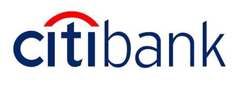
The popular red arc over the Citibank logo is meant to represent an umbrella of protection, conveying a message of safety and security to potential customers.
BarclaysLogo
![]()
The Barclays logo incorporates the silhouette of an eagle-like bird that is formed into the shape of a shield. This design is meant to symbolize strength, protection, and an ever-watchful eye.
Prudential Logo
![]()
The Popular Prudential logo features a large, sturdy-looking cliff-face, symbolizing strength, protection, and timelessness. The logo also draws a circle around this cliff-face, conveying inclusiveness.
KeyBank Logo
![]()
KeyBank combines a logo that features a bright red key along with its motto “achieve anything” to send the message that their bank is the key to achieving financial success.
Merril Lynch Logo
![]()
The bull poised to charge in the Merril Lynch logo is meant to convey both strength and aggression on behalf of their customers. Since a “bull market” is the term used to describe a market with a rising price, the Merril Lynch logo also symbolizes prosperity and is very popular with millions of people worldwide.
Fifth Third Bank Logo
![]()
The Fifth Third Bank logo is designed to look like a horizon, representing a journey towards the future. The green colors of the design further reinforce the horizon-like image and also symbolizes growth. The green used in the logo is close enough to the shade of green used in money to also stimulate an association between Fifth Third Bank and wealth.
Bank of New Zealand Logo
![]()
The soft, rounded typeface used in the Bank of New Zealand’s logo is meant to convey friendliness and approachability. This typeface, called Serrano, was explicitly designed to be used by the Bank of New Zealand in their logo, instilling a sense of uniqueness and reorganizability.
Regions Bank Logo
![]()
The plant sprouting up in the Regions Bank logo symbolizes growth and prosperity, while also appealing to the bank’s mostly rural market. The green shade of the logo also signifies growth and wealth.
Wells Fargo Logo
![]()
The Popular Wells Fargo logo conveys its message almost entirely through its color scheme. The deep red square that surrounds the logo symbolizes strength and power, while the gold color of the font symbolizes wealth and prosperity.
British Business Bank
![]()
The British Business Bank uses an arrow in their logo that is facing towards the top right corner of a square. This familiar image represents growth and prosperity while also sending a message of forwarding progression.
HSBC Logo
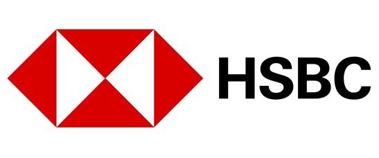
HSBC has branches all over the country. They are headquartered in New York. This logo is very popular and recognized by people all over the world.


