

Handicapped Logo gets a Makeover
One of the world’s most iconic symbols just recently got a much-needed makeover. Known as the “International Symbols of Access” the immediately-recognizable image of a figure in a wheelchair set against a blue background has been used for decades to designate certain areas for use by handicapped people and to signify that stair, elevators, bathrooms, and other utilities are handicapped accessible. Until recently the symbol has remained relatively unchanged, but there has been a recent push to adopt a new, updated handicapped symbol.
To understand this new logo and why it is important, we’ll take a look at the history of the old logo, the design elements of the new logo, and the message it is meant to portray.
History of the Handicapped Logo
In 1968, Rehabilitation International, a federation consists of 145 organizations in 82 different countries, held deliberations on what symbol they should use to designate handicap accessible areas. It was at this time that Susan Koefoed submitted her design to be considered alongside six other potential designs. Shortly thereafter, Koefed’s design was chosen, and the white, wheelchair-bound figure set against a square, the royal blue background would go on to attain worldwide reorganizability as the symbol used to mark spaces reserved for handicapped people, indicate buttons used to activate automatic doors, denote handicap accessible areas, and a number of other uses. Since Koefoed’s original design was so widely adopted, changing the handicap logo since 1968 has been neither practical nor necessary. While changing the logo across the world still presents some logistical issues, there is now a good argument for it to be updated.
What was Updated on the Handicapped Logo (And why it’s Important)
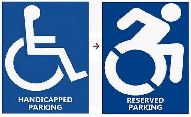
The new handicapped symbol, designed by artist Sara Hendren and philosophy professor Brian Glenney, features a few key changes. First, the new design pictures a handicapped individual with their head tilted forward, indicating their mobility and that they are in control of where they are going. The new design also pictures the individual with their arms back, once again indicating that they are dynamic and in control of their own mobility.
Hendren and Glenney believe that attitude is everything, and they hope that widespread adoption of their new logo will inspire handicapped people to view their disability in a more positive light. It may not seem like much, but the messages we are sending, such as how handicapped people are portrayed in the very symbol that was designed for them, are important to consider as we push towards a society that is more accepting and accessible to people who suffer from any form of disability. Already, the Accessible Icon Project is seeing some early success in replacing the old symbol with their new design, and while there is still a lot of work to do, the initial reaction has been largely positive.
At LogoMyWay, we understand the influence that a logo’s design can have, and we wish the designers of the handicapped logo the best of luck in getting their symbol adopted across the globe.


