This is a look at the Michelin Man Logo and some history behind the tire company.
The Michelin tire company’s iconic logo is Bibendum, commonly known as the Michelin Man Logo. He is one of the world’s oldest trademarks, having been introduced by the Michelin brothers in 1898. Bibendum is sometimes also referred to as Bibelobis or Bib. He debuted as a Michelin commercial poster with the slogan “Nunc est Bibendum,” which is Latin for “Now is the time to drink.”
Michelin is a tire manufacturing company headquartered in the Auvergne region of France. Alongside Bridgestone, it is one of the two largest tire makers in the world. The Michelin company, known officially as SCA Compagnie Générale des établissements Michelin, owns several tire brands and Michelin, including Taurus, Uniroyal, BF Goodrich, and Riken.
The original idea for the Michelin Man came to the founding brothers in 1894, Edouard and André Michelin, when they attended a colonial exposition held at Lyon. Edouard noticed a stack of tires that looked like the figure of an armless man. But it would be another four years until the symbol was finally made. This was when André met the French cartoonist O’Galop (real name Marius Rossillon).
O’Galop had earlier done a logo concept for a Munich company, but it was rejected. It depicted a royal figure holding up a large beer glass along with the slogan “Nunc est Bibendum,” a quote from Horace. Andre liked it and then suggested replacing the man in the drawing with one made from a stack of tires. O’Galop then recreated the symbol with the very first Michelin Man, and the rest is history.
It wasn’t long after his birth when Michelin Man started playing a pivotal role in its marketing efforts. He became the brand’s face in advertising, presenting products, and assisting motorists at every opportunity.
Michelin Conquering Europe
 Michelin opened its first sales office in the U.K., in London in 1905. The Michelin branding team transformed him into a knight with a helmet and shield, ready to conquer new territory. The London Michelin Man also came ready with spectacles, a cigar in his mouth, and a cup, all reflecting common elements in the British culture. The slogan used for the English market was “My strength is as the strength of ten because my rubber is pure.”
The company used many artists over time, with each bringing their own spin to the character. His shape was inspired by bicycle tires—hence the tires’ narrow appearance—while his attitude reflected the culture of the typical customer, shown as bespectacled and smoking a cigar.
Starting in the 1930s, Michelin began to rely more on in-house artists for their brand image. This resulted in more standardized symbols and images, although there were country-specific variations. The Michelin man became thicker, in line with the evolution of tires. He also became less flashy, as the image of wealth no longer matched their broad customer base.
Origin of “Bibendum”
The character’s name Bibendum became famous by accident. It once happened at the Paris-Amsterdam-Paris races, when Léon Théry, a participating driver, saw André Michelin approaching and shouted, “Here comes Bibendum!” in reference to the word that appears on the Michelin poster. Although Théry did not know what the Latin word meant, the name stuck and eventually became the character’s official identity.
Questions have also been raised regarding Bibendum’s white appearance in spite of tires being black in color. As it turns out, tires used to be white before 1912, when manufacturers started to add soot and preservatives to the rubber material. The rubber was originally ivory in color. However, the Michelin Man has to this day retained his original white depiction.
The Bibendum character’s shape has taken on many forms over the years. By the 1980s, he was running with a tire, and on his 100th anniversary in 1998, he was slimmed down to reflect modern tires, which were smaller and lower-profile. By this time, however, the Michelin Man had entered the everyday language to describe someone with a plump appearance.
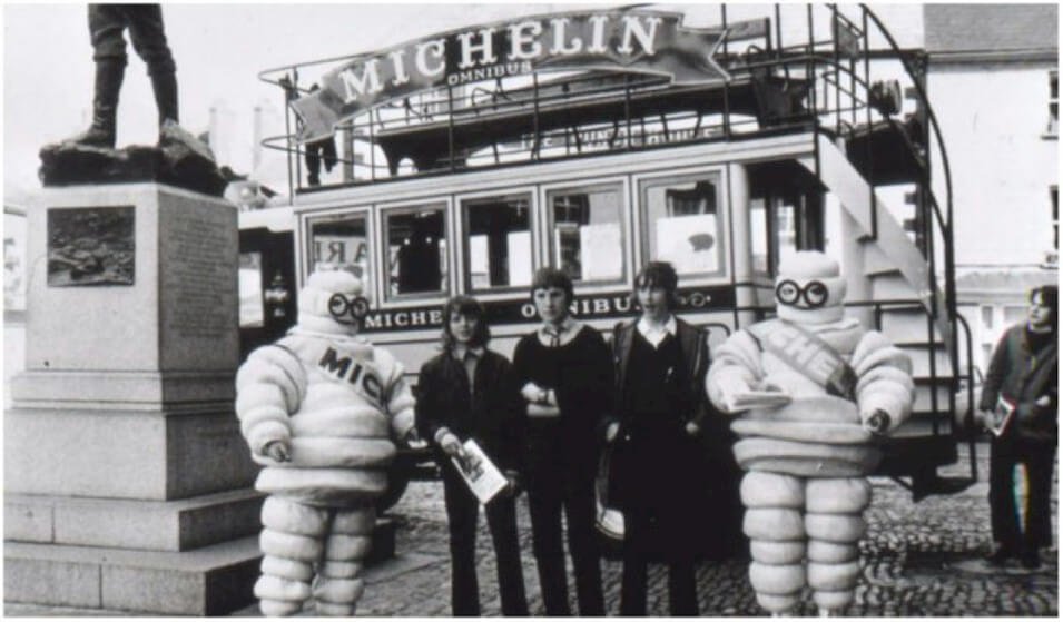 The Michelin Man has even managed to break out of the confinements of the advertising world and into popular culture. His popularity took off more than a century ago, and Michelin started capitalizing on him as early as 1911 with their new Bibendum Building in London.
The Michelin Man Logo Evolution
 The Michelin logo has undergone many changes since it first appeared on the scene more than 120 years ago. However, its visual identity has largely been preserved and reinforced by its Mascot, identified as Bibendum. In each redesign of the logo, Bibendum has retained his place as the central figure.
From the first version in 1898, the Michelin Man’s shape and contours kept changing until 1936, when the figure that’s commonly recognized today was introduced.
1936 – 1968
The logo featured the running Bibendum along with a Michelin wordmark. The character runs with a tire, with the wordmark’s last letter “N” stretched to represent the road. The logo was in black, white, and brilliantly reflected the playful, friendly image of the brand.
1968 – 1997
In 1968, the company changed the logotype to a more modern sans serif typeface, with the letters in capital and extra-bold. The letters’ edges were in a traditional straight cut, reflecting an image of seriousness and stability, in stark contrast to Bibendum’s casual character. As for Bibendum, sometimes he would appear alongside the lettering, sometimes not, depending on the context and medium.

1997 – 2017
The 1997 iteration brought new changes to the color pallet. The logotype was now in white on a blue background, with a yellow line underneath it. The Michelin Man was also reinstated as part of the symbol, standing to the left of the logotype and saluting. The “Michelin” inscription was an italicized version of its predecessor, also with a little more space between the letters.
2017 – Today
The 2017 version introduced a lighter, more straightforward look to the symbol. The logotype is the same but in blue, with the yellow line moved above it. The Mascot is now larger and placed above the lettering, featuring a friendly smile and salute from Bibendum.
The Michelin Logo Design Elements
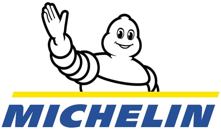 Michelin Symbol: With every new version, the designer brought their own view of the Bibendum character. The most recent version of 2017 shows the Mascot presumably saluting motorists as they drive by.
Over the course of his history, the Michelin Man has become the company’s brand ambassador and one of the most recognizable brand symbols worldwide.
Michelin Logo Font: The current typeface of the wordmark is a solid sans-serif in italics. All the letters are in uppercase.
Michelin Logo Color: The Bibendum character is in his traditional white and black color, while the wordmark is in blue on a white background. There’s also a yellow line above the lettering.
The History of Michelin
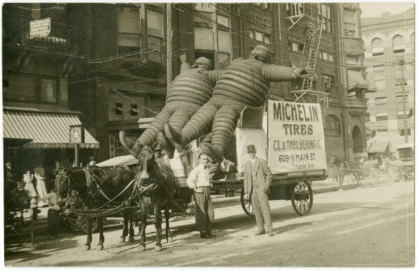
Michelin’s story starts with a rubber factory owned by the Michelin brothers, Edouard Michelin and André Michelin, in the 1880s. In 1889 a cyclist came to the plant to have his pneumatic tire repaired. The tire happened to be attached to the rim, and it took the brothers more than three hours to detach and repair it.
Edouard took the bike on a test drive the following day, and the tire failed after a few hundred meters. Despite the failure, the brothers were excited about the then-new pneumatic tire and started working on their own version. They also wanted to make one that did not need to be attached to the rim.
Soon after, in May 1889, the Michelin Company was incorporated. Two years later, the company patented their removable pneumatic tire, which was used by Charles Terront to win the world’s first long-distance cycling competition.
Michelin In The 1930s
By the 1920s and 1930s, Michelin was operating huge rubber plantations in Vietnam. The working conditions at these plantations were heavily criticized and led to the rise of Phu Rieng Do, a popular labor movement at the time. Phu Rieng Do staged a strike in 1930 to protest the company’s poor working conditions, but the strike lasted no more than a week.
Michelin introduced a new type of tire in 1934. The tire had a special form lining, which would allow it to keep running in case of a puncture. Today, it is known as the run-flat-tire.
Michelin Radial Tire
The company also developed and patented a landmark innovation in the history of tires. The Radial Tire, introduced in 1946, eventually pushed Michelin to among the top world tire manufacturers.
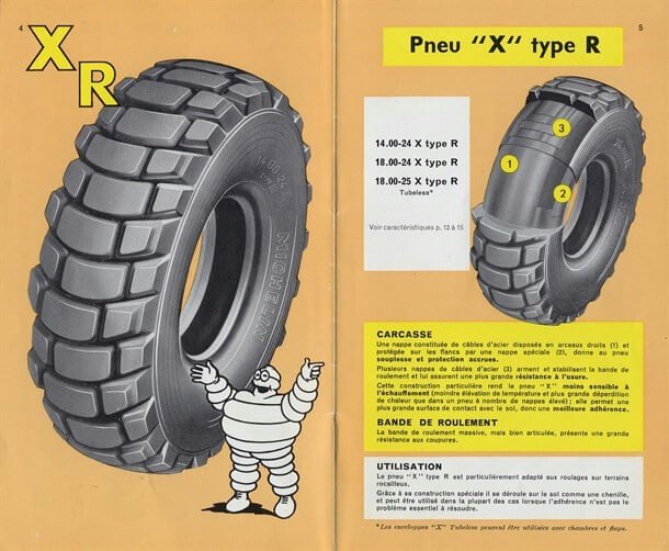
It was initially made for the Citroën cars and branded the “X” tire. Michelin had bought the struggling Citroën Company back in the 1930s. The radial tire eventually became popular all over Europe and the world over, thanks to its improved handling and fuel consumption.
In 1966, the company entered a partnership agreement with Sears to have the radial tires manufactured under the Allstate brand in America. By 1970, the company had reached sales of 1 million units per year.
Michelin opened its first North American sales office in 1968 and soon managed to reach a sizeable market share. The company’s OEM tire (used by American Automobile companies) market share was 10% by 1989.
Up until 1967, Michelin had struggled to market their invention to the American market. Sales of their radial tires took off in 1968, thanks to an article in Consumer Reports, an influential magazine at the time. The article recognized Michelin’s technology’s superiority, and it wasn’t long before their competitors started to decline.
Acquisitions
In 1989, Michelin acquired the American company B.F. Goodrich and Uniroyal. The two companies had recently merged their tire and rubber manufacturing divisions. This acquisition established the Michelin Company as one of the largest tire makers in North America and the rest of the world.
Another major acquisition came in 2018 when Michelin bought Camso, a maker of off-the-road tires. Michelin also owns a 90% stake in the Hungarian company Taurus Tire, in addition to various other brands in Europe.
Michelin regained its status in 2008 as the largest tire manufacturer in the world, after two years of trailing Bridgestone. The company produces tires in numerous countries, including France, Germany, Spain, Poland, Canada, India, Serbia, Thailand, Japan, the U.K., and the U.S. Some of these operations are acquisitions that have continued to manufacture and sell tires under their original brand names, such as BF Goodrich and Taurus.
Michelin Motorsport Participation

Michelin was a participant in the MotoGP races from 1972 to 2008. The company contributed radial construction technology to the competition in 1984, followed by multi-compound tires a decade later. Michelin managed a total of 360 wins in its 36-year participation. For a 13-year stretch between 1993 and 2006, the World Championship was captured by a Michelin rider.
In 2007, the World Championship went to Casey Stoner on Bridgestone tires, after which competitors, including Valentino Rossi, suggested that Michelin tires were inferior. Michelin withdrew from MotoGP when it was announced that a control tire would be imposed starting from 2009. They returned to the competition in 2016 after Bridgestone’s withdrawal in 2015.
Closing Remarks
The Michelin Man Logo and the Company have become synonymous with its iconic symbol, the Michelin Man who’s also known as Bibendum. Such is Bibendum’s popularity that the Michelin logo was voted the best logo ever made by a panel of 22 designers in a competition run by the Financial Times in the year 2000. It can be argued that this report only helped strengthen the public’s perception of the brand.
However, a large part of Michelin’s growth and dominance can also be attributed to their invention of the radial tire in 1946. Thanks to their superiority, radial tires became the standard in Europe and Asia, and, eventually, North America.
Another factor that has helped endear the brand to people is their publication, the Michelin Guides. These are travel guides that the company started publishing since the days of being founded by the Michelin brothers. André wanted to promote tourism through car travel, and the principles offered an excellent opportunity to promote Michelin.


