This is a look at the Twitter Logo and some history behind the business.
With well over 800 million active users, Twitter has earned its place as one of the world’s largest social networking sites. Twitter’s signature Bird logo can be seen popping up everywhere on the internet today; hard to miss for just about anyone who has ever used the internet.
Since its inception in 2006, the social media giant has come a long way, both as a business and a brand. The Twitter logo can be found in some corner of virtually every website, as well as corporate t-shirts, billboards, and other branding paraphernalia.
The Twitter Logo Evolution
The Twitter Bird logo came onto the scene in 2010, but not many people who use Twitter today know that it has a name. It was named Larry T Bird, with the inspiration being the basketball legend Larry Bird who played for the Bolton Celtics.
Twitter’s co-founder Biz Stone, being from Boston himself and a fan of the Celtics, picked the name. He has also been on record confirming that the sporting legend was the inspiration.
The Twitter logo did not start with the bird, but there have only been a few variants since the first version was done in 2006.
2006 – First Official Twitter Logo
The first official Twitter logo was a delightful departure from the prelaunch version. Designer Linda Gavin had just a day to create it before the official launch. It was a simple wordmark featuring a unique rounded typeface, with the letters in small caps and no spacing between them.
The logo’s focus on simplicity blended in with Twitter’s overall design approach and helped endear users to the website. In the sky-blue color that’s become almost synonymous with Twitter, this logo lasted four years before the introduction of the Twitter bird.
2010—The Twitter Bird Icon
After four years of the wordmark, the founders decided to add something that would reflect its identity. This was when the bird was born, and it was said to symbolize the nature of a tweet—quick and short, just like the noises a bird would make. The bird was placed to the right of the wordmark, which remained unchanged except for the color switch to black.
2012 – The Modern Bird
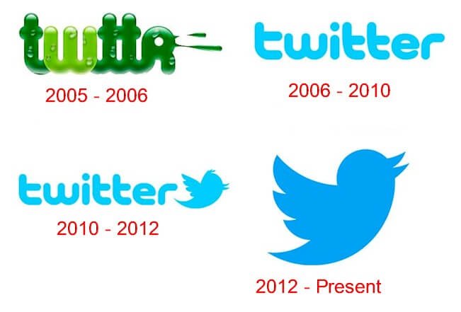
In 2012, Twitter management saw the need to refresh the brand’s image, with the emphasis on even greater simplicity. Twitter had by then become very popular all around the world, so much so that the logo did not seem to need the company’s name. The name was dropped, and the logo now became that little bird.
The bird itself was redesigned to a more symmetrical, clean-cut look. The designers did away with the previous bird’s plumage, and three overlapping circles shaped the wings. They enlarged the icon and switched to a darker shade of blue, which made it more appealing to look at, particularly on the white background of web pages. With this bird symbol, Twitter’s brand identity was established, and it’s become one of the easiest to recognize.
Why the Twitter Logo Works
 There’s little doubt that the bird logo has played a significant role in the company’s success. It was Twitter’s focus on simplicity that drove people to the platform in the first place, and their logo has always been a part of the elements that communicate this ethos to their users.
Twitter has become very protective of their logo, with explicit rules against modifying the logo in any way. This strict policy has also helped the company maintain a consistent brand image across all platforms.
Twitter Logo Design Elements
While a respectable effort, Twitter’s first official logo can hardly compare to the iconic flattering bird being used today, from the days of the thick rounded sans-serif, Twitter’s logo is a testament that perfect is a process that takes time.
The bluebird, with its merry wings and beak open in the manner of a chirping bird, needs no words to describe it. The symbol perfectly sums up the concise nature of a tweet.
Twitter Logo shape and symbol: The current Twitter logo is in the form of a fluttering hummingbird. It was designed by artist Martin Grasser who had just graduated from the Art Center College of Design when he was hired for the task.
The illustration was created with 15 circles layered on top of each other. This geometric approach gave an impeccable shape to each of the parts of the bird: the wings, the head, the beaks, and the belly.
Back in 2006, the Twitter logo was a simple “Twitter” wordmark using a rounded sans-serif font. This roundedness seems to have been the inspiration for the design of the bird that was to make its appearance later.
The first version of the Twitter logo bird in 2010 added some sauce to the logotype, but nothing could beat the refined bird iteration introduced in 2012. The outlines of perfect circles shaped the bird’s rounded belly and wings. Every aspect of the bird, including the beak, was drawn from circular arcs of precise geometry.
Twitter Logo Color: The original logo came in a light blue shade. Blue has proved to be a popular choice among website properties, particularly social networking platforms. In 2010, the logotype was changed to black, with the bird icon taking on the blue from the logotype.
The 2012 variant made the bird a few blue darker shades, presumably to add some contrast against the regular white background. While the shade would still be classified as light blue, it is a bit closer to true blue than the previous aquamarine.
Twitter Logo Font: The 2012 version brought to an end the text version of the logo. The company explained that there was no more need for text to represent Twitter. The first two logo versions used a custom rounded bubble font face created by Linda Gavin.
The History of Twitter
Co-founder Jack Dorsey originally conceptualized twitter in 2006. He first imagined Twitter as a text-based communications platform. Friends could keep tabs on one another based on their status updates, similar to texts but not quite. At the time, Myspace ruled the social networking scene, with Facebook hot on its heels. Social media was all the rage, and Dorsey knew it.
Early Twitter Days
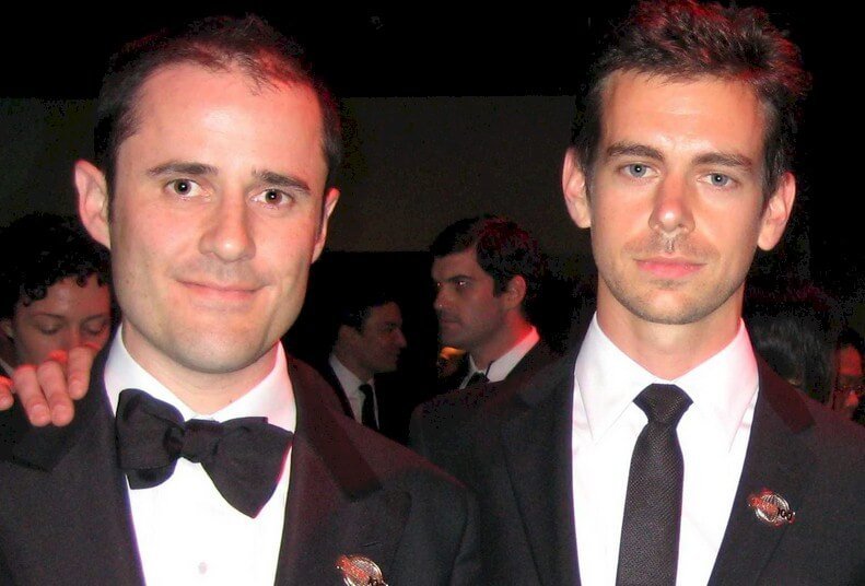 At a brainstorming session held at Odeo, a podcasting company, Dorsey pitched the idea to Odeo co-founder Evan Williams. Evan and his business partner Biz Stone gave Dorsey the green light to dedicate some time to the project.
Twitter was first known as twttr in its early days. It was a popular trend in those days to drop the vowels in a word, sometimes because the domain name in its entirety would not be available. The name is accredited to software developer Noah Glass who was in the original team.
The First Tweet

Jack Dorsey had the honor of tweeting the first tweet on March 21, 2006. The message simply read, “just setting up my twttr.” In those early development days, the team members experimented a lot with SMS messaging. They would often accrue hundreds of dollars in bills on their phone lines as they worked on the product.
While the founders tested Twitter within Odeo’s doors, Odeo was facing some tough times. Thanks to the release of Apple’s own podcasting platform—effectively killing Odeo’s business—the founders made the decision to acquire their company back from investors. Led by Evan Williams, Jack, and Biz Stone, the original team members, bought the company back.
With the buyback, the members acquired full rights to Twitter. There was some controversy surrounding this move soon after Twitter hit big. It has been suggested that the investors did not understand the massive potential within the Twitter platform.
Notably, some original team members, such as Team glass, were left out of the newly-formed Twitter company. The new company was incorporated under the name Obvious Corporation.
Explosive Twitter Growth
 In 2007, Twitter was on the cusp of a massive growth spurt. During one interactive conference that year, more than 60,000 tweets a day were being sent by attendees. The team from Twitter had established a huge presence at the event and was able to capitalize on the platform going viral.
It wasn’t always all sunshine and rainbows, however. In its formative years, Twitter had to suffer quite a few growing pains. One of the biggest challenges was capacity; many times, the platform would go out of service when overwhelmed by large surges of user activity.
Twitter used an illustration by artist Yiying Lu to indicate to users when the service was overloaded. The illustration was a whale getting lifted out of the water by eight birds. The team used this image to let users know that they acknowledged the server load problems and that they were working on it. This whale and its error page soon went viral on the platform itself. It was nicknamed the “Fail Whale.”
Tweet 140-Character Limit to 280-Character Limit
The real reason Twitter imposed a 140-character limit is that the platform was originally made for SMS-based communication. This was also the limit that mobile network carriers have on their SMS services, so Twitter had no choice but to play by the rules.
However, as Twitter evolved into a web-based platform, the character limit was retained as a unique aspect of branding. Many users had grown accustomed to it and even liked it for this very reason.
The 140-character limit stayed on until 2017, when Twitter management increased it to 280, amidst a few protests from users. The original 140-character limit was seen as outdated in the new era of smartphone use.
Usually, when users needed to say more, they posted multiple tweets. Twitter also explained that the increased limit would help users spend less time having to condense their thoughts.
User Innovation on Twitter
As the usage of the platform increased, users coined new terms and invented new ways to use the platform. As an example, users did not initially have the option of replying to tweets. This forced them to mention the user of the tweet they were responding to with the @user_name symbol.
This became the standard method for replies, but Twitter eventually noticed its inconvenience and added a native reply option. It was the same story with hashtags, which eventually became a part of the platform.
Retweets also came as a result of user-driven functionality. Twitter users were wanting to re-post tweets by other users while also giving credit to them (the original user). For this reason, they started at the “RT” indicator before tweeting the message. Twitter added the retweet functionality in August of 2010.
Twitter and Vine
 Twitter acquired Vine in October of 2012 for $30 million, which then seemed like a very astute purchase. Vine was a platform that allowed users to capture and share 6-second video clips about their day to day activities. It soon became the number one platform for short videos on the internet.
In 2013, Instagram threw a curveball by introducing its option of 15-second video clips. This was soon after followed by Snapchat with their option for 10-second videos. Vine was unable to cope with the completion, and within no time, had lost many of its advertisers.
Twitter management made plans to merge Vine into Twitter, but the plans were abandoned following changes to the leadership team. After failing to find a user by late 2016, Twitter decided to shut down the platform.
Last Word
Today, Twitter facilitates all sorts of interactions, from friendly exchanges to celebrity gossip and even official government messages for the public. Many changes have happened within the management board over its short 14-year history, but the platform has only grown stronger since then.
As more users have joined the platform over the years, and with the ever-evolving user needs, Twitter has done a great job of adapting quickly to the times. One thing is nevertheless unlikely to change anytime soon—the legendary blue Twitter logo that has captured the imagination of many a designer, as well as the layman internet user.

