
This is a look at the Lululemon logo and how they got started in the industry.
Lululemon Athletica is a renowned athletic and yoga apparel maker headquartered in Vancouver, Canada. Founded as a yoga apparel retailer in 1998, the company has since expanded into 460 stores worldwide and online.
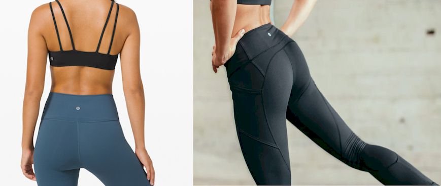
Lululemon has expanded to create a range of athletic wear proudly displaying their logos on shorts, pants, and shirts, as well as yoga accessories and lifestyle clothing.
History of Lululemon
Denis “Chip” Wilson established Lululemon in Vancouver, Canada, in 1999. Before founding the company, Chip had spent 20 years in the snowboard, skate, and surf business and was seeking change. After attending Vancouver’s first-ever commercial yoga class, Chip loved the practice and felt amazing during and after the activity.
With his love of technical athletic clothing, Chip realized that the cotton clothing worn for power yoga at the time was both unpractical and inappropriate. Movements needed flexibility, breathability, and stretchiness that a person could sweat into while exercising. Keeping this in mind, Chip built a design workroom for his new apparel. Struggling with rent, he turned the design room into a yoga room at night.
Chip’s yoga instructors were asked to try out the new outfits, and they then gave the founder useful information and feedback about the clothes. When naming the new company, Chip interviewed 100 people and presented them with 20 brand names and logos, after which he came up with the name Lululemon, which has neither meaning nor roots. It’s believed that Chip chose this name as likes the sound of three L’s in the name. The logo, a stylized A, was meant for the trademark Athletically Hip, which wasn’t picked.
The first Lululemon store was opened in the beach location of Vancouver in November 2000. The shop was meant to be a meeting place for people in the community to discuss matters like exercise, dieting, and cycling. But the store becomes so busy and popular that meeting customers’ needs became virtually impossible. Lululemon grew fast as customers took to the products, and the workforce was keen to learn, challenge themselves, and expand.
From the off, Lululemon had a solid mission that advocated for an active, healthy lifestyle. Inspired by philosopher and author Ayn Rand, Chip built the Lululemon brand aiming to elevate it from average to great.
Lululemon strives to reflect its mission statement in its company culture. For example, store managers are given more say in the running of the stores, and the firm runs on decentralized company culture. Lululemon hires employees based on their commitment level and how well they’re suited to the corporate culture. In order to realize its mission statement, Lululemon employees are called “educators” to recognize their vital role in helping consumers lead an active and healthy lifestyle.
Today, Lululemon stores are heavily focused on interaction with local customers and community development. Almost all stores host nightly or weekly in-house events, with lessons ranging from beginner yoga to advanced yoga and self-defense and goal-setting workshops. Workshops and events generally take place after store hours in the salesroom after products and racks have been shifted.
 Unlike many clothing stores, Lululemon offers no discounts but sells around 95% of its merchandise at full price. Also, its products are dearer than those of competitors, reflecting the brand name’s value. Lululemon uses the scarcity concept to encourage people to buy right away.
Its shelves are often not full, and many products come with short life cycles like six weeks. Therefore, customers are persuaded to buy the items before they’re gone. This is believed to be a key factor in Lululemon’s sustained success and popularity among customers.
In order to support its mission statement, the company has adopted seven fundamental values: quality, product, balance, integrity, entrepreneurship, greatness, and fun. These values help to motive staff and guide their choices.
In 2012, Chip stepped down from the day-to-day running of Lululemon and officially left the firm to pursue other passions. His blog contains his musings and worldviews. Lululemon remains an authentic fashionista firm in the athleisure industry, despite the founder’s several controversial statements in the past.
In 2016, Lululemon entered the Japanese market and currently has a number of stores, mainly in Tokyo.
Key Timelines of Lululemon
1998: Denis “Chip” Wilson founded Lululemon in Vancouver, Canada, and sold the company’s first yoga pants the same year. Chip wanted many L’s in the name so that it’d sound western to buyers from Japan, who tend to have trouble pronouncing the letter.
 2005: Lululemon Athletica sells athletic clothing, including tops, shorts, jackets, sweaters, yoga pants, and innerwear, as well as bags, water bottles, yoga mats, and hair accessories. Lululemon trademarked its novel fabric, Luon, which had a higher-than-usual level of microfiber. Since then, the firm has produced a large variety of fabrics, including moisture-wicking and compression designs.
July 2007: Lululemon had its first public offering in 2007, raising $327.6 million through the sale of 18.2 million shares. In 2008, Christine Day became its chief executive officer.
November 2007: It was reported by the New York Times that Lululemon made bogus health claims about its clothing line called Vitasea. The company had claimed that Vitasea, made from seaweed, offered “antibacterial, anti-inflammatory, detoxifying, and hydrating benefits,” but lab tests didn’t show any major difference in the mineral levels found in Vitasea fabric and a regular cotton T-shirt.
Lululemon was consequently forced to withdraw all claims from seaweed-based products sold in Canada after an order from the Competition Bureau of Canada, an oversight agency.
December 2010: Lululemon recalled a few of its recyclable bags that were made from polypropylene, following reports of high lead levels.
2012: Lululemon sued supplier G-III Apparel Group and Calvin Klein for violation of its three design copyrights for yoga pants. The case was eventually decided out of court that same year.
2013: Lululemon founder Chip has in the past, made many controversial statements that many have derided as distasteful. In an interview in 2004, Chip mocked the Japanese pronunciation of Lululemon.
The same year, he said that Lululemon found it too costly to make attire for plus-size women. In a bid to explain away too much pilling in Lululemon’s clothes, he blamed some people for not properly wearing the company’s clothes or for not having body shapes that are fit for his apparel.
In a 2013 Bloomberg TV interview, Chip said that some women had bodies that weren’t suitable for Lululemon’s apparel. According to Time Magazine, the remarks were “fat-shaming”.
That same year, Lululemon made its third successive appearance on the list of the fastest-growing companies, according to Fortune 500. Chip resigned as chairman in December, and TOMS shoe president Laurent Potdevin became CEO.
 2014: The first Lululemon store in Europe was opened in London. In early 2015, Wilson resigned from the board and was replaced by Michael Casey, the board’s former lead director. In 2018, Potdevin quit the company’s board and as CEO due to misconduct.
2017: Lululemon teamed up with Athletic Propulsion Labs to sell men’s and women’s footwear in 23 states all over the United States. In 2019, the firm created a luxury streetwear product dubbed Lab in some of its stores.
2019: Lululemon invested in Mirror, a new fitness firm that sells speakers and a camera-enabled interactive mirror for at-home exercises. The firms planned to make fresh content for the equipment, beginning with meditation lessons.
In June 2020, the company announced a deal worth $500 million to buy Mirror, taking advantage of a rising trend of people performing virtual exercises at home instead of visiting the gym because of the coronavirus pandemic.
The Lululemon Logo and Its History
Lululemon has one of the most effectual logos out there. The tiny feminine trademark has no clear meaning, but millions consider it as a symbol of being part of a small, well-toned elite. Actually, the attraction of Lululemon’s small, sexy logo could be one of the main reasons why the company is inexplicably successful in such a crowded, competitive marketplace.
Why the Emblem Looks Like “A”
![]() According to the corporate history of Lululemon, the firm’s logo is letter “A”, supposedly a reference to the company’s originally intended name “Athletically Hip”. Further inquiries about the logo design process are strongly fobbed off by the company’s “education” coordinators. But asking customers about the logo’s meaning will elicit scores of answers, none of which have to do with the alphabet.
According to the corporate history of Lululemon, the firm’s logo is letter “A”, supposedly a reference to the company’s originally intended name “Athletically Hip”. Further inquiries about the logo design process are strongly fobbed off by the company’s “education” coordinators. But asking customers about the logo’s meaning will elicit scores of answers, none of which have to do with the alphabet.
Probable interpretations include an omega sign, silhouette of a well-groomed bouffant haircut, or the shape of a uterus. The blank oval can also portray a handheld mirror, the age-old, narcissistic sign of femininity. Squint harder, and you’ll probably see the letter “A”, with the cinched waist a hint of the crossbar.
Regardless of any official explanation, Lululemon’s logo fits the western mold of obedience. The logo’s tapered edges are gently compliant, and the bilateral symmetry bends to tradition. In any case, the Lululemon logo is evidently a receptive, passive vessel, a wordless and utterly reductive symbol of femininity, in sharp contrast to the mantra of liberation Lululemon cheerfully champions.
Lululemon Logo Design Elements
![]() Font: The Lululemon wordmark is written with lower case characters, making it welcoming and friendly. The inscription is written in a conventional sans-serif font, which is much like Bradley Bold due to its clean, neat contours and elegant, sleek lines. The inscription is understated yet timeless and stylish and has the perfect balance of spaces, letterforms, and thickness of lines.
Font: The Lululemon wordmark is written with lower case characters, making it welcoming and friendly. The inscription is written in a conventional sans-serif font, which is much like Bradley Bold due to its clean, neat contours and elegant, sleek lines. The inscription is understated yet timeless and stylish and has the perfect balance of spaces, letterforms, and thickness of lines.
Color: The white emblem sticks out from the red background. The circle and the emblem have a black outline. The white and red color combination of Lululemon’s corporate image is a sign of power and passion, while the black logotype adds a semblance of expertise and professionalism, balancing the bright emblem and adding some seriousness to it.
———————
LogoMyWay is a crowdsourcing website for logo designs. You can start your own logo contest and receive logo submissions in real-time from logo designers all over the world or use our online Logo Maker and make your own logo in less than 10 minutes.


