
Let’s get an insight into the Hot Wheels logo and some history behind the toy car maker.
The Hot Wheels logo conveys the attitude of the brand. It evokes the spirit of speed, strength, freshness, desire, and endurance. In the same light, the logo is clean, readable, and memorable. With these emotions, it has become one of the most influential and familiar logos worldwide.
The Hot Wheels logo appeared in 1968. It featured the flaming symbol, which has become consistent with the brand. In addition, the flame housed the wordmark and the brand’s tagline. It also featured four official colors—red, orange, white, and black.
It served the company for a year before giving way to its successors. The current Hot Wheels logo has two colors—red and yellow. It has the iconic flame but in a smaller and sharper form. Despite the updates on the emblems, they convey the same personality as the original.
The simplicity of the Hot Wheels logo makes it legible, versatile, and scalable across all promotional mediums. Yes, it can drive and speed on any marketing highway, killing no pedestrian. To learn more about the flaming logo and its colorful cars, follow my signal.
Hot Wheels Logo Evolution And Its History
![]()
The Hot Wheels’ visual identity is over fifty years old. It began in 1968 and has evolved eight times. Each redesign aimed to simplify the logo and convey its core values. You’ll find these changes on its symbol, colors, and tagline. The updates have served the brand well. So without further ado, let’s enter the Hot Wheels garage to study its logo evolution.
1968—The Original Logo:
Hot Wheels unveiled its debut logo in 1968. It featured a fire-like symbol that comprised colors, a wordmark, and a slogan. The colors were red, orange, white, and black. The wordmark was written in a sans-serif font. And the slogan read, “Hottest metal cars in the world.” This logo conveys the energy of fire and speed. It lasted for a year.
1969—The First Update:
Hot Wheels updated its logo in 1969 to a modest one. The flaming logo lost its orange charisma. The designer kept three decorated ends instead of seven. And at the lower end of the flame, he added the Mattel mark. This mark represents a wheel and references the parent’s company. The slogan changed to the “Fastest metal cars in the world.” Also, this logo lasted for a year.
1970—The Second Update:
In 1970, the Hot Wheels logo became more simplified. The designer deleted the slogan and some captions on the Mattel symbol. He also introduced a darker red color than the previous ones. This emblem reigned for three years, and it was clean, attractive, and readable.
1973—The Third Update:
After three years, Hot Wheels released another emblem. It was its third update in five years. The new logo had an orange flame background. In addition, the orange flame and white wordmark became broader and more prominent, respectively. It served the brand for about seventeen years.
1990—The Fourth Update:
The brand’s fourth logo brought in lots of changes. First, the fire mark received a black and white outline, making it stand out. Now, the designer executed the wordmark in two color gradients—yellow and white. The emblem got a 3D personality, and it served for ten years.
2000—The Fifth Update:
The fifth redesign was like its immediate past, but with a subtle change. The designer removed the outline and the symbol representing Mattel. He also introduced a yellow flame near the letter—H. Compared to the previous logo, the colors were darker. It stays for four years.
2004—The Sixth Update:
The Hot Wheels logo released in 2004 looked sleeker and professional. The colors became much darker and the wordmark more streamlined. Another subtle change was the flame. It became much sharper with a pointed tip at its right end. It served the company for six years.
2010—The Seventh Update:
For the next four years, Hot Wheels used another logo. Again, the designer discarded the three-dimensional effect. Instead, he opted for an emblem with a flat persona. This logo comprised a red flame background and a yellow wordmark. These colors were brighter and eye-catching.
2014—Today:
The current emblem marks the eighth logo update for Hot Wheels. Interestingly, it has the same personality as its predecessor. The only subtle twist was the size: this latest logo is smaller.
2018- The Anniversary Logo:
![]()
In 2018, the company celebrated its golden jubilee. To mark this anniversary, the company unveiled its anniversary emblem. It featured its iconic flame-like logo below a stylized figure—50. The graphic designer executed this logo in a blue and white color scheme.
Why Does Hot Wheels Logo work?
1. The Logo Is Clean:
Hot Wheels logo is modest: it has fewer graphic elements that respect the branding rules. You’ll find an icon and two colors evoking its famous personality. With this simple feeling, the emblem represents the brand with clarity and loyalty.
2. The Logo Is Readable:
Readability is essential in all logos. You have a severe issue if your customers can’t read your brand’s name. The same goes out for any other captions on your logo. Luckily, the Hot Wheels logo has a readable font. So it’s easy to make out the caption on it. That’s why it’s thriving!
3. The Logo Is Memorable:
Graphic designers aimed to create logos that customers could recall. Customers have less time, so they wouldn’t waste it on detailed emblems. The Hot Wheels logo is memorable. This is because it has fewer graphic elements that give it a modest layout.
4. The Logo Is Unique:
Millions of brands are competing for customers’ attention daily. To have a chance with them, you must set your brand apart. That’s precisely the goal of all iconic brands. And Hot Wheels is no exception. The flaming logo is distinct from similar brands in the industry.
5. The Logo Is Scalable:
Scalability is another powerful logo feature. It can make or break your branding tactics. Scalability ensures a logo can fit multiple mediums regardless of size. Thankfully, the Hot Wheels logo can fit smaller and larger surfaces. It can do this vital task because it’s clean.
Hot Wheels Design Elements
Bright colors and a unique icon give a visual identity to the Hot Wheels brand. Proficiently, these graphic features represent the values of the toy car maker. In addition, the designer kept a legible wordmark in all the emblems. Finally, he picked elements that are relevant to the auto industry.
Hot Wheels Shape And Symbols
1. A Flame:
An abstract burning flame is the main icon for the Hot Wheels logo. It gives a consistent and unique personality to the brand. A burning flame symbolizes desire, passion, light, and hope. As a symbol of warmth, it can also evoke danger, hell, and destruction.
2. A Circle:
A circle is a symbol of evolution. It represents the Mattel logo, which served as the wheel for the emblem. A circle is a never-ending symbol that depicts the divine forces of life. It symbolizes perfection, wholeness, infinity, eternity, and totality.
Hot Wheels Logo Colors
1. Red Color:
Red is the primary color for Hot Wheels. Apart from the 1973 logo, it has featured on the rest. It has a strong connection with speed and heat. These are qualities that the brand wants customers to feel. The color of blood symbolizes lust, strength, passion, and burning desire. Red also has a close association with courage, action, joy, and willpower.
2. Orange Color:
Hot Wheels also used the orange color. It was a visible color in the first and fourth logos. The color blends with red to project the fire attitude of the brand. Orange stands for creativity, fun, and freedom. You can also use orange to signify success, change, and warmth.
3. Yellow Color:
As a flaming symbol, there’s no doubt that it contains an element of yellow. Yellow took a bigger space in the 1990 emblem. Since then, it has featured prominently without halting. The sunshine color stands for freshness, happiness, and optimism. However, it can also signify clarity, honor, and intellect.
4. Black Color:
Subtly, black has also played its role. Black has a robust emotion. It has served as the outline of the logo. The color of darkness represents strength, power, and authority. Yet, it can also carry the energy of seriousness, elegance, and mystery.
5. White Color:
White is another obvious winner in the Hot Wheels logo design. It’s a color of integrity. Mostly, you’ll find it beautifying the wordmark. White, the color of balance, is often used to signify safety, goodness, and purity. Also, it can signal simplicity, sincerity, protection, and humility.
6. Blue Color:
None of the logos featured the blue color. Yet, it marked the personality of the Hot Wheels’ anniversary emblem. The brand unveiled this eye-catching logo in 2018 to celebrate its fiftieth birthday. Blue aligns with the sky and open space. And it signifies loyalty, stability, and faith.
Who Made the Hot Wheels Logo?
![]()
Otto Kuhni is the brain behind the Hot Wheels logo. For over forty years, he worked as a graphic designer for Mattel. In 2012, he earned a place in the Diecast Hall of Fame, receiving a Diecast Designers Award. He has designed for Lockheed, Max Factor, Cox, Tyco, and others.
What Font Is Hot Wheels Logo Using?
The Hot Wheels wordmark remains the same via its series of logos. It’s a custom typeface from the sans-serif font family. Its fairy outlook resonates perfectly with fire and speed. Heavy Heap is the closest font to the Hot Wheels wordmark. Typodermic Fonts is the creator of this typeface.
What Is Hot Wheels Slogan?
To engrave its brand image in the minds of its customers, Hot Wheels have used several catchy slogans. In 1968, the company used the “Hottest metals cars in the world” as its maiden slogan. Then, a year later, it unveiled the “Fastest metal cars in the world” as its tagline.
In 1970, the brand updated its logo and ushered in a new motto. It went for “Go with the winner.” Today, Hot Wheels’ slogan is—It’s not the same without the flame.
What Is the Hot Wheels logo?
From its inception till now, Hot Wheels has kept a fire-like emblem. It represents fire, wheels, and speed. The burning logo uses intense colors to convey its brand identity. The current logo has two colors—red and yellow. While red signifies speed, yellow represents fun.
Why Is It Called Hot Wheels?
The brand’s name—Hot Wheels, originated from a compliment. According to Mattel, the praise came from Elliot Handler, the company’s president. Thus, when Elliot first saw the design and speed of the prototype, he remarked, “Those are some hot wheels!” Yes, the car impressed him.
What Was the First Hot Wheels Car?

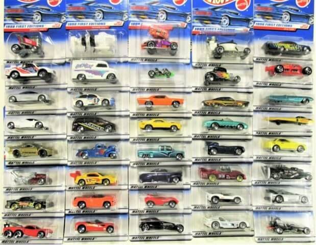
Custom Camaro was the first Hot Wheels toy car sold. It was part of the Hot Wheels line of die-cast cars. Mattel nicknamed the series—The Sweet 16. The company unveiled them at the International Toy Fair in 1968. Interesting, Custom Camaro was sold on May 18, 1968. This date marked the official birthday of Hot Wheels.
The sixteen include Beatnik Bandit, Custom Barracuda, Custom Corvette, Custom Cougar, Custom Eldorado, and Custom Firebird. Also, you’ll find Custom Fleetside, Custom Mustang, Custom T-Bird, and Custom Volkswagen. Finally, Deora, Ford J-car, Hot Heap, Python, and the Silhouette made up the list. The California muscle cars and hot rods inspired these designs.
What Is the History of Hot Wheels?

Two important events led to the birth of Hot Wheels. The first inspiration came from Kenneth, the son of Elliot Handler. Elliot, the co-founder of Mattel, once saw his son playing with Matchbox cars. At once, Elliot conceived the idea of competing with the British toy car maker.
At the end of the 1960s, the auto industry was booming. And Elliot wanted a slice of this hot cake. However, instead of making actual cars, he focused on toy cars. He aimed to design attractive, robust, and the fastest miniature cars for children. That’s the second motivation.
His wife, Ruth Handler, and directors didn’t welcome the idea. Yet, believing in his concept, he got to work with some engineers. Then, on May 18, 1968, Hot Wheels was born. Elliot and his engineers released the first die-cast cars at the International Toy Fair.
They called them—The Sweet 16 because this unique line contains sixteen cars. Two distinctive features on these cars were the spectra flame and the red pinstripe on them. These were visual marks that made the cars unique, eye-catching, and famous.
Out of the sixteen designs, Harry Bradley designed eleven. But in 1969, thinking Hot Wheels wouldn’t succeed; he left to start his consulting business. But the sweet 16 disrupted the competition. Enjoying this competition, Elliot and his associates asked Bradley to return.
As to be expected, Bradley refused. He chose his friend, Ira Gilford, to take his place instead. Gilford, a former Chrysler designer, accepted the offer to work with Mattel. He led many innovative designs. Two of his most fantastic designs were the Splittin’ Image and Twin Mills.
By 1969, Hot Wheels had become the hottest brand of cars in the United States. It became the brand of choice for every child. In 1970, Mattel unveiled its new tagline—Go with the winner. Also, the company released forty-three cars. These included Sizzlers and Heavyweights lines.
The same year, Hot Wheels launched the Snake and Mongoose toy cars. Consumers received them with open arms. Fast forward to 1997, Mattel purchased Tyco Toys, adding to its brand, the Matchbox. Then, in 1998, it marked its 30th birthday in a grand style.
Hot Wheels, in 2018, celebrated its 50th birthday. To mark the event, each blister card on the cars had the 50th-anniversary logo. Also, the company unveiled several collector-focused lines. The same festive year, Hot Wheels released its new catchphrase—it’s not the same without the flame.
Sadly, on March 28, 2021, Hot Wheels’ designer, Ryu Asada, died of cancer at 42.
My Final Thoughts On Hot Wheels Logo History
The story of Hot Wheels is impressive. How Elliot got, the idea shows inspiration can come from anywhere. By watching his son play with the Matchbox cars, Elliot saw a lucrative business. With the help of other engineers, the Hot Wheels brand was born.
On May 18, 1968, Mattel unveiled its first line of cars. They were sixteen colorful and robust little cars. Mattel called the die-cast cars—The Sweet 16. To promote them, Mattel showcased them at the International Toy Fair. Instantly, consumers accepted them.
Since then, the brand has produced several innovative cars and meeting the dreams of children. In addition, Hot Wheels has worked with some of the greatest minds in the auto industry. We can talk of Harry Bradley, Jack Ryan, Ira Gilford, Larry Wood, Paul Tam, and Handler himself.
The Hot Wheels logo represents the iconic brand that made $954.2 million in revenue in 2020.


