This is a look at the ESPN Logo and some History behind the Company
Many sports fans around the world are well acquainted with the current ESPN logo. It’s an iconic representation of the sporting network. Ever wondered what the ESPN logo stands for or who designed it?
While some corporations go for an elaborate design that features various symbols with secret meaning, on first viewing, the ESPN logo looks basic. But as it turns out, there’s much more behind the basic design than meets the eye. Here’s what the ESPN logo stands for, how it’s evolved throughout the years, and its design elements.
What Does ESPN Stand For?
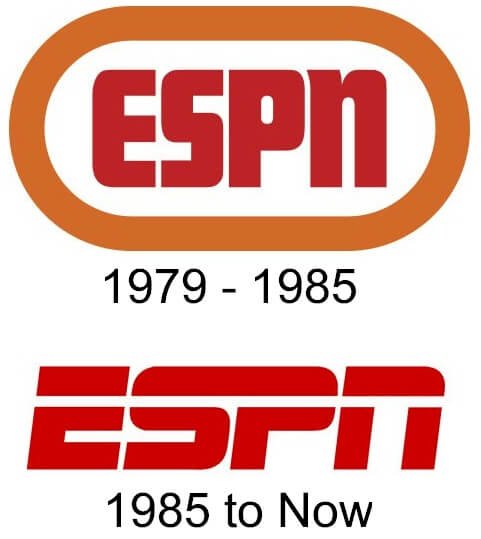
The original ESPN logo was encircled in an orange rounded rectangle. Orange is known to cause the psychological reaction of agitation and excitement, which is what ESPN owners wanted from the logo. It helped viewers look forward to the thrill of the sporting activities that the network showed.
The logo’s text is in original red. While the design may look basic, the color is a strong form of symbolism. As ESPN is a sporting network, the red symbolizes power and passion—elements that make sports events more interesting.
The white background symbolizes purity. Viewers expect nothing but integrity and honesty in competitive players since the younger generation views them as role models.
Who Designed the ESPN Logo?
Aldo Novarese designed the original ESPN logo in 1978 with the Stop font. In 1985, there were some alterations done. The white mark shot upwards in an elongated manner then cut through all the letters. The sweeping stroke was meant to give the emblem a stronger psychological impact on viewers.
Other changes were a brighter shade of red that created a semblance of tension and urgency. It helped provoke excitement in the target audience in readiness for the forthcoming televised sporting events.
ESPN is an acronym for Entertainment & Sports Programming Network. Prior to its change of name, co-founder Bill Rasmussen named the company ESP. The rationale for naming it with only three characters was to raise the sports network profile to the same level as NBC, ABC, and CBS.
Before the network was launched, its name was altered to ESPN-TV before being shortened to ESPN. The “N” was added to distinguish the network from others.
The first ESPN emblem came out in 1978, but it wasn’t until Fall 1979 that it made it to the TV screens. The original logo had a muted shade of red on a white background inside an orange border, spelling out the ESPN acronym.
This logo was used until 1985, when the modern version that everyone recognizes today was designed. The letters S and P didn’t change, but alterations were done on E and N’s letters
.
The ESPN Logo Evolution

The modern version of the ESPN logo was designed in 1985. It’s an acronym written in an ultra-modern signature font. A gap separates the top part of the acronym from the bottom part.
The minimalism of design undoubtedly makes the logo more effective. In most cases, the acronym is red against a white background or vice versa. White symbolizes purity and excellence, while red embodies passion and power.
1979: ESPN Logo in a Ring
The first ESPN logo appeared in a certain promotion as an orange ring that began smaller and then expanded quickly to reveal ESPN’s acronym. In this version, there were hints of the white mark that would end up cutting through the ESPN acronym. However, it was some sort of reflection effect rather than the striking line that would come back later.
1981: So 70s ESPN Logo
The 1981 logo was quite logical and straightforward, keeping the font used by the original 1979 version. It was a basic uppercase, red ESPN acronym inside a thick orange ring against a white background. Orange has always been known to cause agitation among viewers, which is why fast-food restaurants like McDonald’s use it.
Fast food psychologists discovered that orange prods people to eat faster and probably even eat larger amounts of food. When clearing out tables for new customers, orange helps fast-food restaurants keep customers engaged and looking forward to what’s next. And orange perhaps primes people to make more McDonald’s orders while they watch sporting events.
Like the red writing in your bible, the red wordmark allegedly forces viewers to take notice of the ESPN logo. Of course, our blood is red, so the red primes viewers to experience the love and passion of the televised sporting events in America and the world over. White represents purity, reliability, saintliness, and integrity.
1985: Just Do It ESPN Logo?
 In 1985, ESPN unveiled a new logo, most of which we see today. However, a part of that logo disappeared mysteriously.
The main elements of the 1985 version include a black wordmark on a white backdrop, with a line cutting the topmost part of the wordmark to make an unbroken white line through ESPN. This seemingly indicates uniformity in the acronym ESPN.
Since the lines draw our attention, especially in the top part, they seemingly indicate that there’s a forward motion from the first to the last letter, particularly when reading the text. Therefore, the ESPN emblem arouses a sense of anticipation and excitement in viewers.
It’s alleged that the 1985 ESPN logo had another feature: a red swoosh that started from the left bottom corner and arched over the stylized acronym toward the right upper corner. This swoosh is shortest and thickest to the leftmost part of “E” and goes on to become thinner over the logo, going above and back down to just past “N.”
Most of us know that the swoosh is the symbol of NIKE, but the ESPN swoosh wasn’t designed in a similar manner since it was tossed and turned on one side—tweaked as much as a swoosh can be modified.
In fairness, the swoosh wasn’t often used. In some on-screen ads, the ESPN wordmark would show up in different colors. But it was evident that the cut going through the acronym wasn’t going to go anywhere.
2003: Swoosh-less ESPN LOGO
It’s believed that Nike never took any legal action on ESPN regarding the modified swoosh used in sports promotion. But there might or might not have been any violation of the law. That said, the swoosh would eventually be done away with, leaving the ESPN emblem that we all know today.
The ESPN logo colors also underwent something of a change, from the red wordmark with a white border on a black background to a red wordmark on a white background or vice versa.
The ESPN Logo Design Elements

Shape and font: The earliest version of the ESPN logo was introduced in 1979 and was made up of a rounded rectangle that had the acronym ESPN inside.
The current ESPN logo version was launched in 1985 and quickly grew into one of the most recognizable stylized wordmarks in the world of graphic design. There was also an alternative ESPN logo in use at the time, which had a swoosh around the wordmark. It seems to have disappeared in 2003.
Colors: The red in the ESPN emblem embodies the love and passion of the sports televised by the sporting network, while white represents purity, integrity, and reliability.
The History of ESPN
Bill Rasmussen founded ESPN in 1979, trying to broadcast sports in Connecticut via a cable channel known as Entertainment & Sports Programming Network. The NCAA, Anheuser-Busch, and Getty Oil all became involved with the latest cable channel in town.
In 1984, American TV network ABC bought a controlling interest in ESPN. After the merger between ESPN and Capital Cities Communications, Walt Disney bought the combined company in 1996.
Just after being relieved of his post as the communications director for New England Whalers, Rasmussen hatched a plan to produce Connecticut sporting events for the state’s cable network in May 1978. With son Scott, they moved beyond that and started thinking about building a national sports TV channel.
On 7th February 1979, ESPN was granted broadcast rights for sports. The following day, Bill Rasmussen was able to rope in cable companies. At that time, there were ongoing talks on an advertising deal with Anheuser-Busch. Getty Oil joined the board as ESPN’s main financier.
The same year, Rasmussen bought the first parcel of land for the headquarters of ESPN in Bristol, Connecticut. Anheuser-Busch became the main sponsor with a record $1.4 million advertising contract. Getty Oil pumped $10 million into the company, gaining a controlling interest in 1979.
ESPN went on air on 7th September 1979 with limited hours of programming during weekdays and 24 hours on weekends. At its launch, ESPN signed up 625 cable network affiliates, and a total of 1 million households subscribed to the service (about 5% of households with cable). ESPN’s first game involved the Kentucky Bourbons vs. Milwaukee Schlitzes in the world series softball.
The groundbreaking for ESPN headquarters took place in 1980. Full-time broadcasting started in September 1980. At the time, extra programming included weekly boxing games.
Chet Simmons, then NBC Sports President, was recruited to help run ESPN. Rasmussen and Simmons were at loggerheads, with Getty Oil management siding with Simmons. Rasmussen was ousted as ESPN president by Getty Oil’s Stuart Evey by the close of 1980. In 1981, Rasmussen left and offloaded his remaining stake in 1984.
Getty Oil pumped an extra $150 million into ESPN without expecting any profits in the near future and hired McKinsey & Co., a management consultancy firm, to assess the company’s future. Roger Werner, McKinsey’s head consultant, figured that with an additional $120 million and five years, ESPN was going to make a profit.
ESPN soon hired Werner as vice-president of administration, planning, and finance, and he came up with a fresh business plan. Werner came up with a new source of revenue apart from advertising by introducing innovative affiliate fees paid to subscribers by cable operators beginning at 6 cents. ESPN was able to convince most of the hesitant cable companies to pay by 1982. By 1985, the fee had increased to 10 cents.
By the close of 1983, ESPN was the biggest cable TV channel in America, with 28.8 million homes subscribed. Also, in the same year, the company started distributing programming abroad. In January 1984, ESPN bought a 14% stake in ABC, Inc., following it up with the purchase of a controlling stake in June. In early 1986, Capital Cities Communications bought ABC to establish Capital Cities/ABC Inc. Werner became ESPN’s CEO and president.
Multichannel Network

ESPN started branching out into other countries and launching new channels. In 1988, the ESPN International wing was formed to create channels in other countries, starting with ESPN South America in 1989. ESPN Asia was formed in 1992. To enter Europe, ESPN partnered with Canal+ and TFI for a revamped Eurosport.
Hearst Corporation bought RJR Nabisco’s 20% holding in ESPN. In October 1990, Werner quit as ESPN CEO and president for a similar role in another organization. Steve Bornstein took over as ESPN CEO, gaining promotion from his role as executive vice-president overseeing production and programming.
In 1991, ESPN launched its own radio network with 16 hours of programming per week. This was made possible by the ABC Radio Network. In March 1993, ESPN bought the sports programming division of Ohlmeyer Communications. On 1st October 1993, ESPN launched ESPN2. At the time, the channel was targeting audiences between the age of 18 and 34.
In 1994, the company bought Creative Sports and an 80% holding in SportsTicker. In 1997, Classic Sports Network was acquired by ESPN.
In 2006, ESPN bought North American Sports Network, renaming it ESPN America on 1st February 2009.
In 2016, Disney bought a 33.3% holding in BAMTech worth $1 billion with the option of buying a majority stake, which it exercised later and now owns 75%. Disney bought the holding to first create an ESPN-branded streaming subscriber service, which was later named ESPN+.
The Takeaway
ESPN (Entertainment & Sports Programming Network in full) is a globally-renowned American TV network that’s generally considered to be the leading provider of sports-related coverage and programming in the world.
Established on 7th September, the sporting network now has over 5,700 people in its employees around the world, and according to estimates, it’s the most valuable media company in the world with total assets worth at least $40 billion.


