
The first batman logo and symbol appeared some eight decades ago and has been through about 30 iterations since then. Here’s a look at the logo’s long history of transformations in both movies and comics.
The Batman Logo History
The Batman comic series first featured Bruce Wayne as the superhero detective when it came out in 1939. Bruce’s story explains the somewhat eccentric choice of the logo:
As a child, as legend has it, Bruce vowed to go to war against criminals, having had to witness the gruesome, cold-blooded murder of his parents by a criminal outfit. The comics’ creator saw it fit to pick a bat to symbolize this fight against evil and the pursuit of justice. With each struggle and triumph over himself, the hero grows stronger and stronger, all without resorting to dishonest means in his work.
First Batman Logo
The first Batman symbol was the most minimalistic of all in the history of the comics. The bat was a plain silhouette-like image, with no ears, no head, and the size of the image itself took up much less space on the suit than subsequent versions.
That same year, the symbol would undergo several modifications. Newer drawings depicted the bat with a small head and a couple of sharp-edged ears. The upper parts of the wings were originally rounded; in later versions, they were made sharper. Most drawings also showed seven wing points on the bat, as opposed to the original five. However, sometimes the artist would render the original 5-point wings in his drawings.
Evolution Of The Batman Logo
The black bat has long been established as Batman’s emblem—and logo. And while the image has been modified many times over, Batman artists have never quite strayed from the bat’s central theme, which is why the Batman logo, no matter the version, has always been easy to recognize.
Throughout many comics and movies, designers have played around with the symbol by altering the shape, number of webs, and wing points and adding a dash of color to make it pop more.
Batman Logo In the 1940s
Shortly after the emblem’s introduction in 1939, the image was doubled in size. The bat got its ears and head, and the wing points increased to seven from five. The version of the Batman logo in the early forties was about twice as big as the original version.
The image then took on a gothic look in 1941, with the wings stretched out and sharpened. The animal’s head now became more prominent, while the wings grew in height. Some renderings of the symbol also included some blue details on the wing, although these were not at all visible in others, probably due to differences in print quality.
The Batman character got his solo title in 1941. In addition to this, he still got featured in Detective Comics, the top publisher of comics in those days.
Between 1942 and 1944, the number of webs and wing points along the animal’s bottom would keep varying from the initial five to as many as nine. And thanks to the spreading out of the wings, the logo became wide than its predecessors. The ears were also enlarged. On the other hand, the wing points and the tail were made much shorter.
The Batman superhero first appeared in a TV series in 1943. The emblem image on the chest was somewhat smaller than in print, but the details of the image appeared more carefully worked out. Later on, in that decade, the bat acquired a rounded pair of ears in place of the sharp ones. By this time, the logo had been standardized for both the magazine and TV versions.
1946 – 1950 Batman Logo
In 1946, the logo creator dipped into the symbol’s past for inspiration, and as a result, returned the logo to the same original proportions of the central wing point. This time, it looked sharper and was more elongated than the rest of the wing points on the bottom side, which became more rounded. The head also grew larger and became more prominent.
In the print issues published between 1947 and 1950, the points atop the wings became increasingly rounded until a pretty smooth curve ultimately replaced them. With the curve, the designers could now afford the freedom to make the bat larger. For this reason, the approach worked out in their favor, as the objective was to make the emblem occupy as much real estate as possible on the chest.
1950 – 1965 Batman Logo
The 1950s saw many variations in the emblem’s shape. At first, the symbol was rounded, but the edges then became thinner and wider.
But by 1956, the curve was no more, and the logo was triangular in shape. The symbol was made more compact to create ample breathing space, mainly when it came to its width. This triangular variant was arguably the most regularly used one all through the 1950s.
The curve was done away with the same year, as the superhero’s symbol took on a triangular shape. To provide some breathing space, the designers decided to make the symbol a bit more compact, particularly its breadth. Throughout the 50s, the triangular version of the logo was the most prominently used on TV as well as the print editions.
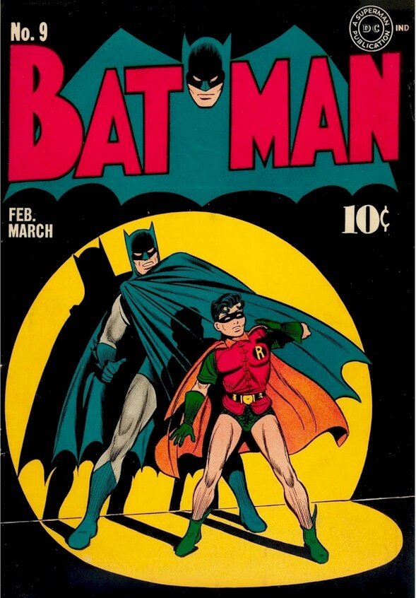
1964 – The Yellow Ellipse
1964 was a landmark year for the symbol—for the first time, the black bat was slapped against a bright yellow elliptic background. The addition of the yellow ellipse around the symbol led some fans to speculate that it made it easier for Batman owners to trademark the symbol. Some other fans claimed that it was all about starting a new era for the brand, which prompted the designers to add an element that would differentiate the new symbol from older versions.
While there are many accounts for the reason the design feature was added, the aim was indeed quite simple—to kick off a new era in design. Some two years later, the bat had its wings “unfolded” to adapt to the shape of the ellipse. Around the same time, the new symbol also got featured in a TV series about Batman.
By this time, the logo had once again become thinner and wider. The wing points on the bottom side had already been sharpened and elongated by 1958, and the head was made a little more prominent than in the preceding versions.
1966 Batman Logo
From 1966, the emblem started to move away from the triangular shape that had dominated the fifties and early sixties. First, the designers gave the bat’s wings a very prominent curve and stretched them to fill up the ellipse. This change was applied to both the top and bottom outlines of the wings. The change also took place on the head and ears: the head became a little more prominent, while the points on the ears were turned to face a little more sideways.
1980 – 1999 Batman Logo
The 80s and 90s were marked with some more experimentation. The emblem designers decided to do away with the yellow ellipse, and the bat took on a larger figure, with wider wings in the shape of a cape. The designers also tried out some more elegant variations of the new look, inspired by the older versions. When the 90s rolled in, Batman again brought back the yellow color.
The Batman logo took a detour in 1986 with the release of “Batman: The Dark Knight Returns.” The film featured Batman using a yellow ellipse to lure his challengers’ fire onto his bulletproof vest. His costume featured a much-enlarged bat with broad wings. The whole look was quite unlike anything the designers had come up with before.
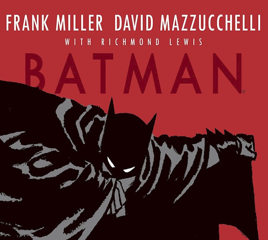
In the 1987 issue named “Batman: Year One,” which told the superhero’s stories of the early days, Batman was adorned in a suit with a retro-inspired emblem. While the illustration was still quite large, it was still smaller than the 1986 version and bore more pronounced curves and angles.
In the thrillers released around that time and into the 90s, the hero always showed up with the yellow ellipse that had become quite recognizable. The yellow oval stayed on until the year 2000 when designers ushered in a new era in the emblem’s design.
Current Batman Logo (2000 – Present)
In 2000, DC Comics artists decided that it was time to take on a whole new direction for the emblem. The yellow ellipse was dropped, and wings went back to the shape of the 1940s, particularly the 1946 version. However, the new logo was still significantly bigger in size than its predecessors throughout the decades.
While the movies stopped featuring the yellow oval in the mid-90s, it stayed on in the comics up until 2000. The stripping away of the ellipse marked the end of a 36-year reign and could effectively be termed as the death of an iconic Batman symbol at the turn of the century.
What does the Batman symbol mean? The Batman logo and symbol are meant to represent a hero of the night. It was designed to create fear when criminals would see it shining in the dark sky.
The Batman Logo Design Elements
Batman Symbol: The choice of the black bat was to symbolize the never-ending struggle between good and evil, as well as the quest for justice. It also spoke to man’s capacity for gaining strength, courage, and hope in the hardest of times.
The Batman emblem was originally made for Bruce Wayne, the Batman, whose terrible childhood experience of witnessing his parents’ murder would change his life forever. Batman swore to avenge his parents’ death by taking on the fight against criminals all by himself. The story paints Bruce Wayne as a character who’s utterly broken and devastated on the inside. But every time he’s faced with a calamity, he only grows stronger.
Batman Logo Colors: The batman symbol has remained true to the original black color throughout its existence.
The yellow elliptical background adopted in 1964 survived until the year 2000, although it had been on-and-off during those years. To this very day, this has been the only real color addition to the logo—but it’s back to plain black once again.
Batman’s Origin Story
More details on Batman’s origin were revealed in issue #47. As it turns out, Bruce Wayne (Batman) was born to Dr. Thomas Wayne and Martha, a wealthy and charitable couple living in Gotham City. One night, while the family was returning from a movie theater, Bruce watched as a nondescript criminal known as Joe Chill murdered his parents. He was only eight at the time, but the tragedy shook him so much that he vowed to dedicate his life to fighting crime.
After some intense mental and physical training, Bruce realized that those skills alone would not suffice. And that is how the idea of a disguise that would “strike terror into their hearts” was born. The very first issue of the comic series was published as a two-page story in November of 1939.
Modern Batman
In an attempt to adapt the comic series to a more contemporary audience, DC comics had to reboot some major characters’ stories. The story of Batman’s origin was retold by Frank Miller in “Batman: Year One,” which gave a grittier tone to the character.
And although Earth-Two Batman has essentially been wiped out from history, many of the stories featured in Silver Age/Earth-One and Golden Age as well retain canonical status in the post-crisis universe. Batman’s origins have remained the same, in spite of variations in storylines.
Closing Thoughts on the Batman Logo History
The Dark Knight, with his black bat emblem, has established himself as one of the most iconic superheroes in modern history. The comic series has undergone some major updates, reboots, and reworks throughout the years, but it continues to entertain generations of fans with their hero’s tales of triumph over crime.
Fans typically use the Batman logo itself in several ways, including wall posters, stickers, tattoos, and clothing apparel. Most fans consider the 2000 version of the Batman logo as the official symbol.


