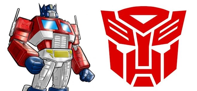
The Autobots logo and symbol is an important part of the Transformers brand and has been featured universally in all Transformers series to differentiate Autobots from Decepticons. In this post, we’ll go over both the Autobots symbol as well as the parent Transformers brand’s logo evolution.
The Transformers brand started in 1984. It includes all media and products from Hasbro, Marvel, and Griffin Bacal, which feature alien robots that transform into automobile and machinery forms.
Autobots Symbol Meaning and History
The Autobots logo is a red mask that is used to represent the Autobot army. The original Autobot insignia was inspired by toys produced in the first year of the original Transformers line of toys. The emblem is a heavily stylized version of the face of Prowl, while the Decepticon emblem is based on the character Soundwave.
Both the Autobots and Decepticon emblems have been rendered in metallic color styles and beveled edges on toy packaging and scene transitions in the cartoon series.
Who are Autobots?

Autobots are benevolent robotic beings with self-configuring capabilities. They come from Cybertron, which is a fictional planet. They are led by Optimus Prime and are the chief protagonists in the Transformers universe, which encompasses various other collections of toys, cartoons, graphic novels, books, and films. The opposing side features the “Evil” Decepticons.
Autobots and Decepticons are robotic characters that can take on the form of machines, automobiles, and other mechanical objects. Sometimes they also transform themselves into organic forms, such as Dinobots.
Autobots usually transform into regular vehicles such as cars and trucks, but sometimes also military vehicles, aircraft, weapons, and even animals. These Autobots are often categorized into special teams that end in the suffix “-bot.” On the other hand, Decepticon names end in “-con.”
Both the protagonists and antagonists in the Transformers series have an emblem that represents the group as a whole. Each of these looks like the head of a transformer. The Autobot insignia is seemingly inspired by the image of a character known as Prowl. This symbol is sometimes known as “Autobrand” and depicts the face of the Last Autobot, according to Transformers Lore.
The Decepticons symbol was likely based on the Soundwave character. There have also been emblems for other Transformer types, including Clench, Ultracon, and Security Services.
Each symbol in the Transformers series has evolved over time with each generation of the series. Many versions are typically similar in terms of style, with the face comprising small geometric shapes to form a transformer’s head. Some logos feature flattened colors, while others are more beveled with a chrome or metallic kind of look.
According to official sources, the Autobots symbol was produced in reference to the face of the Last Autobot, the guardian prepared by Primus for the day that he would not be able to take charge of his own army.
Current Autobots symbol
 The Autobots symbol has remained the same since its inception in 1984. In the first three years, however, Autobots employed a simpler sign. This was probably the face of some ancient robot who spoke with Rodimus Prime in the Matrix.
Although replacements were introduced for the Autobot and Decepticon emblems ahead of Transformers: Generation 2, with the Autobot symbol based on Optimus Prime, the new versions failed to catch on. When the Transformers series reinvented itself as Beast Wars in the mid 1990s, new symbols were designed for both hero and villain factions. These were known as Maximals and Predacons, but they also failed to catch on.
Current Transformers Logo
The film franchise has tended to employ a more conventional approach towards the treatment of its logo. The current logo features the letter “A” in the unique style utilized in the brand’s previous logos. The Autobots “Autobrand” symbol is often featured, too, which helps increase the recognition of the Transformers brand. For the films, the Autobrand emblem is usually modified according to the purpose and theme of the film.
Transformers Logo Evolution
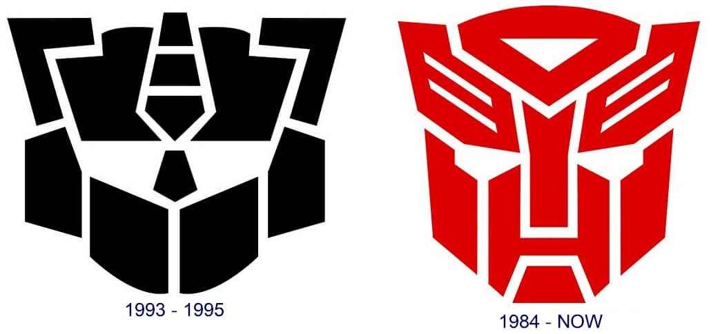 The Transformers logo has undergone a number of major changes throughout the brand’s history. Here’s a look at the different versions that have appeared over the years.
1984 – 1989
The first Transformers logo was designed in 1984 and stayed on with the franchise for five years. It was an inscription in red and gradient blue, with a metallic touch that produced a three-dimensional effect.
The lettering was rendered in two levels, with the first part, “Trans” above and a little to the left of “Formers.” To the left of the “Trans” was the Autobots emblem which was reduced in size to match the lettering. The emblem was rendered in the same style and color palette as the wordmark.
1989 — 1991
The 1989 redesign saw the removal of the emblem from the logo and a switch to a simpler flat style for the lettering. The new wordmark also saw the joining of the two parts into one word to form the inscription “Transformers.” The letters were styled white with a double black outline. The font was a sans-serif, italicized for a special effect.
1991 – 1993
The wordmark became lighter and gained some thickness in the 1991 version. The designers removed the blue horizontal stripe from the letters’ body, which were featured in a gradient red and white style. The outline was changed to light blue, which provided contrast with the white and black shadow of the lettering.
1993 — 1999
This version brought back the emblem as a part of the Transformer’s visual identity. The lettering was depicted in red, while the symbol, which appeared to the right, was depicted in yellow and red. The wordmark itself was redesigned to a bright red square font, with the letters italicized and capitalized and given a dark outline for a shadowy effect.
1999 — 2001
The logotype saw a new redesign of the lettering, with the Autobots symbol again removed. The wordmark was now rendered in one line and utilized a custom sans-serif typeface with the letters in yellow. The lettering also featured a very thin black outline. The letters were rendered with sharp cuts of the lines, with the angles smoothly rounded to add energy and dynamism.
2001 – 2007
In 2001, the logotype was completely redesigned, resulting in a shiny black and blue badge for the brand. The lettering was done in gradient blue and black and outlined with a thick black line that went round the contours of the inscription. The gradient styling made it look like a neon banner, which produced a mystical and creative mood in the logo.
2007 — 2014
The 2007 version brought back the two-level composition. The lettering was in a straight, bold sans-serif which was rendered in a metallic texture, with a thick black outline. This new logo looked much simpler and minimalistic but still modern and memorable. The styling evoked a sense of professionalism and elegance.
2014 — Today
The 2014 version of the Transformers wordmark brought back brightness to the logo. The new logotype used a bold, narrow custom sans-serif font, with the sleek letters written in a dark red shade. Some of the edges of the letters are cut diagonally while others have been shortened, which makes the contours open. All of these small details make the famous brand’s logo unique and easy to recognize.
Transformers Logo Design Elements
Shape and font: The Transformers wordmark utilizes a solid capitalized typeface. The lettering is very clean and easy to read, with several design elements that make it look unique and easily recognizable. The styling of the letter “A” is probably the most recognizable, with its triangular shape having one side half-open.
Symbol: The Autobots emblem does not usually stay the same, with some modifications and facelifts done depending on the series’ visual concept. The overall shape and lines have, however, remained the same, providing a consistent visual identity.
It’s highly likely that the designer of the symbol drew inspiration from the head of Prowl’s toy. In the Marvel comics, this symbol is often referred to as “Autobrand” and is said to represent the face of the Last Autobot. It’s also worth noting that the same emblem was used to represent the Quintesson slave brand in the original animated series.
Colors of the transformers logo: The current logotype is done in a shade of red, while the previous one was done in metallic grey with a black outline. Both logo versions are depicted against a white background.
However, the colors of the insignia vary by context. For instance, the symbol is sometimes featured as a 3D image with a variety of colors and gradients.
History of the Transformers Brand
Transformers is a media franchise owned jointly by American toymaker Hasbro and Japanese toy brand Takara Tomy. It chronicles the battles of sentient autonomous robots, usually the protagonists Autobots and their antagonists Decepticons, who are able to transform themselves into other forms, such as vehicles and animals.
The Transformers franchise encompasses comic books, video games, films, and toys and had grossed over $25 billion in revenue as of 2011, making it among the highest-grossing media franchises in history.
The brand began in 1984 and covers all of the media, toys, and products from Hasbro, Griffin Bacal, and Marvel. The Transformers toys were initially produced by Takara Tomy’s Microman and Diaclone toy lines which featured small plastic cars that could morph into robots for combat. The toys have been consistently available on store shelves for more than 35 years, with very few incidences of absences, none of which lasted longer than 18 months.
In the Transformers universe, there has been an ongoing civil war between the two robot armies known as Autobots and Decepticons. The franchise has seen the endless production of various cartoon series, video games, films, and comic books.
Transformers Generations
In general, the Transformers timeline can be divided into two distinct generations. The first generation lasted between 1984 and 1993, which was the era when comic books and animated cartoons shot into the limelight. The next generation consisted of a number of sequels and spin-offs, including the Beast Wars TV series.
There were a few other incarnations of the Transformers universe, such as the Robots in Disguise series and the Unicorn Trilogy. A competitor series known as Gobots with Toys that was produced by Tonka was bought out by Hasbro. Later, the Gobots appeared in an animated series called Challenge of the Gobots.
Modern Era
In the 90s, the Transformers fandom emerged online, which allowed fans to connect easily with one another. The internet became a popular place for fans to discuss appearances and references to The Transformers brand in pop culture.
A film adaptation of the Transformers series, with Michael Bay as director, came out in 2007 with several sequels between 2009 and 2017. A spin-off film about the Transformers BumbleBee was released in 2018. These nostalgic upsurges have helped to maintain the brand’s status as a pop culture phenomenon over the years.
In more recent times, the movie franchise has been developed, even more, leading to huge blockbuster successes from one sequel to another. Plans are underway for a Transformers Cyberverse, to be released soon. There is a new cartoon series on television, various online fan groups, and an official annual Transformers convention held regularly to celebrate the popular series.
Closing Remarks on the History of Transformers Logo
Even for people who are not fans of the Transformers series, chances are that the average person will recognize the Autobots symbol as well as the Transformers logo. The self-configuring robots have been a part of pop culture since their inception in 1984, even when the series suffered dips in popularity. The Transformers wordmark itself has undergone a series of changes over the years, with just two of several logo versions featuring the Autobots emblem alongside it.
The Transformers logo has gone through a number of versions over the years, but it has still managed to retain the brand’s visual identity. The latest logo evokes a sense of nostalgia among long-time enthusiasts of the series. The Autobots symbol, on the other hand, has remained the same since 1984, is easy to recognize, and has always played a big part in the visual identity of the Transformers franchise.

