
Let’s get an insight into the Doritos logo and some history behind the delicious snack.
Do you remember this quote?
“I only hope that we never lose sight of one thing—that it was all started by a mouse.”
What about the next one?
“I only hope that we never lose sight of one thing—that it was all started by stale tortillas.”
Well, I made up the second one. But Walt Disney made the first quote on October 27, 1954. The remark was about the famous mascot, Mickey Mouse. Interestingly, ten years later, Doritos was also created in Disneyland. This time, the inspiration came from stale tortillas.
Was it accidental?
Well, I think it was magical. Disneyland Park is the home of dreams and excitement. In 1964, it became the birthplace of the golden triangle chips, Doritos. The directors promoted the snack with a colorful logo. However, this official label has evolved.
Today, it has a tasty look that makes consumers salivate. The logo features a strong wordmark with a flame piercing through it. The Doritos logo evokes power and authority. It’s modern, clean, attractive, and can scale on several marketing platforms without burning.
Let’s explore the land of dreams.
Doritos Logo Evolution
![]()
For nearly six decades, the Doritos logo has evolved nine times. This is a conscious effort by the owners to ensure the brand remains relevant. Despite the changes, the food chain has kept a consistent and unique image. From 1964 to 2013, you’ll find minor changes to the trademark. To learn more about these incredible changes, kindly read on.
1964 – Original Logo:
Doritos had its maiden logo in 1964: it featured a wordmark housed in seven vertical rectangles. The shapes comprised four yellow and three orange colors. The font choice was a bold serif with distinct lines. This original logo lasted for nine years, and it looked joyful.
1973—The First Update:
In 1973, Doritos updated its visual mark. Though it looked exactly like the first logo, it had a subtle twist. Instead of the red wordmark, the designer opted for a brown one. Also, the color schemes for the seven rectangles were changed. This logo lasted for six years.
1979—The Second Update:
After six years, Doritos had its second update. With dark yellow and cream shades, the designer skewed the first and last rectangles. More so, the brown wordmark became bolder. Finally, beneath the emblem, you’ll find the tagline—Tortilla Chips in caps. It also reigned for six years.
1985—The Third Update:
Doritos had a colorful logo in 1985. The designer got rid of two rectangles, leaving five to simplify the design. It comprised three yellow and two red colors. In addition, the brand’s name took on black with a white outline. Finally, the letter—I got a triangle instead of a dot.
1994—The Fourth Update:
After nine years, Doritos had its fourth redesign. This time, the rectangles were absent. And the bold black wordmark received a yellow outline. In addition, you’ll find a yellow chip and a red triangle. The triangle had an extension that resembles the zigzag mark. Also, the registration symbol wasn’t ignored in this version. This trademark served the restaurant for almost five years.
1999—The Fifth Update:
Doritos ushered in another update in 1999. This new logo kept the previous design but changed a few colors. Here, the caption turned white with a red outline. In addition, the designer introduced the tagline—corn chips in caps and a black frame. Sadly, this design lasted only for a year.
2000—The Sixth Update:
For almost six years, Doritos opted for a black triangular frame. This shape had a trace of blue around it. The brand’s inscription was kept, but the tagline—corn chip was removed.
2004—The Seventh Update:
Doritos had a three-dimensional logo in 2004. They made this edition for the North American audience. The emblem comprised a stylized triangle above the brand’s name. While the wordmark had a black shadow, the triangle took on a fire attitude. It was extremely modest.
2007—The Eight Update:
The eighth logo update looked modernized. Both the contours of the triangle and wordmark were smooth and thick. With a tiny yellow triangle above the letter—I, this version looked elegant.
2013—Now:
This Doritos logo carries a fire charisma. It’s made possible by the color gradient: red, orange, and yellow. Also, the wordmark dresses in white with black and red outlines. Finally, two sides of the triangle pass through the letters—O creatively. It’s just impressive!
Why Does Doritos Logo work?
1. The Logo Is Unique:
Every brand has a story to tell. So let yours shine via your logo design. This separates the iconic logos from the mediocre ones. For example, the Doritos logo is among the famous trademarks because it’s exceptional. Indeed, it’s unique because it has design elements that aren’t similar to its competition. This gives the brand a commanding personality.
2. The Logo Is Readable:
For marketing, your logo will appear on several channels. Therefore, you need to be careful with fonts. The Doritos wordmark is clean, bold, and readable. Aside from this, the typeface relates well with the food industry. With this quality, its buyers can decode its message.
3. The Logo Is Versatile:
As a clean logo, Doritos enjoys lots of benefits. And one such usefulness is scalability. This allows it to pop up on multiple mediums without losing its shine. Hence, it’s able to engage fans on both smaller and larger platforms. Few examples are Twitter, Snapchat, and billboards.
4. The Logo Is Memorable:
Can you promote your product without its logo and brand name? Well, this is a risky strategy. However, Doritos did that with its campaign called—Another Level. The secret to this is memorability. More so, memorability comes from retention over a long period.
5. The Logo Is Simple:
The Doritos logo is classic. It enjoys a clean personality because its graphic elements are in moderation. This makes it highly recognizable across all marketing channels. Your logo will reach this height when you avoid detailed design elements.
Doritos Logo Design Elements
As a food brand, Doritos favors bright colors that stimulate consumers’ appetite for food. These appetizing colors are red, yellow, and orange. However, neutral colors such as black and white aren’t left from the design. Together with a triangle, they cook the Doritos logo.
Let’s explore them further.
Doritos Logo Shape And Symbols
1. A Triangle:
Experts regard a triangle as a masculine shape. Doritos first used it in the 1985 logo update. Since then, it has become an idolized shape for the food chain. Chiefly, the triangle represents the delicious chips the brand sells. In addition, a triangle signifies stability, trinity, and power.
2. A Rectangle:
A rectangle is the most used shape in logo design. The first four Doritos logos had vertical rectangles. In most cases, the designer used them to house each Doritos’s letter. In psychology, a rectangle stands for trust, order, and peace. Also, it can convey equality, security, and solidity.
Doritos Logo Colors
1. Black Color:
Black is a dominant color in the Doritos logo. In the newest design, it beautifies the triangle and the outline of the wordmark. Black aligns with elegance, power, and sleekness. Also, the color of mystery can evoke fear, authority, and strength. Black gives the logo a prestigious look.
2. White Color:
This color signifies cleanliness, purity, and hygiene. These are suitable qualities for a food brand. White also represents safety, humility, and loyalty. These colors convey a powerful and coherent message to customers. Primarily, the color white paints the brand’s inscription.
3. Orange Color:
Orange has some emotions of red and yellow. This is because it’s a blend of both colors. Orange is one color for food brands. It symbolizes heat, joy, and fun. The color of fire is used to represent health, creativity, and enjoyment.
4. Red Color:
Red stimulates the taste bud. It’s one of the food colors that whet people’s appetite. The hue of blood is linked to love, desire, and hunger. Also, it’s an aggressive color that stands for action, courage, and confidence. In the logo, you can spot the red color-forming part of the flame.
5. Yellow Color:
Doritos doesn’t see the need to forgo the yellow color. From the maiden logo to the current one, the brand hasn’t ignored it. It’s an intense hue that gets noticed and grabs attention. Luckily, it’s one of the preferred colors among food brands. The color of bananas conveys feelings of freshness, happiness, and optimism. Also, you can use it to signal caution, energy, and clarity.
What Font Is Doritos Using?
The Doritos Wordmark is a custom font. Why? The iconic triangle above the letter—I give a clue. If you want to use a similar one, there’s good news. You can choose Nebbiolo Extra Bold. It’s also a powerful and eye-catching typeface you’ll like.
Who Created the Doritos Logo?
Hornall Anderson Design Works LLC designed the latest Doritos logo for the global market. The firm worked in partnership with Frito-Lay, a division of PepsiCo. Today, Hornall Anderson is now called Sid Lee. It’s a creative design firm specializing in branding, advertising, website development, and public relations. It has offices in Toronto, Los Angeles, New York, and Paris.
What Does the Doritos Logo Mean?
Doritos is a Spanish word that means—little golden things. In effect, this references the delicious chips. In the logo, the designer used a triangle to represent the snack. Also, we can link its golden emotion to the corn. Again, the red color hints the pepper used for spicing it.
Did Doritos Change their Logo?
There have been two campaigns suggesting or promoting such an idea. Thus, a “Mockup Concept” and “Another Level Campaign.” Yet, Doritos isn’t changing its iconic logo. It’s pretty simple. Let’s begin with the first one: Mockup Concept. Michael Irvin, a renowned creative director, recently posted a rebrand of the Doritos logo on his Instagram feed. The post went viral, sparking conversation among fans and non-fans alike.
The second is an official campaign by the company. They dubbed it—Another Level Campaign. Stakeholders believe they have a strong brand identity that can help them attract consumers without their logo. It was rolled out in August 2019 to attract Generation Z consumers. These are young consumers believed to be above overt advertising. So, the company took off its logo and name from all social channels. In place, it used a triangle and the caption—Logo Goes Here.
This new strategy encourages its fans to insert their faces in the iconic triangle. In addition, it was a fun way of customizing the logo to fit each consumer. From these campaigns, some loyal fans thought the company was rebranding or removing its iconic trademark. Instead, it was a short-term branding strategy.
What Is Doritos Slogan?
Globally, Doritos used the caption—For the Bold as its slogan. It’s a relevant term that connects well with its youthful audience. To face the adversities of the world, you need to be bold.
When Did Doritos Change Its Logo?
Doritos is experimenting with lots of branding strategies to entice younger consumers. These are Generation Z: They fall between the ages of ten and twenty-four. Experts believe these buyers aren’t responsive to Ads. However, its iconic logo is intact. The last update was in 2013, which begets the current label. It looks powerful, confident, and flavorful to the max.
Is Doritos Logo Copyrighted?
The Doritos logo is trademarked, and Frito-Lay North America, Inc owns it. It was filed on August 23, 2017, and registered on January 16, 2018. Jeanette Zimmer was the Attorney in charge of the registration.
What Is the History of Doritos?
The golden flavored chip is one of America’s beloved food brands. Frito-Lay, a subsidiary of PepsiCo, produces it. Its name Doritos means little golden things in Spanish. The snack was officially launched in 1964 but started selling nationwide in 1966.
The first Doritos were made at the Casa de Fritos at Disneyland in California. This restaurant got some of its products from Alex Foods, a Mexican food supplier, including tortillas. It all began when a sales officer came up with a brilliant and novel idea.
He suggested frying the leftover tortillas into chips instead of throwing them away. The restaurant complied, and a new product was born. The vice president of marketing, Arch West, was happy with the new snack. So, he contracted Alex Foods to make them in large quantities.
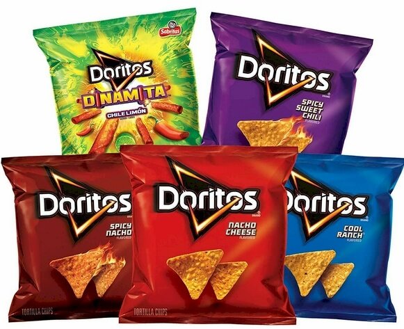
Finally, in 1966, Doritos was unveiled, becoming the first tortilla chip to be launched nationwide in the United States. Though Doritos have many flavors, the original one was just plain. Depending on the market, you’ll find flavors like cool ranch, nacho cheese, taco, pizza, etc.
To intensify its brand image, Doritos relies heavily on marketing: It favors Super Bowl, movies, and celebrity approval, among other high-profile advertising. This has been part of its success.
My Final Thoughts On Doritos Logo History

The Doritos food and logo were all officially unveiled in 1964, founded by Archibald Clark “Arch” West. While the brand has had ten logo designs, its flavors surpass a hundred. Some of the popular ones are cool ranch, spicy nacho, taco, and mountain dew. The original Doritos, which wasn’t flavored, was created at Disneyland.
Doritos is popular because of its aggressive marketing, tasty chips, and attractive logo. Again, it has a strong team that capitalizes on any opportunity that would bring the brand success. Though Arch West is credited with Doritos’s invention, some sources think otherwise.
It’s time to lick your fingers. Finally, be bold to stick to your favorite flavor.


