Let’s get an insight into the Ghostbusters logo and some history behind the paranormal movie.
Ghostbusters is airing soon after over three decades. It’s an American comic-horror film that debuted in 1984. Then, on June 16, 1989, its sequel—Ghostbusters II, was aired. Dan Aykroyd conceived the idea for this awe-inspiring movie after he read an article about quantum physics.
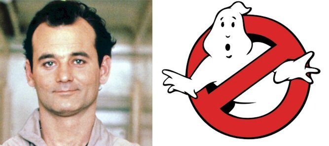
On June 8, 1984, stakeholders unveiled the movie and its visual diplomat together. The Ghostbusters logo features an inscription and a white ghost. Evoking the brand’s persona, the designer rendered the heroic ghost trapped in a letter. Aesthetically, the red no-sign symbol replaces the letter—O.
The current Ghostbusters logo is almost the same as its original. However, the most remarkable change you can spot is the color. While the maiden wordmark dazzled in black, the newest one prefers white. Overall, it’s one of the most recognizable and successful logos in the world.
The Ghostbusters logo is as impressive as its movie. Working within a $30 million budget, Ghostbusters earned about $280 million. With staggering figures, it became the second highest-earning movie behind Beverly Hills Cop. It beat Indiana Jones and the Temple of Doom.
So, it’s no wonder it became the first comic movie to use expensive special effects. Today, Ghostbusters is a multibillion-dollar franchise with investments in comic books, video games, anime series, and other multimedia projects. Funny enough, the ghost is named Mooglie.
Ghostbusters Logo Evolution And Its History
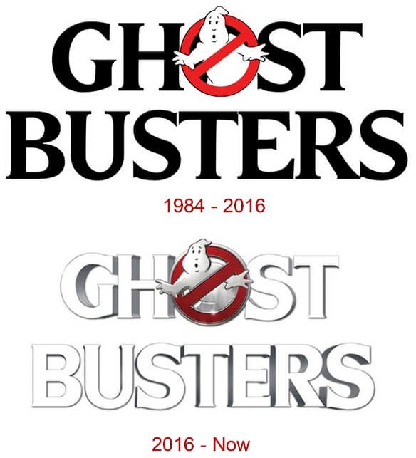
It’s almost thirty-seven years since the Ghostbusters logo came out. Within this time frame, the logo has changed once. While the owners released the original trademark in 1984, the updated one came out in 2016.
And it was the time the franchise launched Ghostbusters: Answer the Call. The storyline focused on four women with interest in the supernatural. So, in New York City, they started a ghost-catching business. Without wasting much time, let’s learn more about these changes.
1984—The Original Ghostbusters Logo:
The first Ghostbusters emblem premiered in 1984. It comprised a black wordmark and a comic figure. Aesthetically, the funny image, a white ghost, is trapped in a red letter—O. Also, the same letter—O served as a prohibition sign. Overall, the all-cap letters were bold and readable.
2016—The Current Ghostbusters Logo:
After thirty-two years, Ghostbusters had a new logo. To create the new visual mark, the designer tweaked the original logo slightly. First, the wordmark became white with a black shadow, evoking a three–dimensional personality. Also, the no-ghost sign became dark red with a thin silver outline.
Why Does the Ghostbusters Logo work?
1. The Logo Is Pleasing:
The Ghostbusters logo is eye-catching. It has a pleasant graphic figure that ignites curiosity. When you come across it, you’ll be compelled to stare at it twice. This trait makes its loyal fans stick around while also allowing potential fans to admire it secretly. Remember, a pleasing logo will elevate your brand over competing ones.
2. The Logo Is Readable:
You can’t gamble with the personality of your brand. This is an essential piece of advice from graphic experts. And that’s why Ghostbusters have chosen a bold and readable font for their logo. Seriously, this custom sans serif font can audition on multiple mediums without defacing. So, adhere to this priceless advice, and your logo will fit on any promotional channel.
3. The Logo Is Memorable:
What can you recall easily? If you’re like me, then you’ll go for simple things. Naturally, this relates to all human beings. So, when designing a logo, opt for a simple one. You may wonder how to achieve this! Well, a simple emblem uses fewer design elements to convey its core values. That’s precisely what Ghostbusters have done with their visual diplomat. It’s clean!
4. The Logo Is Scalable:
You can’t afford to miss the many marketing channels to promote your brand. And this is where scalability comes in. Interestingly, a simple logo design gives you this priceless benefit. So, never underestimate it! Because the Ghostbusters logo is minimalist, it can scale effortlessly.
5. The Logo Is Consistent:
In business, brand loyalty is an asset. And it’s a reputation that takes time to build. So, keep it in mind when crafting your visual identity. In line with this, the Ghostbusters logo has earned some loyal followers. Since 1984, it has used only two logos with the same core values. The consistency in its personality has made it reliable.
Ghostbusters Logo Design Elements
The Ghostbusters logo shows professional handiwork. It tells its story without using detailed design elements. Instead, the trademark features a wordmark, an attractive icon, and relevant colors. Overall, they craft a visual image that most people will prefer calling their own.
Now, let’s dig a little more into these powerful graphic elements.
Ghostbusters Logo Shape And Symbols
1. A Ghost:
The white ghost is the most prominent graphic element in the Ghostbusters logo. In most literary works, a ghost symbolizes mystery, invincibility, and the unknown. Also, it can convey fear, nightmare, and horror. Interestingly, Mooglie is the name of this famous white figure.
2. A Letter—O:
The letter—O is the 15th letter of the English alphabet. It’s a divine letter associated with opportunity, optimism, omnipotence, and official. However, in the Ghostbusters logo, it’s replaced by the no–sign icon. This international symbol signifies caution, safety, and health concerns. So, the iconic red sign represents no-ghost.
Ghostbusters Logo Colors
1. Black Color:
Let’s talk about mystery! Honestly, we can’t speak about it without black. This neutral color held the personality of the first logo. Some of its emotions are fear, death, and evil. Yet, it isn’t always about bad feelings. It can convey positive energies like strength, elegance, and prestige.
2. White Color:
In the latest logo, the designer executed both the wordmark and ghost in white. Most people associate white with cleanliness, light, and innocence. Also, it can communicate safety, protection, and humility. Always, the use of white and black gives a powerful balancing effect.
3. Red Color:
Universally, the no–sign mark always comes in red color. This warm, vibrant color signifies passion, love, and desire. However, to convey anger, violence, and stress, you can also use red. The presence of the red circle makes the white ghost visually outstanding.
Who Created the Ghostbusters Logo?
Dan Aykroyd, the co-author of the Ghostbusters movie, conceived the idea of the logo. Then, Michael C. Gross, an art director, and film producer executed the idea brilliantly. But some people claimed Michael got some help from Brent Boates, another graphic designer.
Even though he is dead, his creation lives on. Also, it’s safe to say that the Ghostbusters logo took inspiration from the universal prohibition symbol. No ill-feeling here, I hope!
Concise History Of the Ghostbusters Movie Series
 Ghostbusters is an American film franchise that focuses on the supernatural. The movie, filmed in New York City and Los Angeles, mesmerizes fans with action, horror, and comedy. Dan Aykroyd and Harold Ramis co-authored it, leaving production in the hands of Ivan Reitman.
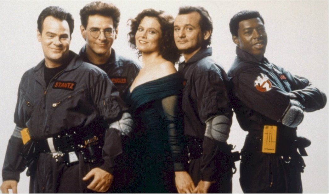
On June 8, 1984, Ghostbusters was released. It featured Bill, Dan, Harold, and Rick. Also, Sigourney, Annie, William, Ernie, and others earned starring roles. The inspiration for Ghostbusters originated from Dan Aykroyd. He has a strong desire and belief in the paranormal.
However, this craving for ghost hunting and battling came from his family. For instance, the mom saw a ghost; the grandfather used a radio to connect with the dead, while the dad authored the book—A History of Ghost. Also, the great grandfather was an established spiritualist.
Movie lovers received Ghostbusters with open hearts, making it the second highest-earning movie in 1984. The film made about $280 million during its debut, becoming the highest comedy ever. Then, in 1989, the owners launched Ghostbusters II, authored by the same writers.
After a long break, Ghostbusters: Afterlife, a sequel to the 1984 edition, is slated for November 19, 2021. Jason Reitman and Gill Kenan co-wrote the movie. Also, Jason doubled as the film’s director. The movie features new stars along with the original cast characters.
Today, the franchise is a multi-billion multimedia empire. Its products include comic books, board games, music, clothing, animation series, haunted attraction, and video games. With its staggering impact, the Library of Congress added it to its National Film Registry in 2015.
Who Is Dan Aykroyd?
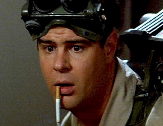
Daniel Aykroyd is a Canadian writer, actor, producer, and comedian. His parents were Samuel Aykroyd and Lorraine Helene Gougeon. His mother was a secretary, while the father worked as a policy adviser to the Canadian Prime Minister, Pierre Trudeau.
Daniel was born on July 1, 1952, in Ottawa, Ontario. He schooled at Pius X and Saint Patrick’s High school. He further gained admission to Carleton University, pursuing criminology and sociology. Sadly, he dropped out.
At seventeen, he joined the Canadian Sketch Comedy series—The Hart and Lorne Terrific Hour. He gained popularity with the NSL – Saturday Night Live, an American Comedy Show. Initially, he worked as a writer, earning $278 per week.
Later, Daniel became an integral member of the show, starring from 1975 to 1979. His writing prowess earned him an Emmy Award in 1977. Before working on Ghostbusters, Daniel starred in several movies. These include 1944 (1979), The Blues Brothers (1980), and Neighbors (1981).
Then, finally, in 1984, he and his partners released Ghostbusters. In this series, he starred as one of the lead characters. Again, in 1985, he featured in the movie—Spies Like Us. As a passionate writer and actor, he co-authored this movie too.
In 1983, Daniel married Donna Dixon, an actress. Together, they have three children—Danielle, Stella, and Belle. Daniel has received several award nominations and won three. These were the results of his outstanding writing and acting in 1977, 1989, and 1992.
Who Were the Four Original Ghostbusters?
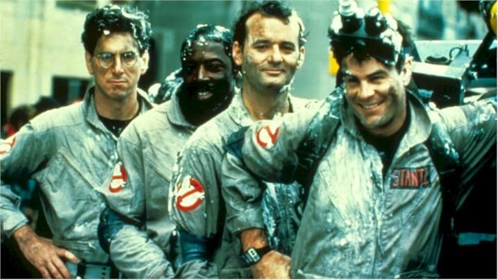
Ghostbusters starred several actors and actresses. Yet, there were three original members. Starring, you’ll find Bill Murray, Dan Aykroyd, and Harold Ramis. These talented actors were famously called the trio of parapsychologists. Starring, Bill played the role of Peter Venkman, Dan played Ray Stantz, and Harold played Egon Spengler.
What Does the Ghostbusters Symbol Mean?
In the graphic world, every design carries a unique message. Yet, in most cases, brands don’t put these messages in the public domain. So, public perception often becomes the order of the day. For example, looking at the Ghostbusters logo, you may associate it with a nightmare.
While this might resonate perfectly with ghosts, the Ghostbusters symbol is unique. So, if not fear, what does the character mean? The emblem symbolizes the quest to ridicule, defuse, and battle ghosts. So there you have it, a positive mission for an impossible task in the real world.
Who Is the Ghost On the Ghostbusters Logo?
Most of us recognize the figure trapped in the red sign as a ghost. Yet, most fans never thought it has a real name. Funny enough, during production, Dan Aykroyd and Ivan Reitman addressed it as Mooglie. Yes, that’s the distinctive name of your comic figure. Lovely moniker, isn’t it?
My Final Thoughts On Ghostbusters
Naturally, we pick signals from our upbringing without even knowing. Dan Aykroyd, the actor, and co-author of Ghostbusters, benefited from this gift. For instance, his father was an author who wrote about ghosts. Similarly, his great grandfather was a well-known spiritualist.
From this background, it was no surprise that an article about quantum physics and parapsychology inspired his idea. The article appeared in the Journal of the American Society for Psychical Research in 1981.
Dan has his family to thank because he has created a lucrative business around the gift he inherited from them. Putting his idea into action and working with other talented individuals, Ghostbusters was born in 1984. Instantly, it became a success, achieving Box Office status.
This action-backed comic horror movie is indebted to its logo. The logo with a ghost stuck in the no–sign icon conveys the emotions of the film. It’s pleasing to the eye, simple, readable, and has the power to battle any scary ghost in and around your apartment.
So, the next time a ghost confronts you, instead of the police, call the Ghostbusters.

