This is a look at the Google logo and the history behind the business.
The Google logo is probably one of the most recognized logos in the world. Google owns over 90% of the search market. That means over 4 billion worldwide. In the US alone there are 246 million google users.
What do the Colors in the Google Logo Mean?
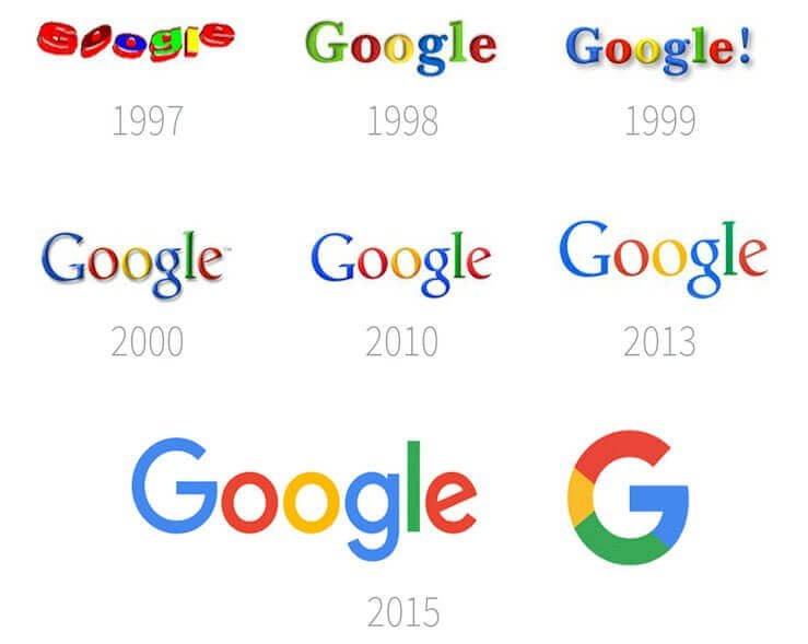
Though Google is famous for frequently changing the logo on the website’s homepage to reflect current events and important days in history, the web giant’s primary Google logo has changed very little over the years. It’s a colorful, immediately recognizable design that Google has been using since Larry Page first created the logo in 1997 using the graphics program GIMP.
Since then, Google has introduced several different iterations of the logo, most often simply changing the font and slightly rearranging the order of the colors. What significance then, if any, do these colors play in the Google logo? It turns out there’s an important message behind the colors Google chose to use in their now-famous logo.
How Colors in the Google Logo were Chosen
Any good artist knows just how important it is to choose the right logo colors, especially in designing something as essential to the branding of a company as a logo. It’s no surprise then that Google—a company famous for the attention they give their logo—didn’t just choose the colors in their logo by accident. When asked how Google came to select the colors they did, Ruth Kedar, the graphic designer who developed the logo the company now uses, said, “There were a lot of different color iterations. We ended up with the primary colors, but instead of having the pattern go in order, we put a secondary color on the L, which brought back the idea that Google doesn’t follow the rules.”
In deciding what the colors in the Google logo mean, designers at the company wanted to start with a pattern that was accepted and recognized, conveying the idea that Google itself was just as taken and recognizable as the first color chart taught across the world. Yet it wouldn’t do for the most cutting edge company in the world to keep things entirely conventional. Being innovative and pushing the boundary of what is accepted as essential to the heart of Google’s mission and vision keeps the momentum going. To convey this, Google decided to break from the traditional pattern they started with and make the L in their logo a secondary color instead. It’s a simple design with an important message, one that accurately captures the vision of the company in just a few recognizable colors arranged in a meaningful order.
What’s the meaning of the Google Logo Colors?

A lot goes into the design of a good logo, not least of which colors are used. Google knew this when they designed their logo, and they put a lot of attention into choosing a color scheme that would be eye-catching, aesthetically pleasing. They would accurately portray the vision of the company. The scheme they chose was incredibly simple but still managed to achieve all three of these goals, proving that simple designs are often the best way to go and that, when it comes to choosing the colors you use in your logo, a little extra attention to detail goes a long way.
Given its popularity, The Google logo is one of the most recognizable in the whole world. It also helps that there have not been many variants of the logo since its inception in 1998. So far, there have been only three major versions of the Google logo, with the last one arriving in 2015, introduced as the more modern and sleeker version of its predecessor.
Google is, without a doubt, the most popular search engine in the world; it hardly needs an introduction. It remains the most trafficked site on the planet, and its parent corporation, Alphabet Inc., is the fourth largest global company by market capitalization.
The Google Logo Evolution
1996: The First Google Logo
The company’s first logo was actually for “Backrub,” the first name that the founder’s Larry Page and Sergey Brin came up with for their search engine. This name was inspired by the fact that the search engine’s primary function was to crawl through the internet’s backlinks.
By 1997, however, they had dropped that name for “Google,” a misspelling of the Latin term “googol,” which means 10100 (10 to the 100th power). The whole idea for the name was that the search engine could serve up 100s of results, or googols, for their search terms.
1998: First Google Logo
While some sources credit the first design to Page, other sources say that Brin created the logo with GIMP, the popular free image editor. This first logo shows the mixed letter colors concept as initially imagined and would become the precursor for subsequent logo versions. The colors’ order is not the same as the version that followed, but the basic idea had been birthed.
Google later added an exclamation mark at the end, supposedly in line with the internet trends of the time, led by Yahoo! At the time, Yahoo! was the biggest website on the internet. The Google founders would have wanted to emulate them.
1999-2010: Ruth Kedar’s Logo Versions
In 1999, Ruth Kedar, an assistant professor at Stanford, met Page and Brin through a mutual friend. The young Google founders were not quite happy with their logo, so they asked Kedar if she could produce improved prototypes.
Kedar first made one using the typeface Adobe Garamond, with all letters black and a multicolored emblem that joined the two “O” letters. She also did away with the exclamation mark.
Her next variant utilized the Catull typeface, a font that should be familiar to most users. All letters were in black except for the second “O,” which intertwined with red and white geometric shapes and a line through. The shape was meant to communicate a sense of accuracy.
In several other variants, Kedar got more experimental; she played around with the colors, adding a magnifying glass in two different versions and interlocking the middle O’s in another version. However, there was a need to move towards simplicity, and the most detailed look yet came in the eighth version.
Kedar needed to show that Google’s potential was more remarkable than being just a search engine, which meant removing the magnifying glass altogether. And to show how unconventional Google was, she changed the conventional order of primary colors in the logo.
Google Logo Simplicity
The last variant was the most minimal and became Google’s official logo for 11 years, ending in 2010 (or 2015, if not taking into account the small changes in 2010.)
The design changes in 2010 were only minor, however. First, Google dropped the drop shadow effect on the wordmark, and secondly, they changed the second “o” from yellow to orange.
2015: New Google Logo

When 2015 came around, Google felt that it was finally time for a rebrand. Google designers from different cities met in New York for a week-long race to develop a new brand image and logo for the company.
After this design sprint, the Google logo was dramatically transformed. While the lettering maintained its predecessor’s multicolor pattern, the sleek new Google font, Product Sans, was a refreshing departure from the old serif font, Catull.
Product Sans, the company’s new custom typeface, was to be rolled out on all of Google’s products. Google’s designers also made a number of variations of the logo to be used across different platforms, such as the rainbow “G” used on the company’s mobile apps.
The 2015 logo, while still looking simple, was an upgrade for designers to work with as well. The switch from a serif to a sans-serif has made it easier for designers to manipulate the design as required by different platforms, particularly mobile. Serif fonts are generally known not to scale well because of the little serifs/glyphs at each letter’s edges. When rendered in very small sizes, their legibility suffers more than in their sans-serif counterparts.
The new logo was also designed to appear younger, fresher, fun, and less threatening. In other words, users should see Google as a cool tech company, rather than a massive tech corporation to be afraid of.
Logo Dynamism
Google also implemented some dynamic logo features in its latest rebrand. When you start a voice search on your mobile device, you should see some three Google dots in a bouncing animation anticipating the query. The dots will then change into an equalizer that corresponds to your speech. And after you’ve said something, the equalizer goes back to the animated dots to show that Google is processing your query.
The Start of the Google Doodle

Google’s first Doodle—a temporary modification to the logo—came as far back as 1998. This was even before Google became an official company. Sergey and Page were going to the Burning Man festival, and they wanted to put up an “out of office” message. So they added a stick drawing behind the second O of the logo.
As the years went by, the doodles became more and more detailed. In 2000, Denning Hwang, then an intern at the company, made a doodle for Bastille Day. The Doodle received so much love from users that the founders hired him as “Chief Doodler.”
Today, Google often puts up a doodle to commemorate national holidays and select special occasions, like birthdays of famous people from the past, such as Einstein, Tesla, etc.
Most doodles of the early days were used for marking the more well-known events, such as Halloween, Mothers’ Day, Valentine’s Day, etc. With time though, the doodles became more creative and purposed for varied occasions, such as the one in 2017 celebrating (or mourning) the first day of the school year.
Google Logo Design elements
Google Symbol

In 2015, Google introduced a new favicon alongside the new logo. The multicolored capital “G” symbol appears on various Google products, including Gmail, Android apps, and many other places as an alternative to the logo.
What Font Is the Google Logo?
The current Google logo utilizes a sans-serif font, Product Sans, custom-made by the company’s in-house design team. The font is pixel-friendly, thanks to its bold and streamlined contours, making it suitable for all screen solutions.
What Colors Are In The Google Logo?
Google’s current logo uses its traditional and familiar colors: red, yellow, blue, and green. The actual color order for the letters is blue-red-yellow-blue-green-red. The ordering remains unchanged from the previous logo version.
A Brief History of Google
First going by the name Backrub, Google started as Larry Page’s research project at Stanford. Page was on the computer science graduate program, where he would meet Sergey Brin. At the time, Page was investigating the behavior of internet backlinks and the possibilities of having an internet crawler that could determine which pages were being linked to from other pages. He saw this as a revolutionary approach to building a search engine of some kind.
With Brin’s math expertise, the two friends partnered up to create the famed PageRank algorithm, which was named after Larry. The algorithm would rank the importance of web pages based on a few link factors. With this technology, the most powerful search engine of the time was born and would launch within Stanford’s private local network in August of 1996.
1998: Google Incorporated with $100,000 in Angel Investment
Google was incorporated officially in 1998 under their new name, Google, with $100,000 in funding from the co-founder of Sun Microsystems, Andy Bechtolsheim. The founders then moved their operations to Susan Wojcicki’s garage. Susan would later go on to become the CEO of YouTube.
Thanks to the vast number of links coming up on the web every day, Page and Brin believed that their search engine would only become more accurate as the World Wide Web continued to expand.
September 2002: Yahoo’s Failed $3 Billion Acquisition
In the early 2000s, Yahoo! was well established as the premier search engine of the web. On the other hand, Google had implemented better search technology and even became Yahoo!’s search technology provider in the year 2000. In the summer of 2002, Yahoo made an offer to acquire the search engine company for $3 billion, but the offer was quickly turned down. The founders at Google believed their company was worth at least $5 billion at the time.
April 2004: Gmail Launches
2001 saw the start of an in-house project by Google employee Paul Buchheit. The company’s internal communication needs were on the rise, and Paul was tasked with creating an email product to address these needs. Paul had some experience building web-based email solutions. He had now decided to build a faster, lightweight application using Ajax, then an upcoming web scripting technology that could make it possible to dynamically fetch server content without having to reload the page.
On 1st April 2004, Gmail was made available to the public with a cool 1GB of data storage, which was way more than other email services offered at the time. In just a few years’ time, Gmail’s popularity had surpassed that of Yahoo! Mail.
October 2006: Google acquires YouTube
Google managed to acquire YouTube for $1.65 billion, having outbid tech giants such as Yahoo! and Microsoft. The deal was considered great by both parties: Google entering the video platform business, and YouTube, barely a year old, now able to utilize Google’s vast company resources.
The Google acquisition of YouTube has proven to be one of the best acquisitions in the short history of the internet, given YouTube’s position as the number one video platform of the web.
April 2007: Google Acquires DoubleClick
Google had established itself from the early 2000s as one of the biggest advertisers on the internet through its AdWords program. But with the acquisition of DoubleClick, an advanced advertising technology platform, Google cemented its place as the dominant advertising force in the search engine marketing space.
September 2008: Android Launches
Today, more than a billion smartphone users are on the Android platform, but it’s incredible to imagine that Google initially acquired the platform for just $50 million in 2005. Android debuted with the launch of the HTC dream phone in October of the same year. And now, about 15 years later, the Android platform is a million miles ahead of its chief competitor, Apple’s iOS.
Modern Day Foray into AI
Today, Google is also pioneering research and innovation in the Artificial Intelligence sector, with key breakthroughs already in self-driving cars, smart 3D glass technology, Google Maps, voice-powered search, and numerous ventures in education.
Final Thoughts
Google is one of the most powerful businesses globally, and its influence doesn’t seem to be waning any time soon. While the company has also had its fair share of poor decisions, such as Motorola Mobile’s acquisition in 2013, its smart acquisitions and massive success as a search engine and tech solutions provider have more than made up for all of its missteps.
With its simple but brightly-colored letters, the colorful Google logo is one of the most instantly recognizable symbols anywhere in the world. And after the 2015 rebranding effort, Google’s brand image now feels more polished and user-friendly than ever before.


