
This is a look at the Walmart Logo and the history of the company.
First, let’s start with the evolution of the Walmart logo. The first logo was designed in 1962, and as you can see, it was very plain. The logo then evolved into a more western look in 1964 and progressed with a more modern look into 2000.
![]()
The king of retail, Walmart, is the most successful chain of stores in the world today. Though the company has seen some stiff challenges as of late from e-commerce platforms, Walmart still reigns supreme across the globe as the go-to supplier for a vast range of products. In this article, we’ll take a look at the Walmart logo and the history of their enormous success.
History of Walmart
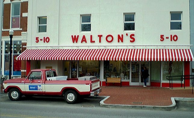
Sam Walton, the legendary founder of Walmart, opened his first retail store in 1950 in Bentonville, Arkansas. Right away, Walton adopted an unrivaled yet straightforward business strategy. He lowered prices well below those of his competitors. It was a move that slashed his profit margins, but Walton was confident it would pay for itself in increased sales. He was right, and by 1967 Walton’s business model was successful enough to support 24 different stores across the state of Arkansas.
By 1985, Walmart had 882 stores across the nation, with sales that year totaling $8.4 billion. By 1988, Walmart was the most profitable retailer in the US. 1988 was also the year that Sam Walton stepped down as the company’s CEO, turning the job over to David Glass. Though already an unprecedented success, the 1990s saw Walmart achieve an unbelievable flurry of growth. In 1990, Walmart had sales totaling $32 billion and locations in all 50 states. In 1991, the company went worldwide, opening its first international store in Mexico City, Mexico.
Since then, Walmart hasn’t looked back. With 5,229 stores in the US and 6,300 international stores, Walmart was able to generate a revenue of $482.1 billion in 2016—a figure that is even more impressive considering the stiff competition Walmart has faced in recent years from e-commerce rivals such as Amazon and Jet.com. Along with raking in a staggering amount of revenue, Walmart is also one of the world’s largest employers, with approximately 2.2 million employees worldwide. This, combined with the company’s never-ending list of charitable contributions and the positive impact the company’s affordable prices have made in the lives of shoppers across the world, makes Walmart a success that extends beyond zeros in front of a dollar sign.
What role, though, did Walmart’s logo play in this success, and how did it come to be?
The Walmart Logo
The Walmart logo is one that has undergone several different iterations over the years. The first logo that Sam Walton used was pretty basic, and not a lot of emphasis was placed on its design. Over the years, the company played around with several different designs, mostly flip-flopping on whether to hyphenate the company name in the logo to read “Wal-Mart,” separate it with an asterisk as in “Wal*Mart,” or push the words together to read “Walmart.” Though all of these designs saw usage over the years, the company eventually settled on the latter in 2008.
![]()
Today, the company’s logo features the word “Walmart” spelled out in all lowercase letters accented on end by a yellow sunburst the company refers to as “the spark.” This logo marks the sixth version of the company’s logo, and it was reportedly designed to make shopping at the store more attractive to higher-income families.
Anand Kumar, a University of South Florida marketing professor, said of the new logo that “People aren’t going to change stores because of a logo, but the old one associated Walmart with cheap. Along with store improvements, this will help change perceptions.”
Meanwhile, Linda Blakley, spokeswoman for the Bentonville, Ark., chain, commented on the new logo saying that “We wanted something softer, friendlier and warmer. Walmart Spark is the spirit of our company: innovation, inspiration, and people working harder to bring prices down.”
If nothing else, the Walmart logo’s numerous changes and their reasoning shows the significance that companies as successful as Walmart place on details such as their logo design.
Design Elements of the Walmart Logo
![]() Before the most recent Walmart logo was unveiled, Walmart used a logo that sported a red, white, and blue color scheme in an attempt to invoke patriotic appeal to their still largely USA-centric customer base. The latest logo was designed using a soft blue and yellow scheme to be more welcoming and inviting to their customers across the world.
Before the most recent Walmart logo was unveiled, Walmart used a logo that sported a red, white, and blue color scheme in an attempt to invoke patriotic appeal to their still largely USA-centric customer base. The latest logo was designed using a soft blue and yellow scheme to be more welcoming and inviting to their customers across the world.
The change was also necessary because Walmart was trying to rebrand itself at the time to do away with its image as a cheap, lower-class company. Walmart knew that switching logos was a prominent part of changing their image and associations, regardless of whether the old logo was sufficient, and decided to go with a completely new design that would be the new face of the rebranded company.
Concerning the purpose of the spark in the logo, Linda Blakely said it best by pointing out that the spark is a symbol for innovation and inspiration—both things that have driven the company forward over the years.
The popularity of the Walmart Logo

When you run a company as prominent and influential as Walmart, everyone will have an opinion about your every move. Concerning the decision to go with the new logo, people voiced a lot of criticism, saying that the design was uninspired and describing the Walmart Spark as looking like everything from an asterisk to a sphincter.
Regardless of whether the design for Walmart’s new logo was uninspired, it still served its purpose well. In Walmart’s case, the new logo didn’t have to be completely innovative and original. It just had to be different from their old one, representing a fresh start and a new direction for the company.
This is an essential lesson for anyone considering rebranding. If you aim to drastically change your company’s image, you will need to get rid of the things people associate with the company’s old branding. No matter how much you change about its mission, function, and marketing, people will have a hard time seeing it as any different if it is still represented by the same logo. At Walmart, executives realized this and chose a fresh, new Walmart logo to represent their company going forward.


