Let’s get an insight into the Yankees logo and some history behind the NY baseball team.
The New York Yankees are one of the most decorated baseball clubs in the world. The Yankees have produced some of the most outstanding players in the game’s history. In addition, they have won the World Series Championship twenty-seven times, an enviable record.
Again, as one of the oldest baseball teams, the club has earned several nicknames. You’ll hear names like the Yanks, the Bombers, and the Pinstripes, for good or bad reasons. Other words include the Bronx Zoo, the Damn Yankees, and the Evil Empire.
Interestingly, the Yankees are the only baseball club that doesn’t use players’ names on their uniforms. Whether playing home or away, the Yankees respect this custom. To date, the celebrated club has retired twenty-one numbers for twenty-three individuals.
Officially starting in 1901, the franchise unveiled its maiden visual ambassador. It was a readable logotype featuring an orange letter—O. Since then, the club has redesigned its trademark to fit its values. Overall, the Yankees have had thirteen emblems in 120 years.
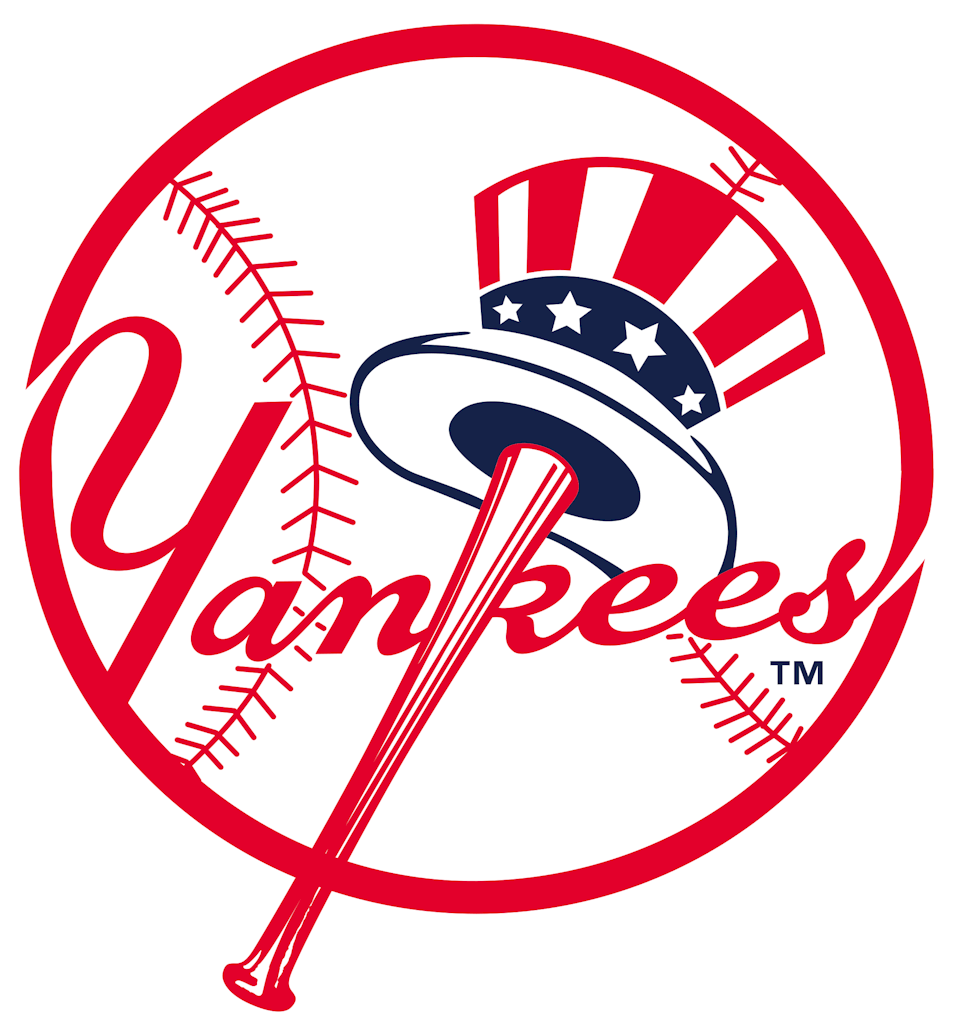
The current logo, crafted in 1968, is a circular red emblem. It features graphic elements that identify the team as a baseball club. It’s attractive, powerful, exceptional, and timeless. From caps to social media, this famous emblem plays skillfully without getting injured.
To learn more, let’s unfold the Yankees logo history.
Yankees Logo Evolution
 The Yankees have had a remarkable visual trip. For the past 120 years, the Yankees emblem has evolved twelve times. First, it has transitioned from an impressive letter—O to initials before changing to an interlocked logotype and finally settling for a circular one. To explore these changes, let’s step onto the field.
1901—The Orioles Logo:
The first Yankees logo featured a bold letter—O. It referred to the Orioles, the team’s original name, Baltimore Orioles. In addition, this logotype had two colors—orange and black. It was classic, attractive, and professional-looking. However, it lasted only for a year.
1902—The Baltimore Logo:
The Yankees’ second trademark was also a monogram. But this time, it featured a letter—B, referencing the city of Baltimore. Again, it had a geometric square attitude that makes it clean, bold, and readable. This blue and white logotype also reigned for a year.
1903—The Black New York Logo:
In 1903, the team had a new name which was reflected in its logo. This visual emblem featured the letters—NY, which referenced the city of New York. The creative director wrote these black letters in an Old English font. This visual image looked modest and confident, like the past ones.
1904—The Blue New York Logo:
A year later, the Yankees logo underwent a slight change. The designer kept the old English flavor for the letters—NY yet updated the color to blue. It looked brighter and loyal.
1905—The Interlocking Logo:
The Yankees’ fourth logo update came with a unique style. The designer interlocked the letters—NY and gave them rounded edges. Also, dark blue on a white background became the color scheme. Compared to the previous logo, this short-lived logo had smooth letters.
1906—The Detached Logo:
The fifth Yankees logo redesign saw the letters—NY detached again. Though they kept their smooth and rounded edges, they came with a brighter blue color. Still, the letters represent the city of New York.
1907—The Dark Blue Logo:
In 1907, the Yankees logo kept its unique personality yet introduced a few changes. The letters—NY became lighter and the color dark blue.
1908—The Bone Logo:
The club unveiled its seventh logo update in 1908. Again, it kept the distance and the color scheme of the previous design. However, its thick letters looked more like bones.
1909—The Blue Stylized Logo:
Replicating the 1905 design, the Yankees welcomed yet another iconic design. The designer used bold sans-serif letters with smooth and sharp elongated ends. This stylized version of the interlocking letters—NY looked attractive and authoritative. It lasted for three years.
1913—The Brown Stylized Logo:

In 1913, the team adopted the name—New York Yankees. So, the designer tweaked the logo slightly to honor it. Though the designer kept the previous charisma, he altered the font style and the color.
1915—The Dark Blue Stylized Logo:
The tenth update, which marked the eleventh logo of the Yankees, was released in 1915. It had the same font. However, the designer executed it in a dark blue color, and it reigned for about thirty years.
1947—The Circular Logo
The Yankees had an entirely new logo in 1947. It featured the Uncle Sam hat, a baseball bat, and a wordmark executed beautifully in a circular frame depicting a baseball. This iconic design danced in the official colors of the United States—blue, red, and white. It lasted for twenty years.
1968—The Current Logo:
The Yankees circular logo took on a subtle personality in 1968. The color scheme became brighter and darker, and its contour lines were refined. In addition, the designer discarded the sky blue color under the hat’s brim, favoring white color instead. As a result, it looks clean, attractive, and powerful.
Why Does Yankees Logo work?
1. The Logo Is Attractive:
In simple terms, the Yankees emblem is attractive. Its official color choice makes it visually appealing. With this quality in place, fans will associate with it. Well, by nature, we are wired to drift to things that attract. So this is a massive bonus for the Yankees team.
2. The Logo Is Unique:
In the branding world, uniqueness pays in the long run. And that’s precisely what the designers did with the Yankees’ visual identity. The logo stands tall in crowded fields because it’s none like others. In a straightforward term, it’s utterly exceptional.
3. The Logo Is Readable:
In most cases, script fonts are hard to read. But the designers did splendid work by choosing a readable typeface. That makes it easy for fans to decode its message across any medium.
4. The Logo Is Memorable:
It’s pretty easy to process the Yankees emblem. The reason being it has few unique design elements. As a result, it has an advantage over its rivals because fans can quickly recall it.
5. The Logo Is Relevant:
Relevance is another vital quality that’s helping the Yankees logo to shine. It has graphic features that are related to its sporting interest. For instance, you’ll find a baseball and a baseball bat.
Yankees Logo Design Elements
The creative directors behind the Yankees logos are professional. They understand the usefulness of graphic elements and their emotions. Therefore, in crafting the Yankees emblem, they picked the most suitable shapes, colors, and typeface to convey the brand’s unique values.
Yankees Logo Shape And Symbols
1. An Oval:
The Yankees maiden logo resembles an oval. An oval derived its name from the ovum, which symbolizes fertility, rebirth, and family. In other jurisdictions, the geometric shape can signify immortality.
2. A Hat:
One of the graphic elements in the Yankees logo is a hat. It’s quickly identified as Uncle Sam’s mark. A hat signifies protection. It can also convey the aura of power, authority, and respect. In some cultures, a hat symbolizes prestige, wealth, and nobility.
3. A Circle:
The Yankees have a circular logo. It references baseball, one of the official objects used in that sport. A circle symbolizes totality, wholeness, and perfection. Also, you can use it to convey unity, community, and eternity. This geometric shape is a mark of evolution.
4. A Baseball Bat:
A baseball bat is an identifiable object in the game of baseball. It represents defense, scoring, and hitting. Its presence in the emblem makes it easy for people to tell the team’s sporting discipline.
Yankees Logo Colors
1. Orange Color:
The orange color gave beauty to the Yankees’ debut emblem. It marked the soul of the letter—O. Orange represents joy, success, and creativity. But you can also associate it with passion, fun, and freedom. The color of sunshine, orange, is a mixture of red and yellow colors.
2. Black Color:
From its beginning, the Yankees logo gave preference to the black color. It was one of the team’s empowering colors. This neutral hue signifies power, fear, and strength. Also, the color of darkness can evoke mystery, authority, and prestige. Black made the logo look dominant.
3. Blue Color:
Blue resonates with the sky and ocean. It holds the feeling of freedom, inspiration, and wisdom. As a primary hue, it has an enduring presence in the Yankees emblem. You can also use blue to signify loyalty, stability, and confidence. These traits mark the spirit of the team.
4. Red Color:
Red took center stage in 1947. Before then, it wasn’t an official color in the logo. This primary color aligns with blood and fire. In its joyous glory, red symbolizes desire, passion, and strength. Others also use red to convey the spirit of action, courage, and willpower.
5. White Color:
What can these Yankees’ colors—orange, black, blue, and red do without the white? In simple terms, they will be defeated. White forms the background hue for the logo and gives balance to all the other colors. White is a neutral color that signifies goodness, safety, and perfection. It can also communicate simplicity, cleanliness, and humility.
Who Created the Yankees Logo?
Louis Tiffany created the stylized interlocking logo—NY in 1909. It remains one of the most iconic trademarks in the sporting world. Then, in 1947, Henry Alonzo Keller, a sports artist, developed the circular Yankees emblem. This is also one of the brightest and famous logos in the industry, with an exceptional American attitude.
What Font Is Yankees Logo?
The font used for the interlocking emblem is custom. However, the circular logo features a different typeface. The closest font to the Yankees’ script is Machiarge Regular Font. In addition, Flat-it published this brush script. The fonts are unique, readable, and eye-catching.
How Did Yankees Get Their Logo?
According to popular legend, the Yankees interlocking NY logo took inspiration from a visual emblem created in 1877. This image, created by Louis B. Tiffany, was used to honor John McDowell, the first New York police personnel to be shot at a post. It was a medal of valor.
What Does the Yankees Logo Mean?

All the Yankees’ logos were designed with some unique messages in mind. From the first to the current, the Yankees emblem symbolizes patriotism, sportsmanship, and community.
Is Yankees Logo Copyrighted?
The Yankees logo isn’t a public domain identity that you can use without legal action. Under the legal presence of Mary L. Kelvin, it was registered on October 23, 2007. It’s owned by the New York Yankees Partnership and filed under the employee name Thompson Heather.
How Yankees Got Started?

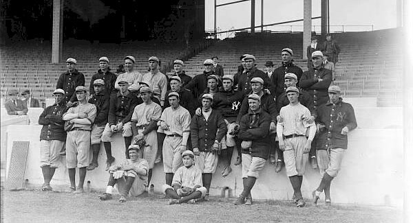
Based in the New York City of Bronx, the Yankees are an American professional baseball club that plays in the major league. In 1901, they began the season as the Orioles, competing for two seasons from Baltimore, Maryland.
Then, in 1903, Frank Farrell and Bill Devery bought the team and moved it to New York City. Here, they changed the team’s name to the New York Highlanders. Then, in 1913, the club officially became the New York Yankees.
In 1915, Colonel Jacob Ruppert and Captain Tillinghast bought the franchise from the owners. Until 1922, the Yankees played at the Polo Grounds, briefly sharing the Hilltop Park with the Giants, and finally to the Yankees stadium.
The Yankees stadium cost $2.5 million, and its construction lasted for eleven months. The club moved to the new stadium in 1923. On the Opening Day, the stadium attracted 99,200 fans. “The House that Ruth Built” became the nickname for the stadium.
The reason was that Ruth doubled the club’s attendance. Ruth was signed in 1921, and his presence helped the club pay for the new stadium. At the end of their baseball season, the Yankees won their first championship. And for three repeated years, they faced the Giants in the World Series.
Murderers’ Row became the nickname of the Yankees’ lineup in the 1927 season. The lineup included Ruth, Gehrig, Tony, Bob, and Earle. With this squad, the Yankees won 110 games, becoming the first baseball club to occupy first place every season.
Fast forward to 1964, CBS bought 80% of the club for $112 million. Yet, the team performed poorly under the new management. For instance, they had a record of 77—85, their first poor showing in forty years. The team’s misfortune continued until new owners bought it.
In 1973, George Steinbrenner and other investors bought the club from CBS for $8.7 million. But within a year, George bought most of the additional shares, becoming the majority owner. George and his new board took strategic decisions that changed the course of the team.
For instance, the club signed Catfish Hunter and hired Billy Martin as manager. With these additions, the Yankees got to the 1976 World Series. But, sadly, the Cincinnati Reds beat them. Then, in 2009, the team started the season in a new stadium located north of River Avenue.
Under the leadership of Joe Girardi, the Yankees finished first in the American League East. Then, finally, they reached the World Series, defeating the Philadelphia Phillies 4–2, lifting their 27th World Series Title. Today, the NY Yankees are owned by Hal Steinbrenner.
Drawing the Curtains Down On the Yankees Logo History
The NY Yankees are arguably one of the most successful baseball franchises in history. They began in 1901 in Baltimore, Maryland, before moving to New York City in 1903. Initially, the team was officially called Orioles, referencing Baltimore City.
After buying and moving it to New York City, Frank Farrell and Bill Devery renamed the club the New York Highlanders. However, this name lasted for ten years, giving way to another name—the New York Yankees in 1913. Since then, this name has remained unchanged.
Like most sporting teams across the world, the Yankees have tasted bitterness and sweetness. Yes, they have had their worst and best seasons in Major League Baseball. Yet, the club has impacted the league for about twelve decades, winning the World Series twenty-seven times.
Finally, the Yankees logo has been instrumental to the club’s popularity and success. It’s iconic, eye-catching, simple, memorable, and versatile across all marketing platforms. It has considered the basic rules governing the creation of logos. That’s why it’s recognizable worldwide.


