Let’s get an insight into the Google Maps logo and some history behind the digital map.
Google released its Google Maps logo and application in 2005, and the trademark featured a colorful inscription, keeping the company’s identity intact. Also, beneath it, you’ll find the words—Maps and Beta painted in yellow and gray, respectively.
Aiming for a minimalist logo, Google refreshed this trademark several times. Then, after these changes, Google unveiled the latest emblem to commemorate its 15th anniversary. The logo comprises a wordmark and an icon, and it dazzles in the company’s colors.
Often, the special symbol is called a pin, marker, or an inverted teardrop. Today, the eye-catching logo is the face of one of the world’s most powerful mapping apps. With over a billion users, the app began as a digital version of a physical map.
Therefore, it helped users navigate from point A to B. However, today, the app has grown with advanced functions. These include transit, traffic conditions, street view, forty-five degrees (450) imaginary, and time-lapse, to list a few.
Now, with Google Maps, you can explore, commute, contribute, update, and save locations.
Google Maps Logo Evolution

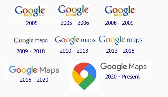
The Google Maps logo has have had multiple updates for the last seventeen years. The first logo appeared in 2005, and its maiden updates took place the same year. In addition, the logo has transitioned from a wordmark to a trademark comprising a symbol and an inscription. To learn more about these changes, kindly read on.
2005—The Maiden Google Maps Logo:
Google unveiled its first Google Maps logo in 2005. This wordmark dazzled in the company’s official multicolor. Also, the iconic logotype comprised the words—Maps and Beta below the brand’s name. The words came in yellow and gray, respectively. Sadly, it was short-lived.
2005—2006—The Second Google Maps Logo:
Google refreshed its Google Maps logo slightly in 2005. And this ushered in a second logo. This version of the logo kept the personality of the previous one. However, the word—Local replaced the caption—Maps. Also, the inscription—Beta was bid farewell, and it reigned for almost a year.
2006—2009—The Third Google Maps Logo:
For company reasons, Google updated its logo again. Here, it kept the identity of its wordmark but changed the caption—Local to Maps. This colorful logo reigned for about three years.
2009—2010—The Fourth Google Maps Logo:
In 2009, Google updated its Google Maps logo. This version came with the famous—Maps on the right of the company’s name. Again, instead of the usual yellow shade, this inscription was rendered in light blue. Finally, it was written in lowercase letters and stayed for about a year.
2010—2015—The Fifth Google Maps Logo:
Google released its fifth visual identity for Google Maps in 2010. Compared to its predecessor, it looked flatter, cleaner, and brighter. This resulted from the absence of the gradient, and it reigned for nearly five years because of its striking charisma.
2015—2020—The Sixth Google Maps Logo:
This version of the trademark had a new font style. The wordmark, featuring a sans-serif typeface, looked modern and bold. The caption—Maps was executed in title case letterings and gray. Luckily, it ruled for about five years.
2020 – Present:
In readiness for its 15th anniversary, Google refreshed its Google Maps logo. This attractive logo consists of a wordmark and an icon. This Google Maps Icon comes in blue, green, yellow, and red. Also, it has a white dot in its middle. Again, the colorful emblem, a location marker, finds itself on the left side of Google Maps’ gray inscription. Overall, it’s simple, eye-catching, and memorable.
Why Does Google Maps Logo Work?

1. The Logo Is Simple:
In graphic design, simple logos are the benchmark. Thankfully, the Google Maps logo follows this same standard. This is because it isn’t overloaded with too many graphic elements. So, the logo conveys a coherent message to its audience with this in place.
2. The Logo Is Memorable:
One remarkable benefit of a minimalist trademark is memorability. Luckily, the Google Maps logo is easy to notice, understand, and remember. So, people can’t help but commit it to memory effortlessly. Seriously, you’ll have a repeat business if people can recall your brand.
3. The Logo Is Relevant:
The Google Maps logo applies to its service niche. The choice of colors, font, and teardrop icon all align with its offering. For instance, the green color indicates outdoor, entertainment, and leisure. Also, the iconic symbol shows the user’s location on the Google Map. Remember, though this advice is important, most brands don’t sweat over it.
4. The Logo Is Versatile:
In business, logos are used as an effective advertising tool. So, they should be capable of showing on various marketing channels. Owing to its modest outlook, you can bet the Google Maps logo can adapt to multiple marketing platforms. Though colorful, the Google Maps logo can also take on a monochrome color scheme while looking impressive.
5. The Logotype Is Readable:
From all angles, the Google Maps logo is highly legible. It owns this to its font preference. We should understand that readability is an important component of logo design. Legibility is so crucial, allowing logos to be readable, recognizable, and reinforcing the brand’s persona.
Google Maps Logo Design Elements
Google Maps logo has relevant graphic elements. These include colors, text, and a spectacular symbol. They combined to give a pleasing personality to the trademark. Though the logo has undergone multiple refreshments, it has kept its core personality over the years.
Now, let’s explore these elements in detail.
Google Maps Logo Colors

1. A Blue Color:
Blue is a color of intuition. It’s a primary color and one of Google’s custom colors. Though it has several emotions, on the map, it indicates transport and shopping. Yet, the sky color can signify loyalty, stability, freedom, and serenity. But, don’t forget; it can sometimes evoke coldness.
2. A Red Color:
Red is the color of blood and energy. Like blue, it’s Google’s official color and a primary hue. It symbolizes longing, romance, joy, and strength in most fields. Also, throughout history, red has been used to convey anger, danger, lust, and violence. Remember, red is an action-focused color.
3. A Yellow Color:
Yellow is a color of hope and honor. Like blue and red, it’s one of Google’s idolized colors. On the positive side, it symbolizes happiness, freshness, and intellect. But then, on the flip side, it can promote deceit, sickness, and jealousy. So again, remember yellow is an attention-getter.
4. A Green Color:
Green is a color of healing. Also, it’s one of Google’s favored colors. On the Google Map, it represents the outdoors, entertainment, and leisure. Besides this, the color signifies growth, harmony, fertility, and renewal. Sadly, however, it can emit emotions such as greed and envy.
5. A White Color:
The White color marks the center of the location marker icon. Most experts tout it as a color of goodness. These people associate it with purity, humility, perfection, and safety. Additionally, the color of heaven signifies innocence, cleanliness, softness, and illumination.
What Do the Icons On Google Maps Mean?

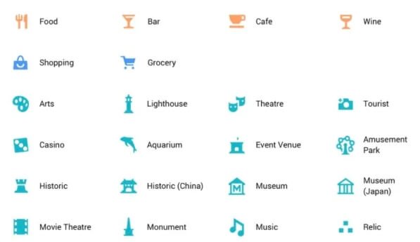
Google Maps is an intuitive location finder. Google Maps uses several icons to represent each landmark to make it easy for people to find locations. It’s common to find unique symbols for schools, roads, hotels, hospitals, libraries, etc.
First, let’s start with these recognized (+, -) signs. The plus (+) icon lets you zoom in on a location. This helps you enlarge the specific location to find more details. In contrast, the minus (-) icon allows you to zoom out of a location. Also, there is a compass-like symbol.
It’s made up of a dot inside a tiny circle with four directional points. When you enable Google Maps, this symbol shows your location. More so, when searching for location information on Google Maps, the magnifying glass is a handy tool.
In addition, Google Maps uses the exclamation point to signify traffic incidents. Then, the sight of a worker and a shovel indicate road construction. Interestingly, a blue letter—M represents an elevated or underground rail. In contrast, a blue circle around an airplane aligns with an airport.
Besides these symbols, you’ll find a tree for a park, a shopping bag for shopping centers, a knife and fork for restaurants, and glass for bars, to mention a few. But, of course, with Google Maps, finding the location of businesses is a lot easier.
And remember, the icons will serve as your online tour assistant.
Is the Google Maps Pin Trademarked?
Google has used the pin on several marketing materials, including games. Under the United States patent laws, the pin is registered as a teardrop-shaped marker. The widely noticeable inverted-drop-shaped symbol shows locations on Google Maps. At times, it’s called the marker.
What Is the Purpose of Google Maps?
Google Maps functions as a digital map. Its primary purpose is to provide driving direction. Today, it provides mapping and navigation to its billion users. Unlike physical maps, Google Maps provide direction in two and three-dimensional satellite views.
Also, it allows businesses to include their information on its interface. That makes it quick for users to search for them. Again, the app offers several landscape views, including street, traffic, terrain, etc.
Additionally, the app can be customized and embedded into web pages via the Google Maps Platform. This is an advanced development interface based on JavaScript.
Short History About Google Maps
![]()
Google Maps is a digital mapping application from Google, Inc. It provides satellite imagery, street maps, and real-time traffic situations. Two brothers, Lars and Jens Rasmussen, initially designed Google Maps as a C++ desktop application.
In October 2004, Google bought the program and turned it into a digital application. Then, on February 8, 2005, Google unveiled the service after adding geospatial data visualization and a real-time traffic analyzer. The interface uses JavaScript, XML, and Ajax for its front end.
In the same year, Google added Google Earth, bringing three-dimensional views of the world on a desktop. In addition, Google Earth has over 36 million square miles of high-definition satellite images for travelers. Moreover, in December 2005, Google released Transit Trip Planner.
This service helps commuters see public transport schedules and routes. It began as a separate product but was later added to Google Maps, reaching several cities worldwide. By 2007, Google Maps featured a miniature view with a movable rectangle.
Primarily, this feature indicates the area shown in the main viewport. Also, Google released Street View on May 29, 2007. Then, the mobile edition of Google Maps followed on November 28, 2007. In addition, it came with the beta version of “My Location.”
My Location uses the GPS of mobile devices to determine the user’s current location. On September 23, 2008, Google added Google Maps to its android operating system. Then, the iOS version followed in 2012.
On April 19, 2011, Google added Map Maker to its America interface. This allows users to provide real-time changes to the map without waiting for third-party firms. Then, in June 2012, in partnership with the Canal and River Trust, Google began mapping Britain’s rivers and canals.
On June 27, 2016, Google released new satellite imagery. First, the company acquired it from Landsat 8, consisting of about 700 trillion pixels of new data. Then, in September 2016, it bought Urban Engines, a mapping analytics company.
On October 16, 2017, Google updated its mapping service. Here, it gave access to several images of planets and moons. In August 2018, Google Maps introduced a three-dimensional globe viewing. It was followed by a speed trap and camera alerts in January 2019.
Google, in December 2019, added an incognito mode. This allows users to access locations without saving entries on their Google accounts. Then, in 2020, it released a new app symbol to celebrate its 15th anniversary.
Drawing the Curtains Down On Google Maps Logo History
In October 2004, Google acquired a C++ desktop application. It was created by Lars and Jens Rasmussen, two Danish brothers. By purchasing ZipDash and Keyhole, Google converted the app into a digital mapping application.
Eventually, Google Maps was launched on February 8, 2005. Then, in September 2005, Google updated its satellite imagery to allow users to see the flooding in New Orleans. Then, two years later, it unveiled its app for Mobile 2.0. This came with a beta version of “My Location.”
Also, on September 23, 2008, Google announced the app release on Android. Then, four years later, it released the app in the Apple store. Finally, to mark its 15th birthday, Google unveiled its newest app icon. It was released in February 2020, featuring the pushpin beside its wordmark.
This new colorful trademark indicates the company’s innovative transition over the years. However, the original logo was a wordmark that included the captions – Map and Beta below it. After this maiden logo, Google has used several others to convey its service mission.
Yet, despite the changes, the company has strived for consistency in its visual identity.


