
Let’s get an insight into the Gap logo and some history behind the clothing line.
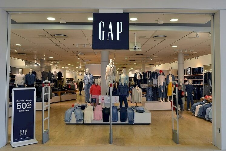
Gap Inc. has a monochrome wordmark. It’s one of the most noticeable logos in the clothing industry. It has some essential qualities that make it influential—It’s simple, readable, memorable, and versatile. The company unveiled it in 2016, featuring only uppercase letters.
However, the original Gap logo debuted in 1969. It was also a wordmark with a black and white color palette. Unlike the current logo, the designer rendered it in lowercase letters. In addition, this trademark had a tilted article—the above it. For about seven years, it served the company.
Since it began in 1969, Gap has had five logos. Yet, the changes were minor, keeping the personality consistent. In 2010, the company unveiled its fourth logo, but it got the backlash of the public. Therefore, it reigned for only seven days, paving the way for its predecessor again.
The Gap logo represents the face of Gap Inc. Mr. and Mrs. Fisher raised about $63,000 to start this clothing line in San Francisco. Initially, they targeted the younger customer with their Levi’s jeans and records. With demand skyrocketing, they quickly expand into other markets.
Though they have closed some stores in the United Kingdom, they still have a presence in France, Canada, Brazil, Ireland, and other countries. The Gap name originated from the term—Generation Gap. Today, Sonia Syngal leads the company as its Chief Executive Officer.
Gap Logo Evolution and Its Incredible History
![]()
For a little over five decades, the Gap logo has changed four times. While the original logo came out in 1969, the first update happened seven years after. Then, the subsequent changes followed. That was in 1986, 2010, and 2016. Yet, in 2010, something dramatic took place.
Laird and Partners designed the 2010 Gap logo. And Gap management unveiled it on social media. Then, shockingly, experts and customers spoke bitterly against it. So Gap went back to its 1986 logo design. Having laid the foundation, let’s now explore these updates.
1969—The Original Gap Logo:
The Gap released its first logo in 1969. It was a lowercase logotype that served the company until 1976. Here, in a tilted mode, the designer placed the word, “the” above the brand’s name–gap. With creative eyes, you’ll notice the letters—g, a, and p sharing an even-sized circle. Interestingly, the lines at their sides make them different. This logo dazzled in monochrome.
1976—The First Gap Logo Update:
After seven years, the Gap updated its logo. This new emblem kept the details of its predecessor except one. You’ll notice the designer has leveled the article above the caption—gap. Compared to the previous article, this one looked bolder. Playfully, it ruled for almost ten years.
1986—The Second Gap Logo Update:
The Gap unveiled its third logo in 1986. It comprised a white wordmark on a blue square. Here, the designer executed the wordmark in uppercase letters. In addition, he omitted the famous article. Because of its identity, the logo earned the nickname—Blue Box.
2010—The Third Gap Logo Update:
After twenty-four years, Gap opted for another design. It featured a blue square behind a wordmark. Creatively, while the inscription was bold, the frame drifted to its upper right corner. Sadly, this logo lasted for a week—customers disliked it. So Gap reverted to its iconic Blue Box.
2016—The Current Gap Logo:
In 2016, the Gap ushered in a new logo. It was a slight change to the 1986 logotype. The designer removed the blue frame. Also, you’ll notice an increase in the spaces between the serif letters. Finally, this wordmark is enjoying a monochrome color palette.
Why Does the Gap Logo work?
1. The Gap Logo Is Simple:
Simplicity makes the Gap logo workable. It uses minor design elements to convey its core messages. Also, it can quickly take on other colors with ease. If you desire an effective logo, then take this humble path. Remember, using lots of elements wouldn’t help your brand.
2. The Gap Logo Is Readable:
Gap Inc. has a wordmark type of logo. Essentially, it’s readable. Also, it was designed with the end-user in mind. And that’s why it’s effective. Regardless of the medium, the Gap logo is identifiable on all. While you own the logo, you designed it for your audience. Never forget this!
3. The Gap Logo Is Memorable:
An influential logo is always memorable. And the Gap logo is just one. Because it has a clean personality, customers can quickly recall it. To engrave your brand on customers’ minds, go for the modest logo design. Remember, simple logos will save you lots of money.
4. The Gap Logo Is Versatile:
The Gap logo is practical because it’s versatile. It has the flexibility to fit all marketing channels. From outdoor, print, and digital, it can dazzle with no issue. Remember, you’ve several platforms to enhance your brand identity. So take advantage!
5. The Gap Logo Is Timeless:
No smart entrepreneur would design a logo for the short benefit. So you shouldn’t either. The Gap logo has no trendy elements. And that’s why it’s so effective. To achieve this quality, avoid fashionable graphic elements. In the long run, you’ll be glad to have heeded this piece of advice.
Gap Logo Design Elements
The Gap logo is one of the simplest emblems in existence. The company has always favored a wordmark style of logo. In all cases, you’ll find Gap using only fewer graphic elements. That’s a font and color, and occasionally, you’ll see a geometric shape.
Now, let’s explore them further.
Gap Logo Shape And Symbols
A Square:
Gap introduced a blue square in the 1986 design. It’s one of the widely used symbols in graphic design. A square symbolizes unity, orderliness, safety, and security. In some jurisdictions, this icon represents the ends of the earth—east, west, south, and north.
Gap Logo Colors
1. Black Color:
The color black symbolizes mystery. Also, it’s a neutral color that signifies elegance, formality, and authority. Well, these are some of its positive feelings. But, on the flip end, it can convey the energy of fear, evil, death, and sorrow. The gap seems to enjoy using this incredible color.
2. Blue Color:
Gap introduced the color blue in 1986, and it reigned for a long time. Blue evokes the beauty of the sky and ocean. Powerfully, it conveys the spirit of loyalty, safety, and stability. In addition, it signifies serenity, trust, and tranquility. In the branding world, blue is the most favored color.
3. White Color:
Like black, white is also a neutral color. It plays a dazzling role in the Gap logo. Its presence gives balance to the other essential colors Gap has adopted. In most cultures, white symbolizes positive energy. Again, the color of heaven signifies goodness, humility, simplicity, and loyalty.
Is Gap Logo Copyrighted?
The Gap logo isn’t in the public domain. Gap applied with the United States Patent and Trademark Office on February 29, 1972. On October 10, 1972, the office granted Gap its application. Though this information relates to the original trademark, the current one is also registered. To use this mark, save yourself the legal pain by talking to the brand owners.
What Font Is the Gap Logo In?
Throughout its history, the Gap logo has used legible fonts. For instance, the 2010 logo design used a font called Helvetica. It was clean, readable, and confident. However, the font in the current version is close to Spire Regular. Ann Pomeroy designed this serif font with clarity.
What Is the Meaning Behind the Gap Logo?
You have asked a sensitive question. So, let’s delve a little into history. In 1969, Gap was born in San Francisco. It was a period when sexuality was a major issue in the US. Laws against sodomy were firmly enforced. Yet, despite the law and stigma, people were gay and proud.
Therefore, some people linked the slang to the brand. To them, Gap was an acronym for—Gay and Proud. While it sounds factual, it isn’t true. Gap references the generation gap existing at the time, essentially clothing choices.
For instance, clothing brands sell products that don’t appeal to younger consumers. So, the unmet gap between supply and demand inspired the formation of Gap as a clothing line. In short, Gap means to fill the gap. So, yes, Donald and Doris Fisher used their brand to fill the generation gap.
Why Did Gap Change their Logo?
There are several reasons a company might change its logo. Few instances are outdated logos, sales impact, expansion, merger, etc. Moreover, in 2020, Gap saw the need to revamp its visual aid. First, they felt the logo had served for almost twenty years. Hence, it needed some retooling.
Second, the decline in revenue forced them to update their visual emblem. So, they hired Laird and Partners to redesign their logo. Well, they got a wordmark that featured a square behind its letter—P. Sadly, it failed to win the hearts of fans. So Gap reverted to its previous logo.
How Gap Got Started?
The Gap Inc. is an American clothing line founded on August 21, 1969. Donald and Doris Fisher started it in San Francisco, California. The brand has a global presence. Legend has it that the success of the Tower of Shoes inspired Donald Fisher.
To replicate its business model, he spoke to Walter Haas Jr., president of Levi Strauss & Co. Walter referred him to his Director of Advertising, Bud Robison. Together, both men drafted a legal plan, leading to the birth of Gap. Doris Fisher came up with the company’s name, Gap.
In the deal, Donald signed to sell only Levi’s products. Likewise, Robison agreed to pay a 50% advance in the Gap’s radio advertising. Again, he pledged constant stocking for the Gap store. With this agreement, the Fishers opened their first store near City College in San Francisco.
To attract young customers, they added LP records alongside Lev’s apparel. Then, in San Jose, Gap opened its second store. With 6,600 square feet, about half of the space was used to stock products. Finally, in 1971, Gap opened its corporate office in Burlingame, California.

By 1972, Gap had opened 25 stores. Then, in 1974, Gap started selling private-labeled products. Finally, in 1976, the company went public. It offered 1.2 million stocks at $18 per share. In expansion mood, Gap unveiled two chains of stores in 1977: Logo and Brands.
Gap bought the Banana Republic in 1983. It was a two-store safari and travel-themed retail store. It was founded in Mill Valley, California. Then, in 1984, the company unveiled the famous Pocket—T in 21 colors. Two years on, Gap opened its first kids’ store in San Mateo, California.
Fast forward to 1991; Gap stopped selling Lev’s apparel. Then, eight years on, the San Francisco Chronicle named Gap—the company of the year. Then, in 2004, Fisher stepped down as board chairperson. Sadly, in 2009, he passed on, leaving the company in the hands of his family.
How Big Is Gap Inc.?
Gap Inc. is an American clothing giant operating globally. It has a presence in Canada, United Kingdom, China, Japan, and Ireland. France, Mexico, Taiwan, Italy, and Hong Kong aren’t left out. The seven major brands of the company include Old Navy, Gap, and the Banana Republic.
Also, you’re likely to find Athleta, Intermix, Janie $ Jack, and Hill City brands. As of 2020, Gap has 117,000 workers operating worldwide. This is a reduction of 129,000 from the previous figures. Also, the company operates 3,100 stores across the world.
These stores, together, generated $13.8 billion in net sales for the brand in 2020. Today, Sonia Syngal, the CEO of Gap, leads a brand worth $9.28 billion as of September 29, 2021. Though it’s struggling, it’s still one of the largest and most recognizable clothing brands worldwide.
Why Is It Called Gap?
Doris Fisher, the co-founder of Gap Inc., chose the name for the company. Before starting, it was hard to find apparel for young customers. Luckily, the couples spotted a unique gap between supply and demand. So, they set out to fill the generation gap by targeting the younger generation. In short, Gap isn’t an acronym, rather a reference to the generation gap.
Summary of the Gap Logo and Its History
In 1969, Donald and Doris Fisher founded Gap in Francisco, California. Their inspiration came from not finding a pair of jeans that fit. So, with $63,000 seed capital, the couple opened their first store. They located it at Ocean Avenue, San Francisco, selling Levi’s jeans and LR records.
Doris Fisher assigned the name—Gap. And it’s a reference to the generation gap. In San Jose, the Fishers launched their second store in 1970. By 1973, they had about twenty-five stores. In addition, the success of these outlets led the Fishers to serve customers outside the United States.
Currently, Gap runs seven brands. These are Gap, Banana Republic, Old Navy, and Intermix. The rest are Athleta, Janie and Jack, and Hill City. Despite the reduction in its labor force, Gap still has a staffing strength of 117,000 workers. Also, it has about 3,100 stores worldwide.


