
This is a look at the Forbes logo and some history behind the business magazine.
Can you list 400 family-owned brands in the world that remain competitive over decades?
Forbes ranks as one of the most powerful family-owned brands in the world. The company that has mastered the art of writing, editing, and publishing business articles has a modest logo serving as its brand ambassadors for over a hundred years and counting.
The Forbes logo, with its minimalist outlook, features a white wordmark on a contrasting black background. The logo design’s white and black color scheme makes the brand look clean, robust, attractive, and recognizable anywhere.
This simple emblem communicates with the wealthy and influential business owners worldwide daily. It reaches these change–makers on its magazine covers, websites, social media handles, and other targeted promotional channels.
With a readership base of 5.8 million people, the Forbes logo is one of the most popular and influential emblems globally.
The Evolution of Forbes Logo
![]()
Forbes has survived different periods and adopted its logo design to reflect those times. For this simple reason, the Forbes logo has had many updates. In this write–up, we will look at the most prominent ones. So let’s head straight to the designing studio:
1918–1923—The Beaux-Arts Style
Forbes unveiled its first logo to the public in 1918. It was a wordmark logotype with swatches around the letterings. The black official emblem reflects the designing taste of the era—The Art and Craft movement in the United States’ printing industry.
1923–1930—The First Update
Forbes had three different wordmark logos within this period. The first two logos had black outlines with white filled colors. But the third had a solid black hue—these three variations came in caps with different fonts.
1930–1937—The Ford Influence
The company updated its logo for the second time. It went for a script wordmark emblem. The emblem featured lower case letters, yet the letter—f appeared to be wearing a hat on its top. Some design experts prefer to call this version of the emblem berserk. It mimicked the Ford design.
1937–1938—The Bauhaus Influence
Forbes had its fourth logo redesign. It got rid of the script design for custom roman caps. The letter—O in the design looks like a complete circle, and it was outstanding. The six letters had more expansive spaces between them, making the logo noticeable.
1938–1948—The War Poster Inspired
For the next ten years, Forbes experimented with three different designs. It opted again for the script design, but this version was sharp and sleek. It had another one with a drop shadow—this version looked elegant and powerful. The last logo design the brand used took inspiration from war posters.
1948–1966—The Breathing Logo
In 1948, Forbes unveiled a logo design that set the tone for today’s emblem. It was bold, all–caps serifs wordmark logotype with spikes around its edges. The design style, with its unique letter—F, was readable and memorable.
1966–1978—The Gothic Logo
Forbes saw the need to use another logo design. The company released a logotype with heavyweight letters. The font, which looked like Franklin Gothic, was based on a blend of serifs and Universe font.
1978–Now—The Modern Logo
The current Forbes’ official logo comes with a bold sans–serif typeface. The massive logotype is clean, readable, and elegant. In 1999, the designer tweaked the wordmark a bit, allowing more spaces between the letters. With this subtle update, the letters become sharper.
Why the Forbes Logo Works?
1. The Forbes Logo Is Consistent:
Some of us might think the Forbes logo has had too many updates. Though this is true, the changes didn’t affect its general outlook and core values. For about ten decades, the Forbes logo has kept its graphic elements—a wordmark and colors.
2. The Forbes Logo Is Readable:
It would be a grave mistake for a brand that sells “meaningful words” to the public to be unreadable. The Forbes logotype has a typeface that’s bold and legible across any channel—magazines, websites, social mediums, etc. You can’t miss it when it pops up!
3. The Forbes Logo Is Clean:
The writing and publishing industry entails cleanliness and attention to detail. Forbes has translated this quality into its famous emblem. The logo design features fewer graphic elements, helping it to achieve a modest status. With just a font and two colors, the Forbes logo stands out from the crowd.
4. The Logo Is Memorable:
Once you see the Forbes logo, you can recall it anytime with less stress. This is one powerful trait shared by all iconic symbols worldwide. The simplicity of the Forbes logo accounts for its memorability among its avid readers and stakeholders.
5. The Logo Is Scalable:
The Forbes logo works because it has met one of the basic requirements of a great logo design. With less elaborate graphic elements, the emblem is versatile across all marketing mediums. This means the logo can look great on promotional channels without losing its size, shape, colors, and other vital features.
The Forbes Logo Colors:
1. Black Color:
I want readers to perceive me as powerful and elegant—Forbes seems to say for choosing black as one of its brand’s colors. Black, a mysterious color, signifies wealth, power, and sophistication. It can also evoke negative emotions such as fear, danger, and sadness. The black pairing with the white color makes the Forbes logo stand out from the noise.
2. White Color:
Forbes favors cleanliness, simplicity, and peacefulness for choosing to use white as one of its emblem’s colors. White is the most neutral of colors, and it aligns with light, winter, and the heavens. In some cultures, natives use the white color to convey purity, innocence, and humility. The Forbes logo design looks minimalist with the white color painting its wordmark.
3. Blue Color:
Readers’ desire for trust among brands and Forbes unlocks this emotion by using blue on some versions of its logo designs. Blue, a relaxing color, signifies peace, calm, and confidence. It can also radiate emotions like stability, truth, and unity. The sky and water bodies have close relationships with the color blue.
What font is the Forbes Logo?
Forbes uses a typeface that has a close likeness to the Publico Headline Bold font. However, the letter—r, in Forbes’ case, has been changed. Publico Headline font comes in different weights—light, medium, bold, and extra-bold. Paul Barnes, Christian Schwartz, Kai Bernau, and Ross Milne designed the font in 2010.
Who Started Forbes Magazine?
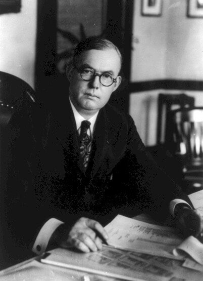
Robert Forbes and Agnes Moir gave birth to Bertie Charles Forbes, who later founded the Forbes Magazine. On 14th May 1880, the couples welcomed their son in New Deer, Aberdeenshire in Scotland. Bertie Charles Forbes was the sixth child of ten children.
Growing up, he emulated the spirit of hard work from his family. For instance, he started herding cattle and shining shoes when he was nine. And four years later, he mastered Pitman’s shorthand on his own. By 1894, young Forbes had become an apprentice for the Dundee Courier.
Young Forbes became a journalist for the Dundee Courier in 1897 at the age of seventeen. He combined his work with night lectures at the University of Dundee. With unrelenting effort, he rose to sub-editor and finally, to an editorial writer.
Charles Forbes moved to Johannesburg, South Africa, in 1901, to cover the Boer war. Nearly a year later, he worked briefly at the Natal Mercury and found the Rand Daily Mail. In 1904, he joined the Journal of Commerce in New York, and in 1906, became its financial editor.
In 1911, Charles Forbes became the business and financial editor of the New York American. But, after five years, he resigned to focus on a more challenging adventure. He got married to Adelaide Stevenson on 20th April 1915.
They had five children—Bruce, Malcolm, Gordon, Wallace, and Duncan, all males. He had his last breath on 6th May 1954 in New York City. His children took over the company.
How Did Forbes Begin?
Having mastered the art of writing and editing, Charles Forbes became a famed financial writer and editor. So, after resigning from the New York American, he branched into writing books. His first published book—Men Who Are Making America, became a success.
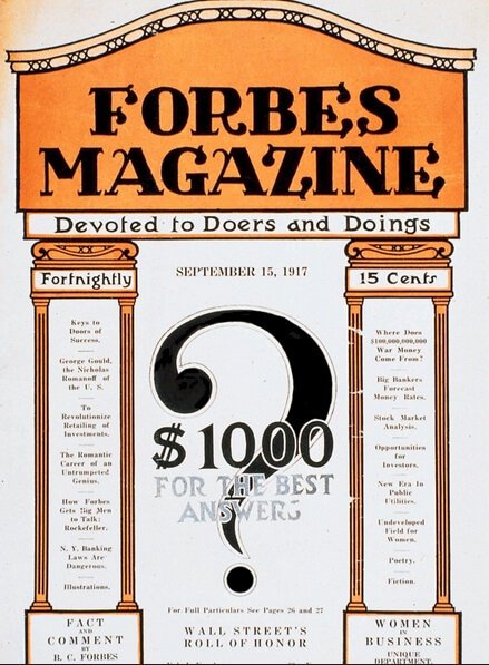
Is it fair to chronicle the trials and triumphs of entrepreneurs in books without starting a business yourself? Perhaps Charles Forbes thought it was unfair, so, together with Walter Drey, they created a bimonthly magazine called Doers and Doings in 1917.
To simplify the name, they chose Forbes for the magazine. Whereas his partner, Walter Drey provided the publishing skills and experience, he became the cash–reliever. Walter assumed the role of a vice–president, and Charles Forbes, editor–in–chief.
In the 1920s, Forbes’ magazine circulation soared, and it achieved monumental success. This drew the interest of the media investor, William Randolph Hearst, who wanted to buy the brand. However, Charles Forbes and his business partner, Walter Drey, refused to sell.
Before the 1930s, Forbes was the only business magazine in the United States. However, beginning the 1930s, Business Week and Fortune joined the competition. These new entrants stamped their authority on the rivalry, and Forbes’ circulation reduced massively.
During the 1932 Depression, the company went bankrupt. As the business financier, he kept the business afloat via his freelancing earnings from Hearst papers, as a columnist. Malcolm Forbes, who joined the firm in the mid–1940s, gave the brand new insight.
Malcolm hired new writers and editors with the senior staff, and the Forbes Investors Advisory Institute started. The changes shot the magazine circulation to 100,000 readers. With a focus on facts and accuracy, the magazine gained entrepreneurs’ trust as a reliable source of business information.
The brand became famous and thriving throughout the 1970s and 80s under the leadership of his sons. In 1982, the directors launched Forbes Richest 400—a list of the 400 wealthiest Americans, and readers loved it.
How Big Is Forbes?

Forbes is based in New Jersey, United States, and it’s an American business magazine. Charles Forbes and Walter Drey formed it on 15th September 1917 to satisfy the information needs of entrepreneurs.
With changes in the media landscape, Forbes runs as an internet media firm. It serves the business world with business information that covers—finance, marketing, technology, politics, communications, investing, and its popular wealthiest–list, Forbes 400.
The magazine comes out biweekly, and it has about 657,215 circulations nationwide. The company also reported reaching nearly 75 million monthly global audiences via print, digital, television, and conference. Also, Forbes boasts of almost 5.8 million readers globally.
Forbes is the largest and most popular global media brand in the world, with about 400 employees and 2800 journalists around the globe.
Who Owns Forbes?
For ninety–seven years, the publishing giant was wholly owned by the Forbes Family. But today, the brand has two wealthy owners. In 2014, the Forbes Family sold a majority of its ownership to Integrated Whale Media Investments.
The buyer is a Hong Kong-based investment group. So, we can boldly say that the Forbes Family controls a minor stake in the company.
Drawing the Curtains Down On Forbes Logo History
Entrepreneurs—both new and seasoned are thirsty for reliable and timely business information. Bertie Charles Forbes used his talent, education, and experience to fulfill this gap in the publishing industry – His product is aimed at the most influential people in our society.
The aura of these leaders and their impacts globally is reflected in the Forbes brand. Today, people across the world see the iconic Forbes logo as trustworthy, authoritative, and wealthy. You can’t go wrong with the same line of thought—The brand is informative and exciting.
Every day, the brand and the Forbes logo inspire millions of people worldwide to take pragmatic steps toward changing the world. The Forbes visual asset is a change-maker and an ambassador worth celebrating.


