
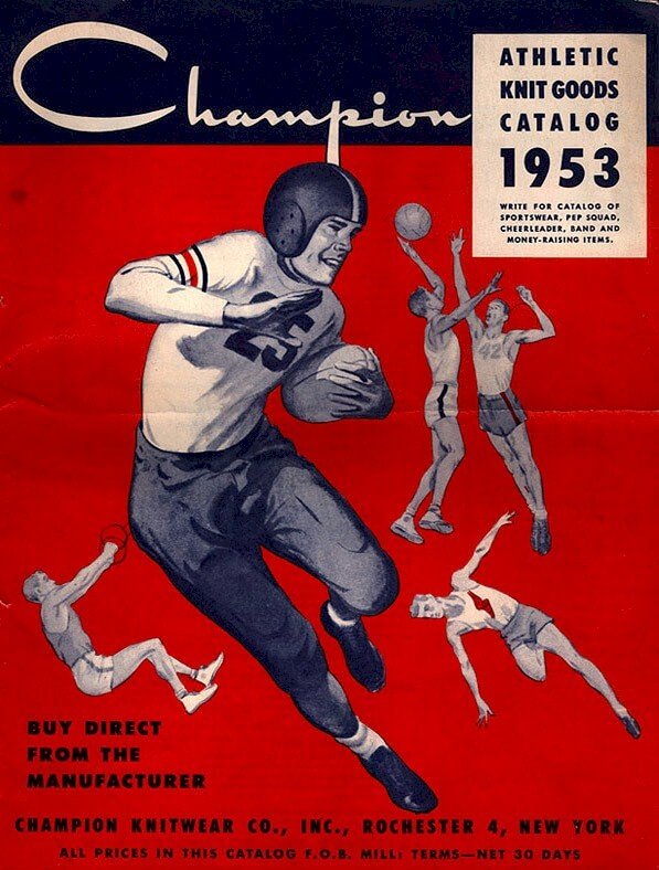
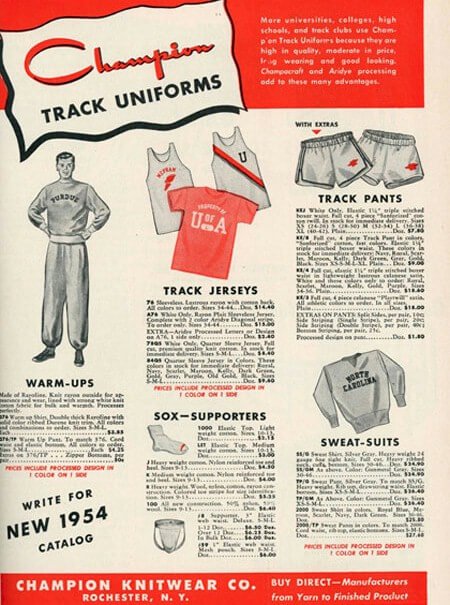
Let’s take a look at the Champion logo and some history of the business.
The rise of the champ is getting noticed. Guess who I’m referring to? Don’t cast your mind to teams in football, basketball, or ruby. And either way, don’t think of individual athletes in tennis, golf, or boxing. This time, the champ isn’t rising from the sporting world.
Soon, the veteran shall take its rightful place among world brands. To decode the puzzle, turn your focus to the fashion world, and you’ll find a century-old rising brand called Champion. In the early 1920s, Champion ruled the fashion world with its quality and inventive athletic wear.
It designed and made uniforms for athletes in colleges, students in the US Military Academy, and NBA teams across the United States in its glorious days. It also collaborated with other reputable brands across the world. However, it lost its shine and faded out from the competition.
Today, Champion is on the rise again. Its once famous Champion logo is leading a comeback campaign. The trademark is a wordmark script with a unique letter—C. Its color palettes are blue, red, and white. You can see the signature emblem on the team’s uniforms, shirts, sleeves, etc. It’s still the old ways.
![]()
Yet, the Champion logo has taken the merit of modern channels to interact with more clients. From 200,000 Instagram followers in 2016, the champion brand is now the host to 5.8 million loyal followers. Yes, I told you that the premier inventor of the famous “hoodie” is back in fashion from the start.
The Champion Logo Evolution
![]() What can you expect from a company that is over 100 years? You’ll expect many changes. That’s the case with Champion, yet we would focus on its significant updates that gave birth to the current one. Come with me while we learn about the century-old logo evolution of Champion:
What can you expect from a company that is over 100 years? You’ll expect many changes. That’s the case with Champion, yet we would focus on its significant updates that gave birth to the current one. Come with me while we learn about the century-old logo evolution of Champion:
1919 to 1940s—The Earliest Champion Logo
For a visionary company that started in 1919, it would be smart to think that it had a symbol that identifies its brands. Whether it was patent is not stated. Yet, it featured on several of its earliest sports apparel. The mark was a big blocky letter—C on the chest area of the uniforms. Often, this readable mono emblem comes in various typefaces.
The 1940s to 1950s—The Second Champion Logo
The company used another emblem within these periods. The logotype showed an athlete running toward a finish line. Most people recognized this signature emblem as the official logo for Champion. The athlete and a finish line translate into a winner, and it reflects on the image of the brand, Champion. The company featured this symbol on the neck label of uniforms.
The 1950s to 1960s—The Innovative Letter—C
The iconic letter—C appeared somewhere in the 1950s. It has a thick vertical bar across its middle. The standalone logotype had solid blue and red color scheme. Mostly, it’s featured on the left side of the sleeves. The trademark had a white outline. Even today, the company used it on some of its designs. It has become one of the industry’s identifiable logotype.
1960 to Present—The Champion Wordmark
The current Champion logo wordmark features the iconic letter—C and the inscription “hampion.” Together, they spelled the brand’s name. It’s the most widely used version of the emblems. The font is blue with red and white hues filling the spaces in the custom letter—C.
Why the Champion Logo Works?
The blue, red, and white Champion icon is everywhere. It is on the chest of sweatshirts. It doesn’t end there: On the front of caps, you’ll spot it there. The logo is now a friendly symbol on the sides of track pants. With this fame, we need to look at the factors making the Champion logo glow.
The logotype is efficient because it’s clean. It doesn’t have many shapes to distort its message. It has only a typeface and some attractive colors. That makes it easy for customers to read and understand it. With this, it has fulfilled one of the basic rules of branding.
Can this wordmark scale on multiple mediums? Why not! The logo is once again breaking ground on digital mediums, social media, and merchandising. It has a clean layout, which is keeping its quality across all promotional platforms.
The consistency of the Champion logo as an ambassador for a century has won the trust of celebrities. It has revived its days of innovations, quality, and affordable pricing. Thus, igniting the loyalty that customers had for it.
In effect, the Champion wordmark has almost everything that a good logo can boast of. It’s modest, readable, recognizable, versatile, and timeless.
Champion Logo Design Elements
The Champion logo design is a great eye-opener. Its fewer graphic elements affirm that designers understand the power of simple trademarks in the past. The logo design comes with colors, a font, and a vertical line. One after the other, let’s look at them below:
Champion Logo Shape And Symbols
- A Letter C:
With its style and appeal, the designer and founders made a massive capital of the letter—C. It’s iconic and minimalist. It represents the first letter of the brand’s name and the third letter of the English alphabet. In graphic design, the letter—C resonates with a waning moon. It also conveys the spirit of clarity, charity, and confidence. As the first letter of Christ, it’s a sacred typeface.
- A Vertical Bar:
One supportive design element in the wordmark logotype is a vertical line or bar. It sat across the middle of the first letter of the brand’s name, Champion. It’s a thick bar that has a unique meaning. A vertical line or bar connects the North Pole to the South Pole, accentuating a lack of movement. As a chosen shape in the trademark, it represents the stability of the company.
Champion Logo Colors
- Blue:
Champion adopted the color of trust and loyalty for its official wordmark logotype. Yes, blue is the prominent hue in the trademark. And it’s the most widely used color in the branding world. It represents serenity, peace, and integrity. In nature, you can find blue in the sky and the sea. The negative emotions of blue can be aloofness and sadness.
- Red:
Red is a spot on hue in the logo design. The color of passion and desire paints one space of the famous letter—C. In the natural world, red connects to blood, heat, and sunshine. It’s a suitable hue for evoking attention. In terms of its negative emotions, it can promote anger, danger, and aggression. As a vibrant color, it stands for energy, courage, and power.
- White:
White, as a vital hue, gives contrasting usefulness to the wordmark. The color can feature on various parts of the logo. And it depends on the medium the company wants to use. White, the color of virtues, conveys purity, cleanliness, and simplicity. In the natural environment, white connects with winter and snow. Brands can also use it to represent loyalty and goodness.
Champion Logo Typography
Champion has portrayed itself as a brand that stands by winning athletes and teams. This winning mentality reflects its brand persona. The lettering, which is closer to the font Monoment, is custom typography. The custom script typeface still looks like a running font, and it reminds us of the running athlete in the earliest insignia.
Who Started Champion Clothing?

Champion was a family clothing business. William and Abraham Feinbloom started it: These two brothers with flaming passions for clothing revolutionized the sports and fashion industry. From Poughkeepsie, New York, these entrepreneurs formed the company in Rochester.
They built a solid foundation by focusing on original sportswear designs and processes. They also didn’t ignore quality materials and aggressive marketing. These led to their success and influence throughout the United States. From this impact, they branch to the casual wear market.
In 1938, the Feinbloom brothers invented the “Reserve Weave” technology. This innovative stitching prevented the shrinking of uniforms when users washed them. It solved a major challenge that customers had. Because of World War II, it took the brothers 14 years to get their patent in 1952.
Again, the Feinbloom brothers stormed the market with another novel product. It was the hooded sweatshirts. The brand became so famous for this clothing design and eventually became part of the American pop culture.
Abraham became the president in 1962 after serving as a vice president and secretary. He became the chairperson of the board in 1968 and finally retired in 1972. Both brothers have impacted the Rochester community with funds and their ideas.
How Champion Got Started?
In 1919, Champion started as a knitwear company. This reflects its original name, Knickerbocker Knitting. The brand focused on wholesaling its sturdy sweaters to retailers. The founders soon spotted a gap in the sportswear clothing and took advantage of it.
The new business idea presented itself when the founders were not happy with American Football sportswear quality. With innovation, quality materials, and effective marketing, the company hit the ground running.
In Michigan, the brand first partnered and designed for the American Football team. It was an instant success. While the managers were glad about the price, the athletes were super excited about the uniform’s quality and fit.
The power of word–of–mouth promotion was established. It caught the ears of other managers from colleges across the United States. Soon, they also started ordering football stripes and sweaters from the company. The demand was at an all-time high for the Feinbloom brothers.
In 1926, the brand partnered and supported the Wentworth Military Academy with school uniforms. During that period, college sports didn’t have a standard uniform, so the brothers resorted to altering it. In the 1930s, they changed the company’s name to Champion Knitting Mills Inc.
The company’s main fashion lines were t-shirt, sweatshirts, and socks. Their quality attracted many colleges who started engraving their emblems on the undecorated Champion products. It served as the official attire for the schools. Not long, the US Military also joined the train.
Sara Lee bought the company in 1989, and it’s now part of the Hanes brands. So, the headquarters is now in Winston Salem, North Carolina. It’s the second-largest brand for Hanes.
How Big Is Champion Clothing?
As an American fashion brand, Champion designs and makes sports, foot, and casual wear. Some of these products include t-shirts, hoodies, and jackets. Others are sneakers, socks, hats, tracks, and sweatshirts.
With locations in 60 countries, Champion’s sales are booming. In 2018, the brand brought in about $1.4 billion in global sales. From these figures, the company is hoping to gross $2 billion by the year 2022. This is good news for a brand that is rising again.
The company has about 70,000 employees who serve customers in North America, Africa, Europe, and Asia. It has also expanded its product lines for men, women, and children.
Summary of Champion Logo and The Business
![]() Businesses act like human beings. They have their life cycles, just like we do. It evolves around seeding, startups, growth, maturity, and decline (rebirth). Every entrepreneur loves the growth and maturity stages but hates the decline path. Yes, the last level is a nightmare.
Businesses act like human beings. They have their life cycles, just like we do. It evolves around seeding, startups, growth, maturity, and decline (rebirth). Every entrepreneur loves the growth and maturity stages but hates the decline path. Yes, the last level is a nightmare.
Champion Knitting Mills Inc. has tasted all the stages. It had bowed out of the competition after many years at the top. What a drastic change? Well, this is a normal process every entrepreneur should have in mind. It would come when you least expected it.
The good news is that the Champion Logo is back in vogue. The brand has shown a trait of a victor. Take note; winning doesn’t always define a champ. A champion is that person or brand that rises after facing defeat or faded out.
The stakeholders have revived the brand by investing in technology, people, and focusing on aggressive marketing. Champion has a strategic partnership with celebrities and other influential brands, along with its quality range of products.
At the heart of this rebirth is the blue, red, and white trademark. It’s leading a silent crusade to reign again as the emperor of fashion. Let’s keep our eyes on it and appreciate the outstanding work it’s doing.


