
The Atlanta Braves logo was inherited from the Milwaukee Braves visual identity. When the Milwaukee Braves shifted their base to Atlanta in 1966, they became known as the Atlanta Braves and used the same uniform, color scheme, and logo as their predecessor. But over time, the Atlanta Braves came up with their own distinct visual identity.
The “Braves” nickname began in Boston, 54 years before the team found itself in Atlanta. After using a slew of team names such as Beaneaters, Rustlers, and Dovers, the Braves moniker was eventually unveiled and has since stuck.
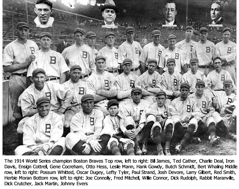
The Braves owner James Gaffney belonged to the Tammany Hall New York City political organization whose symbol was a Native American chef. There was a change of ownership in the 1930s, and the club was rebranded as the Boston Bees. But after only five seasons, the club reverted to being known as the Braves.
During their Atlanta stay, the Braves have gone through two different periods of branding. The current era started in 1987 and is heavily inspired by their original uniforms of the 1966 and 1967 seasons. In the 1970s and almost throughout the 1980s, the team chose a more contemporary look, changing to a white and blue pullover with their cap spotting a lowercase “a.”
The Atlanta Braves Logo Evolution
The Braves logo has gone through a lot of changes since 1900. They were all over the place, and I’m sure the logo will change more as time goes on.
![]() The Atlanta Braves is arguably one of the most historic baseball teams globally, which is portrayed in its logo. The logo itself has been redesigned 29 times throughout the team’s history, representing every era of the famous sporting institution.
The Atlanta Braves is arguably one of the most historic baseball teams globally, which is portrayed in its logo. The logo itself has been redesigned 29 times throughout the team’s history, representing every era of the famous sporting institution.
1883-1888
The Atlanta Braves were initially known as Boston Beaneaters. Like most teams before the 1900s, the team’s logo was a simple red curved wordmark “Boston.”
1889-1896
The team’s red curved wordmark “Boston” was changed to navy blue.
1897-1899
From 1897 to 1899, the team adopted a new logo: a big blue Old English font “B,” representing the city of Boston.
1900
The previous logo version of 1897-1899 was changed to red.
1901-1906
Over five years, the club switched back to the arched blue wordmark “Boston.”
1907
The club was rebranded “Boston Doves,” Its logo was a large red Old English font “B.”
1908
The logo this time was based on the red “B,” written in a different typeface.
1909
In 1909, the team’s logo was a classic red block “B” placed in a black ring that resembled a baseball.
1910
Before renaming the Boston Rustlers, the team switched back to its logo version of 1901, a curved red “Boston” wordmark. This was when the last Beaneaters logo became the last Doves logo.
1911
The Boston Rustlers logo had a new color scheme—navy blue against a white background and a different shape of the letter “B .”The letter was rendered in sleek lines with acute angles, portraying a perfect gothic style.
1912-1915
The club was renamed again in 1912. It became known as the Boston Braves and adopted a new visual identity. The logo now portrays a Native American male facing to the left, drawn in white and red, wearing an ornamental feather headdress.
1916-1920
The portrait of the Native American man became a little smaller. It was placed against a bold blue circle, which brought distinction and brightness to the logo and appeared professional.
1921-1924
In 1921, the wishbone letter “B” replaced the portrait. The color scheme was changed to white and blue, a fresh, professional combination that brought a sense of reliability and expertise to mind.
1925-1928
In 1925, the color scheme and contours of the wishbone letter “B” were refined, lightening the blue shade and making the lines of “B” longer and smoother. The new “B” featured a tiny white triangle on the vertical bar, facing to the right while depicting a “play” button. The logo looked playful and stylish with elongated and curved tails on the vertical bar.
1929 — 1935
The club switched back to the portrait of the Native American man for its last visual identity of the Boston Braves era. However, the portrait was redrawn with a natural skin tone and more colors. The contours stayed the same, though, as in the 1912 version.
1936 — 1937
The Boston Braves were renamed Boston Bees in 1936, and they came up with a new logo. It was the exact same wishbone “B” of the 1925 version, but with a thick bright blue outline and a lime-yellow shade inside the body.
1938
The color scheme stayed the same in 1938, but the “B” had its contours modernized. The “B” was now geometrically shaped, with its bottom and top horizontal outlines slightly curved to the center. Moreover, the blue outline got thinner, making the yellow-lime tint of the body look crispier and lighter.
1939
The “B” retained its contours in 1939 but switched the color scheme to a slim blue outline and a dark red body. The logo looks more powerful and brings a sense of energy and danger to mind. Although the emblem was in use for just a year, it was such a clean and professional image.
1940
In 1940, the Boston Bees brought back the gothic style letter “B.” Redrawn with its upper tail waving horizontally and its lines a bit elongated. The “B” was rendered in royal blue against a white background, suggesting a sense of loyalty and authority.
1941 — 1944
The club was renamed Boston Braves once again, keeping the previous logo version unchanged for three more years. The club saw no need to redesign its logo as the “B” remained unchanged.
1945
For just a year, the club brought back its emblem of 1929: a portrait of a Native American male wearing a red ornate feather headdress. Like in the 1930s, the color scheme and contours of the logo stayed the same, giving the emblem a bright and modern look.
1946 — 1952
In 1946, the Boston Braves modified their logo, redrawing and slightly elongating the lines and refining the color scheme. The Native American got a slightly darker skin tone, and his lips became red. Moreover, the emblem’s black outline became wider, making it appear powerful and confident.
1953 — 1956
The Boston Braves became the Milwaukee Braves after moving to Milwaukee in 1953. A new logo was adopted that same year, portraying a Native American male facing to the right. This new emblem comprised a red, yellow, blue, and white color scheme, placed against a bold yellow circle.
1957 — 1965
The iconic Braves emblem was introduced in 1957. It was the image of a Native American Iroquois Indian male with a pink skin tone laughing out loud with his eyes closed. The man had a black and yellow feather showing at the back of his head and a golden hoop earring on his left ear.
1966 — 1971
In 1966, the Milwaukee Braves moved to Atlanta and were renamed the Atlanta Braves. The club’s new logo was entirely modeled around the previous design but with an improved color scheme and extra lettering. The Native American man had his skin tone changed to Bowen, and a black-and-white feather replaced the yellow one.
The wordmark was “Atlanta” in uppercase, written in a narrowed and rounded sans-serif font, placed over the emblem, while the “Braves” wordmark was handwritten with a curved font the emblem. Both wordmarks were rendered in deep red.
1972 — 1984
In 1972, the iconic Iroquois Indian male portrait was made bright and more contemporary, drawn in red and white, and placed on a bold blue square featuring rounded angles.
The wordmark “Atlanta” was taken out, while the “Braves” wordmark was redrawn and placed below the emblem, overlapping the solid blue square. The wordmark was rendered in red and had a double blue and white outline.
1985 — 1986
In 1985, the color scheme of the Atlanta Braves logo was improved, as was the wordmark. The blue background got more intense and darker, while the “Braves” wordmark font got more elegant and smoother.
1987 — 1989
In 1987, the blue tint of the Braves logo got even darker, making the portrait look even more stylish and modern than ever. The wordmark was refined again, shortening the letters but making them wider, while white was added to the outline.
1990 — Present
In 1990, the Atlanta Braves removed the iconic Iroquois portrait as its visual identity, opting to use the “Braves” wordmark rendered in red, featuring a navy blue outline. Below the wordmark is an ancient red hatchet, symbolizing the team’s strength and tireless efforts to up their game.
The Atlanta Braves Logo Design Elements
Color: Apart from the scarlet red, navy blue, and white making up the team’s official color scheme, the Braves logo also features yellow.
Font: The bespoke curvy script looks like one’s handwriting. The letter “e” is one of the Braves logo’s most unique features.
The History of Atlanta Braves
Based in Atlanta, the Atlanta Braves, aka the Braves, are a US professional baseball team. The team competes in the US Major League Baseball, representing the East Division of the National League.
The Atlanta Braves played their home fixtures at Atlanta-Fulton Stadium between 1966 and 1996 and at Turner Field between 1997 and 2016. Their home ground has been Truist Park since 2017, located 10 miles northwest of Atlanta Central Business District in Cumberland.
The name “Braves” started being used in 1912 and arrived from a term used to describe a Native American fighter. Often nicknamed “the Bravos,” the Atlanta Braves are often considered “America’s Team” because the team’s games were continuously aired on the national TBS network from the 1970s to 2007, giving the Braves a countrywide following.
The Chicago Cubs and Atlanta Braves are the two charter franchises still left standing in the National League. The Braves were established in 1871 in Boston, Massachusetts, as Boston Red Stockings, and the team says it remains America’s oldest continuously running a professional sports franchise.
After several name changes, the club eventually started being called the Boston Braves, a name used for nearly the first 50 years of the 1900s. The team then relocated to Milwaukee, Wisconsin, in 1953 and became known as the Milwaukee Braves. In 1966, the team relocated to Atlanta and was renamed the Atlanta Braves. The name has stuck since then.
Between 1991 and 2005, the club was one of the most illustrious baseball teams in the US, claiming an unprecedented 14 successive division titles and boasting one of the best pitching rotations of all time. Most notably, the rotation comprised pitchers Tom Glavine, John Smoltz, and Greg Maddux. Also, pitcher Steve Avery significantly contributed to the rotation from 1991 to 1993.
The Atlanta Braves claimed the West Division of the National League from 1991-1993 and the East Division of the National League from 1995-2005, after divisional realignment. In 2010, the team reached the playoffs as a Wild Card in the National League.
In the 1990s, the Braves qualified for the baseball World Series multiple times, beating the Cleveland Indians to win the 1995 title. In 1876, the Braves debuted in the National League and won a record 21 divisional championships, four World Series titles, and 18 pennants in the National League.
Summing Up the History of Atlanta Braves
The Atlanta Braves, aka the Braves, is a professional Major League Baseball team in the US. The club represents the East Division of the National League and is based in Atlanta, Georgia. It was founded in 1871.
Before being known as the Atlanta Braves, the team went through various guises. At first, the team was called Boston Beaneaters, then Boston Doves and Boston Rustlers. The name Boston Braves first appeared in 1912, before it became Milwaukee Braves when the club moved to Milwaukee. When the club relocated to Atlanta, it was renamed the Atlanta Braves. This name has stuck since then.
In 1976, media magnate Ted Turner bought the Atlanta Braves. He was a very pragmatic owner who used athletes to market his WTBS cable channel. In December 2005, Turner announced that he was selling the Braves. Since February 2007, the team has been owned by Braves Liberty Media Group.


