

This is a look at the Supreme Logo and the history behind the business.
Catering to the underground culture of skateboarding, hip hop, and rock, the skateboarding, and apparel brand Supreme has carved out a very successful niche for its products. Today, Supreme has established itself as one of the most popular streetwear brands and logos in the world, boasting major collaborations with companies such as Nike, North Face, Playboy, and many others as well as record-breaking sellout times of its newly released products.
Given the enormous amount of success that the brand and logo has enjoyed over the past few years alone, it should come as little surprise that the Supreme logo is now one of the most recognizable logos in the street-wear industry. The story of how Supreme established this level of success as well how their iconic logo came to be, though, is one that contains both high-points of astounding success as well as instances of considerable controversy.
The History of Supreme
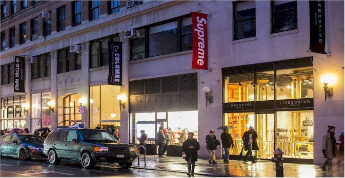
The very first Supreme store was opened by James Jebbia in downtown Manhattan in 1994. This very first store featured a unique layout that was designed with skaters in mind. The products in the store were placed around its perimeter, leaving plenty of open space in the store for skaters to skate around the store while they browsed through its products.
For ten years, the Supreme brand consisted of this one single store, but in 2004, Jebbia opened up a second Supreme store in Los Angeles. The Los Angeles store was almost double the size of the New York store and even featured an indoor skate bowl. Little by little, Jebbia began to open up other Supreme stores all over the world, including stores in multiple Japanese cities, a store in Paris, and more. All of these stores were built with the same skater-friendly layout of the first Supreme store.
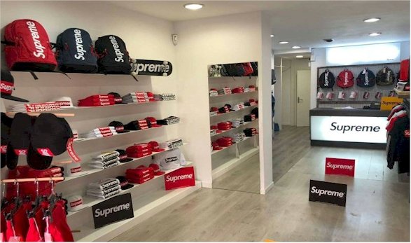
As for the products that Jebbia made available in these stores, the Supreme brand stocked its own line of clothing and skating supplies as well as clothing from a number of other brands such as Nike, Van, Spitfire, Thrasher, SB, and many others.
As the popularity of the Supreme brand grew, Supreme began to actually collaborate with many of these brands rather than just stocking their products. Today, Supreme frequently collaborates with a number of popular brands, including Nike, North Face, Hanes, Levi’s and others to create products that featuring both the branding and style of Supreme as well as the branding and style of the company that they are collaborating with.
In 2017, Supreme became a billion-dollar brand, and James Jebbia announced that the company had sold half of its stock (about $500 million worth) to The Carlyle Group, a private equity firm. Since then, the popularity and cult following of the Supreme brand has continued to grow. Today, new lines of Supreme products are renowned for selling out in record-setting times, and the resale value on some of the brand’s more popular products often climbs to considerable numbers of a thousand dollars or more. The fact that Supreme only releases short runs of new products has played a large role in these record sellout times and high resale value.
Of course, the iconic Supreme logo can certainly be tied to much of the success that the company has enjoyed.
History of the Supreme Logo
When James Jebbia opened the first Supreme store in Manhattan, the main purpose of the store was to sell products from other brands that were popular among the skating community. However, Jebbia wanted to commemorate the opening of the store by selling three t-shirts that were original to the brand.
All three of these t-shirts were very simple in their design, with one featuring the picture of a popular skater on the front, the other featuring a picture of a popular musician, and the third featuring the rather simplistic Supreme logo that Jebbia’s friend had designed for him when he opened the store.
![]()
It wasn’t long, though, before the t-shirt that featured the Supreme logo began to outsell all other products in the store, and Jebbia realized that he was on to something special with this logo. Jebbia then began to design a wide range of other clothing products that featured the Supreme logo in a variety of colors. Before long, the Supreme logo had become a status symbol in the street culture of New York City, and the groundwork that would pave the way for the logo to become internationally popular in skating, hip hop, and rock circles across the world had been laid.
However, there was a degree of controversy about the logo’s design. After Jebbia’s friend designed the original Supreme logo, Jebbia felt as if the logo looked a little flat. In order to add more depth to its design, Jebbia lent his friend a book by New York conceptual artist Barbara Kruger for inspiration. In the end, the Supreme logo came out looking very similar to Kruger’s signature style of artwork, which featured bold white letters surrounded by the red font in order to portray a rebellious, anti-capitalist message.
Kruger didn’t own any copywrites on the logo itself, and no legal action could be taken against Supreme, but that didn’t stop the artist from commenting about how she was very displeased about the company so blatantly co-opting her signature style.
In spite of this controversy, though, there’s no denying the fact that the Supreme logo turned out the be very lucrative for the brand. The message that Kruger managed to convey with her artistic style fit Supreme’s target audience perfectly and the popularity of products that featured the Supreme logo skyrocketed, first in New York City and then across the world.
Looking For a Logo Designer?
Over 30,000 businesses have trusted LogoMyWay with their logo design. We have thousands of logo designers ready to work on your new logo.
Design Elements of the Supreme Logo
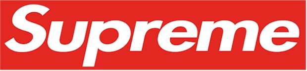
The Supreme logo features the name of the company in bold, futura, oblique font surrounded by a bright red box. It’s a simple design, yet the aggressive combination of the font and color scheme is one that broadcasts a message of rebellion and anti-authority that resonates with Supreme’s customers.
This, of course, should come as a little surprise seeing as the artistic style that the logo is built around was carefully developed by an artist who intended for it to convey that exact message, whether she intended for her style to end up being the face of a highly popular clothing brand or not.
While it is unfortunate that Barbara Kruger’s work was used in a way that she did not condone, it should also be noted that appropriating the styles of other artists and brands is somewhat common in the skating apparel market, and Supreme isn’t the only brand in this industry to design their logo in this manner. That’s not meant to excuse the appropriation of Kruger’s style, but it is to say that Supreme certainly wasn’t acting outside the norm when they developed a logo using design elements that weren’t entirely their own.
All controversy aside, the bold, eye-catching design of the Supreme logo has undoubtedly served the brand well, allowing them to subtly speak to the interests of their target audience while still creating a logo that is simple and clean in its design.
The popularity of the Supreme Logo
Over the years, the Supreme logo has enjoyed an enormous amount of representation in pop culture. Celebrities ranging from NFL wide receiver Odell Beckham Jr. to Justin Bieber have all been spotted wearing clothing that sports the Supreme logo, and Supreme has teamed up with an equally wide range of celebrities to create photoshoots featuring their logo including Michael Jordan, Lady Gaga, Mike Tyson, Neil Young, and many more.
Always looking for opportunities to grow the recognizability and popularity of their logo even further, Supreme has engaged in a number of stunts and artistic ventures where their logo was the centerpiece, including teaming up with a UK artist who creates crop circles to create a massive crop circle featuring the Supreme logo at a secret location in California. The crop circle was then featured in a short film that the company produced, called Crop Circles.
Recently, the Supreme logo has been making rounds in the news once again, stirring up controversy in a way that almost seems fitting for the brand at this point. This time, though, the controversy involves the NBA player J.R. Smith, who was told by the NBA that he would have to cover up his tattoo of the Supreme logo during games or face a fine from the league for promoting a third-part brand during games. Smith, however, has indicated that he has no intention of covering up the tattoo, and Supreme is no-doubt thrilled with both the extra publicity and the rebellious stance that plays perfectly into their overall message.
While the Supreme products play an important role in a company’s success, some brands are established almost entirely off the popularity and recognizability of their logo. This is the case with Supreme, and though the origins of the logo that has made them a worldwide brand may be somewhat controversial, Supreme is one of the rare brands that leverage controversy rather than being damaged by it.


