A look at the 3M Logo and the History behind the Company.
3M (previously called Minnesota Mining & Manufacturing Company) is a United States multinational conglomerate company, with headquarters in Maplewood, Minnesota.
It boasts over 76,000 workers worldwide and produces a diverse range of around 55,000 products, ranging from medical and electronic materials to adhesives. 3M’s corporate image is hugely shaped by its unique and innovative products, and its new products account for up to a third of its total sales annually.
The History of 3M

3M was established in the North Shore neighborhood of Two Harbors, Minnesota, in 1902. Owing to the rich iron ore deposits discovered in Northern Minnesota, prospectors were drawn to the area. 3M’s founders wanted to mine corundum, which is used in sandpaper. But they discovered that the mine had the mineral anorthosite instead of corundum, so they abandoned the idea.
After this disappointment, the company shifted to nearby Duluth, aiming to make abrasive products. A St. Paul investor Lucius Ordway Jr heavily invested in 3M and ultimately convinced the firm to shift its manufacturing plant to St. Paul.
Although Ordway’s continuous “savior” investments saved 3M from financial ruin, new employees were brought in to rejuvenate the firm and cultivate relationships with customers. A bookkeeper known as William McKnight, who became president later on in 1929, led efforts to focus on quality control. Also, he recruited Archibald Bush to oversee the sales of the company’s products. 3M made its first profit in 1916 after manufacturing its first unique item: Three-M-ite abrasive cloth. After this long-overdue success, 3M gave its shareholders their first dividends.
In St. Paul, the management of 3M promoted a culture of scientific discovery and innovation. To encourage staff to invent new products, the firm laid down a “15% rule”, which let scientists spend 15% of their time working on their own projects.
Many of the company’s most popular products were created through independent research at the company’s facilities. These include a decorating ribbon called Sasheen ribbon, and Tartan Track & Turf, the first-ever manmade athletics track and turf.
Another innovative 3M product was the company’s Technical Forum, developed in 1951. The product was created to allow the company’s technical staff to learn, educate, and collaborate with others who usually worked on very different products.
While Post-It Notes and Scotch Tape are arguably the two most popular consumer products made by 3M, there are numerous other products that the firm has pioneered, with some of them even invented accidentally.
For instance, in 1953, two lab technicians Joan Mullen and Patsy Sherman were working on rubber fluorochemical substances when Mullen inadvertently dropped the fluid’s beaker on her shoes. Sherman found it impossible to wipe the fluid off Mullen’s shoes but realized that this was a golden opportunity to invent something. Within a few years, 3M had introduced Scotchgard fabric protector, and Sherman kept improving the still popular item all through her career.
3M’s innovations had far-reaching ramifications on a variety of industries, including entertainment and office supplies. 3M developed the first photocopier Thermo-Fax in 1950. Although more up-to-date photocopiers have been manufactured since Thermo-Fax modernized office communication and productivity.
3M also developed far more than masking tape with their Scotch Tape line of products—Scotch video and sound, magnetic recording tapes allow TV and music shows, in that order, to be pre-recorded instead of produced live. During the 1980s, the company even won Academy and Emmy Awards for its innovations in videotape magnetic film and advances in movie soundtracks.
As 3M grew into more industries, it aimed to enter the worldwide market during the 1950s. The company and its rivals developed a joint company that could take on foreign firms, but this venture soon ran into headwinds because of anti-trust laws.
Using the aspects leftover from the collaboration, 3M streamlined its own global network and launched operations in 12 different countries throughout the 1950s. Throughout the 1960s, 3M established operations in a further 23 countries—at least one per continent bar Antarctica. This sustained early expansion helped 3M to make its presence felt in a worldwide market and helped to make the company one of the largest in the United States.

While 3M is mostly known for its Post-It Notes and Scotch Tape products, the company has formulated solutions for a wide range of industries and purposes. Specialized stoplights, reflective street signs, Scotch-Brite cleaning pads, and Thinsulate thermal insulation are only a fraction of the numerous innovations that have helped make this mining company a Fortune 500 multinational corporation.
Key Timelines for 3M
1902: Minnesota Mining & Manufacturing Company is established in Two Harbors. The firm plans to mine corundum that’s used for sandpaper and grinding wheels.
1905: After finding out that the mine had a useless rock instead of corundum, 3M is acquired by investors John Dean and Edgar Ober and relocated to Duluth to make sandpaper instead.
1910: A St. Paul investor, Lucius Ordway, saves the firm from going under by heavily investing in manufacturing and relocating its plant to St. Paul.
1916: Inspired by the booming success of its Three-M-ite abrasive cloth, 3M makes a profit for the first time and relocates its main office to St. Paul.
1921: Under William McKnight, 3M purchases Wetordry waterproof sandpaper copyright and hires Francis Okie, its inventor.
1925: While working on enhancing Wetordry, Richard Drew develops a masking tape that’s to be used in the car industry, the first item in the renowned Scotch Tape product line.
1937: Richard Carlton establishes Central Research Lab. Early on, this lab scores a major success when the reflective street signs used today are developed.
1946: 3M gets listed on the NYSE.
1956: A fabric protector, Scotchgard, is introduced to the market. A couple of years later, Scotch-Brite cleaning pads enter the market.

1961: 3M introduces Scotch Magic Tape. A year later, the company relocates to a new head office in Maplewood near St. Paul.
1979: Thinsulate is introduced. It’s a light, portable insulator that transformed outdoor winter clothing.
1980: 3M introduces Post-It Notes to the market after being developed by Art Fry.
2002: On its centennial, Minnesota Mining & Manufacturing Company officially changes its name to 3M Company.
2018: 3M agrees to an $850 million settlement deal with the Minnesota State after being sued for heavily polluting the waters near the firm’s research facilities in Maplewood and St. Paul.
The 3M Logo and Its History
3M’s logo is the main feature of the company’s corporate identity. Throughout the decades, it has come to symbolize its innovative and quality products and services. The simple 3M emblem has evolved from a basic design feature into an important company asset.
3M Logo Evolution

1906 — 1938
3M’s first logo was created in 1906. It was a compact black rhombus with the lettering “3M CO” in white. The diamond was surrounded by a two-circle frame, which housed the company’s long name in uppercase letters.
1926 — 1938
In 1926, two extra variants of the 3M logo were designed. One was a basic inscription “Three M” featuring two thick dots on either side of the inscription. The second portrayed a framed rhombus featuring a black inscription “3M CO” inside, like on the first logo, but a more modern, light one, thanks to the change of the colors.
1938 — 1942
In 1938, the first 3M logo was still being used, but the font was refined and switched to a classy serif one. But the second version, which looks more like the one of today, was also created to highlight the company’s growth and progress.
It was a solid bold “3M” inscription with a short diagonal dash. It was a minimalist, clean emblem, provoking a sense of power and confidence.
1942 — 1944
The 1942 experiment brought a serif typeface to the logo. There was thin white border in the emblem, looking masculine and bright.
1944 — 1948
But in 1944, 3M decided to revert to the 1938 version, with a thinner dash that was placed diagonally. The lettering was recognizable, reflecting the fundamental approach and unique character of the company.
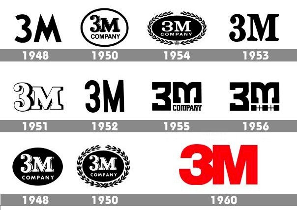
1948 — 1950
There was no sight of the dash in 1948. The lettering’s contours were refined to create a finer balance in spaces and size.
1950 — 1951
The 1950s logo consisted of a “3M Company” lettering surrounded by an oval frame. The word “Company” in uppercase was rendered in a sans-serif typeface, while the upper section of the lettering was written in an ultra-bold serif typeface.
1951 — 1954
During this period, there were two logo versions in use. One was written in a serif font, and the other was more laconic and modern, depicting elongated and narrowed sans-serif lettering. The logo was occasionally used by itself; sometimes it was inside a black oval against a white background. However, the most common variant was white lettering inside a black oval.
1954 — 1960
The company retained its previous version, but it now had a laurel wreath enclosing it, which was occasionally removed. The lettering was now written with a slender white shadow, which added volume and class to the entire image.
1960 — 1978
From 1960, 3M decided to revert to minimalism and designed a new logo, consisting of a solid smooth “3M” wordmark in a clean and classic serif typeface. But this logo only lasted a year and a new version was created in 1961.
It was an outstanding custom “3M” wordmark, with a flat upper section and sidebars made with “M” and bottom lines made with “3”. The two versions were very similar but positioned in different directions. This was a remarkable modern visual identity for an influential company.
1978-Present
The current 3M logo was designed in 1978. It’s made up of an ultra-bold wordmark, rendered in a classic Helvetica font, with “3” joined up with “M”.
Besides, this is the first-ever colorful variant of 3M’s visual identity. The main color used is scarlet red, which becomes black on printed versions.
The combination of red and white is a sign of power, energy, and passion. This combination perfectly characterizes the business and its principles.
3M Logo Design Elements

The current 3M logo, designed in 1978 by the renowned strategic branding company Siegel+Gale, is a very intense, powerful, and authoritative work of art.
Logo Shape: The 3M logo has a character overlap induced by ultra-tight kerning, which brings cohesiveness and strength to the emblem, as well as to the image of the company.
Logo Color: The choice of bold letters in scarlet red gives 3M an air of stability as well as an innovational spirit.
Logo Font: The logo is rendered in the classy Helvetica Neue Condensed group of fonts to basically portray its modern yet stylish feel.


