This is a look at the Subway Logo and the history of one of the most recognized fast food establishments in the world. The Subway logo and brand has gone worldwide and continues to grow.
Combining the appeal of fresh, healthy menu items with the speed and convenience of fast food, the restaurant chain Subway has exploded into an international success, bringing in $11.3 billion in 2016 from US sales alone. While much of Subway’s success is no doubt due to their menu and the near limitless sandwich combinations it provides, there’s a lot to be said for the sandwich chain’s marketing as well. In this article, we’ll take a look at how Subway got to where it is today and the role that its recognizable logo has played in its marketing success.
The History of Subway
The history of Subway started in 1965 when Fred DeLuca borrowed $1,000 from a friend named Peter Buck in order to fund the opening of a sandwich shop in Bridgeport, Connecticut called Pete’s Super Submarines. A year later, the two formed a holding company to oversee the expansion of their restaurant named Doctor’s Associates – a name derived from DeLuca’s desire to make enough off the restaurant to fund his medical school tuition. By 1968, the two men changed the name of their restaurant chain to Subway.
It didn’t take long at all for Subway to begin seeing incredible success. The first Subway on the West Coast was opening in Fresno, California in 1978, and by 1984 the restaurant had gone international by opening a Subway in Bahrain.
Fred DeLuca served as the company’s CEO until 2015. Having suffered from leukemia for the past two years, DeLuca finally turned his position over to Suzanne Greco before passing away a few months later.
In spite of the death of its founder and former CEO, Subway has continued to see unparalleled success. In fact, the 26,744 Subway locations in the US actually surpasses the number of McDonald’s location in the country, making Subway the most common restaurant in the United States. Since 2007, Subway has continued to rank high in Entrepreneur’s Top 500 Franchises list.
Along the way, the chain has undergone a few changes to keep them growing and appealing to their customers, including some notable changes to their store design in 2016 which features USB charging ports at the tables, self-order kiosks, new menu items, and bread made without gluten.
Subway’s marketing plan has also evolved along the way, with the restaurant partnering heavy with sports figures to associate their products with health and athleticism. This has allowed Subway to set themselves apart from most fast-food chains (you probably wouldn’t find and NFL star eating McDonald’s on a regular basis) and portray themselves as a healthier version of fast food enjoyed even by athletes even at the highest level of success. Of course, Subway’s marketing plan has also revolved heavily around their recognizable logo – a logo that has remained mostly the same since it was very first introduced by Subway founders Fred DeLuca and Peter Buck.
Evolution of the Subway Logo
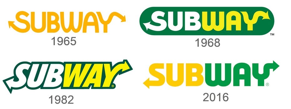
The history of the Subway logo dates all the way back to the very first sandwich shop that DeLuca and Buck opened. After changing the name of their restaurant to Subway, the two men developed a yellow logo with arrows coming out of the “S” and “Y” in Subway. This logo remained in place with only slight changes throughout the majority of Subway’s impressive growth until it had the first significant change in 2002. At this point, the company began using thicker, italicized characters to spell Subway and changed the color scheme to green, yellow, and white.
For a brief period of time from 2015 to 2016, Subway also used a single color variation of their logo in solid green. Recently, though, the Subway logo has undergone another significant change. In 2016, Subway unveiled its most recent logo, which featured somewhat of a return to the original logo, losing the italics and dark green border while also adding more curves to the logo.
While the Subway logo has indeed undergone several different iterations, it’s interesting to see a company that has kept the basic design of their logo ever since they opened their very first location. The history of the Subway logo may be short compared to the lengthy history of some companies, but, nevertheless, it has undoubtedly demonstrated plenty of staying power.
Design Elements of the Subway Logo
The Subway logo makes use of dark, crisp greens to convey the idea of freshness as well as bright yellows to convey positivity and flavor.
Concerning the two arrows in the Subway logo – which have stayed with the logo no matter which version the company has come out with – Subway has long promoted their products to a very active, athletic audience. The arrows in the Subway logo serve to promote the idea of movement and motion. For active individuals who choose Subway over other, less-healthy fast food alternatives, this is a positive message. The arrows also convey the idea of speed, promoting the message that, in spite of the fact that Subway is fresh and healthy, it is also a very quick and convenient option.
The popularity of the Subway Logo
Much of the popularity of the Subway logo can be summed up in the logo’s staying power. Unlike many companies whose current logo looks drastically different from the logo they started out with, Subway’s logo has remained mostly the same from start to finish.
Subway has also created a monogram out of the iconic arrows in their logo and continue to use that monogram in much of their marketing material. You can find this monogram everywhere from Subway’s commercials to the paper that they wrap their sandwiches in.
All told, Subway has managed to create a widely recognizable logo that conveys all of the messages they hope to get across to their customers. What’s better, they managed to get it right on the very first go, which says something for putting thought and effort into your logo so that you are able to keep it throughout the lifetime of your company.


