

A look at The NBC Logo and Its History. Founded in 1926, the National Broadcasting Company (NBC) is the oldest major broadcasting network in the US. Currently, NBC is the owner of 13 popular television stations as well as an affiliate with 200 other stations. For almost 100 years, the story of NBC has been one of boundary-pushing innovation and unparalleled success. In this article, we’ll look at the history of NBC as well as the history and importance of its iconic logo.
The History of NBC
In 1926, the nation’s first permanent radio network, NBC, was founded by a man named David Sarnoff. Less than a year into the network’s existence, NBC was already broadcasting some of the biggest events in the nation such as the Rose Bowl, the heavyweight fight between Gene Tunney and Jack Dempsey, and even Charles Lindbergh’s historic return to the United States after the first-ever trans-Atlantic flight.
In 1929, NBC first sounded their now-iconic chimes. The immediately recognizable sequence of notes, G-E-C, went on to be the switching cue that NBC used on their network and actually became the first audio sequence registered as a trademark with the U.S. Patent and Trademark Office.
Throughout the 1930s, an era known as the golden age of radio, NBC dominated the medium, helping drastically grow its popularity. In 1939, though, NBC helped usher in a new era – the era of television. NBC aired the Macy’s Thanksgiving Day Parade on tv later that year, and in 1940, the network introduced a series of made-for-television films featuring star comedians Abbot and Costello. By 1947, even NBC’s lauded radio program Meet the Press had transitioned to the medium of television, and that same year, the first televised World Series aired on the network. A new age of media had begun, and NBC was at the forefront of it.
Today, the network continues to reap the rewards of their rich history and eye for innovation. In 2015, NBCUniversal grossed $28.462 billion in revenue, and the network continues to be a dominating influence in mainstream media. What role, though, did the network’s colorful logo play in helping them reach this monumental level of success?
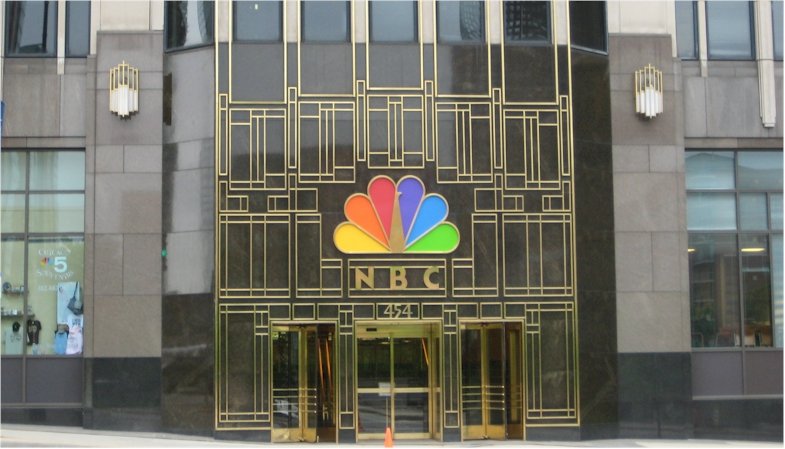
History of NBC Logo![]()
Before NBC expanded into television, the company did not have a logo. Once visual branding became an essential part of their business, though, the company quickly adopted and purchased a logo.
This first logo, though, was relatively short-lived. In fact, none of the NBC logos have stuck around for very long. Since the network had its first logo designed in 1944, the NBC logo has undergone nine different variants and the logo we are familiar with today has only been around since 2012 (though granted, the logo that preceded the modern version was quite similar to the one NBC now uses).
In 1956, NBC unveiled the logo that would serve as the inspiration for most of the variants that came after it, including NBC’s present logo. This logo, dubbed the NBC peacock, featured a peacock with brightly colored plumage in several shades.
So why did NBC want a brightly colored logo? It turns out that the company that owned the network, RCA, was also one of the first companies selling color television sets. RCA hoped that by introducing a bright, colorful logo at the beginning of every broadcast on the most popular stations at the time, people would be encouraged to purchase color television sets.
For some time, though, NBC strayed away from the peacock logo. From 1959 to 1976, the network used an animated snake logo to accompany their peacock logo, and from 1976 to 1979, the peacock logo was replaced entirely by an abstract N. In 1979, though, the network returned to using their famous peacock logo.
In 1986, the peacock’s body became more abstract, blending into the background and leaving the brightly colored feathers as the prominent feature of the logo. In 2012 the network switched to a flat variant that does not have the letters “NBC” underneath it.
Design Elements of the NBC Logo
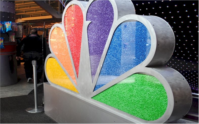
The NBC logo displays a variety of colors, and, when it was animated (as it often was), the variety of colors displayed was even larger. This use of color directly coincided with the rising popularity of color tv and was an attempt to not only help the network’s parent company sell more color television sets but also establish NBC as a leader in media technology.
In fact, from colors to animations, the design elements of the NBC logo have always been used to demonstrate the network’s technological advances, which is part of the reason the logo has been updated so many times.
In the modern NBC logo, there a number of intentional design elements. For one, the beak of the peacock was changed so that it faces to the right, signifying that the network is looking toward the future rather than back at the past. The six feathers of the peacock represent the network’s six divisions: yellow for news, red for entertainment, blue for network, orange for sports, green for productions, and purple for stations.
Rightfully proud of their logo, NBC is very particular that these design elements are replicated exactly; the network maintains rules regarding how the logo may be reproduced in the NBC Logo Legal Usage Guidelines, which they hand out to NBC employees who are involved with graphics as well as outside vendors who need to use the logo.
The popularity of the NBC Logo
As mentioned, no variation of the NBC logo ever stuck around for very long. This, though, is not to say that the various logos NBC has used over the years have not been popular or effective, but rather is a consequence of the manner in which NBC has used their logos.
For NBC, their logo has always represented their technological capabilities. As technological capabilities update, updates to the logo have been required as well. This use of their logos, though, is a great example of how logos can be used to demonstrate the cutting-edge nature of a company.
Today, in spite of the fact that it has only been around five years, the current NBC logo is one of the most popular and recognizable logos in the world – providing a great marketing tool and branding strategy for the nation’s oldest broadcasting network.


