The Toyota Logo and some History behind this auto giant.
One of the top automotive manufacturers in the world, Toyota has been selling a wide range of vehicles since the company was founded in 1939. The Japanese car manufacturer sold over 8.5 million cars in 2016 and netted over $2.3 billion. In this article, we’ll look at the Toyota Logo and the history of the company, and the role the logo has played in the company’s astounding success.
This History of Toyota
For all their success in the automobile industry, Toyota didn’t start out selling vehicles. At least the company that Toyota was a subsidiary of did not. Instead, the company, then known as Toyoda Automatic Loom Works, started out selling textiles and automatic looms. In the early 1930s, however, the Japanese government began urging Toyoda to expand into automobile production in order to supply the nation’s ongoing war with China. Kiichiro Toyoda, the son of the company’s founder, traveled to Europe to investigate the intricacies of automobile production, and in 1934 the company produced its first Type A engine. One year later, Toyoda was manufacturing its first vehicle, the Model AA passenger car.
Shortly after that, the automobile manufacturing wing of Toyoda Automatic Loom Works became its own company, which was named Toyota. The explanation behind the change in just a single letter was the fact that, in the Japanese spelling of the word, the new name consisted of eight strokes—a lucky number in Eastern culture.
During the Second World War, Toyota dedicated all of its efforts to manufacturing simple trucks to be used by the Japanese military. Allied forces recognized the contribution Toyota was making to the Japanese war effort and scheduled a bombing raid on their factories that would have likely crippled the young company. However, in a stroke of good fortune for Toyota, the war ended before the attack could be carried out.
With the war over, though, Toyota still faced many challenges. The Japanese economy was crippled, and Toyota spent several years on the brink of bankruptcy. In spite of this, the company held on and slowly began to expand. By the end of the 1960s, Toyota had exported its one-millionth automobile.
Today, Toyota has carved out a large share of the global automobile market by selling affordable, fuel-efficient trucks, cars, and SUVs. It is also the second most profitable company in Japan, coming in just behind fellow Japanese car manufacturer Mitsubishi. What role, though, did Toyota’s logo play in the company’s success, and how did it come about?
The Toyota Logo
The first logo for Toyota came about as the result of a public competition. It was also during this competition that the name “Toyota” was suggested to replace the name “Toyoda”. The company went with the results of the competition, changing its name to Toyota and choosing a blue and red, diamond-shaped emblem as the company’s very first logo.
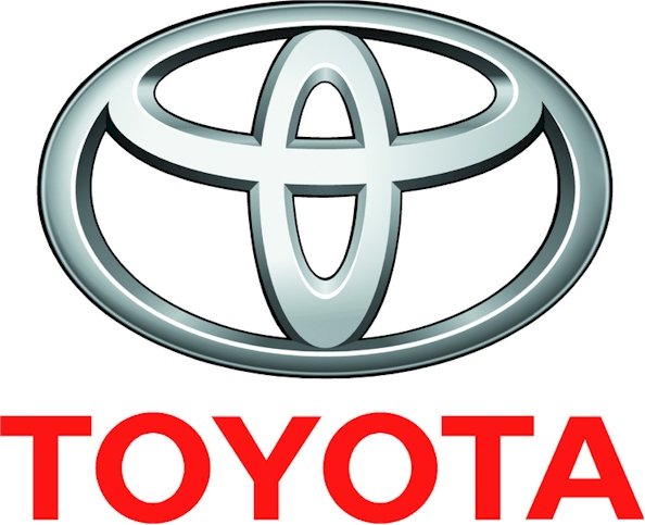
This logo served the company until 1989 when Toyota unveiled a new logo to commemorate the 50th anniversary of the company. This new logo featured three separate ovals combined together and is the logo still used by the company to this day. According to Toyota, designers spent five years developing the new logo to ensure that the design would be well-accepted in all of the company’s many international markets.
Toyota debuted the new logo on their luxury vehicle, the Celsior, in October of 1989. Shortly after that, the new logo was found on every Toyota vehicle in production.
Design Elements of the Toyota Logo
The Toyota logo may appear relatively simplistic at first glance, however, it contains several exciting and unique design elements. To see the meaning behind the Toyota logo, one need look no further than Toyota’s own explanation:
“The two perpendicular ovals inside the larger oval represent the heart of the customer and the heart of the company. They are overlapped to represent a mutually beneficial relationship and trust between each other. The overlapping of the two perpendicular ovals inside the outer oval symbolizes “T” for Toyota, as well as a steering wheel, representing the vehicle itself. The outer oval symbolizes the world embracing Toyota. Each oval is contoured with different stroke thicknesses, similar to the “brush” art known in Japanese culture.”
In addition to this, Toyota set out to design a logo that would be immediately recognizable and announce the presence of a Toyota vehicle on the road. To do this, Toyota designed the logo to look the same when viewed normally and when viewed inversed (as it would be when viewed through a rear-view mirror). This is an especially impressive feat when considering all the other messages the logo manages to incorporate.
Even today, the Toyota logo stands unparalleled as one of the most complexly designed logos in the automotive industry, and Toyota is an excellent example of a company that has placed an immense amount of importance on their logo design.
The Popularity of the Toyota Logo
Despite all its successes, throughout the history of the Toyota logo, the emblem has never generated quite the same level of popularity as the Ford and Chevrolet logos, though perhaps it is a bit unfair to compare the popularity of the Toyota logo to two competitors as steeped in tradition and national appeal as Ford and Chevy.
Though there might not be nearly as many shirts and hats displaying the Toyota logo, the design has still accomplished all of its intended purposes. Toyota managed to design a simple logo with a complex message. They also managed to design a logo that would be recognizable and appealing in all of the many countries they sell vehicles in.
Lastly, one great testament to the popularity of the Toyota logo and the importance the company places on it is the entire pages dedicated to the logo’s design and history on Toyota’s website. A visit to these pages leaves no doubt about the pride Toyota has for its logo and is another excellent example of the value a good logo design can have.


