

This is a look at the Uber logo and the history behind the company. The Uber logo and brand has become a massive player in the transportation and tech industry.
In recent years, a concept is known as the “sharing economy” has taken the market by storm, giving rise to a number of truly revolutionary businesses. While a number of companies have cashed in on this trend, the sharing economy’s undisputed king is Uber – a ride-sharing company that empowers anyone to start earning money with their vehicle and enables those needing a lift to quickly and affordably find a ride. The amount of success Uber has been able to achieve in their short history is remarkable, and in this article, we’ll take a closer look at the origins of Uber as well as the role their logo has played in the company’s historic success.
How Uber Started
Uber was first founded in 2009 by Garrett Camp and Travis Kalanick under the name UberCab. At the time, Camp had recently spent $800 hiring a private car to transport him and his friends on New Year’s Eve, and he was trying to figure out a way he could make the service more affordable to the average person. Camp reasoned that allowing multiple people to share the cost of the service would drive it down, and UberCab was born.
In 2010, a man named Ryan Graves responded to a tweet sent out by Travis Kalanick and became the first UberCab employee. He was made a general manager and was given between 5-10% of the company. Not long after, he was named the company’s CEO.
In 2011, the company’s name was shortened to Uber, and in 2012, Uber rolled out UberX – a service that allowed people to work for Uber driving their own car. Since then, Uber has been on the cutting edge of a number of transportation services and technologies, from self-driving cars, to a carpooling service, and even a helicopter service.

Today, Uber operates in 300 cities across 6 continents, and in 2016 Uber grossed $20 billion. Interestingly enough, Uber actually lost $2.8 billion on that 2016 gross, showing just how committed the company is to continue to push the envelope and develop new services and technologies that will revolutionize the transportation industry.
Even in locations that do not yet have Uber, Uber is still a household name. Thanks in part to the way it has disrupted the transportation market and thanks also in part to clever marketing, Uber is now known around the world, and it will be exciting to see what the company is able to do in the future given its worldwide popularity and its commitment to growth.
While a lot of factors played into launching Uber into the level of recognition and success the company enjoys, one of those factors was the ever-recognizable Uber logo.
The History of the Uber Logo
In 2010, when the company was still UberCab, they unveiled a logo that featured a red “UC” with the company’s name above the logo. When the name was changed to Uber, the logo dropped the “C” as well as the word “Cab” in the name above it. However, the rest of the design stayed the same.
It was in 2012 that the Uber logo got its first major overhaul. The new logo ditched the bright red and bold letters and instead featured a darker color scheme and slim, modern-looking letters. The goal in this redesign was to make the Uber logo look more modern and luxurious – both themes that Uber tries to touch on in their marketing.
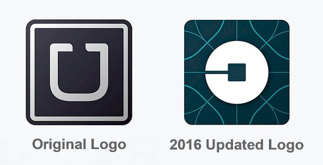
For several years, this logo remained the one in use by Uber and became widely recognized across the world. In 2016, though, the Uber logo underwent another major overhaul, this time ditching the “U” and the company name entirely. Some described the new logo as bizarre, yet there is a lot of meaningful elements to its design that really convey the type of company that Uber hopes to be moving forward.
The Design Elements of the Uber Logo
The new Uber logo features a slightly abstract design that the company says was inspired by the bit and the atom – both building blocks of technology and the world.
The color scheme of the Uber logo still reflects many of the same themes as previous iterations, using crisp whites and dark blues to convey a message of luxury as well as futuristic technology.
Speaking about the new logo, Uber said, “This updated design reflects where we’ve been, and where we’re headed. The Uber you know isn’t changing, our brand is just catching up to who we already were.”
No doubt, the futuristic, modern design of the new Uber logo is very much in line with Uber’s own futuristic and modern approach to the transportation industry.
The popularity of the Uber Logo

The design has always been an essential aspect of Uber’s business model. In order for the company to be successful, the design of their app and their website both had to be flawless. To this end, the Uber logo has played an important role in the company’s design. It has served as the thumbnail for the Uber app and is also displayed throughout the app and website itself.
While the latest Uber logo is still relatively new, the company is already investing a lot in it. They even released an explainer video detailing some of the meaning behind their new logo. In this video, Uber says, “We leave no bit or atom unturned to create industries that serve people—and not the other way around.”
There’s little doubt that the new Uber logo will play a huge role in the company’s branding and marketing, which is why Uber has worked so hard to make the design elements of the logo reflective of the company’s message and their approach.
In summary, Uber is a company with a complex mission and a complex message. Part of their challenge, then, is to convey that mission and message to their customers, and the design of their logo is one of the tools they are using to accomplish this task. It’ll be exciting to see what Uber is able to accomplish in the coming years and equally exciting to see how the company continues to use its logo and their eye for attractive, meaningful design to push Uber forward.
Here is a look at the New Uber Logo released in Sept 2018
Just two days after hiring their first chief marketing officer they came out with a new brand.
The new visual identity was designed by Wolff Olins.
Molly Watson the director of the verbal identity at Wolff Olins San Francisco, said the new logo was designed to represent Uber’s growth and security.


